
Gantt Project
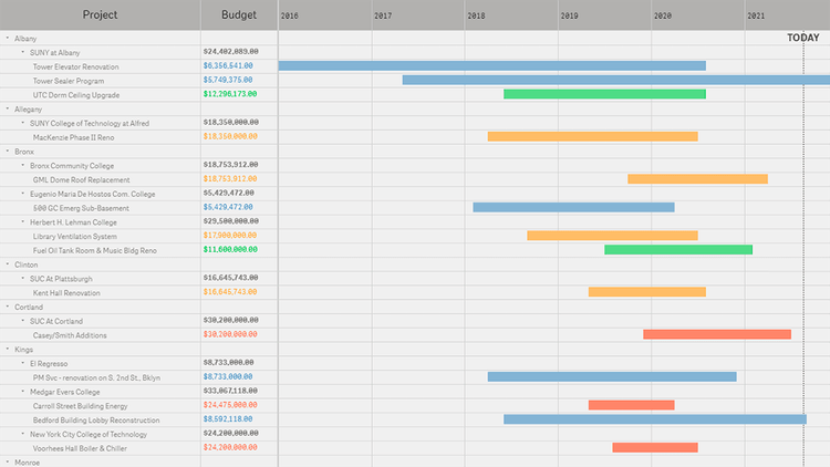
Active Construction Projects (DASNY)
Explore all active dormitory construction, renovation, and repair projects in New York State where DASNY carries out some level of management oversight — by county, institution, project, architect, start year, or completion year. See how close to conclusion each work is at a glance. Switch to sorting by budget to quickly identify the most expensive projects and find out their location, manager, etc.
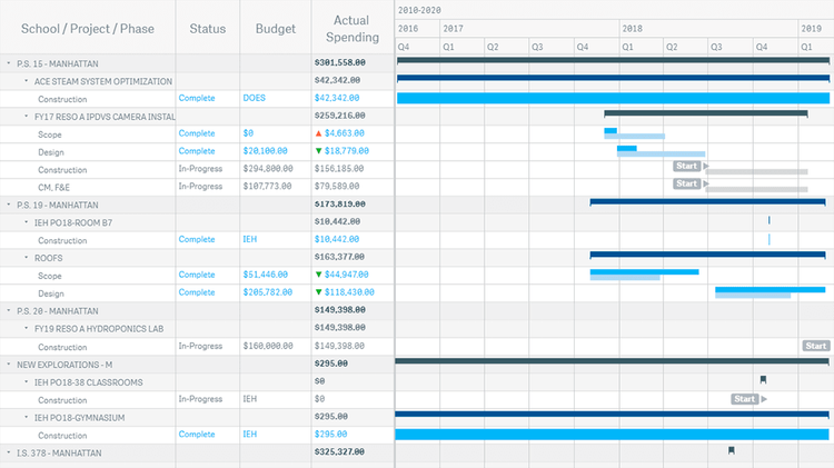
School Facilities Projects (NYCSCA)
Investigate the timeline of all school facility development projects managed by the NYC School Construction Authority that are currently ongoing or completed in the last two decades, in a transparent start-to-finish overview. Inspect budget performance across the phases and spot cost overruns and savings in an instant. Compare the original schedule projections with the actual time spans to promptly discover shortcomings and delays.
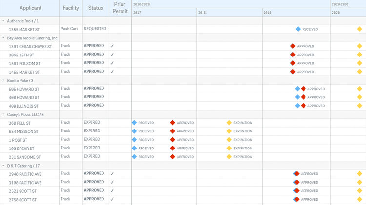
Mobile Food Facility Permits (SF Public Works)
Run through the mobile food facility permits in San Francisco in an intuitive visualization of the official data provided by the city's Public Works department. For each vendor and location, quickly see the current status of the permit (approved, expired, inactive, issued, requested, or suspended), as well as the dates when the application was received and approved, and when the permit is set to expire.
Organization Overview
Check out a brilliant way to consolidate project management and decision making in your company or organization using Gantt charts in Qlik Sense. Imagine you have scores of employees across multiple departments — and thousands of tasks across various projects. Now, enjoy a comprehensive overview of the entire work at a glance! With the ultimate effectiveness and efficiency, perform project planning and scheduling, and keep all processes on track.
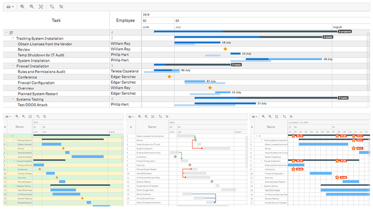
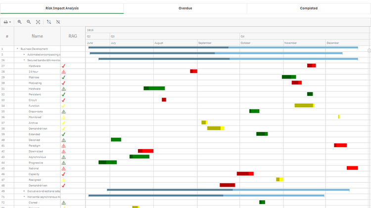
Project Gantt Chart Features
Gantt charts are an essential project management tool, ideal for showing a project schedule. Explore all major features of our intuitive Project Gantt Chart Extension for Qlik Sense while looking at this visualization of (fictional) project data. See different data structures, customizable tables and timelines, flexible milestones, dependency connectors, fiscal year settings, coloring patterns, and much more demonstrated in action.
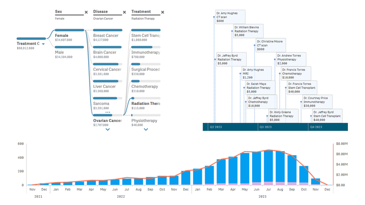
Healthcare Dashboard
Unlock transformative insights in healthcare using Qlik Sense with AnyChart's extensions: Decomposition Tree, Gantt Chart, Combo Chart, Sunburst Chart, and Timeline Chart. Dive deep into metrics like admissions, patient counts, and treatment costs. Perform root cause analysis or ad-hoc explorations with ease. Maintain clear, actionable visibility of doctor-patient timelines and track each patient's journey with insightful precision.
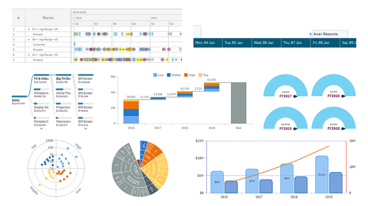
AnyChart Complex Demo
Named best in data analytics and visualization in 2023, AnyChart offers a set of innovative Qlik Sense extensions. Discover the power of the major ones in a quick demo overview and see how they can help you take your visual analytics in Qlik to the next level: Decomposition Tree, Gantt Chart, Combo Chart, Circular Gauge, Bullseye Chart, Sunburst Chart, Timeline Chart, and Waterfall & Advanced Waterfall Chart.