
Extensions for Qlik
Unique tools for your Qlik apps and dashboards — Spreadsheets, Decomposition Tree, Gantt, and more.
Bring the familiar flexibility of Excel into Qlik Sense with a fully governed spreadsheet workspace embedded directly in your dashboards.
Delivers formulas, cell formatting, and multi-sheet logic tied to live Qlik data so users can calculate, edit, and analyze without exporting or moving to external tools.
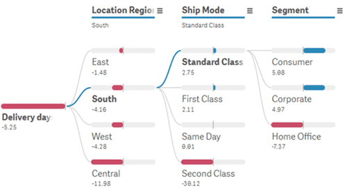
Add dynamic root-cause exploration to Qlik Sense with an interactive decomposition tree that expands metrics step by step.
Enables users to quickly identify the dimensions that drive a result, with AI Splits automatically surfacing factors with the strongest impact in the breakdown.
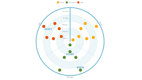
Use a concentric bullseye layout in Qlik Sense to organize items across tiers and segments for quick structural comparison.
Positions products, customers, or initiatives into rings and slices so stakeholders can see priority, grouping, and relative progress at a glance.
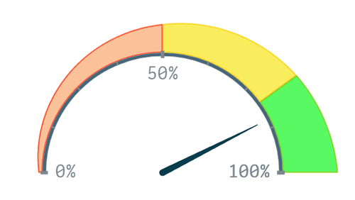
Present key metrics in Qlik Sense with a circular gauge that shows current value, progress toward a target, and threshold-based ranges in a compact visual.
Provides an immediate visual reference that brings KPI meaning into focus and helps users clarify performance levels within the broader analytical context.
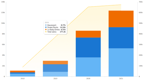
Combine multiple chart types in Qlik Sense with a flexible combo chart that supports bar, line, area, and marker series, including stacked and grouped options, on shared or dual axes.
Ideal for comparing related measures such as volume and rate or actuals and targets, presenting trends and relationships in a single coherent view.
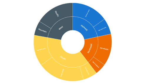
Visualize hierarchical data in Qlik Sense with a sunburst chart that arranges levels as nested rings for intuitive, multi-level exploration.
Reveals structure, proportions, and relationships in one circular view and lets users compare segments, drill into subcategories, and understand how each part contributes to the whole.
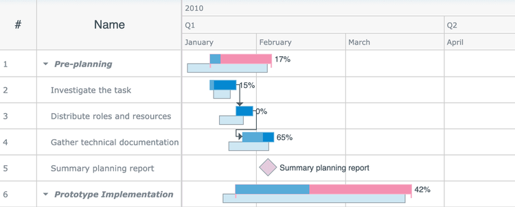
Visualize project timelines in Qlik Sense with an interactive Gantt chart that displays tasks, dependencies, milestones, and progress in a clear, structured format.
Makes it easy for teams to review schedules, track execution, and understand project status directly inside dashboards.
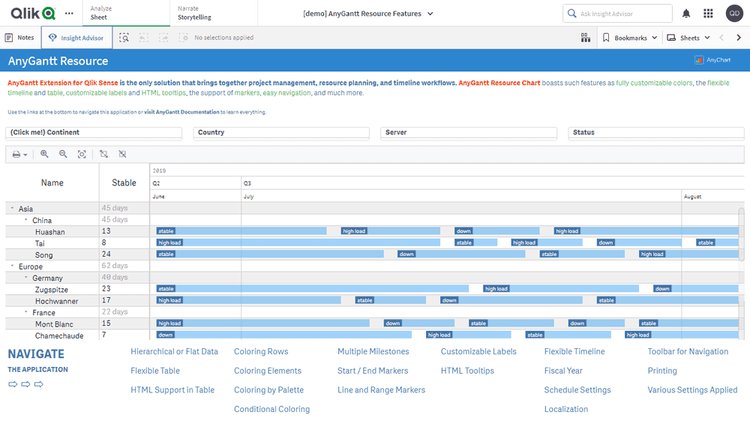
Display resource workloads in Qlik Sense with an interactive Gantt chart that shows availability, assignments, and utilization for people or assets over time.
Reveals how capacity is distributed, which helps users spot imbalances, overloads, and emerging conflicts in resource allocation.
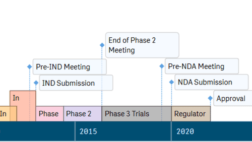
Represent event sequences in Qlik Sense with a timeline chart that displays moments and intervals in a clear, horizontal format.
Helps users examine phases, states, and activity periods to see when events occurred, how long they lasted, and how multiple timelines align and relate.
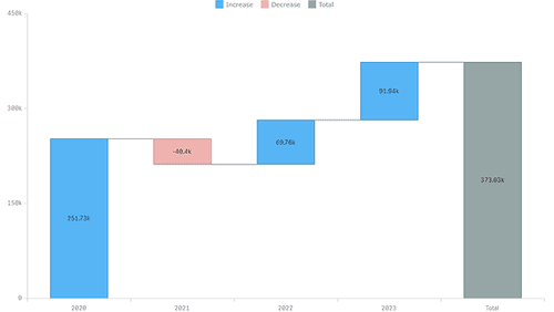
Explain step-by-step changes in Qlik Sense with a classic waterfall chart that visualizes positive and negative contributions from start to finish.
Makes incremental category effects easy to follow and helps users understand how each component shapes the final total.
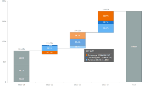
Highlight complex contribution patterns in Qlik Sense with an advanced waterfall chart that supports grouped and stacked steps for multi-layer comparison.
Clarifies how categories and subcomponents influence a total so additive and subtractive effects become easier to interpret.