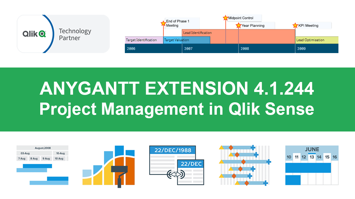
Hey Qlikkies, meet the awesome Qlik Sense Timeline Chart from AnyChart! We are excited to deliver it in the new, just-released version of our AnyGantt extension.
Hence the Timeline Chart has become — wait for it — the 40th chart type available in our data visualization extensions for Qlik Sense overall! For AnyGantt specifically it is the 3rd one, making AnyGantt a unique, cutting-edge Project Management Bundle for Qlik now comprising the Project Gantt Chart, Resource Chart, and Timeline Chart in a single intuitive extension.
However, it is not all great news. Release 4.1.244 also brings a bunch of other awesome features and improvements to the AnyGantt extension. Discover what’s new right now.
What’s New in AnyGantt Extension 4.1.244
Timeline Chart for Qlik Sense
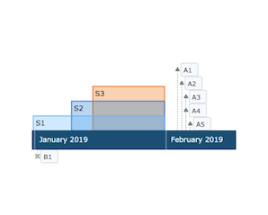
So yes, first and foremost, we have added Timeline Charts. This chart type is commonly utilized to visualize a sequence of events in chronological order, showing events that last for a certain period of time (ranges) and those with zero duration (moments). Events and dates are displayed along the horizontal timeline bar (axis). A Timeline Chart can be a great visual tool to monitor and explore the order of events, critical milestones of a project schedule, and so on.
Coloring/Palettes Support
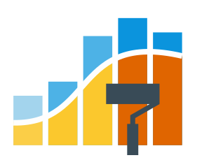
Every element in Project Gantt, Resource, and Timeline charts now has the option to be colored according to a set of predefined color palettes (schemes). Palletes can be applied in a lot of ways, including coloring by position in the hierarchy, by group, and more.
Start/End Markers
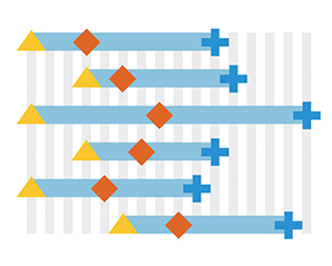
Now you can add start and end markers to make tasks and periods easier to read on the timeline. Progress bars also have start and end markers, which makes this mechanism even more flexible and remarkable.
Zoom Using Mouse Wheel
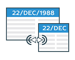
We’ve also added the option to choose whether you want to scroll or zoom using the mouse wheel on the chart. This new feature is currently included in the extended interactivity settings.
Row Height Settings
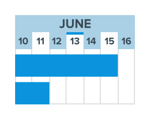
It is now possible to set the height of rows in Gantt and Resource charts in order to make a visualization either more compact, when you have a lot of data, or simply more readable if needed.
Disabling Table
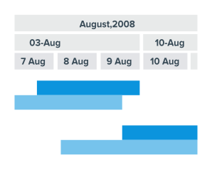
In addition, Resource and Gantt charts are now equipped with the option to remove the table part from the display, leaving visible only elements with the timeline.
More Improvements
In further response to your invaluable feedback, we have also provided the AnyGantt extension for Qlik Sense with the following improvements:
- Label settings now include presets that will allow you to easily configure the corners and shape of the background.
- The font of the toolbar text and the color and size of the toolbar icons have become configurable.
- Now you can choose which print paper sizes to display in the Print drop down menu in the toolbar.
- Also, we’ve refined the fiscal year settings.
Plus, some bugs are now fixed. For a complete list of the delivered corrections, see the version history.
Try Qlik Sense Timeline Chart and Other Features
Get the latest, 4.1.244 version of our AnyGantt extension to try the amazing Qlik Sense Timeline Chart and other stunning new features.
Then do not hesitate to let us know what you think about this new release. What else should we add? Or change? Or fix? Your feedback largely determines our roadmap and we are always happy to be of help. Feel free to get in touch with our Support Team — at support@anychart.com or via the online chat on our website. Or simply leave your comments below this post.
In case you missed it, we partnered with Qlik last year and launched three intuitive extensions for data analytics and business intelligence experts using Qlik Sense. Go ahead and try them free of charge and schedule a call with us for a personalized demo.

