
Within the framework of our series of tutorials explaining in detail different aspects of building a Gantt chart in Qlik Sense, we are glad to share a new quick visual manual. This one describes how to color a Project Gantt chart in the AnyGantt extension for Qlik Gantt charts.
Join us as in this tutorial we are going to make it completely clear how to color all main parts of Project Gantt charts: elements, chart area, table cells, table header, and timeline levels. In addition, you can see tutorials about labels, tooltips, and reference lines and ranges — they can also be colored. (Those about tooltips and reference lines and ranges are coming soon. Meanwhile, check out the AnyGantt extension’s documentation or ask our support engineers for assistance.)
For your convenience, this tutorial is available in two versions. Check it out as a video with a voice over (embedded right below). Or keep reading the alternative, text+pictures version.
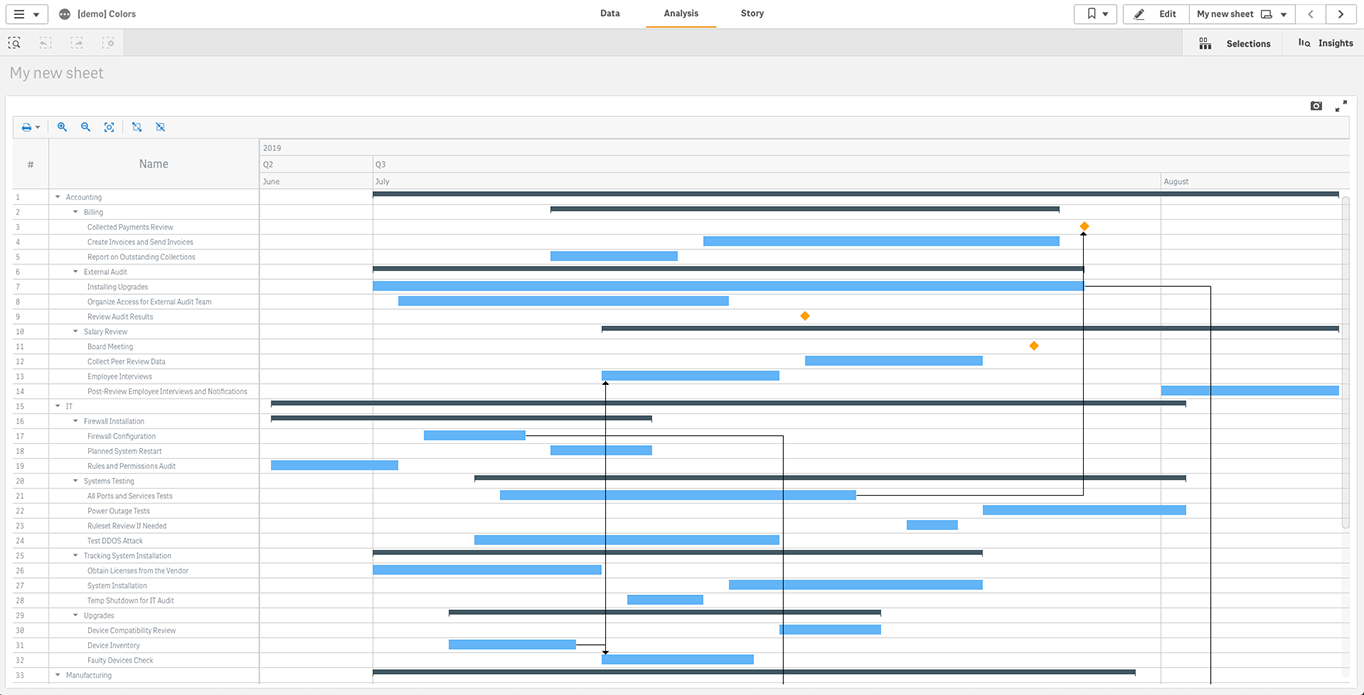
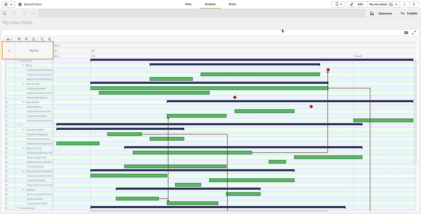
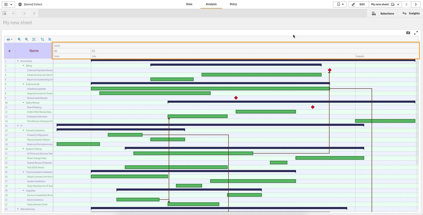
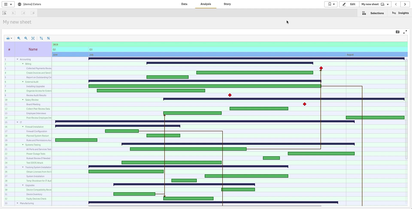
Default Look
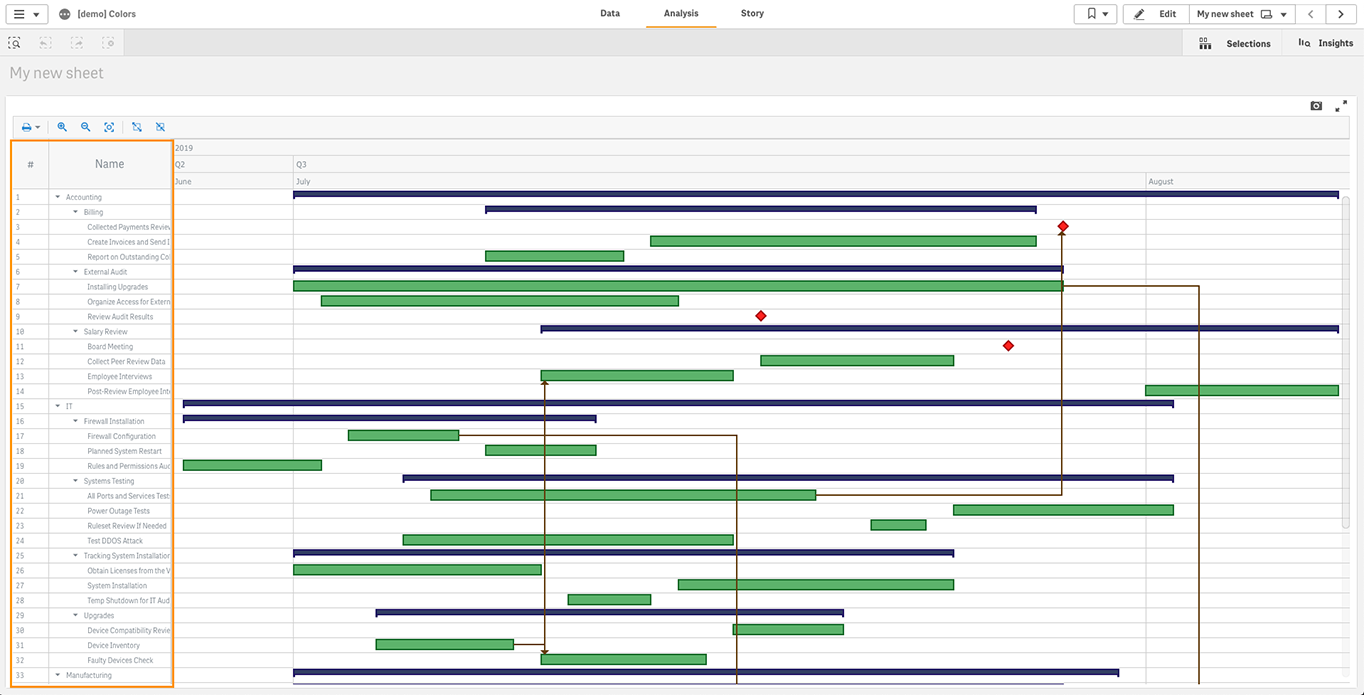
Here is how the Qlik Gantt chart powered by our AnyGantt extension for Qlik Sense looks like by default:
Coloring Elements
You can set the default fill and stroke colors of an element of a Project Gantt chart in just a couple of clicks.
In the properties panel, go to “Appearance” and choose “Defaults“. Click an element to open its settings.
For example, you can configure actual bars:
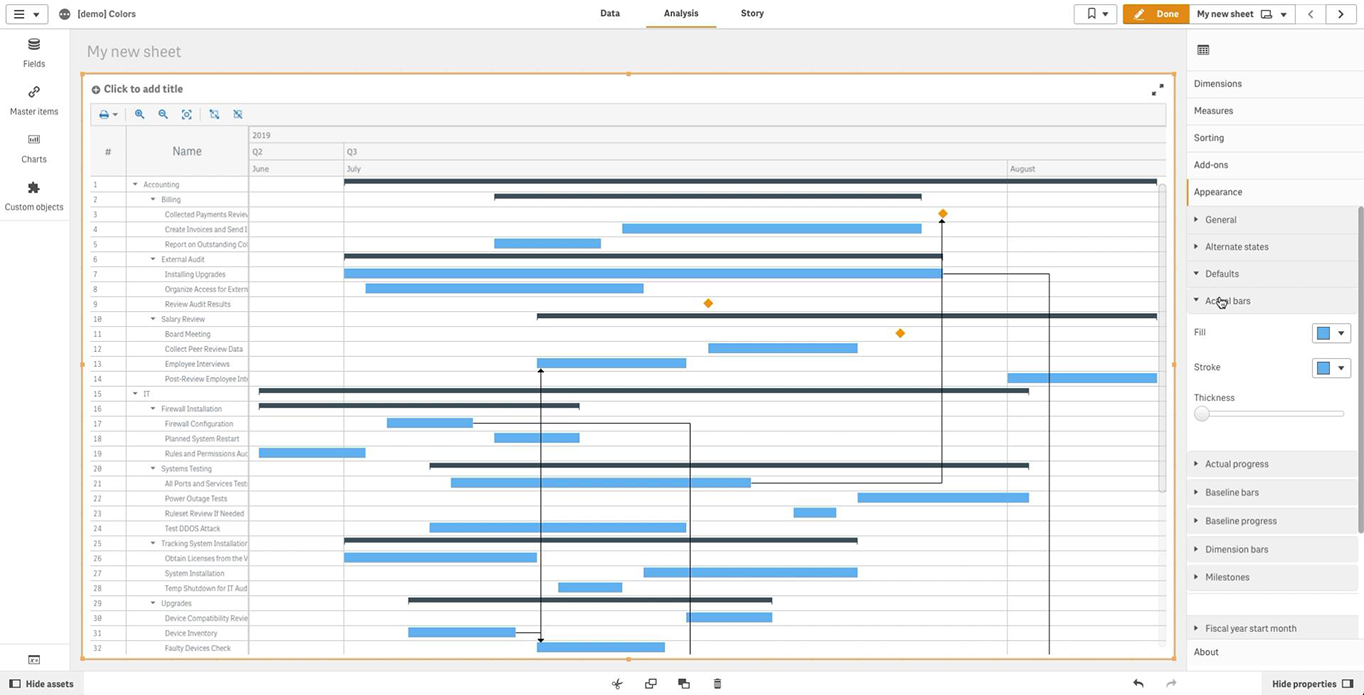
Use the “Fill” option to set the fill color, “Stroke” to set the stroke color, and “Thickness” to set the thickness of the stroke.
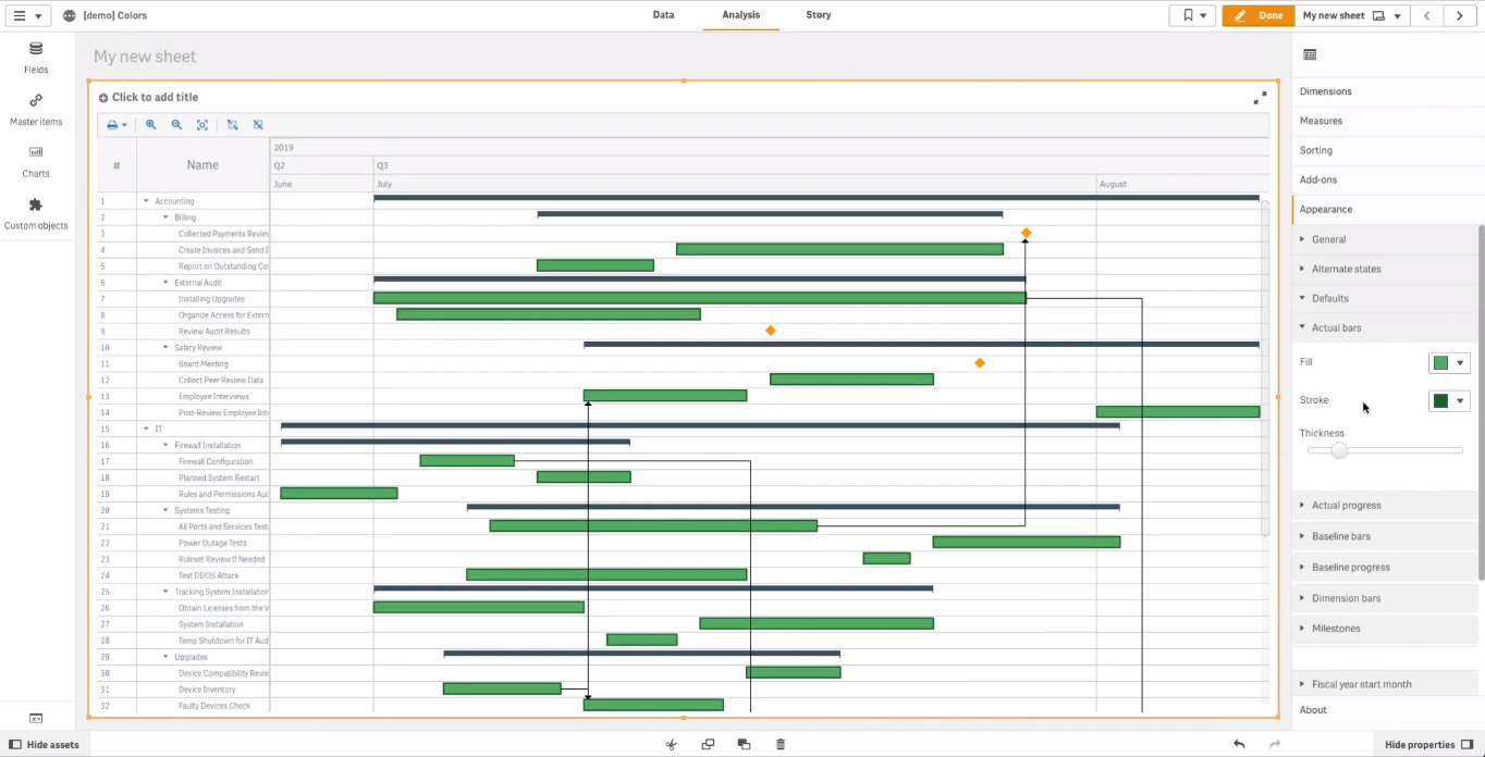
You can also set colors of milestones and dimension bars, in the same way.
To set the stroke color and the thickness of connectors, in the properties panel go to “Add-ons“, then “Connectors“. After that, use the “Color” and “Stroke thickness” options.
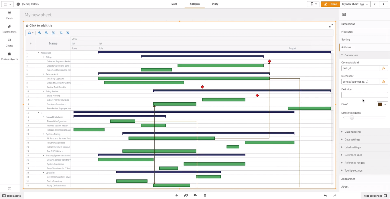
In case you are interested in more advanced options of coloring Qlik Gantt chart elements, we will also share the “Colors of Elements” tutorial soon. It will explain, among other things, how to color elements by expression; in the meantime, to learn about that, we invite you to the Color by Expression section of the AnyGantt extension’s documentation.
Coloring Table Cells and Chart Area
The table on the left of the Gantt chart displays text information.
You can color its cells, and the same colors will be automatically applied to the chart area — the area where elements are displayed.
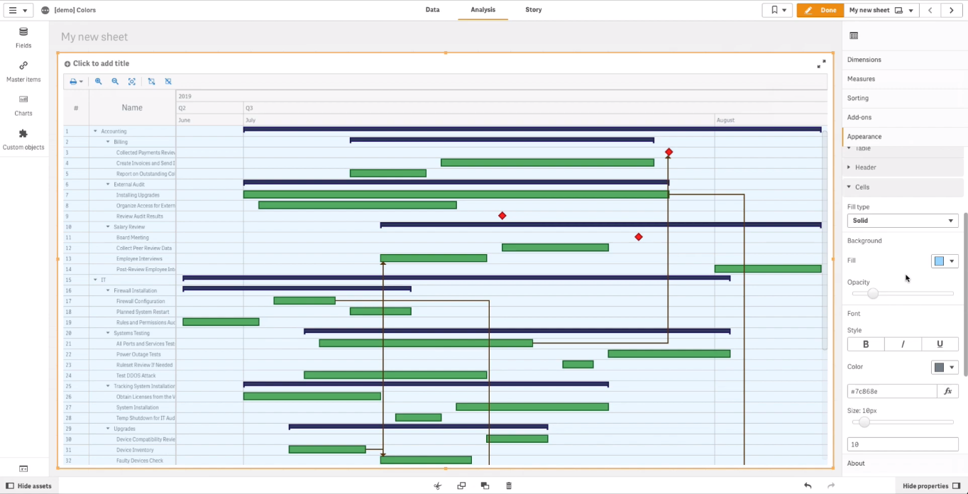
In the properties panel, go to “Appearance“, then “Table“, then “Cells“.
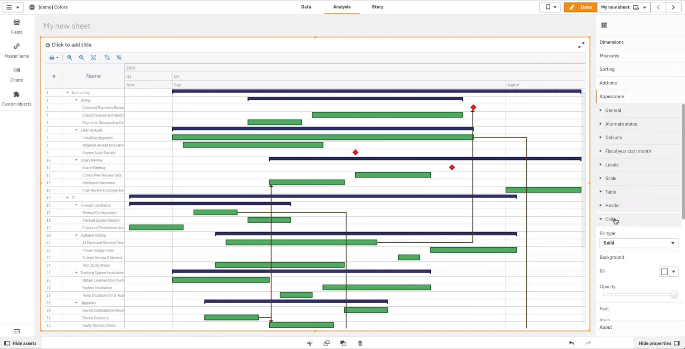
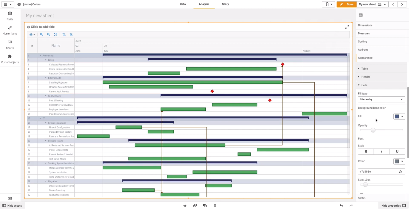
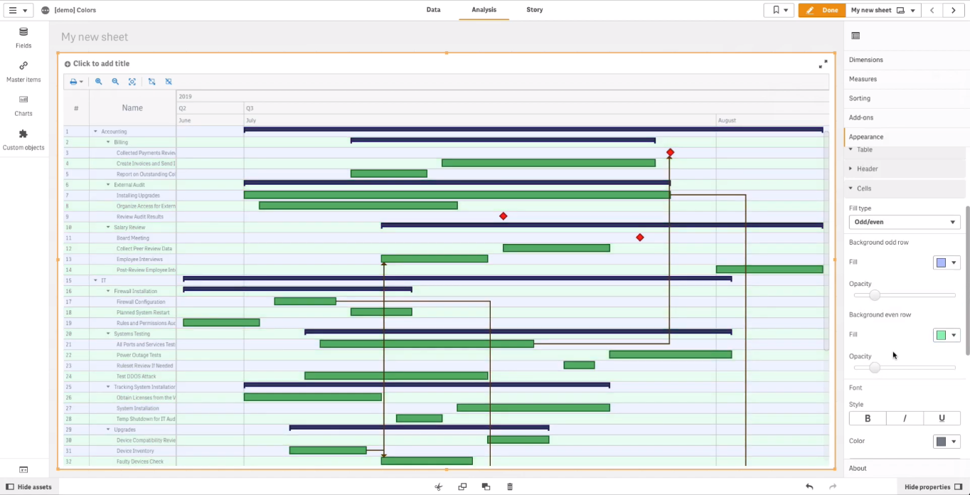
Select the fill type from the “Fill type” drop-down menu. The available options include: “Solid“, “Hierarchy“, and “Odd/even“.
Solid fill is applied to all rows. Go to “Background” and use the “Fill” and “Opacity” options to set their fill color and opacity. Note that the color you set affects not only the table, but also the chart area.
Hierarchy fill is applied only to rows displaying hierarchical dimensions. As you can see, the color you choose in the “Background” section automatically adjusts to mark different levels of the hierarchy.
If you choose the odd/even fill type, in the “Background” section you can set two different colors: one for odd rows and another for even rows.
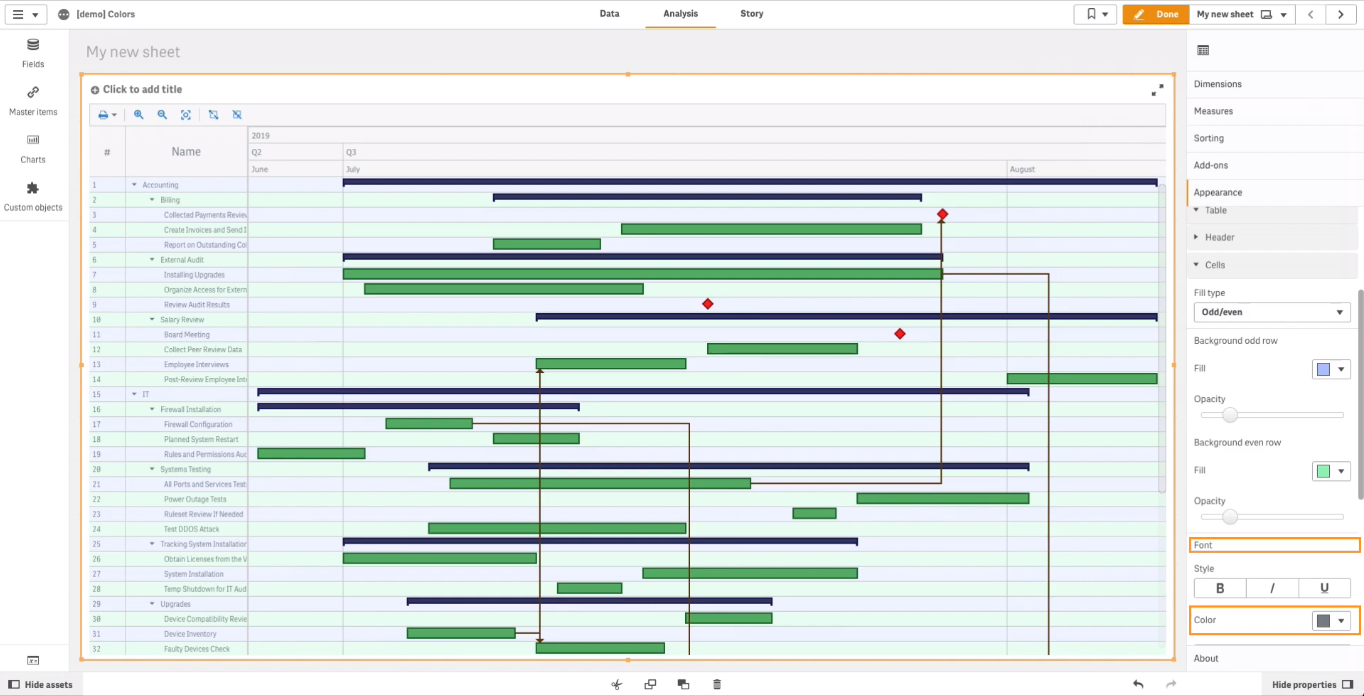
To color the font, go to “Font” and use the “Color” option.
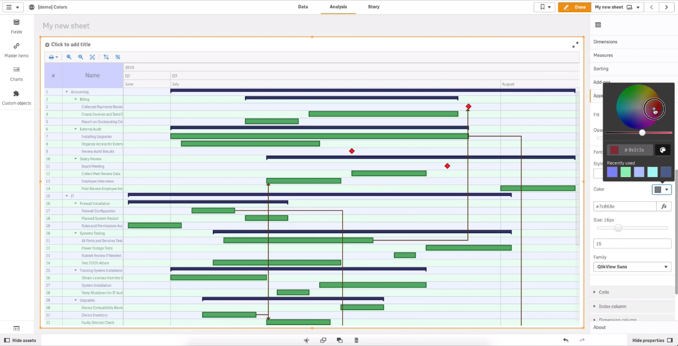
Coloring Table Header
The header on the top of the table displays titles of its columns.
You can color its background and font.
To open the settings of the header, in the properties panel go to “Appearance” –> “Table” –> “Header“.
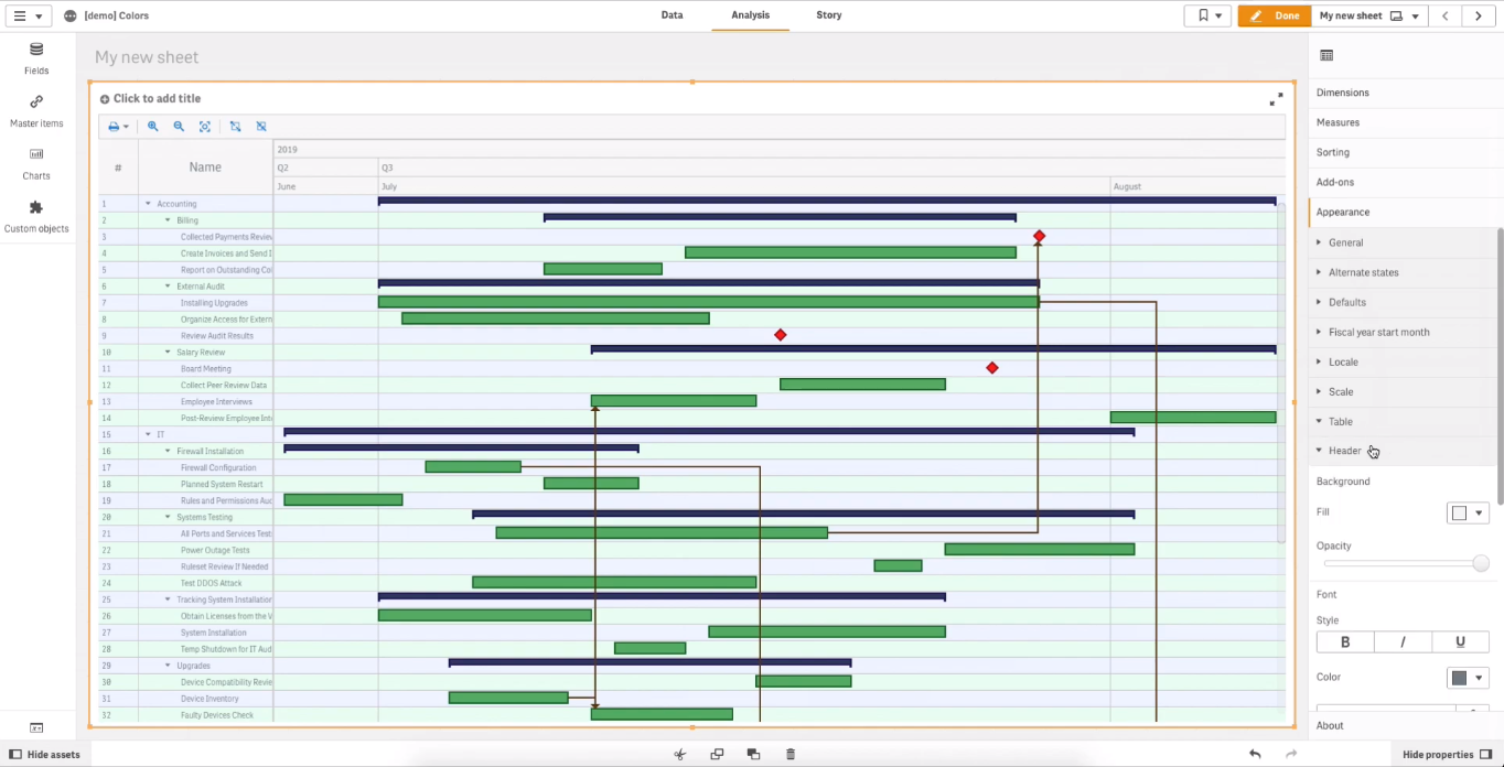
To color the background, go to “Background” and use the “Fill” and “Opacity” options.
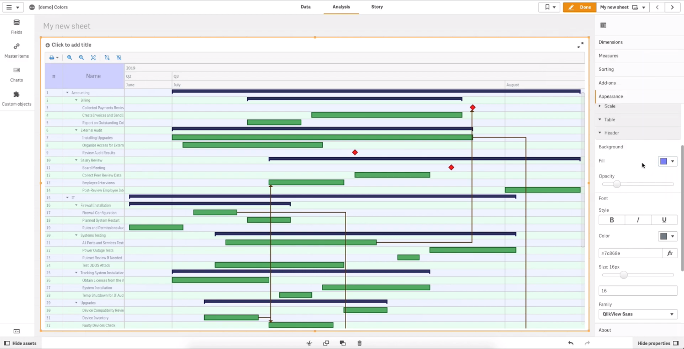
To color the font, go to “Font” and use the “Color” option.
Coloring Timeline Levels
A timeline is a set of rows, or levels, above the chart area, where dates are displayed.
Timeline levels are configured individually. For each of them, you can set the background and font colors.
To open the settings of a level, go to “Appearance” –> “Timeline” in the properties panel.
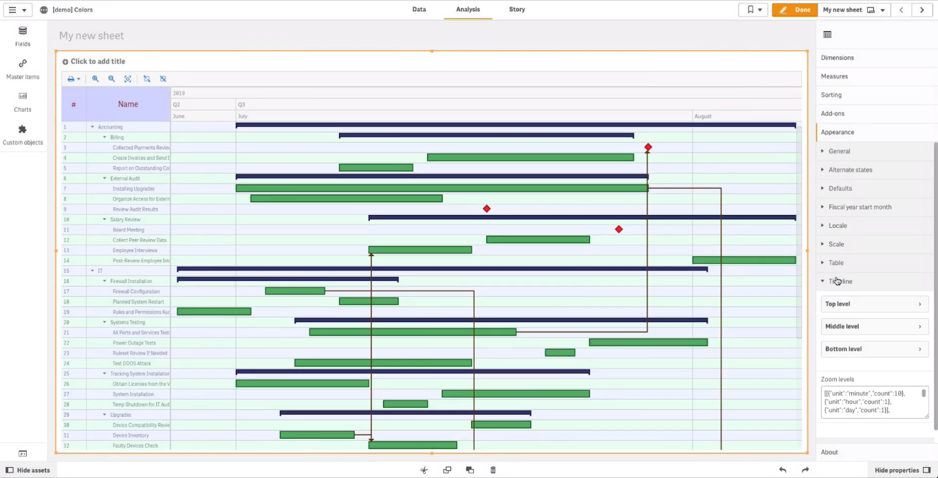
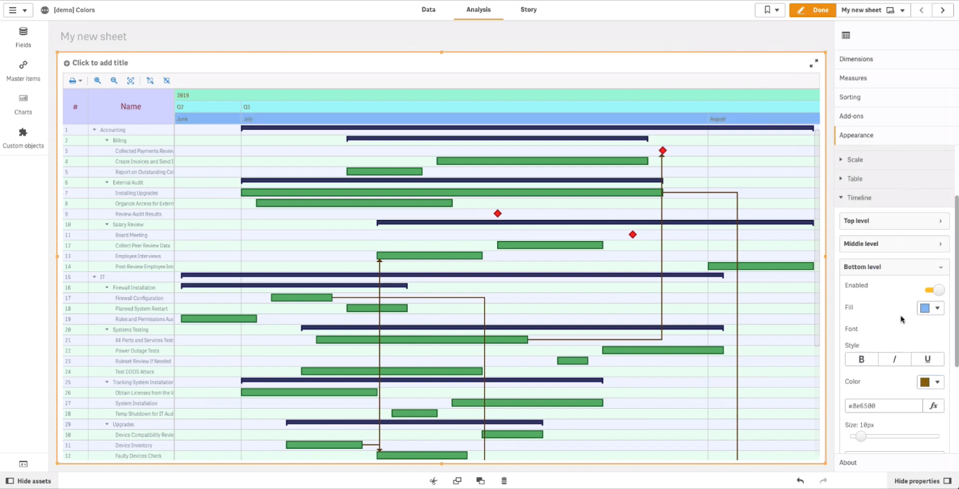
Then select one of the levels: “Top level“, “Middle level“, or “Bottom level“.
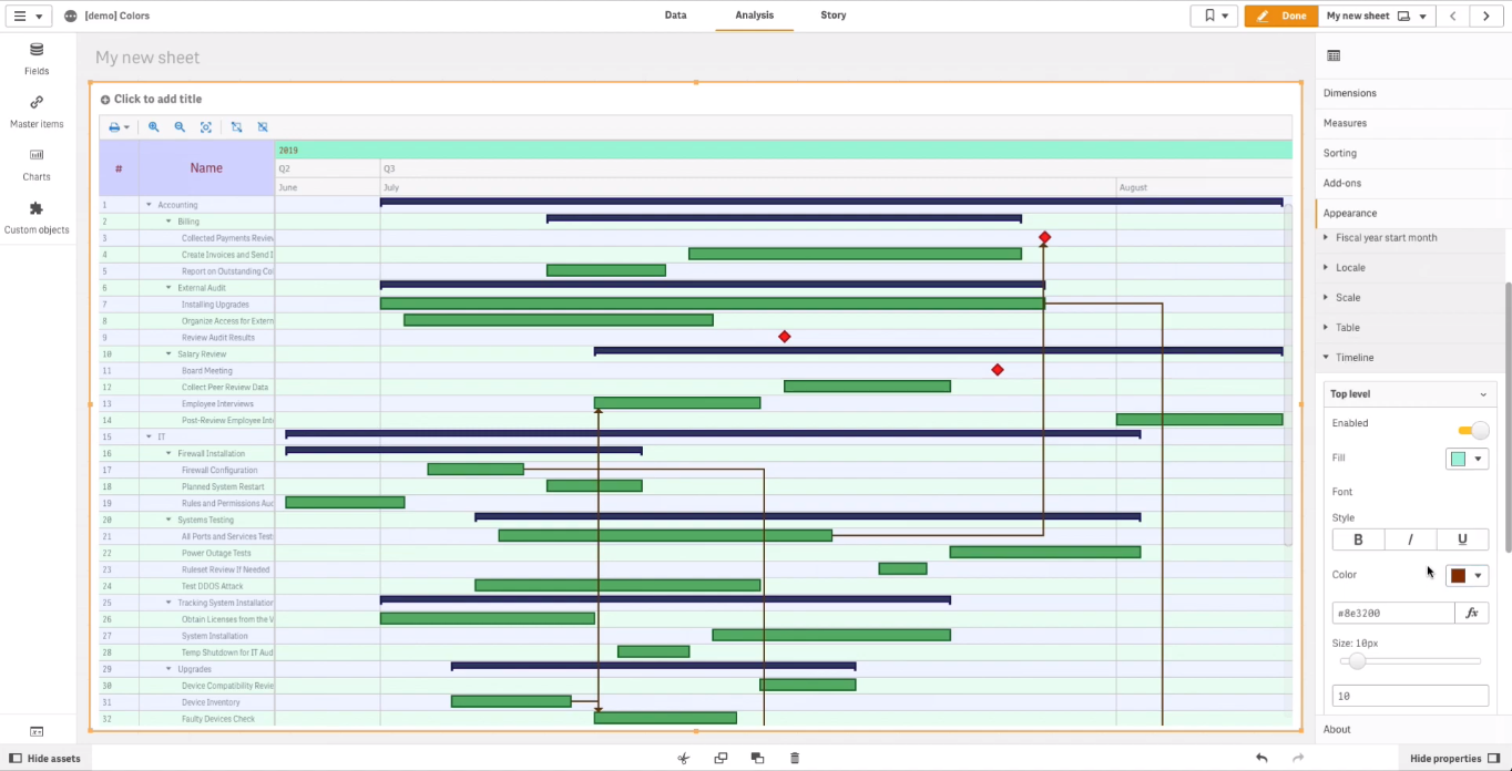
Let’s select the top level first. To set the fill color of a level, use the “Fill” option. To color the font, go to “Font” and use the “Color” option.
Now, let’s color the middle and bottom levels:
Colored Qlik Gantt Chart
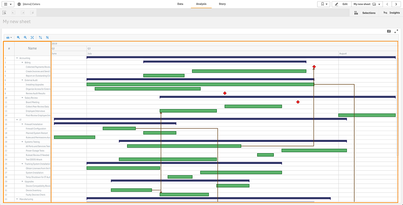
Now all main parts of the Project Gantt chart are colored! Take a look:
Questions?
Still have questions about how to customize Gantt charts in Qlik Sense in terms of color when you are using the AnyGantt extension for data visualization and analytics in project management? Do not hesitate to ask in the comments below or get in touch with our Support Team directly at [email protected].
Looking for more charts for Qlik Sense? In total, we have 39 chart types available for you in the three intuitive Qlik Sense extensions launched within the framework of our partnership with Qlik. Even more charts and features are coming soon.