
Looking for the simplest way to create a Gantt chart in Qlik Sense to further streamline data-driven project management in your company or organization? We’ll show you one right now! Follow this quick tutorial and you’ll learn how to easily visualize project tasks and activities as data in a matter of minutes — on smart, interactive Gantt charts using the intuitive AnyGantt extension for Qlik by AnyChart.
Watch the video tutorial:
Or read the text-and-pictures version below.
Loading Project Data in Qlik Sense
In Qlik, everything starts with the data.
We are going to create a Gantt chart based on data from an XLSX file that looks as shown below.
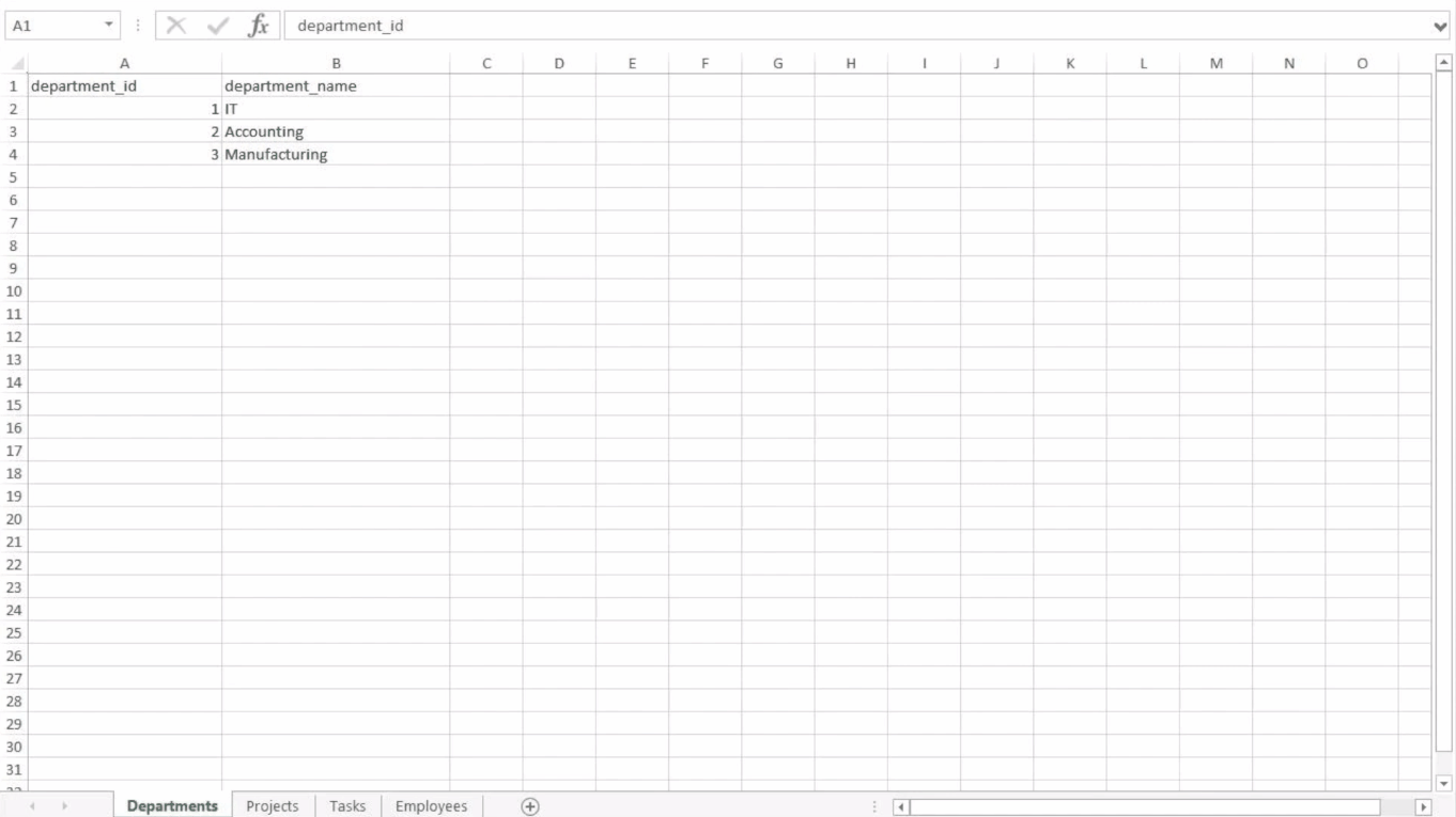
The tables in the file represent the structure of a company and its project schedule. There are three departments, each of them carrying out several projects. Each task within a project is assigned to a certain employee.
First of all, we will create an app, add this data to Qlik, apply the suggested associations, and load the data.
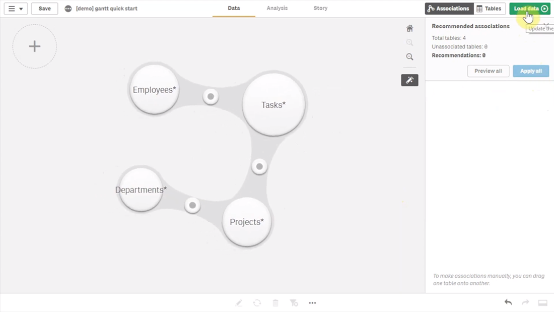
Then we need to make sure that Qlik established proper associations between tables.
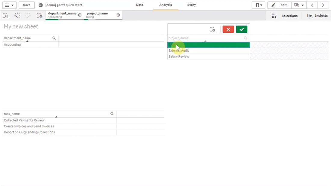
Let’s create a sheet and add three filter panes by dropping three fields on the sheet: ‘department_name’, ‘project_name’, and ‘task_name’.
If we switch from ‘Edit’ to ‘View’ and try to select a department and a project, we will see that associated tasks are displayed correctly.
Adding Gantt Chart in Qlik Sense
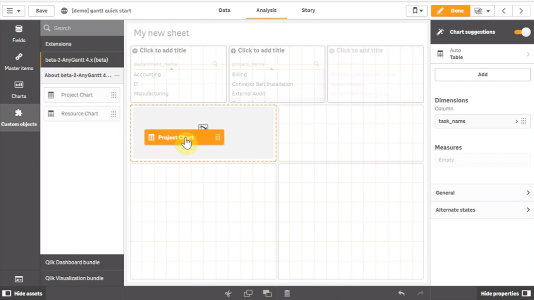
Now that the data is loaded and the associations between the tables are set up the right way, we can add a Gantt chart.
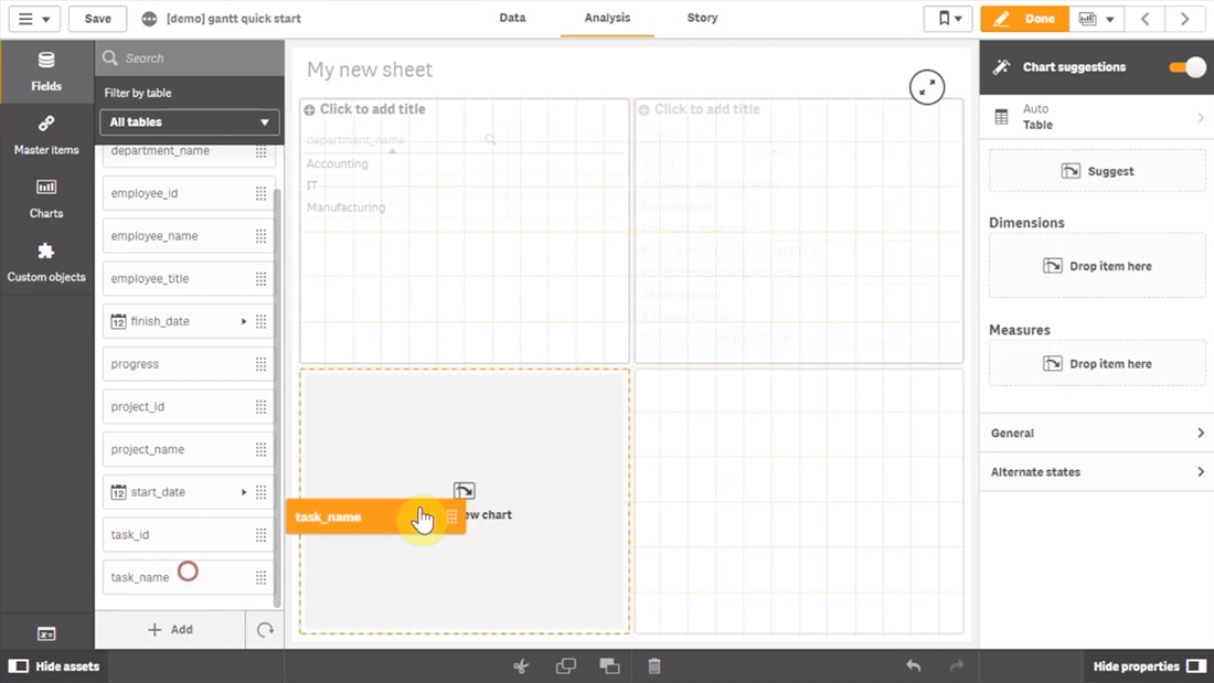
Go to ‘Custom objects’, find AnyGantt, and drop a Project Chart on the sheet, below the filter panes we added before.
Add dimensions
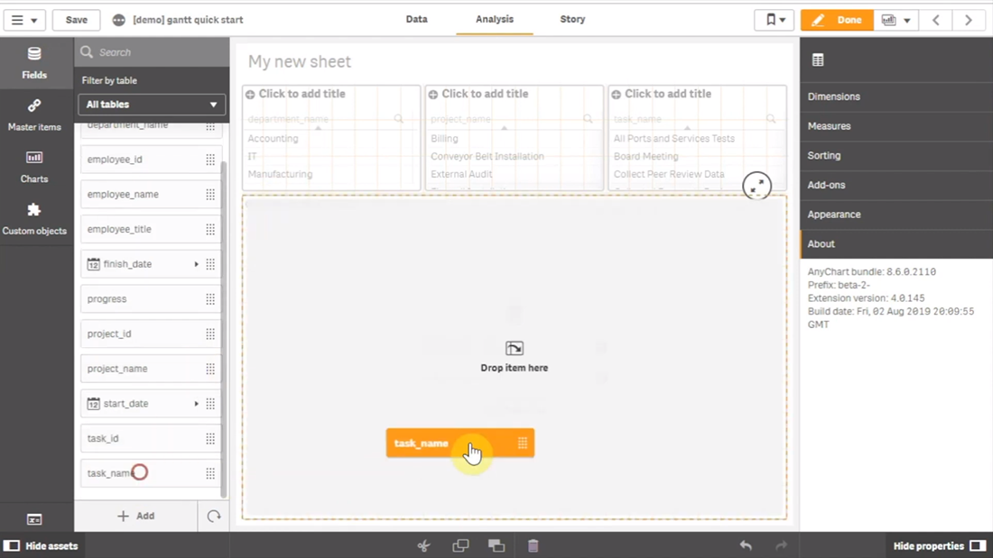
To configure the Gantt chart, we need to add dimensions representing the hierarchical structure of our data.
We will use the following dimensions: ‘department_name’, ‘project_name’, and ‘task_name.
Add measures
The next step is adding measures.
Let’s use the ‘start_date’ and ‘finish_date’ fields.
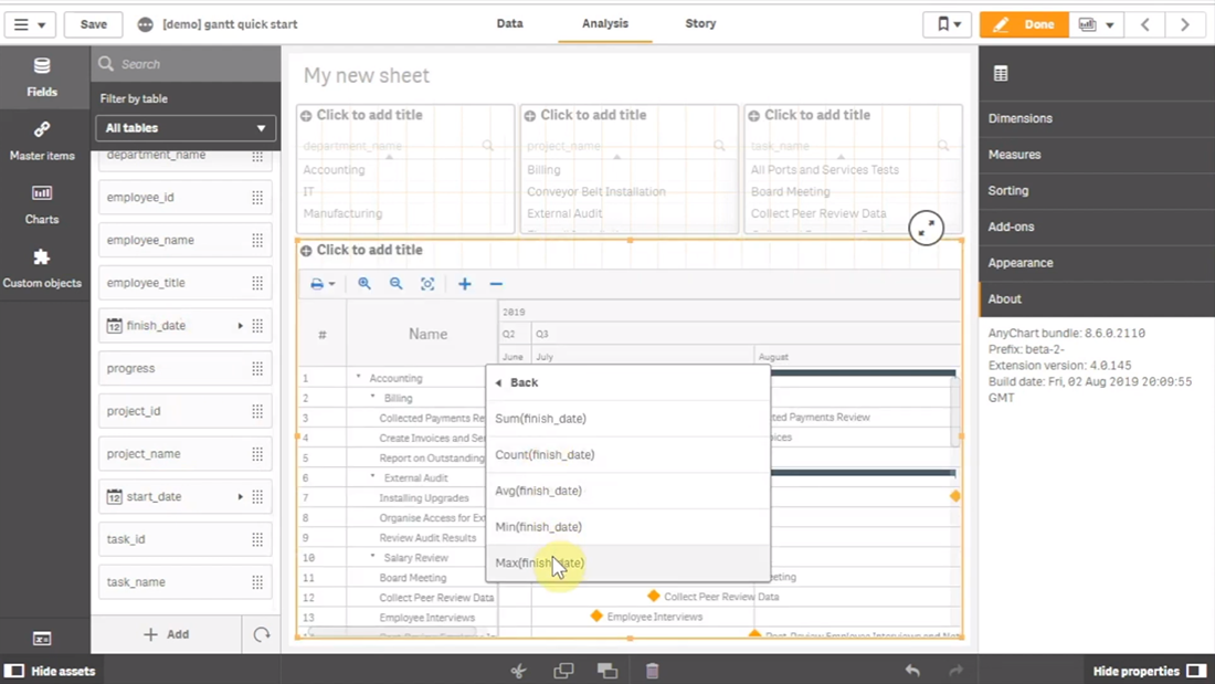
These measures do not require aggregation, so we can use either the ‘Only()’ aggregation or just the name of the field.
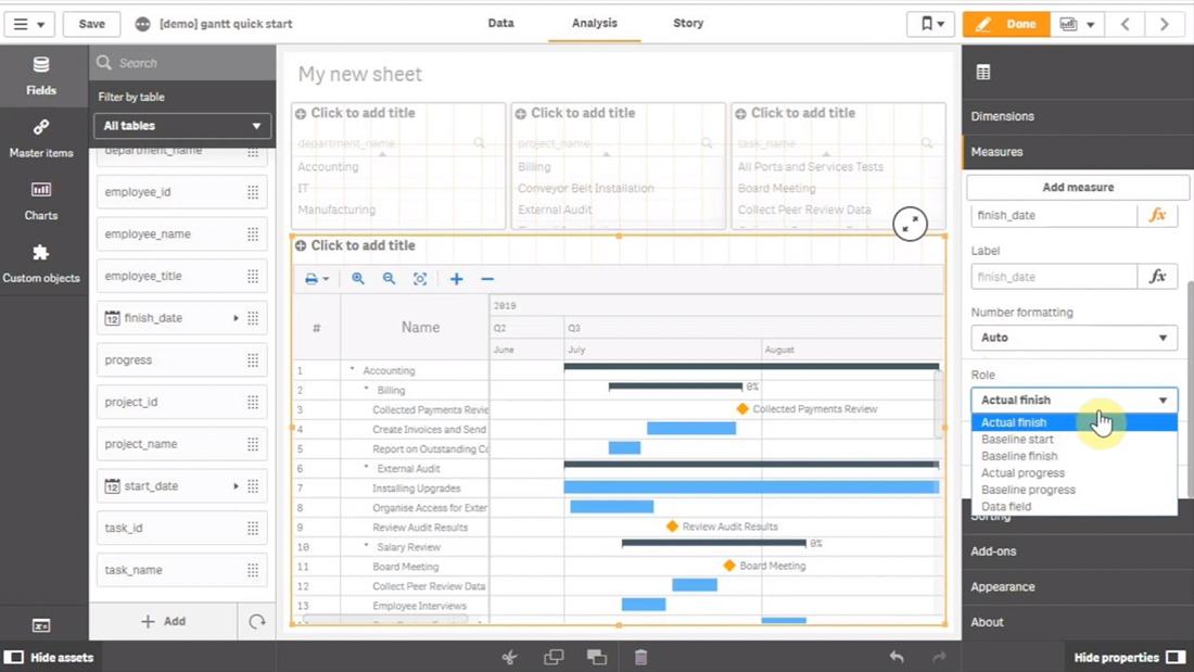
Map data
Then we need to make sure that AnyGantt interprets our dates correctly.
Use the ‘Map as’ drop-down menu to map the ‘start_date’ field as ‘Actual Start’ and ‘finish_date’ as ‘Actual Finish’.
As you can see, you can also map a date as ‘Baseline Start’, ‘Baseline Finish’, ‘Actual Progress’, “Baseline Progress”, or “Data Field”.
Preliminary result
After these steps, we can already see a Gantt chart:
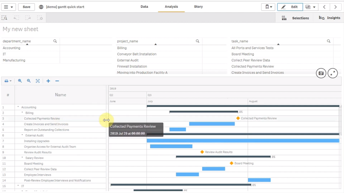
The data grid on the left displays the hierarchy of departments, projects, and tasks.
The timeline on the right displays the duration of tasks.
Show actual progress
Let’s add one more measure, ‘progress’, and map it as ‘Actual Progress’.
Please note that you do not need to aggregate it.
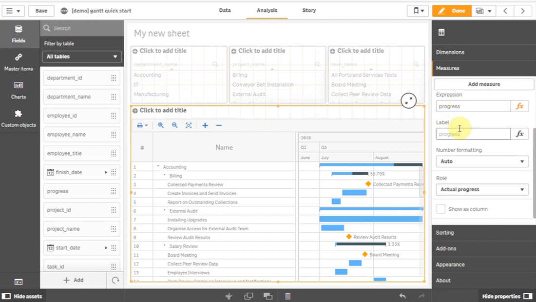
Now you can see progress bars.
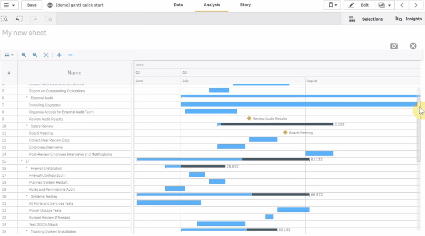
Result: Gantt Chart in Qlik Sense, Built with Real Ease
That is it, the Gantt chart is ready:
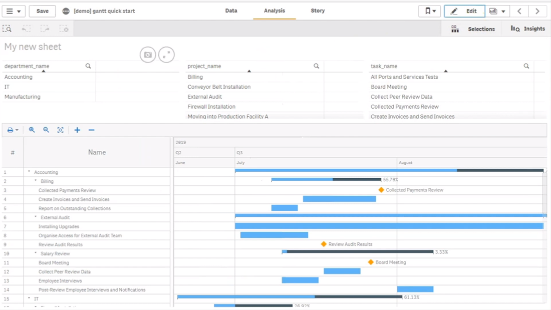
In the ‘View’ mode, select a department or a project in a filter pane, and the Gantt chart will display the related tasks.
It is very easy!
Questions About Charting in Qlik Sense?
If you have any questions on how to create a Gantt chart using our AnyGantt extension for Qlik Sense, or a data visualization based on any other of over 30 chart types we’ve delivered to Qlik Sense in our extensions earlier this year within the framework of our newly launched technology partnership with Qlik — drop us a note in the comments below or contact our Support Team directly.