Decomposition Tree Extension for Qlik Sense
The Only Way to Add Decomposition Trees to Your Qlik Sense Apps — Now with AI Splits!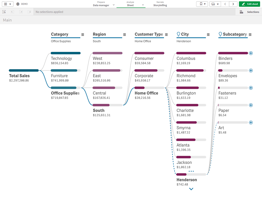
Decomposition Tree Extension for Qlik Sense is a cutting-edge tool to create elegant decomposition trees and the only way to add charts of this type to your Qlik Sense app. Disaggregate your data across multiple dimensions, identify which factors affect core metrics, and now automatically reveal key impacts with AI Splits — to optimize business performance and profits on the spot!
The granular data presentation provided by a decomposition tree is perfect for ad hoc exploration and root cause analysis. Simply choose the measure you want to analyze and see how it breaks down across multiple dimensions. A variety of built-in features let you quickly adapt the visualization to your data and goals and easily fit it into your dashboards.
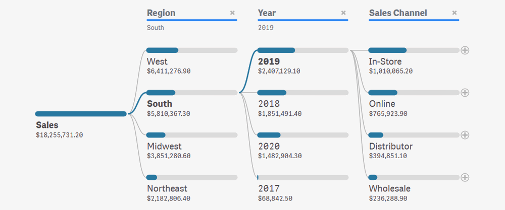
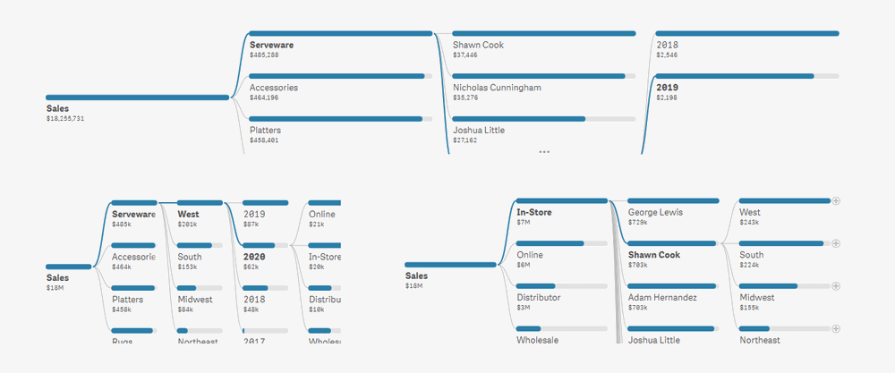
Slice and Dice in Any Order
Choose the order of the dimensions for a breakdown of the measure you want to analyze. Or leave it to the user, as it’s so simple to set the next dimensions and rearrange them on the fly with easy-to-use UI controls.
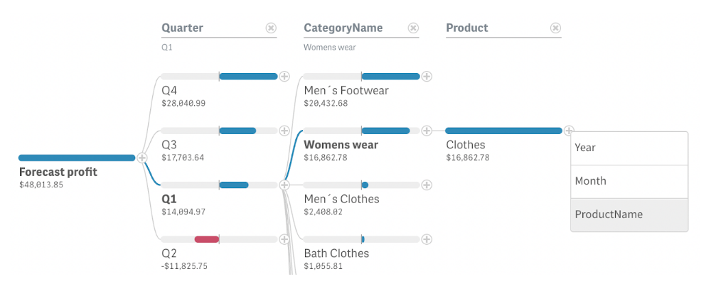
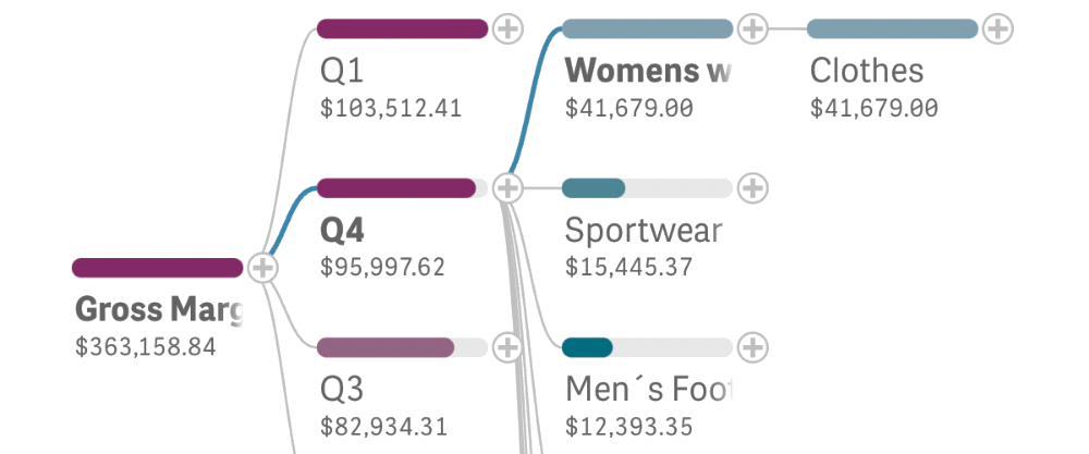
Auto-Detect Key Impacts with AI Splits
Instantly uncover critical factors affecting core metrics with AI Splits. This feature leverages advanced algorithms to automatically identify the highest and lowest impacts, streamlining root cause analysis by delivering deeper insights faster than ever.
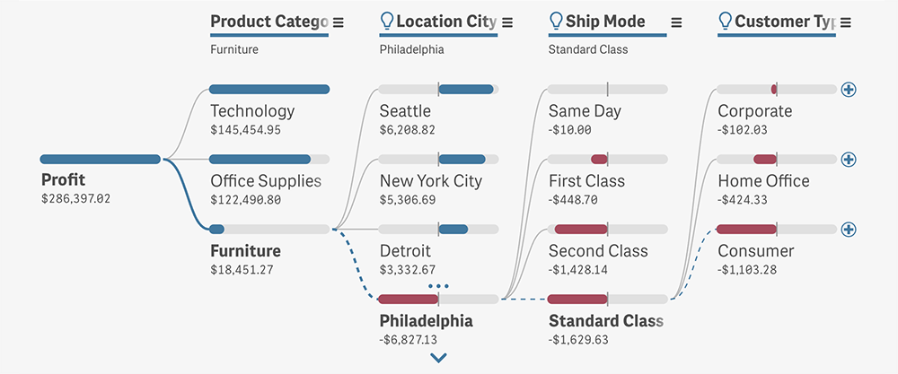
Work with Negative Values
Easily add negative values to the decomposition. Positive values cover the whole bars of the respective elements in the decomposition tree. But when there is at least one negative value on a level, the element bar gets split into two equal parts to ensure an intuitive understanding.
Scale Value Bars
Highlight the desired insights by choosing the way the width of the value bars is calculated: relative to the maximum value across the current level (to compare levels within a dimension), relative to the parent value (to compare contributions to the parent), or relative to the root element (to compare contributions to the total).
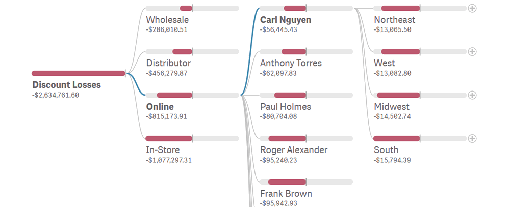
Adjust Colors
Optimize the legibility of the visualization by choosing the right coloring option depending on the task at hand: bicolor (with different colors for positive and negative values), conditional, by measure, or simple solid (e.g. for branding purposes).
Set Space-Efficient View
Opt for a compact or wide view depending on the desired place in your BI dashboard and the nature of your data being disaggregated across dimensions.

Navigate with Zooming and Paging
Navigate the decomposition tree with ease even when there are too many elements. Zoom in and out to get the best view of your data at any moment. Use paging to limit the number of elements displayed on each level at a time and browse beyond with the help of intuitive UI controls.
Want to know how it works with your data? Simply schedule a 30-minute call with us
AnyChart has been developing visual data tools for over 20 years!
Our products have received a lot of recognition and awards from data visualization and software industry experts.