
We’ve made a new tutorial on building charts in Qlik Sense. This one sheds light on how to add dimensions and measures creating a Project Gantt chart using the AnyGantt extension.
The tutorial is available in the video version on YouTube. You can watch it now:
Or you can read the text-and-pictures version of the same tutorial right here below.
Dimensions and Measures: First Steps
To create a Gantt chart in Qlik Sense, you need to add only one dimension, which represents tasks or activities.
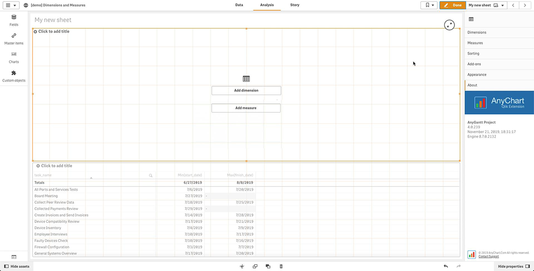
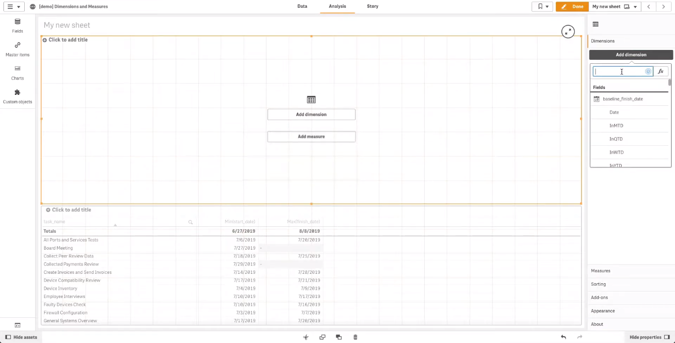
To add a dimension, go to “Dimensions” in the properties panel.
Then click “Add dimension” and select a dimension for your data visualization.
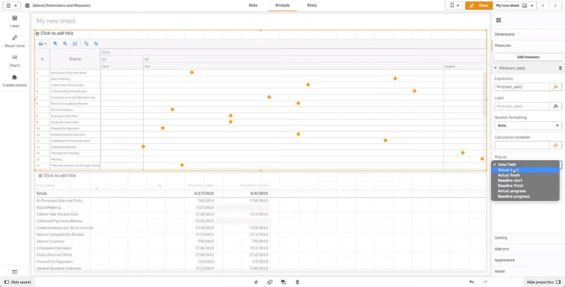
To add a measure, go to “Measures” in the properties panel. Click “Add measure” and select a measure.
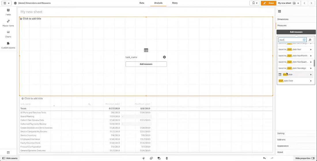
Then map the measure using the “Map as” drop-down menu.
Basically, it is sufficient to add only one measure — the start date. Map it as “Actual start”.
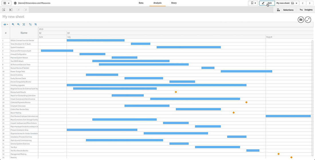
Now you can see the Gantt chart:
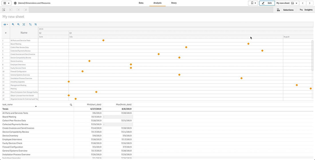
The dimension column on the left displays task names — the dimension we added before.
On the right, there are project tasks. All tasks are currently shown as milestones because we used only one measure.
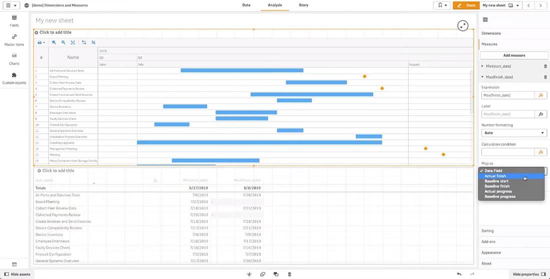
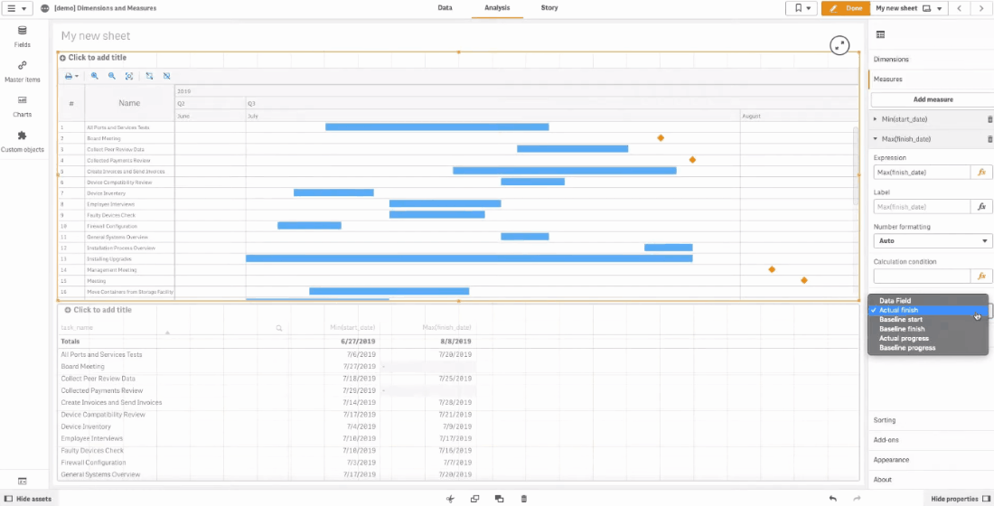
To create actual bars for the tasks, you need to add a second measure — the end date. Map it as “Actual finish”.
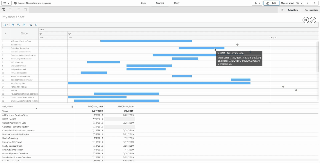
As you can see, now most tasks are shown as bars. Some of the tasks, however, are still milestones because the end date is not specified for them in the project data:
Mapping Measures
To make the measures work correctly, you should map them.
Select the mapping depending on the type of element a measure represents.
Use “Actual start” for project milestones, “Actual start” and “Actual finish” for actual task bars, “Baseline start” and “Baseline finish” for baseline bars, “Actual progress” and “Baseline progress” for actual and baseline progress bars.
Use “Data field” (the default mapping) if a measure you are mapping represents some additional information, and you want to display it only in a measure column.
Multiple Dimensions
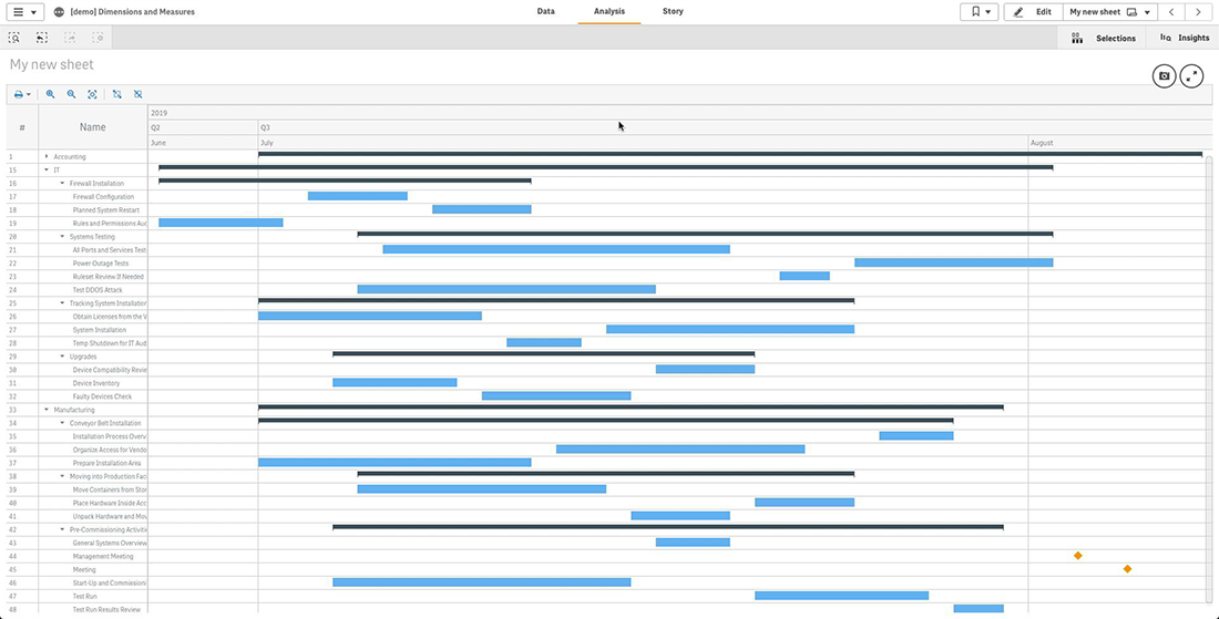
The next thing you should know about dimensions and measures is that you can add multiple dimensions to create a multi-level hierarchy in your Project Gantt chart in Qlik Sense.
Please keep in mind that you need to arrange dimensions in the correct order, from higher to lower levels. To change the order, just drag dimensions in the properties panel.
When there are two or more dimensions, AnyGantt displays all dimensions in the dimension column hierarchically, as a tree-like structure. Also, it groups actual bars and other elements under dimension bars.
Dimension Column Text
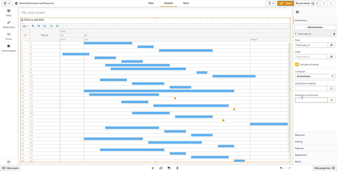
You can customize the text displayed in the dimension column of the Gantt chart in Qlik. For example, let us use numeric identifiers of tasks as a dimension. Look, now the dimension column displays numbers:
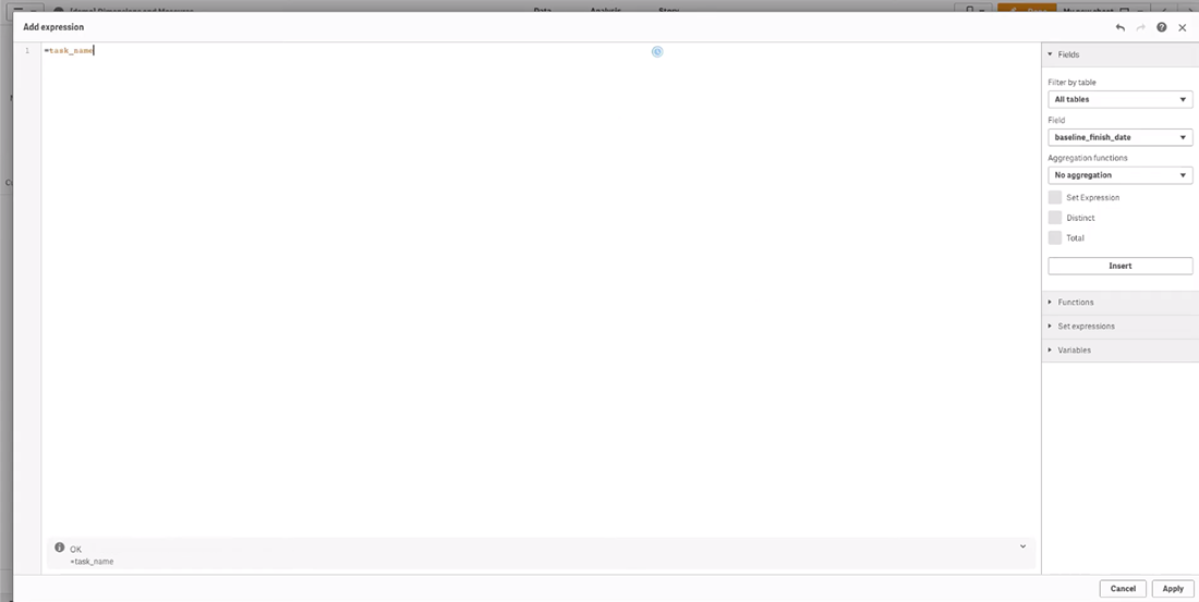
To set the displayed text, we need to go to “Dimensions” in the properties panel, click the dimension, and enter a string value or a string expression in the “Dimension column text” input box. We will use the field containing task names:
Now the dimension column displays project task names. Take a look:
AnyGantt works correctly only with unique identifiers, so using this feature may make sense if task names are not unique, but you still want to display them.
Questions About Dimensions and Measures?
Thank you for checking out our new Qlik Sense charting tutorial. Do you have any questions about dimensions and measures or anything else on making Gantt charts using the AnyGantt extension for data visualization in project management? Let us know in the comments below or contact our Support Team directly at [email protected].
Looking for more Qlik charts? Don’t miss out on the other two Qlik Sense extensions we launched within the framework of our technology partnership with Qlik — the AnyChart extension with more than 30 chart types for Qlik Sense and the AnyStock extension for stock and any other time-series charts.