
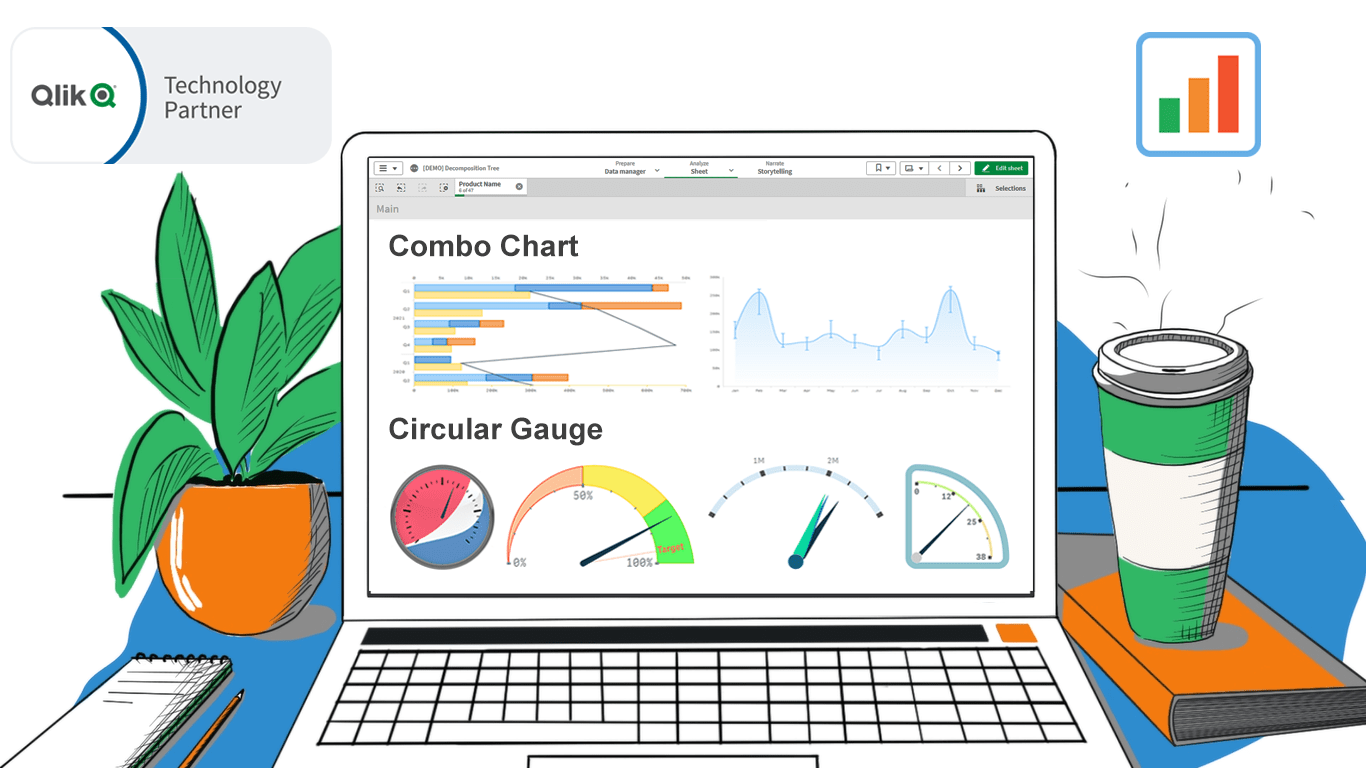
In addition to the Decomposition Tree and new Gantt Chart features, we are excited to release two astonishing extensions. Enjoy making sense of your metrics using the brand new approaches you never had in Qlik before — with our Deluxe Combo Chart and Versatile Circular Gauge for Qlik Sense!
Now, join us for a quick overview of these novel extensions and check them out right away!
1. Deluxe Combo Chart
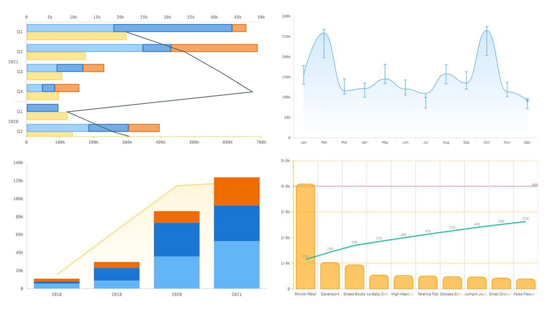
A combo chart is an ideal way to visualize how several metrics change over time or by category when they are different in scale to discover possible correlations. One of its most popular varieties is a Pareto chart, which consists of a line and bars.
Our Combo Chart extension for Qlik Sense lets you easily go way farther than Qlik's native implementation of combo charts!
First, you can add nested axes, error bars, and crosshairs.
Second, you get a range of chart types to choose from for display on a combo plot based on what data and questions you have:
- area, spline area, and stepped area charts
- bar and column charts
- dot/marker charts
- line, jump line, spline, and stepped line charts
- stacked and 100% charts (area, bar, column, spline area, and stepped area)
Third, you can have not only one dimension but even two or three dimensions that can be used to create stacks or nested axes.
Check out our free Qlik Sense demo app showcasing all major features of our combo chart extension in action:
Get and enjoy our combo chart extension:
➡️ Download Combo Chart Extension
2. Versatile Circular Gauge
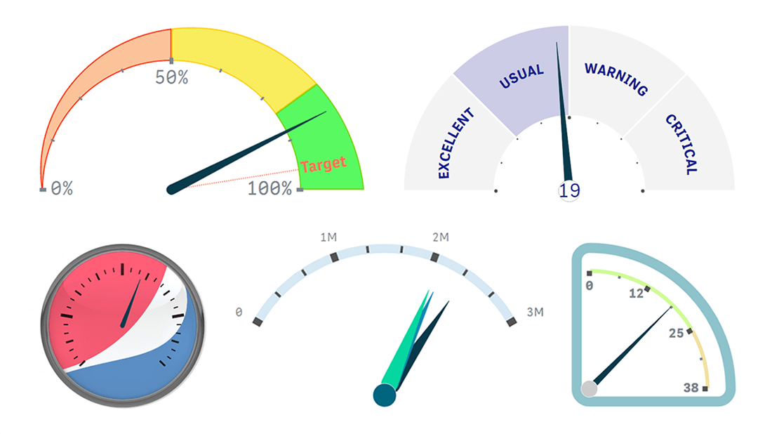
A circular gauge, or a speedometer chart, is widely used to display a single metric's value and hint at how it should be interpreted in terms of performance or progress.
Our Circular Gauge extension for Qlik Sense, unlike what's been so far possible in Qlik, provides you with the ultimate freedom in visualizing your KPIs! You can:
- Add multiple pointers to show several measure values and even use a dimension.
- Make any shape by choosing the start and swipe angles relevant to your dashboard or value.
- Tune the gauge according to your taste or branding requirements as there are various visual settings for every element available.
- Add images and texts to maximize the legibility of the chart or add branding elements.
- Use gauges as small multiples that can be instantly expanded to show more, because our gauges are smartly adaptive for any size.
Check out our free Qlik Sense demo app showcasing all major features of our circular gauge extension in action:
Get and enjoy our circular gauge extension:
➡️ Download Circular Gauge Extension
These two visualizations will be invaluable tools in your data analytics and business intelligence arsenal. Try them out, ask your questions if any, and let us know if you lack anything else in Qlik Sense!
ICYMI: We partnered with Qlik to bring new data visualization choices to the Qlik platform via intuitive extensions for Qlik Sense. Give them a try — download, see demo apps, or book a live demo session.