As 2024 draws to a close, we at AnyChart are proud to reflect on another remarkable year of innovation and achievement within the Qlik ecosystem. From receiving prestigious industry recognition and delivering major product enhancements to forging valuable connections and sharing our expertise with the global community, it has once again been a year of tremendous progress. We’re excited to revisit the highlights of 2024!
Best in Data Analytics & Visualization in 2024
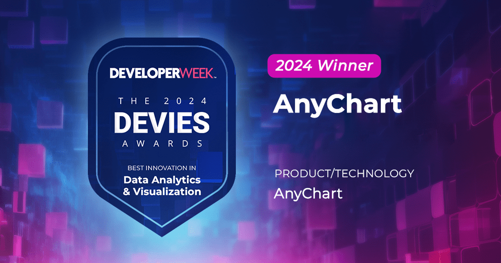
The year started off on a high note with AnyChart winning the DEVIES Award for Best in Data Analytics & Visualization for the second consecutive year. This prestigious recognition once again spotlighted the strength of our core JavaScript charting library — the very backbone of all our extensions for Qlik Sense.
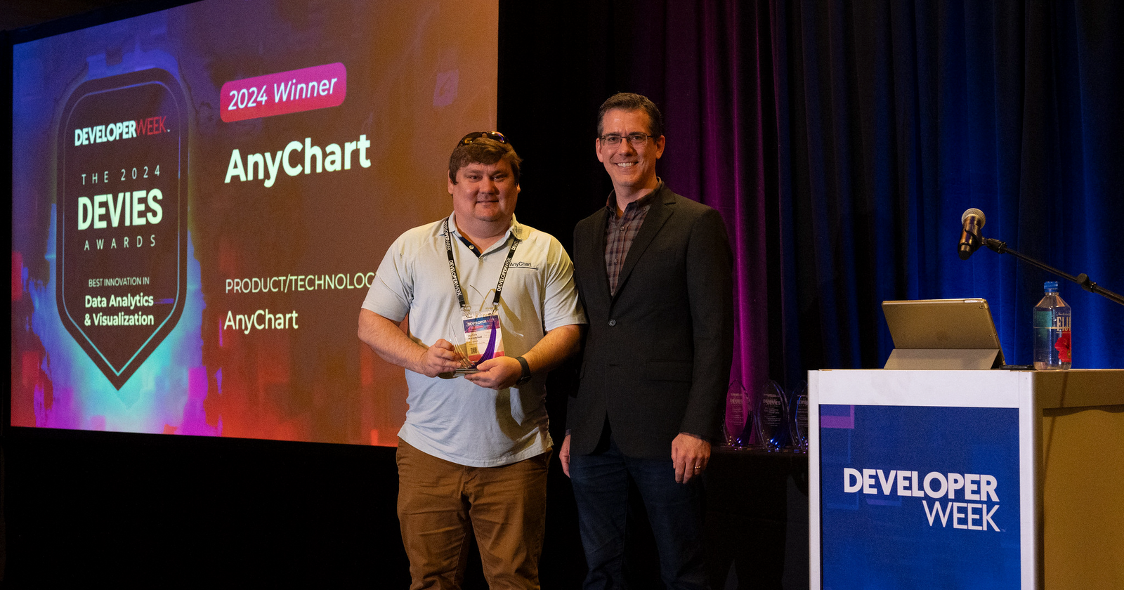
Our CEO and co-founder, Anton Baranchuk, proudly accepted the award on February 21 at DeveloperWeek, the world’s largest developer and engineering conference & expo, held at the Oakland Convention Center in California. “AnyChart’s win is evidence of their leading role in the growth and innovation across the software industry,” said Jonathan Pasky, Executive Producer of DevNetwork, producer of DeveloperWeek and the 2024 DEVIES Awards.
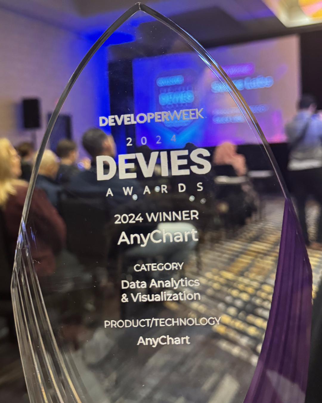
This accolade set a tone of achievement for the rest of the year.
New Features & Enhancements
Guided by our customers' needs and feedback, we worked diligently throughout 2024 to introduce new features and improvements to our extensions for Qlik Sense. From the Decomposition Tree to the Combo and Waterfall Charts (and beyond), our updates were designed to expand capabilities, enhance ease of use, and help you empower your users to make sense of their data more efficiently and effectively. Here's a glimpse of the most notable additions:
Decomposition Tree
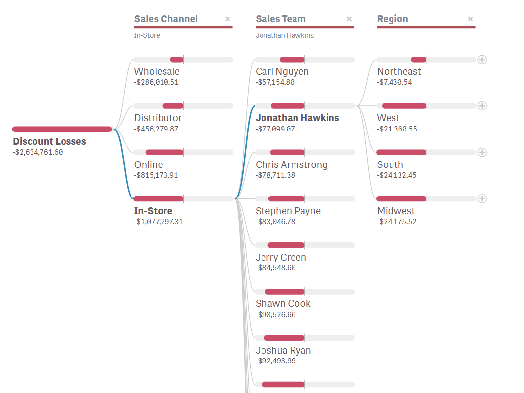
Our Decomposition Tree became even more versatile and insightful with a host of new features:
- AI Splits: Enable automatic detection of critical impact factors across all dimensions, making it possible to instantly pinpoint what drives a metric.
- Percentage Contribution: Display auto-calculated percentages to highlight each factor's weight and relative patterns.
- Second Measure: Allow side-by-side comparisons between two measures for richer context and deeper insights.
- Measure Variance: Emphasize differences between two measures to focus on changes and trends.
- Column Item Coloring: Highlight critical patterns with custom colors so that important insights stand out.
- Tooltip Customization: Take full control over hover details to provide the most relevant context.
Learn more | Download | Explore the demo app | See the tutorial
Combo Chart
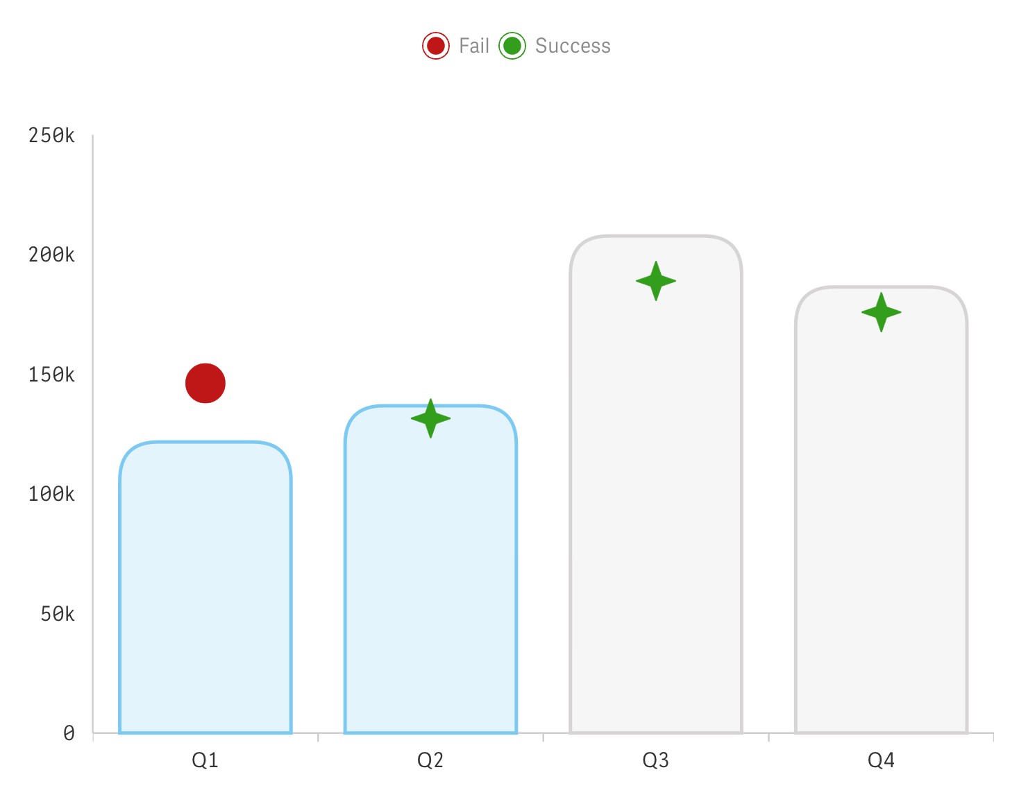
We enhanced the Combo Chart, making it even more intuitive and flexible for analyzing time series and combining multiple data types:
- New Markers: Choose from now 22 marker shapes to enable intuitive visual differentiation among data series.
- Flexible Marker Customization: Adjust size, shape, and color as needed — even conditionally — to ensure maximum clarity.
- Conditional Reference Range/Line Labels: Dynamically explain crucial trends or values as data evolves.
- Flexible Series Colors: Assign individual colors to each series for straightforward distinction of metrics and categories.
Download | Explore the demo app
Waterfall Chart
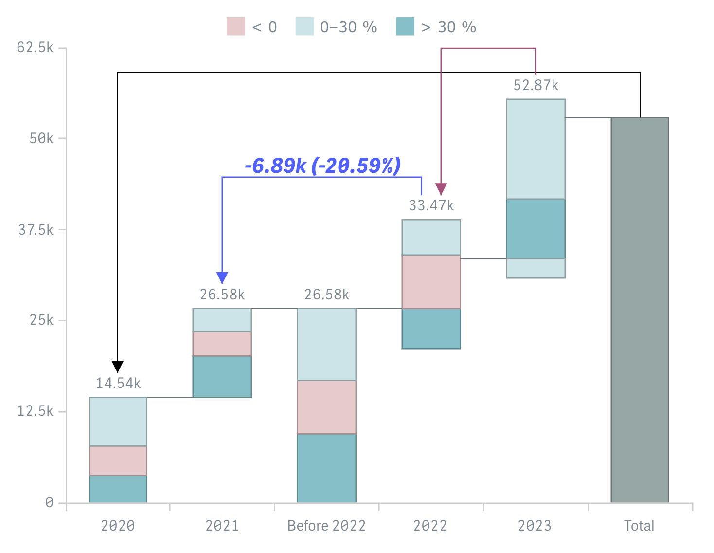
We enriched the Waterfall Chart to better serve a variety of business needs:
- Measure Operation Mode: Adjust how the chart interprets each value to ensure it precisely reflects the intended data narrative.
- Second Dimension Selection: Enable instant focus on a subcategory's contributions when selected.
- Total Bar Flexibility: Control the position of the total bar and highlight specific segments as needed.
- Versatile Coloring by Expression: Apply full-fledged conditional coloring to emphasize significant patterns and shifts.
- Arrow Connector Upgrade: Highlight specific value transitions with greater precision and flexibility for a clearer narrative.
Learn more | Download | Explore the demo app
Making Waves in Qlik Community
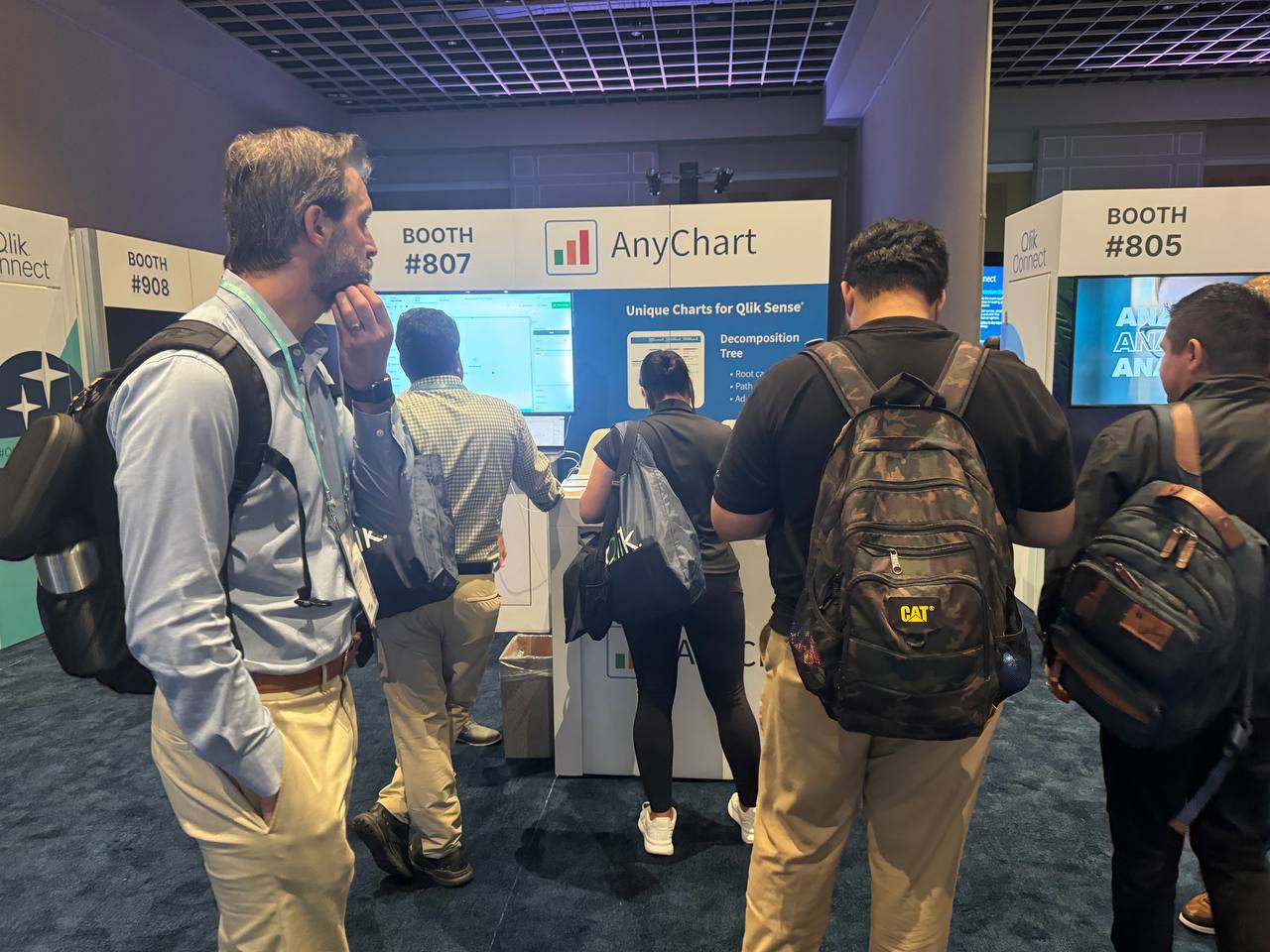
We rocked again at Qlik's annual global forum. After our blast at QlikWorld 2023 in Las Vegas, we made our mark at Qlik Connect 2024 in Orlando this June. We showcased our latest developments for Qlik Sense, engaged in insightful discussions, and forged valuable new relationships.
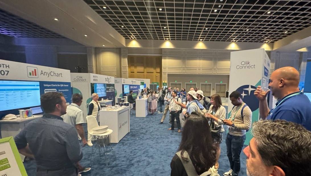
Our booth hummed with activity, and we even secured a win in the social media contest — a testament to the high level of enthusiasm around our offerings.
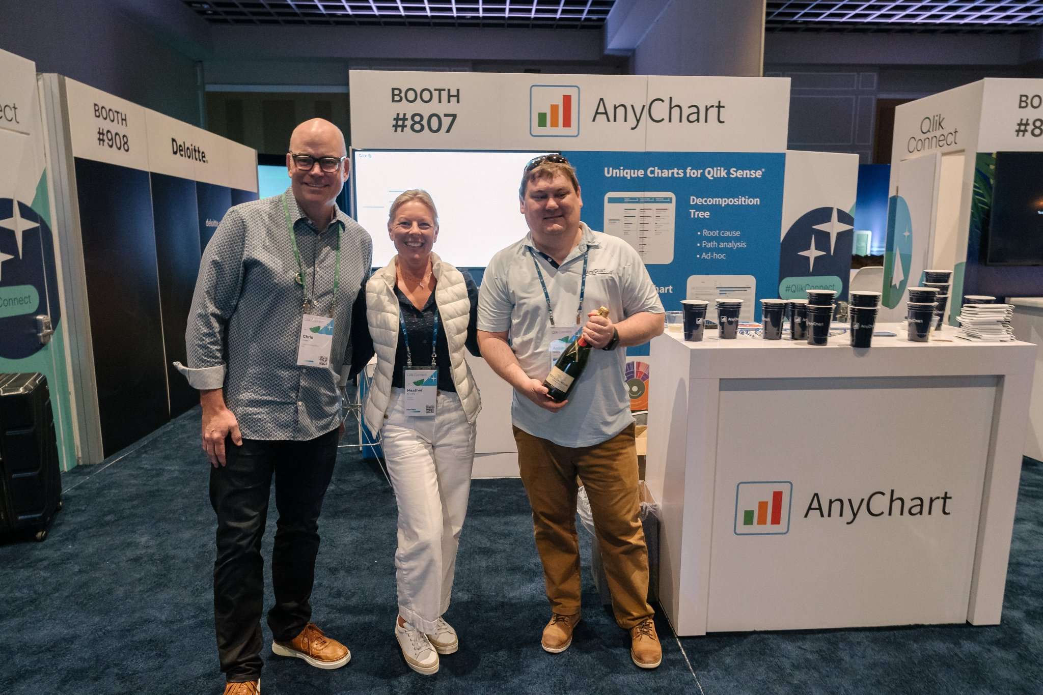
The positive feedback and excitement from the Qlik community continue to inspire us to push boundaries and think bigger.
Sharing Knowledge & Resources
Beyond the event floor, we invested heavily in expanding our educational resources and sharing best practices online. The biggest shining star of our outreach this year was the Decomposition Tree — a powerful visualization previously unavailable in Qlik Sense and one whose potential we've worked hard to fully unlock for the Qlik community.
Decomposition Tree Webinars
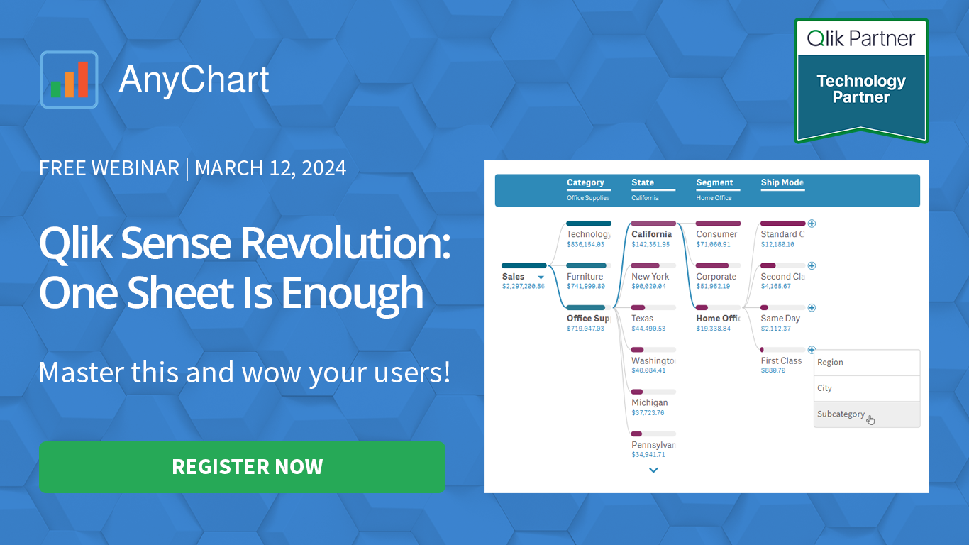
We hosted two open webinar series dedicated to the Decomposition Tree, providing hands-on demonstrations, tips, and best practices. These sessions helped everyone from newcomers to seasoned Qlik developers understand how to leverage this visual's powerful features for actionable insights.
Check out the latest webinar on demand
Comparing Pivot Table with Decomposition Tree

One of our top content pieces this year was an in-depth article comparing the decomposition tree visual to a traditional pivot table. It struck a chord with many thousands of readers and even became our most-read publication on Medium in five years. The piece shed light on how decomposition trees can streamline analysis and deliver more intuitive insights, inspiring many to rethink their data exploration strategies.
Read the article on our blog | Read the article on Medium
Video Tutorial
We also published a comprehensive video tutorial demonstrating how quick and easy it is to create a decomposition tree in any Qlik Sense application. This step-by-step guide is designed to help both beginners and experienced developers quickly add this powerful visualization to their dashboards.
Watch the video | Read the text
Healthcare Dashboard Demo App
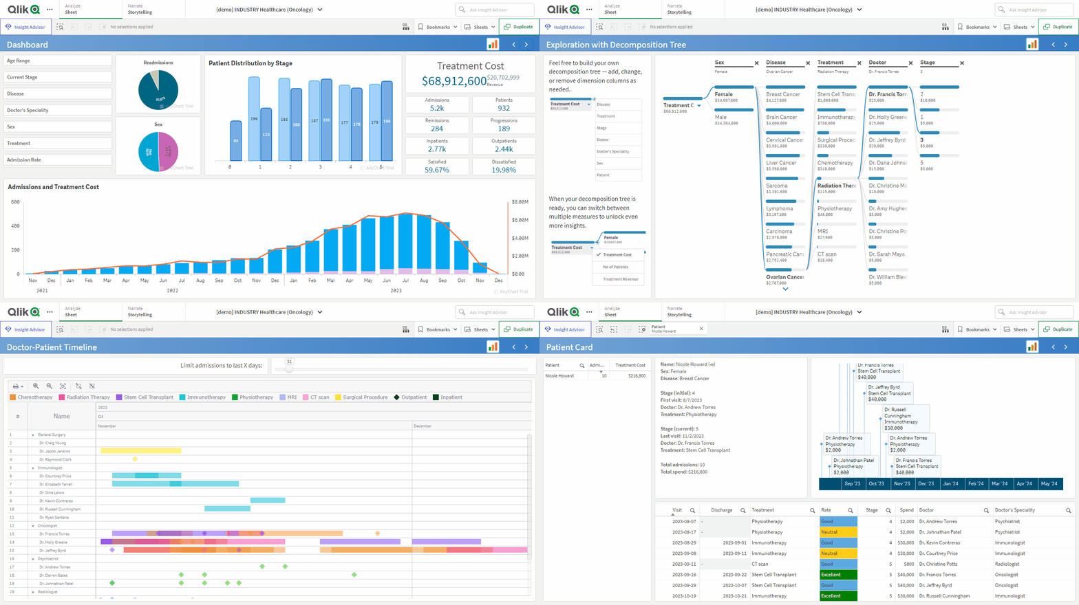
To illustrate our solutions in action, we introduced a new, healthcare-focused demo application. Catering to the increasing interest from health and pharma organizations, it shows how advanced visualizations — including the Decomposition Tree, Gantt Chart, Combo Chart, Sunburst Chart, and Timeline Chart — can simplify the analysis of metrics like admissions, patient counts, and treatment costs. It demonstrates how to perform root cause analyses with ease, maintain clear visibility into doctor-patient timelines, and track patient journeys with insightful precision.
See the demo app | Explore more demo apps
New Customer Area for All
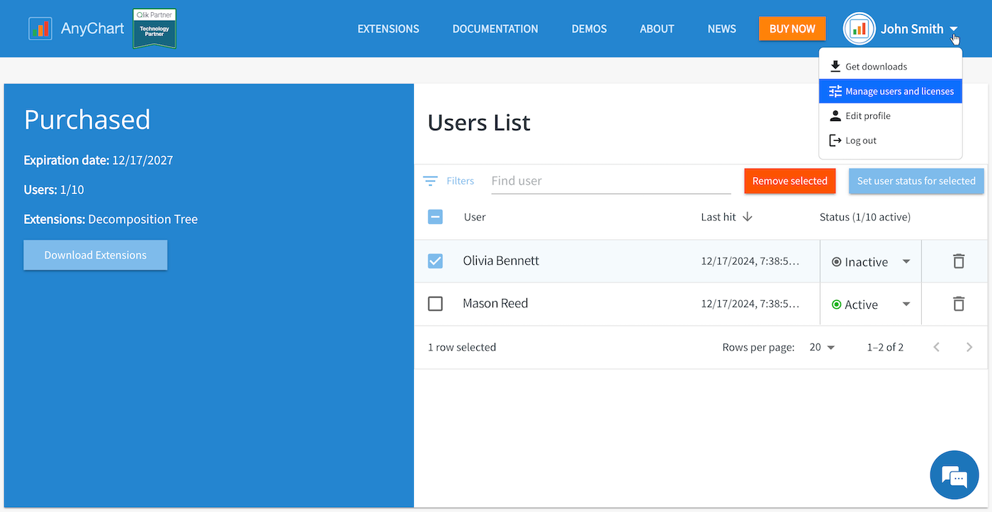
New customer area capabilities are now rolled out to all users of all our extensions for Qlik Sense. Whether you’ve purchased a license or are still evaluating, you can manage your assets seamlessly:
- License & Trial Overview: See all licenses and trials at a glance.
- User Management: Monitor users, assign statuses, and remove access as necessary.
- Trial Extension: Extend trials in duration or user count with a single click.
- Easy Access to Updates: Download the latest versions of our extensions, ensuring you always benefit from our newest features.
Welcome to our customer area: log in or sign up
Looking Ahead: AI & Beyond

As we look to the future, we’re more excited than ever about the potential of artificial intelligence to drive faster innovation. We’re now exploring ways to harness AI to streamline the creation and integration of custom visualizations powered by our robust, award-winning JavaScript charting library. By combining our expertise with AI-driven efficiencies, we aim to considerably accelerate the delivery of flexible, high-value charting solutions tailored for Qlik Sense — and beyond.
Meanwhile, if you are interested in getting any specific visualization type or feature for your Qlik apps, drop us a line or schedule a call!
Wrap-Up
In summary, 2024 was another fulfilling year of progress for AnyChart. We introduced transformative features, strengthened our engagement with the global community, enhanced customer resources, and ventured into exploring AI-driven opportunities — all with the goal of helping you create even better charts and dashboards that truly drive insights. Along the way, we earned new recognition affirming our commitment to continuous improvement and innovation.
As we move into 2025, we remain dedicated to pushing the boundaries of what’s possible in data visualization and analytics, ensuring you always have the tools you need to succeed.
Happy holidays, and here’s to an even more exciting 2025 — stay tuned!

