
Waterfall Advanced
Technical maintenance update to support ongoing improvements.
Improvements:
QLIK-760 — Color by Expression Enhancements:
- Subtotals can now inherit colors from preceding points.
- Data points for which the color expression resolves to null are now gray by default.
- The legend now shows only custom items when using the color-by-expression mode.
Bug fixes:
- QLIK-771 — Fixed issue with incorrect category labels appearing when selection is performed
Selection by Second Dimension (Subcategories)
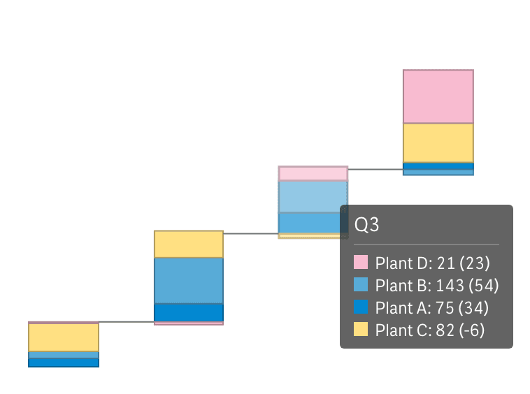
In scenarios with two dimensions and one measure, our latest update enables users to make selections based on the second dimension. Users can now conveniently select the desired subcategory directly from the legend, seamlessly focusing on its contributions to the category values.
For example, when exploring sales (measure) by quarter (first dimension, including categories) and by product (second dimension, including subcategories), a click on a product's name in the legend triggers its selection. This highlights the product's share within the overall sales by quarter, while connected visualizations consistently drill down for a more detailed analysis.
Total Bar Positioning
We've also introduced the option to display the Total bar at the beginning of the X-axis. To activate this, navigate to Appearance > Presentation > Total in the properties panel and select "Start" from the Position dropdown menu. Easily revert to the default layout by choosing"End."
Stacked Total Bar
We've expanded the options for displaying total bars. Alongside the typical single solid bar representation and our handy Split Total feature (allowing you to divide the Total bar into multiple consecutive bars), you now have the choice of a stacked bar with colored or non-colored sub-bars. This addition enhances the evaluation of subcategory contributions to the Total, complementing the existing options to grant you complete control over the visualization of your Totals in waterfall charts.
Improvements:
- Enabled second dimension (subcategories) selection when only one non-calculated category (from the data itself) is displayed while the other categories are absent or those automatically calculated such as total, subtotal, or total split bars.
- Updated the naming of elements in the properties panel for improved readability and navigation.
Bug fixes:
- Removed underscores from category names on the X-axis.
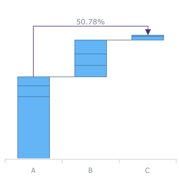
Cross-category Connectors
AnyChart Waterfall extensions now allow you to add Cross-category Arrow Connectors that can show the percentage or absolute value difference between any two categories
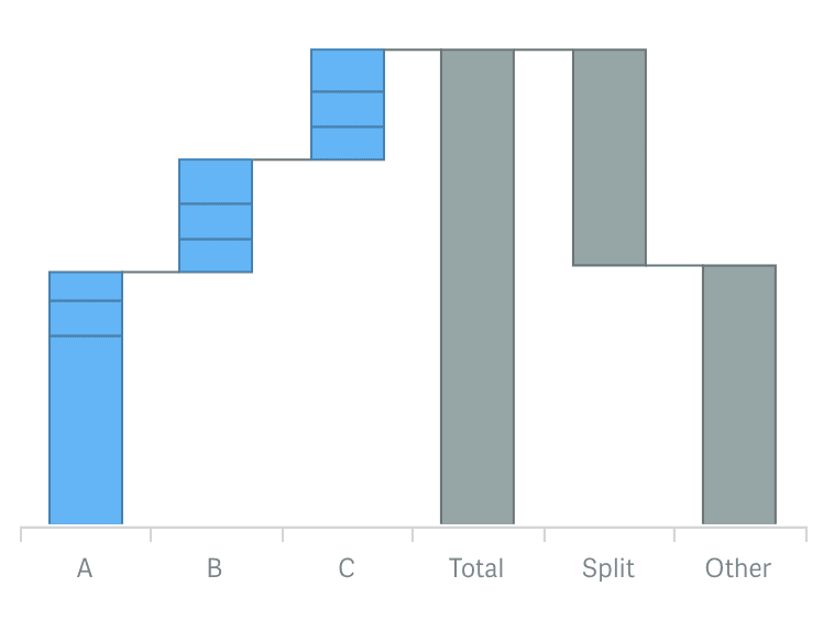
Split total display
Now you can use a split display of the total category to provide for context and clear view of the elements total value consists of.
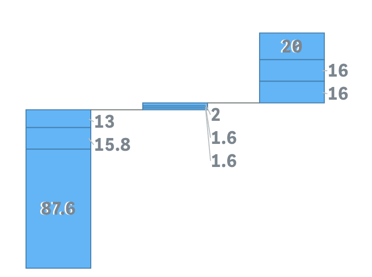
Outside labels placement and threshold modulus settings
Stacked AnyChart Waterfall Extension for Qlik Sense now has a special option for small values in stacks: labels can be displayed right beside the stack or hidden if values defined by a certain threshold are irrelevant to the analysis.
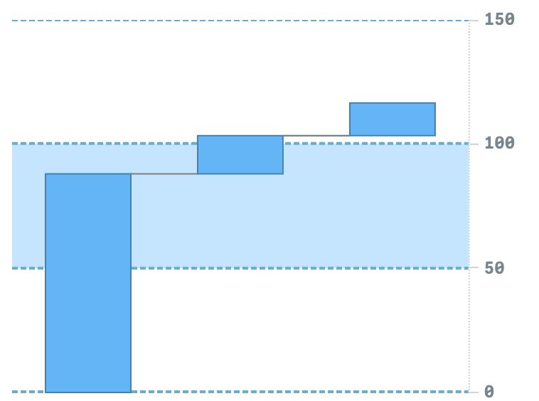
Axis and Grid settings
Waterfall charts now have extended axes and grid settings giving you an option to give charts a more appealing and informative look.
Union tooltip for subcategories stacks
Stacked Waterfall charts now have an option to show one tooltip for a stack instead of separate, allowing users to see all information about elements accompanied by proper color legend.
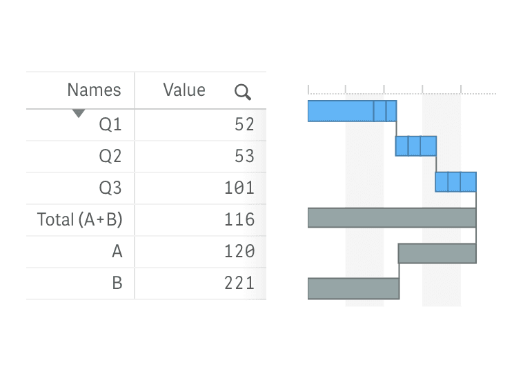
Vertical Layout
All Waterfall charts can now be shown vertically, allowing you to place them against a table and provide information in more telling context.
Improvements:
- QLIK-409 — Stack labels can now show absolute and relative values.
- QLIK-414 — Axes labels for subtotals can now be set with expressions and variables.
- QLIK-294 — Calculation conditions are now available for dimensions and measures.