
Waterfall Advanced
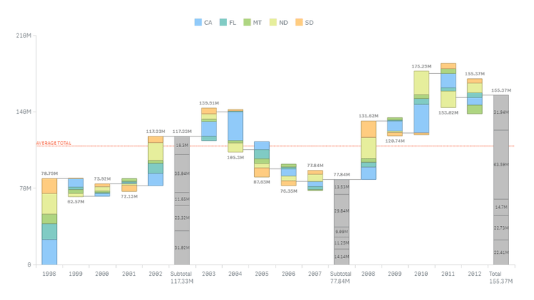
U.S. Honey Production (NASS)
Gain rich insight into the volume and value of honey production across the United States of America as officially reported by the USDA's National Agricultural Statistics Service. Know which states output the most honey. Instantly figure out and look into increases and declines in their contributions year by year. Focus on certain states or periods at a click by making use of the appropriate filters.
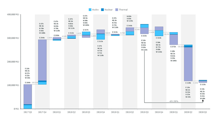
Power Generation in India (CEA)
Run a quick visual analysis of power generation from thermal, nuclear, and hydro energy sources in India over the last few years — based on data delivered by the country's Central Electricity Authority through the National Power Portal. Track quarterly changes in the amount of electricity produced, overall or by type. Locate the increments and decrements that have the biggest effect nationwide and in individual regions.
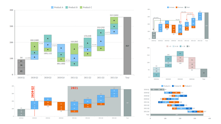
Stacked Waterfall Chart Features
Discover the stacked waterfall chart option in Qlik Sense, and analyze the cumulative effect of added and subtracted values both by category and by subcategory. While looking at a fictional product metrics visualization, explore all major features of our intuitive Advanced Waterfall Chart Extension for Qlik Sense. See sub-bars stacked within main bars, different data modes, customizable labels, and much more demonstrated in action.
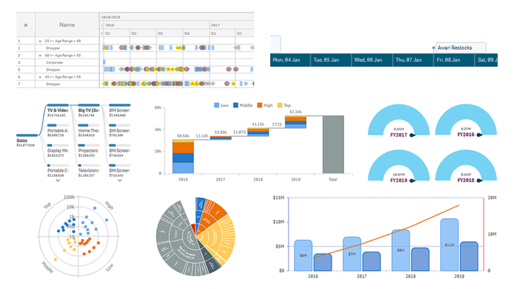
AnyChart Complex Demo
Named best in data analytics and visualization in 2023, AnyChart offers a set of innovative Qlik Sense extensions. Discover the power of the major ones in a quick demo overview and see how they can help you take your visual analytics in Qlik to the next level: Decomposition Tree, Gantt Chart, Combo Chart, Circular Gauge, Bullseye Chart, Sunburst Chart, Timeline Chart, and Waterfall & Advanced Waterfall Chart.