
Gantt Resource
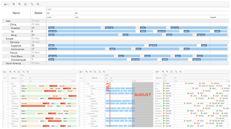
Resource Gantt Chart Features
Resource Gantt charts enable you to manage resource allocation in an efficient and effective way. Explore all major features of our intuitive Resource Gantt Chart Extension for Qlik Sense while looking at this visualization of (fictional) resource use data. See different data structures, flexible tables and timelines, customizable milestones, labels, markers, coloring, fiscal year settings, and much more demonstrated in action.
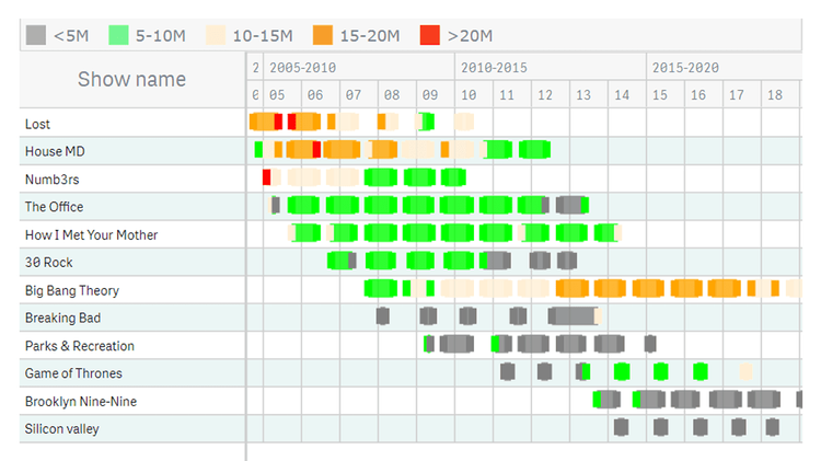
TV Shows (Resource Gantt Multiple Milestones)
Analyze the popularity of various TV shows by season and episode — with our Resource Gantt charts for Qlik Sense and the feature of multiple milestones in a single line in action. Compare viewership on a per-episode basis and identify the most and least viewed episodes. Examine the first and last episodes. Get an overview of all seasons with color-coded bars based on the number of views