
We've just updated the AnyChart and AnyGantt extensions for Qlik Sense to further facilitate the path to enhanced data-driven insights for you! Keep reading to learn about the new amazing Waterfall Chart and Gantt Chart features delivered in the 4.3.249 releases. Then check out the latest versions to see them all in action!
Waterfall Chart
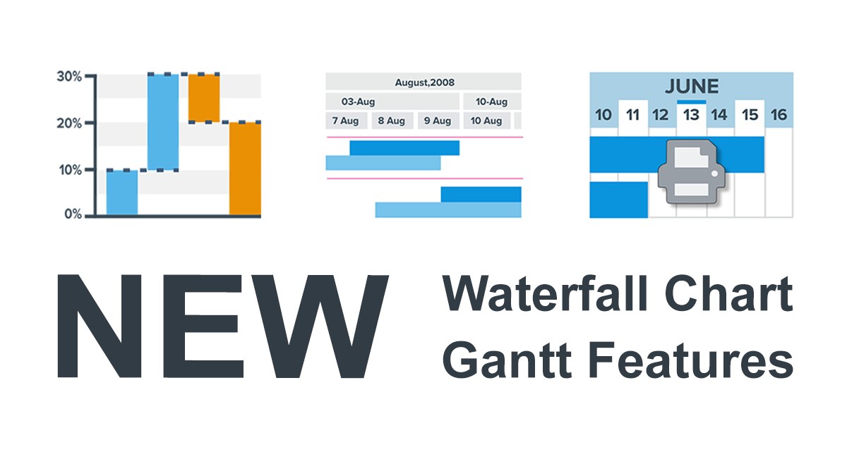
Continuing to improve our charts for Qlik Sense based on your feedback, this time we've reconsidered the Waterfall Chart and are glad to introduce you to its brand new version. Meet the AnyChart 4 Waterfall Chart in Qlik!
The new AnyChart Qlik Waterfall Chart stands out from the crowd with its amazing ability to get data both as absolute values for each state and as differences between the states. Moreover, our Waterfall Chart supports two stacking modes and can display totals and subtotals.
A Waterfall Chart — you could have also heard it called a Mario Chart, a Bridge Chart, or a Flying Bricks Chart — is widely used for analytical purposes. Such a form of data visualization makes it easy to look into data through the lens of how a certain value is affected by a series of intermediate values, positive and negative.
Try and enjoy the new Waterfall Chart for Qlik Sense in the AnyChart extension!
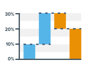
Visible Date Range Printing in Gantts
You know you can print your entire Gantt chart in an instant using the navigation toolbar or through the dedicated drop-down menu. But what if you only need to visualize a part of it on paper?
We've made it all flexible! Now you can choose to print the currently visible part of a Gantt chart when you want to focus on the specific dates and periods — what you see is what you get!
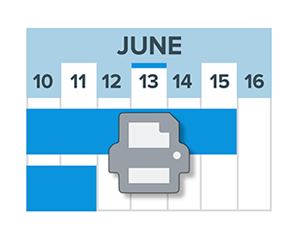
Grid Line Stroke Settings in Gantts
Talking about the major news of the September release, here's another great improvement: Horizontal grid lines in Gantt charts are now configurable!
Feel free to choose what kind of stroke you need in your project visualization, including the color, thickness, and type.
More Gantt Improvements
Actually, we've delivered even more Gantt chart improvements in the latest release of our AnyGantt extension for Qlik Sense, or Project Management Bundle as we've been calling it since spring 2020 when it received the awesome Timeline Chart in addition to Project Gantt and Resource Charts.
All updates are listed in the AnyGantt for Qlik Version History — don't forget to take a look.
Share Feedback
Please send us your feedback. You know we always carefully listen to your ideas and do our best to implement them in a timely manner.
🖖
In case you missed it, we partnered with Qlik last year and launched three intuitive extensions for data analytics and business intelligence experts using Qlik Sense. Go ahead and try them free of charge and schedule a call with us for a personalized demo.