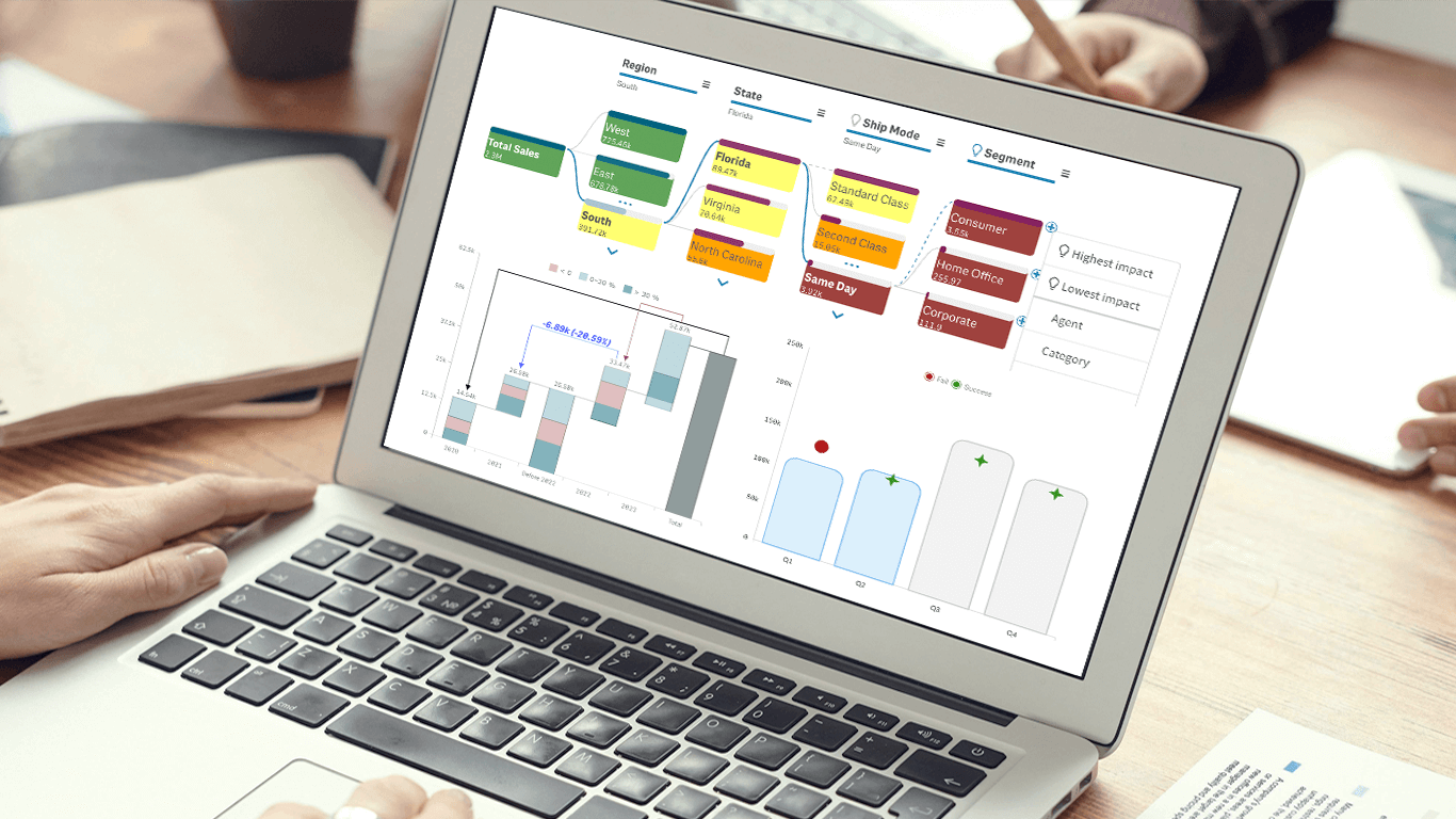
We’re excited to announce a series of updates to our extensions for Qlik Sense! They bring greater flexibility and precision to your data visualizations, allowing for uncovering deeper insights even more effectively. The most stunning new feature is AI Splits in the Decomposition Tree — let your users find the highest and lowest impacts with unprecedented speed!
The complete list of October 2024 updates is below. Read on to learn what’s new!
What’s New in Qlik Sense Extensions — October 2024
Decomposition Tree Extension
AI Splits — Reveal Highest/Lowest Impact Instantly!
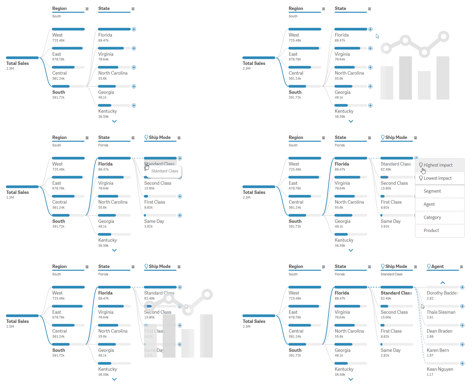
Our Decomposition Tree for Qlik Sense now features the AI Splits feature, enabling users to instantly discover the highest or lowest impact factors within the data. Similar to the functionality available in Power BI, this feature leverages intelligent algorithms to automatically identify and highlight the most significant contributors to any metrics.
Exploring data in the Decomposition Tree typically involves manually selecting the next dimension to drill into to find out what contributes to a particular value. With AI Splits, users can click the plus sign next to an item and simply choose to display the highest or lowest impact. The feature automatically
- scans all available dimensions,
- identifies where the maximum (or minimum) value occurs for the metric being analyzed, and
- expands the dimension containing that critical value, highlighting it for immediate attention.
This intelligent automation transforms root cause analysis, making it super easy to delve directly into the most impactful areas without manual effort. By quickly uncovering the key contributors, AI Splits helps focus the exploration where it matters most, saving time and enhancing decision-making.
To enable AI Splits, navigate to the new Analysis section in the properties panel and choose Absolute from the dropdown menu. Please note that this feature requires the Use flex dimension option to be active (found under Presentation > Appearance), ensuring that the order of dimensions is not fixed so the tree can dynamically adjust based on the AI findings.
Custom Coloring for Column Items
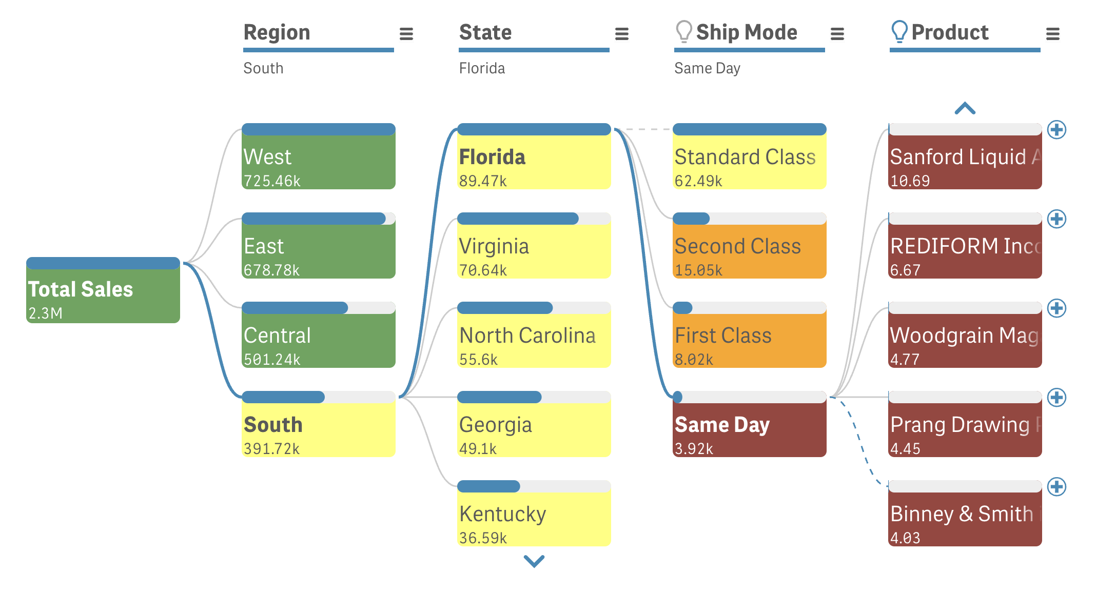
We’ve added the option to change the coloring of the column items — the boxes containing dimension labels, values, and value bars. You can now customize their background colors by selecting a single color or using expressions.
In the properties panel under Appearance > Colors, you’ll find a new Item color switch:
- Auto: Keeps the default white color.
- Custom: Allows you to define custom coloring options using the Color by dropdown:
- Single color: Select a color using the color picker.
- By expression: Use expressions to set colors dynamically. You can input color names (e.g., 'red') or Qlik color functions like Red(200).
During selection mode, the behavior remains consistent: selected items are highlighted in green, and items that cannot be selected are shown in gray.
Tooltip Customization
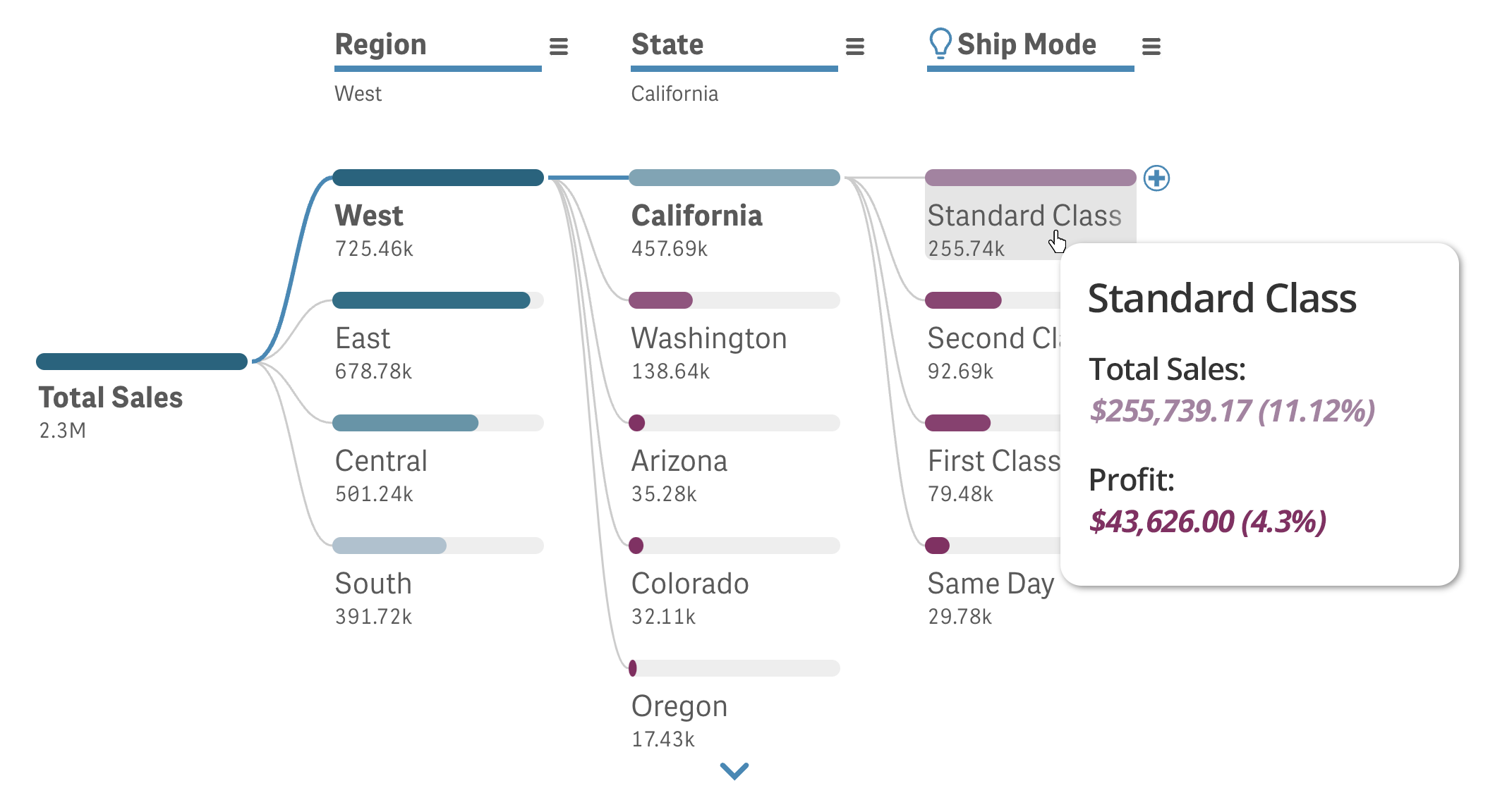
We’ve enhanced the tooltip functionality to allow customization of the information displayed. This gives you full control over the information you want to present when users hover over items.
In the Appearance section within the properties panel, you’ll find a new Tooltip switch:
- Auto: Keeps the default inter-level value rows.
- Custom: Allows you to customize the information in the tooltip:
- Hide basic rows: Remove the default inter-level value rows.
- Title: Add a header for the tooltip. Leaving it empty will result in no tooltip title displayed.
- Content: Use expressions to customize the content shown in the tooltip body. If the basic rows are not hidden, this information will be added below them.
Combo Chart Extension
Marker Settings by Expression in Marker Series
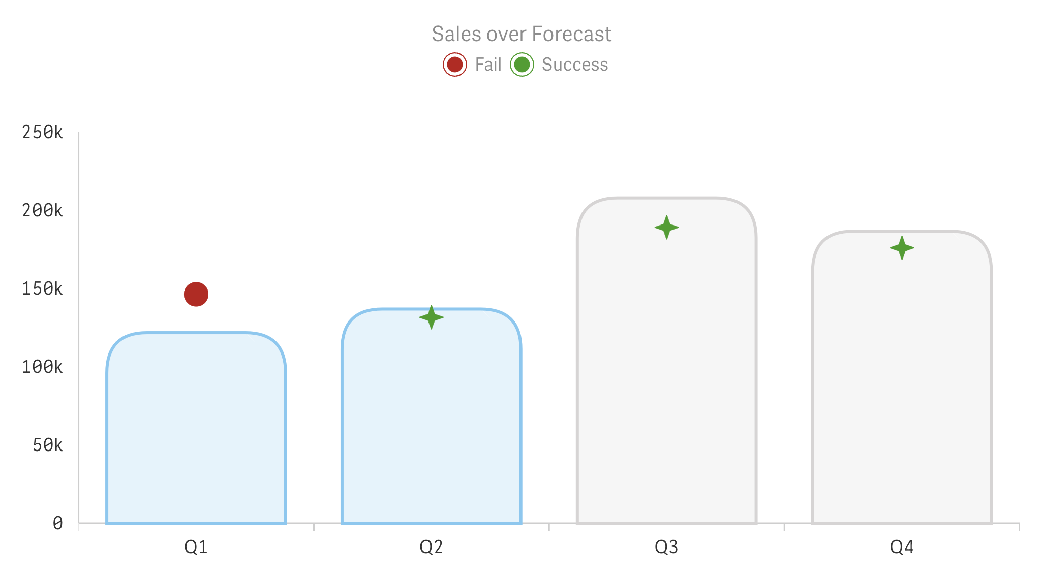
We’ve expanded the customization options for the marker series in our Combo Chart extension. You can now configure both the shape and size of markers using expressions, allowing for dynamic adjustments based on your data. This means your markers can change in response to data values, making your charts more informative and engaging.
If you prefer, you can still select a single shape (or image) and set a single size for all markers, just as before. Color settings remain flexible, supporting both single values and expressions for dynamic coloring.
To access these options, navigate to Data > Measure > More properties > [Marker] > Presentation within the properties panel.
Data Point Settings in Line & Area Series
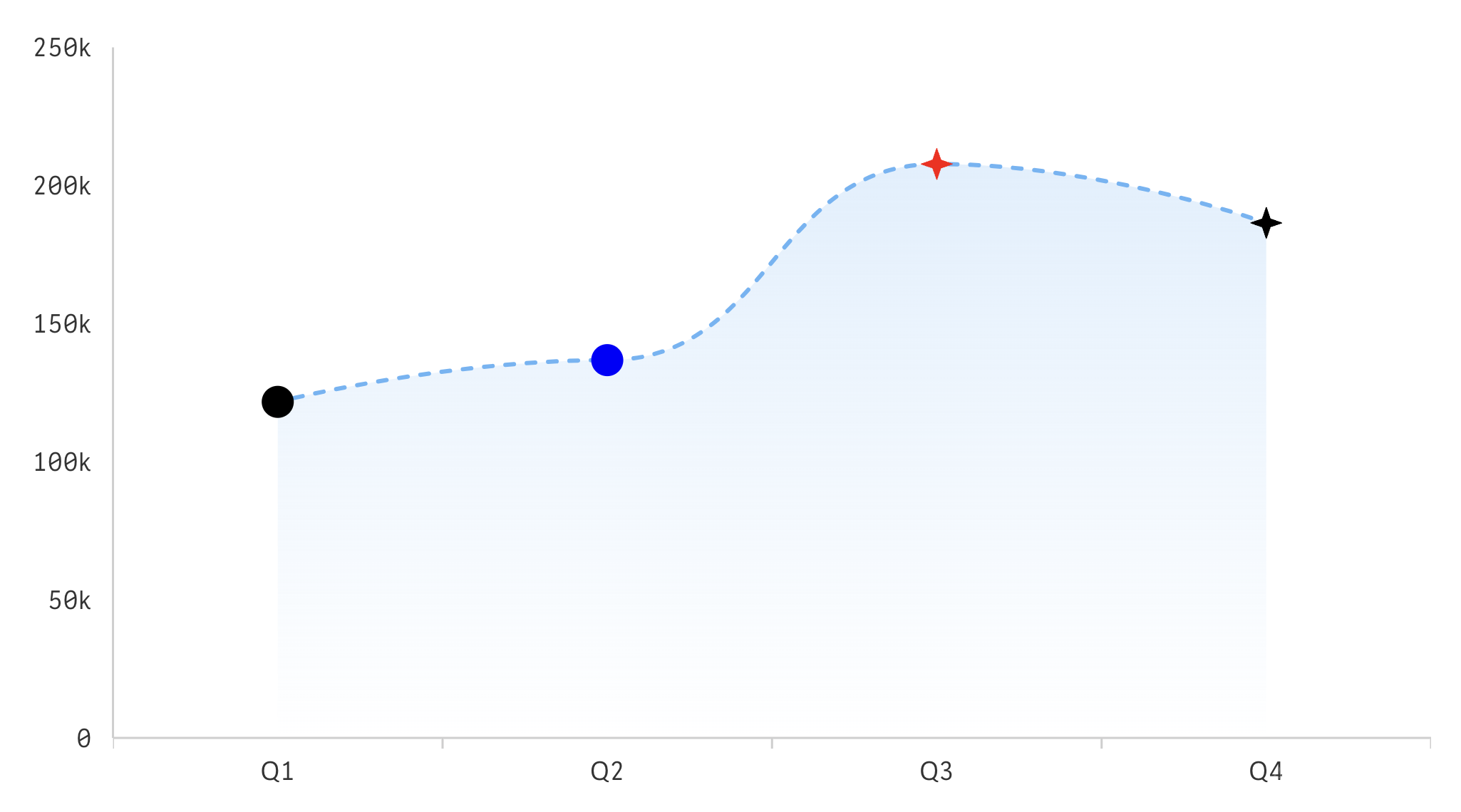
We’ve enhanced the data point customization options for line and area series.
Previously, data points would appear as markers only when hovering over the chart, with limited customization — you could set a single size, and the color matched the series automatically, with control over fill opacity only.
Now, you have greater control over data point presentation as we’ve added a new Data points section in the properties panel, under Data > Measure > More properties > [Line or Area] > Presentation within the properties panel:
Data Point Marker Display Options
You can choose whether to display data points on hover only or always, using the Show dropdown. You can also hide them at all by switching the Data points toggle to Disabled.
Data Point Marker Customization
If you decide to display data points, whether on hover or always, you now have more options to customize the corresponding markers:
- Shape: Select from multiple shapes (or use an image as a marker), or set the shape dynamically using expressions.
- Size: Adjust the size with a slider for a single value or use expressions for dynamic sizing.
- Color: Set the color to match the series, choose a single color, or define colors using expressions.
These enhancements provide you with the flexibility to tailor data point marker appearance to your specific needs, enhancing the clarity and aesthetic of your charts.
Waterfall Chart Extensions
Measure Operation Mode in Waterfall Classic
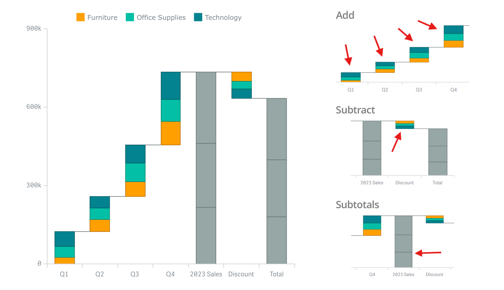
We’ve introduced a new feature allowing you to choose the mode of how measure values in your data should be operated.
In the measure settings, there is now a Measure operation dropdown:
- Add: This is the default behavior, where values are added sequentially, whether positive or negative.
- Subtract: Indicates that values must be subtracted, effectively reversing its sign. For instance, a value of 1 becomes -1, and -1 becomes 1.
- Subtotals: Takes values as is, treating them as subtotals.
This feature provides more precise control over the waterfall, ensuring the accuracy and clarity of your financial or other analytical presentations.
Arrow Connector Upgrade in Waterfall Classic
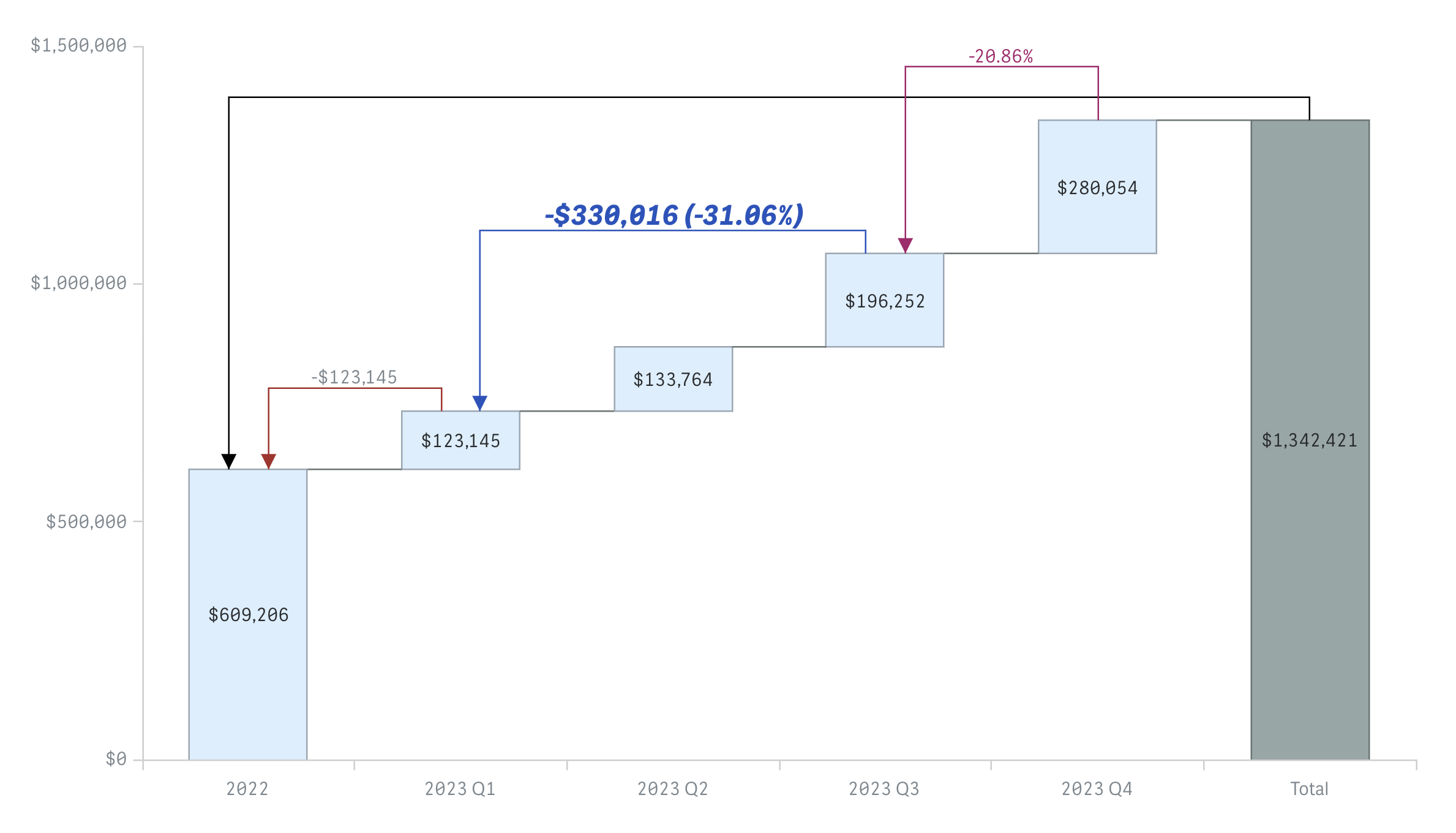
We’ve made significant improvements to arrows to enhance your ability to highlight specific value transitions between columns.
Text Templates for Labels
You now have the flexibility to display not only either absolute or percentage values on arrow labels but also both or none. It is achieved by selecting your desired combination of checkbox options in the arrow settings under Add-ons > Arrows within the properties pane.
This enhancement allows you to convey more (or less) detailed information about value changes between columns.
Label Font Customization
In addition to the previously available option to choose the alignment of the arrow label, new settings have been added to customize the font of arrow labels, including style, family, color, and size. These settings are available in the arrow settings under the Add-ons > Arrows section within the properties panel.
It allows you to match the labels to your chart’s aesthetic or your organization’s branding guidelines.
Number Format Unification
The number formatting settings, located in the Number formatting section of the properties panel, now apply to arrow labels as well.
This means the number format you select — Auto, Number, Money, Date, Duration, Custom, or Measure expression — will be consistent across your entire chart, including the arrows.
Improved Arrows Placement Algorithm
We’ve reworked the arrow placement algorithm to ensure more accurate positioning, enhancing the legibility of your waterfall charts. The arrows now align more efficiently and precisely with the columns they connect, providing a cleaner and more professional appearance.
These upgrades make the arrow feature more flexible and powerful, enabling value transitions to be conveyed more effectively.
Additional Appearance Flexibility in Waterfall Classic
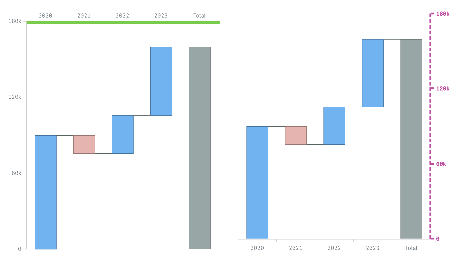
Axis Ticks Settings
You have just got more control over the appearance of chart axes. You can now disable ticks on the axes by unchecking the new Show ticks checkbox in Appearance > X-axis and Appearance > Y-axis sections within the properties panel.
Plus, adjustments to the axis stroke thickness and color, made from the same sections in the properties panel, will also apply to the corresponding axis ticks.
This allows for a more cohesive and personalized look for your waterfall charts.
Connectors Dropping
By default, waterfall charts display connectors between neighboring columns to illustrate the progression between sequential values. For situations when the data structure features multiple measures, we have now added a Connector checkbox option in the measure properties that allows you to remove the connector from a specific column to the next one. This is useful in scenarios where certain measure columns should not appear linked, providing a cleaner visual when necessary.
Upgraded Coloring by Expression in Waterfall Classic & Advanced
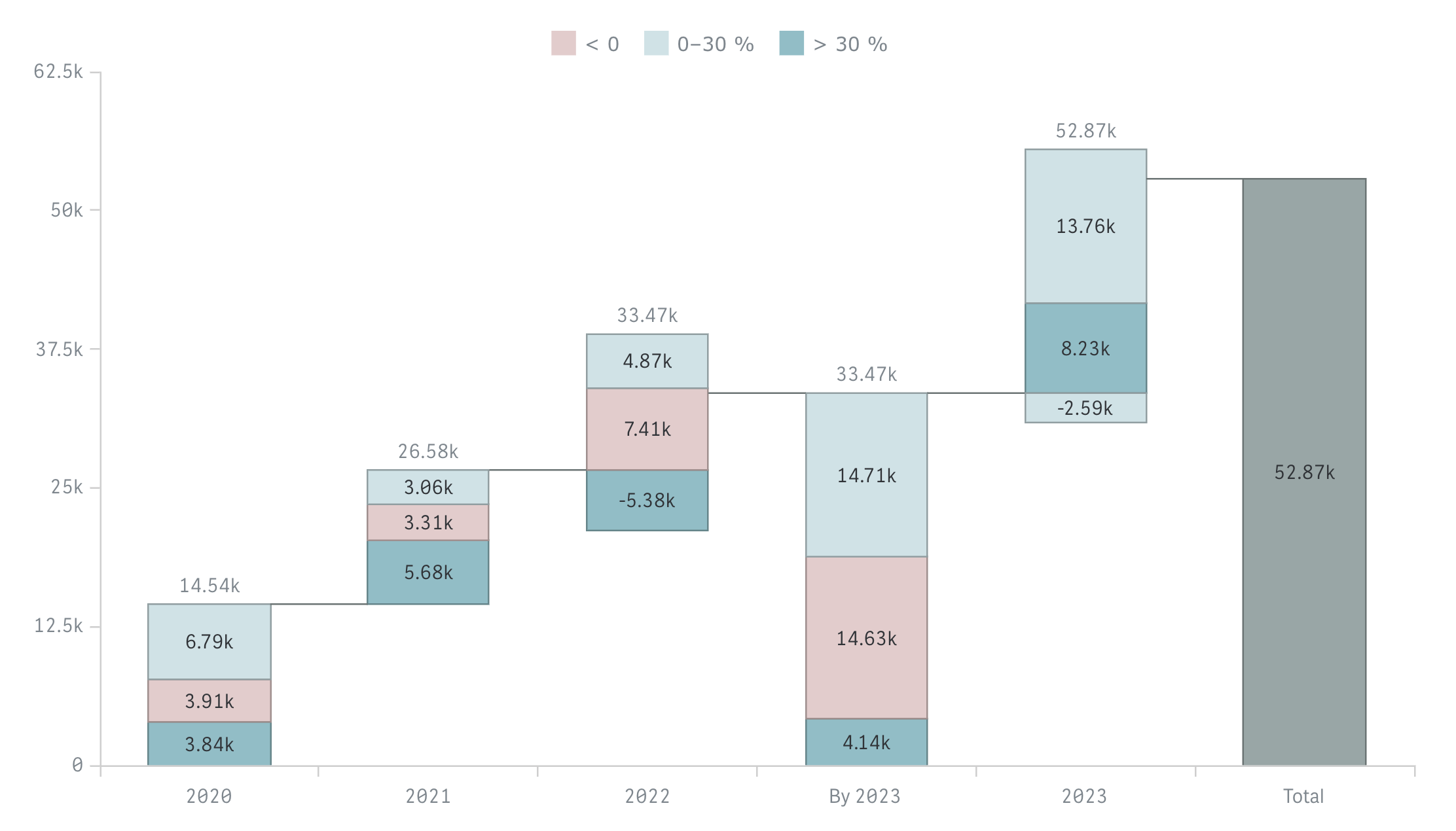
Color by expression is an effective way to highlight data points based on dynamic conditions. We’ve made some improvements to this mechanism.
Subtotals Coloring by Previous Points
Subtotals can now inherit the color from the preceding data point in each series, ensuring visual continuity and making it easier to track cumulative values in stacked waterfall charts. Checking the Color subtotals as subcategories option under Appearance > Colors and legend in the properties panel enables this behavior.
This enhancement eliminates the previous limitation where subtotals were colored using default palette colors that couldn’t be changed.
Null Colors Resolved to Gray
If a color expression resolves to null (i.e., it does not return a valid color string), the data point will now be colored gray by default. This ensures that only data points with defined colors are highlighted, and any undefined cases are visibly neutral.
It allows you to define colors for all necessary scenarios and avoid inconsistent coloring that could previously occur when default palette colors were applied unintentionally.
Legend Shows Only Custom Items
When using coloring by expression, the legend now only displays custom items with values > 0. This keeps the legend clean and relevant, showing only the information that you’ve explicitly defined. Data points with null colors will not add entries to the legend and will appear in gray.
These enhancements provide greater control and clarity when using expressions to color your waterfall charts, making your data visualizations more meaningful and easier to interpret.
Download & Send Feedback
We invite you to download the updated extensions and explore the new capabilities firsthand!
Your feedback is invaluable to us — it drives our continuous improvement and helps us ensure that our tools for Qlik Sense effectively meet your needs. If you have any comments, suggestions for new features, or require support, please don’t hesitate to reach out.

