
Tracking project progress using Gantt charts in Qlik Sense has become even easier with the latest update of our dedicated extension! Learn about the just-released features and improvements below. Then update to the newest version of AnyGantt for Qlik and check them out in action!
Baseline-Dependent Coloring of Actual Bars
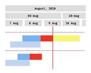
Now the actual bars can be automatically colored depending on the current status compared to the baseline plan. In this way, the variances between the present and original schedules are prominently highlighted and therefore comprehended at a glance.
Such an advanced visualization will make it easy to evaluate progress and performance in real time, enabling you to quickly spot tasks that lag behind the plan along with their estimated time of completion.
Baseline Milestones
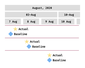
Milestones can now be put on not only actual but also baseline elements, which makes project planning and tracking with our Gantt charts even more efficient and streamlined.
So first you can schedule any important dates such as meetings, approvals, phase completions, and other major events or goals. Then it is easy to visually compare the actual milestone dates to the initial, baseline project plan.
Multiple Improvements
As always, we have also made a bunch of improvements to the existing mechanisms. The most significant ones are:
- Milestones preview centered in a row.
- Baseline bars can be shown above actual bars.
- Collapse/expand buttons are configurable now.
- HTML support in dimension column rows.
- Performance improvements.
Check out free Qlik Sense demo apps showcasing our Gantt charts in action:
Learn how to configure a Gantt chart in Qlik Sense making the most of our extension:
Get and enjoy the latest version of the Gantt chart extension:
➡️ Download Gantt Chart Extension
In case you missed it, we have also released three unique visualizations for Qlik Sense: Decomposition Tree, Deluxe Combo Chart, and Versatile Circular Gauge. Check them out too, ask us questions if any, and let us know if you lack anything else Qlik Sense!
ICYMI: We partnered with Qlik to bring new data visualization choices to the Qlik platform via intuitive extensions for Qlik Sense. Give them a try — download, see demo apps, or book a live demo session.