You asked, and we listened. We have continued to work on plans to deliver an unprecedented experience with Waterfall Charts in Qlik Sense. And we are pleased to announce that several new valuable features are now there to improve the way you explore not only a by-category but also a by-subcategory breakdown of metrics!
Read below to see what's new in our Stacked Waterfall Chart for Qlik Sense — just upgraded with the July release of the AnyChart Qlik Extension — and give it a try without delay!
Cross-Category Arrow Connectors
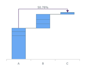
First, our Waterfall Charts for Qlik Sense are now equipped with cross-category arrow connectors. You can use them to display the differences between any two categories, in absolute values or percentages.
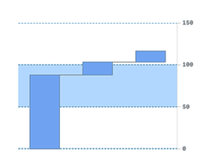
Split Total Display
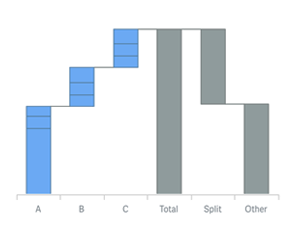
Second, a split display of the total category is now available. This new feature will allow you to provide more context along with a clear view of the elements that the total value consists of.
Outside Labels
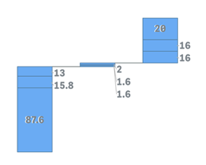
Third, we have added two options for the display of small subcategory values. Depending on the situation, you can make their labels shown right next to the stacked bars or simply hidden in case the corresponding values defined by a certain threshold are not really relevant in your current data analysis.
Axis and Grid Settings
Fourth, we have extended the range of options to customize axes and grids. The updated settings will make it easy for you to give your Waterfall Charts in Qlik Sense an all the more visually appealing and informative look.
Union Tooltip for Subcategory Stacks
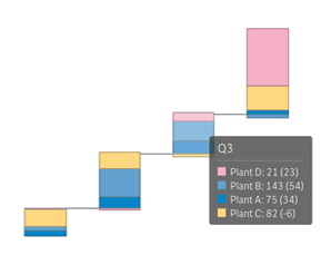
Fifth, now you can choose to display a single tooltip for an entire stack of subcategories instead of individual tooltips for each subcategory. In this way, complete information about all the elements of a stacked bar — together with a color legend — will show up once any subcategory is hovered.
Vertical Layout
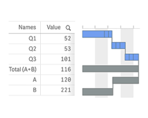
Sixth, our Qlik Waterfall Charts can now be displayed vertically. This will allow you, for example, to place them against a table in order to represent information in a more telling context.
More Improvements
These are the six most amazing features of the new release.
We have also improved a number of other aspects, including but not limited to the Bullseye Chart legend, Waterfall Chart labels, and Gantt Chart flexibility. Check out the complete release notes:
- Version History of AnyChart Extension for Qlik Sense
- Version History of AnyGantt Extension for Qlik Sense
What else do you need in Qlik? Please share your thoughts with us and we will be glad to include your ideas in the roadmaps for our Qlik Sense Extensions.
In case you missed it: We partnered with Qlik and launched three extensions for BI and data analysis professionals using Qlik Sense. Feel free to give them a try and schedule a call for a personalized demo.