
印度电力生产(CEA)
适用于 Qlik 的发电演示应用使用堆叠瀑布图展示季度变化。借助 AnyChart 扩展,在 Qlik 中体验高级可视化分析。
印度电力生产(CEA)


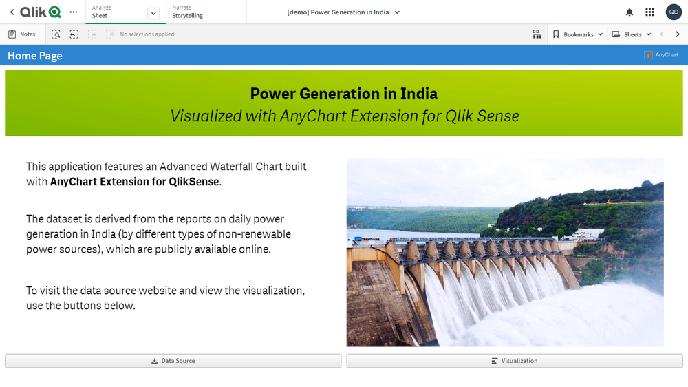

关于此应用
对印度近年来火电、核电和水电的发电量进行快速可视化分析,基于中央电力局(CEA)通过国家电力门户发布的数据。按季度跟踪总体或按类型的发电变化,定位对全国及各地区影响最大的增减幅度。
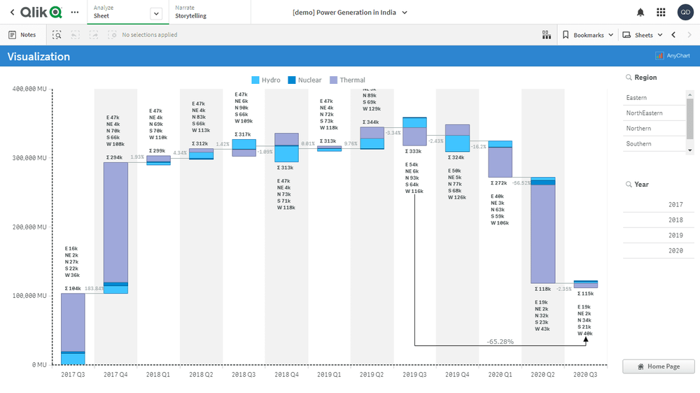
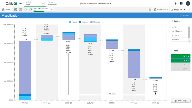
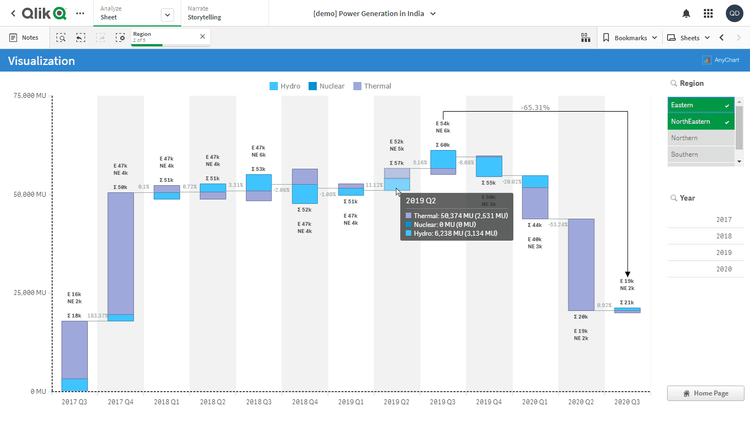
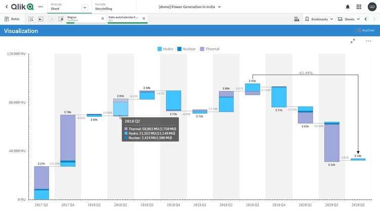
本应用包含一个高级瀑布图,由 Qlik Sense 的 AnyChart 扩展构建。数据集来自印度每日发电量报告(按不同类型的不可再生能源),该数据已在网上公开发布。
瀑布图:
- 图表显示了历年不同能源类型的发电量变化情况。
- 数据结构:1 个维度 + N 个度量。
- 堆叠标签已定制,显示各地区及总体的发电量绝对值。
- 当选择一个或多个地区时,堆叠标签仅显示所选地区的信息。
- 图表包含分组提示工具,能同时显示悬停柱子下所有子柱的信息。
- X 轴网格使用颜色阴影处理,以便更容易区分每根柱子对应的年份。
- 添加了箭头,用于显示 2019 年第三季度与 2020 年第三季度之间的百分比差异。
其他功能:
- 可按年份和地区进行筛选。