Version 4.x History
AnyChart Qlik Extensions version 4.10.0
Released May 30, 2025AnyChart Qlik Extensions version 4.9.0
Released Oct 30, 2024Waterfall Classic: Measure Operation Mode
Introduced the ability to choose the operation mode for measures – Add, Subtract, or Subtotal – providing precise control over how each measure contributes to the waterfall chart.
Waterfall Classic: Arrow Label Customization
Added text templates for labels on the arrows connecting columns, allowing you to display values, percentages, or both. Also included settings to customize the font of arrow labels: style, family, size, and color.
Improvements:
Waterfall Classic & Waterfall Advanced: QLIK-760 — Color by Expression Enhancements:
- Subtotals can now inherit colors from preceding points.
- Data points for which the color expression resolves to null are now gray by default.
- The legend now shows only custom items when using the color-by-expression mode.
Waterfall Classic: QLIK-785 — Additional Adjustments:
- Improved the arrow placement algorithm.
- Number formatting settings now also apply to arrow labels.
- Enhanced axis ticks settings.
AnyChart Qlik Extensions version 1.2.0
Released Oct 30, 2024Combo Chart: Marker Settings by Expression
You can now configure the shape and size of markers using expressions. This allows for dynamic adjustments based on data, making charts more informative and engaging.Improvements:
- QLIK-744 — Combo Chart: Added controls to enable/disable the display of data point markers in line and area series.
AnyChart Qlik Extensions version 1.1.1
Released Apr 24, 2024Bug fixes:
- QLIK-778:
- Extension first load issue fixed
- Elements not showing in the definition panel issue fixed
- Expression color application issue fixed
- Incorrect color application for some chart types fixed
- Incorrect color application for stacked charts fixed
AnyChart Qlik Extensions version 4.8.1
Released Mar 30, 2024Bug fixes:
- QLIK-771 — Waterfall Advanced: Fixed issue with incorrect category labels appearing when selection is performed
AnyChart Qlik Extensions version 1.1.0
Released Mar 30, 2024QLIK-742 — Combo Chart: Added an option to set an individual chart color
Improvements:
- QLIK-739 — Combo Chart: Reference lines/ranges improvements
- labels are now fx-inputs
- ranges are now drawing as start-to-end of category
- in case start and end values are the same category will be full colored
- if one of start/end values is missing category will not be colored
- QLIK-743 — Combo Chart: Added 12 new marker types to marker chart
AnyChart Qlik Extensions version 4.8.0
Released Jan 31, 2024Waterfall Advanced: Selection by Second Dimension (Subcategories)
In scenarios with two dimensions and one measure, our latest update enables users to make selections based on the second dimension. Users can now conveniently select the desired subcategory directly from the legend, seamlessly focusing on its contributions to the category values.
For example, when exploring sales (measure) by quarter (first dimension, including categories) and by product (second dimension, including subcategories), a click on a product's name in the legend triggers its selection. This highlights the product's share within the overall sales by quarter, while connected visualizations consistently drill down for a more detailed analysis.
Waterfall Advanced: Total Bar Positioning
We've also introduced the option to display the Total bar at the beginning of the X-axis. To activate this, navigate to Appearance > Presentation > Total in the properties panel and select "Start" from the Position dropdown menu. Easily revert to the default layout by choosing"End."Waterfall Advanced & Classic: Stacked Total Bar
We've expanded the options for displaying total bars. Alongside the typical single solid bar representation and our handy Split Total feature (allowing you to divide the Total bar into multiple consecutive bars), you now have the choice of a stacked bar with colored or non-colored sub-bars. This addition enhances the evaluation of subcategory contributions to the Total, complementing the existing options to grant you complete control over the visualization of your Totals in waterfall charts.Improvements:
- Enabled second dimension (subcategories) selection when only one non-calculated category (from the data itself) is displayed while the other categories are absent or those automatically calculated such as total, subtotal, or total split bars — in Waterfall Advanced.
- Updated the naming of elements in the properties panel for improved readability and navigation — in Waterfall Advanced and Waterfall Classic.
Bug fixes:
- Removed underscores from category names on the X-axis.
AnyChart Qlik Extensions version 1.0.2
Released Sep 11, 2023Combo & Gauge: General Styling Customization
Introducing an array of general styling options to customize your Combo Chart and Circular Gauge visualizations in our Qlik Sense extensions. These improvements encompass background color and background image, as well as title, subtitle, and footnote texts, enabling you to easily align your data presentation with your design vision.
Access and configure these settings within the properties panel, specifically under the Styling > General section. Here, you can select font styles, color schemes, and more to tailor your visuals to your preferences.
AnyChart Qlik Extensions version 4.7.257
Released Apr 18, 2023Sunburst: "Other" Data Grouping
We've improved data handling for displaying a large number of points, and now less significant points can be grouped into an "Other" category using two algorithms — by value and by angle. This streamlines complex visualizations, making them easier to read and understand. You can access this feature under "Data handling" > "Grouping."Sunburst: Optimized Display of Levels
Our latest update brings an optimized display of levels (dimensions) on the chart. You can now control the number of visible levels and adjust the pixel width of the radius for other levels, resulting in a more visually pleasing and informative appearance. You'll find this feature under "Appearance" > "Levels." Additionally, null values in the data set are no longer shown on the chart for a cleaner presentation.Sunburst: Customizable Stroke
Add more personalization to your charts with our new customizable stroke feature. Feel free to adjust the color, thickness, and opacity of the stroke of graph elements, getting greater creative control over your visualizations. Simply navigate to "Appearance" > "Colors" > "Stroke" to access the stroke settings.Bug fixes:
- Minor bug fixes and improvements
AnyChart Qlik Extensions version 4.6.256
Released Jan 20, 2023
Deluxe Combo Chart
Combo charts for trend analysis can help you discover correlations that might exist between several values over time or by category. Go way beyond Qlik's native capabilities with our new Combo Chart extension!
Highlights:
- Use up to 3 dimensions in our combo chart to help analyze your data
- Error bars allow for statistical analysis at a glance
- Wide variety of chart types available
See the Deluxe Combo Chart Features demo app for Qlik Sense.
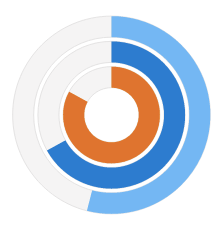
Versatile Circular Gauge
Gain freedom in effectively visualizing your KPIs using our Circular Gauge extension for Qlik Sense! With new options for viewing your KPIs, you'll find our gauges to be flexible beyond the standard ones in use today.
Highlights:
- New selection of shapes and sizes provides you with more options
- Multiple pointers/reference ranges show more info in a smaller space
- Support for custom images allows you more branding options
See the Circular Gauge Features demo app for Qlik Sense.
Improvements:
- QLIK-439 — Waterfall Classic/Advanced bars and legend coloring using master dimension.
- QLIK-514 — Sunburst sorting improvements.
- QLIK-604 — Waterfall Advanced/Classic axis labels angle settings added.
AnyChart Qlik Extensions version 4.5.254
Released Jul 21, 2021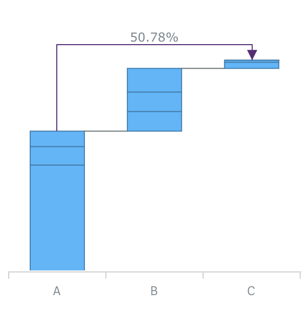
Cross-category Connectors
AnyChart Waterfall extensions now allow you to add Cross-category Arrow Connectors that can show the percentage or absolute value difference between any two categories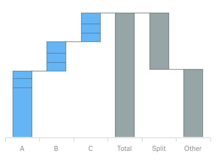
Split total display
Now you can use a split display of the total category to provide for context and clear view of the elements total value consists of.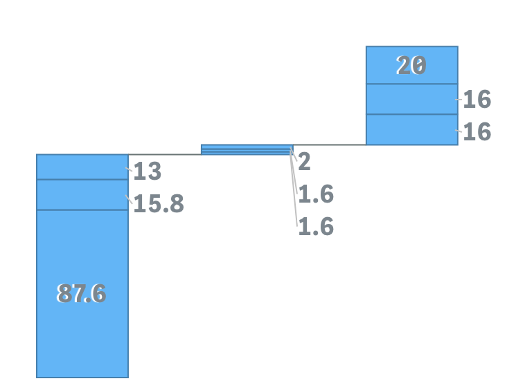
Outside labels placement and threshold modulus settings
Stacked AnyChart Waterfall Extension for Qlik Sense now has a special option for small values in stacks: labels can be displayed right beside the stack or hidden if values defined by a certain threshold are irrelevant to the analysis.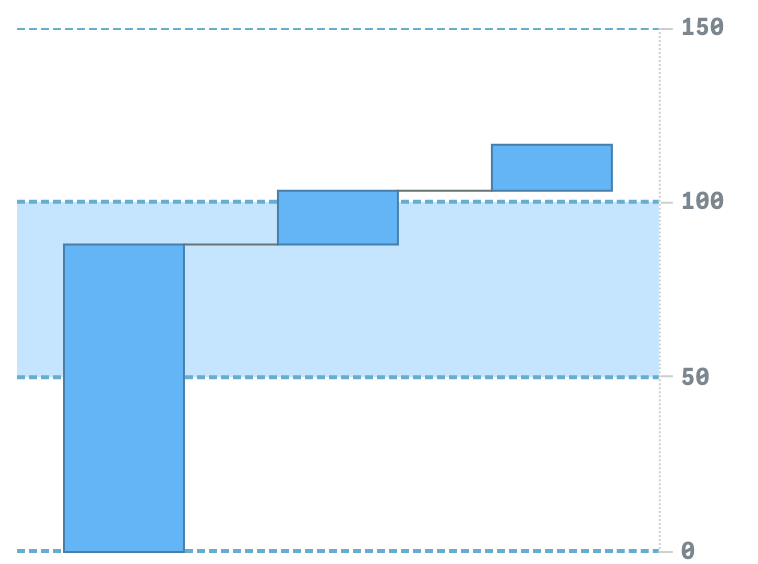
Axis and Grid settings
Waterfall charts now have extended axes and grid settings giving you an option to give charts a more appealing and informative look.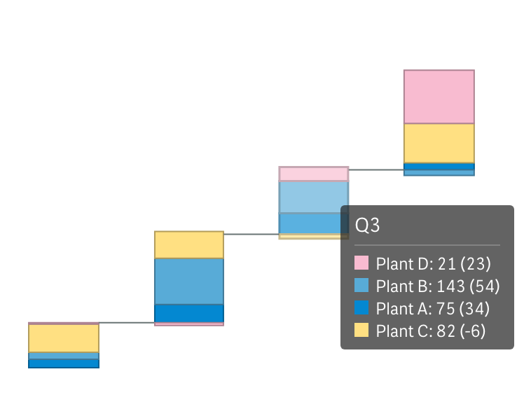
Union tooltip for subcategories stacks
Stacked Waterfall charts now have an option to show one tooltip for a stack instead of separate, allowing users to see all information about elements accompanied by proper color legend.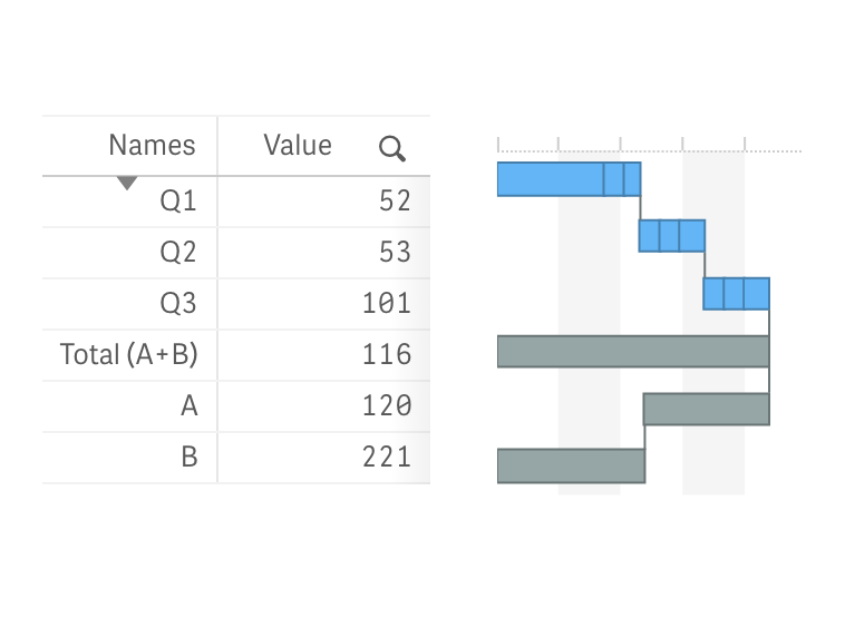
Vertical Layout
All Waterfall charts can now be shown vertically, allowing you to place them against a table and provide information in more telling context.Improvements:
- QLIK-409 — Stack labels can now show absolute and relative values.
- QLIK-414 — Axes labels for subtotals can now be set with expressions and variables.
- QLIK-294 — Calculation conditions are now available for dimensions and measures.
Bug fixes:
- QLIK-368 — Bullseye legend issue fixed
AnyChart Qlik Extensions version 4.4.253
Released Mar 3, 2021
AnyChart Bullseye Chart
AnyChart is proud to present a unique Bullseye Chart Qlik Sense Extension. Bullseye chart is an excellent graphical tool to be used with data that is both quantitative and continuous in measurement, such as a measured dimension or time (variables data). The Bullseye chart is perfect when you need to estimate whether each of two parameters is within its desired or expected range.
Bullseye charts are commonly used in drug development in healthcare and pharmaceutical industries, as well as any other case when phases or stages need clear visualization, and range tracking across multiple parameters are required.
AnyChart Qlik Extensions version 4.3.251
Released Dec 17, 2020
Waterfall Chart(Classic & Advanced)
Waterfall Chart (or Mario Chart, Bridge Chart, or Flying Bricks Chart) is widely used for analytical purposes.This chart type facilitates the analysis of processes (sales, production, research, and so on), especially when it comes to exploring or communicating transitions between the stages in a process.
AnyChart 4 Waterfall Chart comes as two extensions: AnyChart Waterfall Classic and AnyChart Waterfall Advanced.
Our waterfall charts stand out from the crowd by being able to get data both as absolute values for each state and as differences between the states, support of several stacking modes - either by measures or by dimensions, and ability to show totals and subtotals.
- Learn more about Waterfall Chart in the Chartopedia.
Bug fixes:
- QLIK-269 - Sunburst: Fixed incorrect selection behaviour
AnyChart Qlik Extensions version 4.2.248
Released July 15, 2020
New chart type added: Sunburst.
Sunburst - also known as Ring Chart, Multi-level Pie Chart, and Radial Treemap - is typically used to visualize hierarchical data structures.
New Sunburst Chart is the first chart in the reimagined set of AnyChart extensions - AnyChart v4. Easier to use, straight to the point visualizations with native Qlik experience.