AnyGantt Extension for Qlik: Project Chart
Basics
Chart Types
AnyGantt Extension for Qlik provides the following chart types:
- Project Gantt – a classic hierarchical Gantt chart that schedules projects over periods of time. It can display only one task or milestone in one row.
- Resource Chart – a Gantt chart that schedules resources (e.g. equipment or employees) over periods of time. It can display multiple periods and milestones in one row.
- Timeline Chart – a visualization of events on an axis in chronological order. It can display both events occupying periods of time and events with zero duration.
This section explains how to create and configure Project Gantt charts.
Other chart types are available via AnyChart Extension and Decomposition Tree Extension.
Downloading and Installing
Qlik Sense Desktop
To install AnyGantt Extension in Qlik Sense Desktop, do the following:
- Download AnyGantt Extension for Qlik Sense.
- Extract the archive.
- Open a Windows Explorer window and navigate to the Qlik Sense Extensions directory:
..\Users\<UserName>\Documents\Qlik\Sense\Extensions. - Copy the anygantt-4x-project folder to the Extensions directory.
- Copy the anygantt-4x-resource folder to the Extensions directory.
- Copy the anygantt-4x-timeline folder to the Extensions directory.
- Relaunch Qlik Sense Desktop.
Qlik Sense Server
To install AnyGantt Extension on a Qlik Sense server,
- Download AnyGantt Extension for Qlik Sense.
- Open Qlik Management Console (QMC): https://<QPS server name>/qmc
- Select Extensions on the QMC start page or from the Start drop-down menu.
- Click Import in the action bar.
- In the dialog, select the downloaded archive. Leave the password area blank.
- Click Open in the file explorer window.
- Click Import.
Qlik Sense Cloud
To install AnyGantt Extension in Qlik Sense Cloud, do the following:
- Download AnyGantt Extension for Qlik Sense Cloud.
- Extract the archive.
- Access the Management Console:
- add /console to your tenant address: https://<your tenant address>/console
- or use the navigation link Administration under the user profile in the hub
- Go to the Extensions page and click Add.
- In the dialog, select the archive with the extension in the bundle – for example, anygantt-4x-project.zip.
- Click Add.
- Repeat the steps above to add other extensions.
- In the Management Console, go to the Content Security Policy section and click Add.
- In the dialog, give the Content Security Policy a name – for example, AnyChart.
- Type the address of the origin server: qlik.anychart.com
- Select the following directives:
- connect-src
- font-src
- img-src
- script-src
- style-src
- Click Add.
Overview
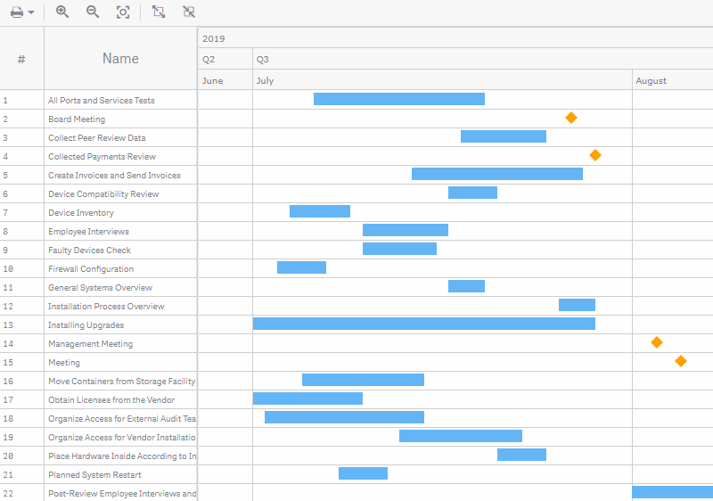
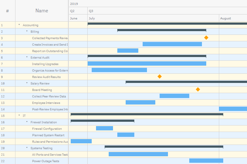
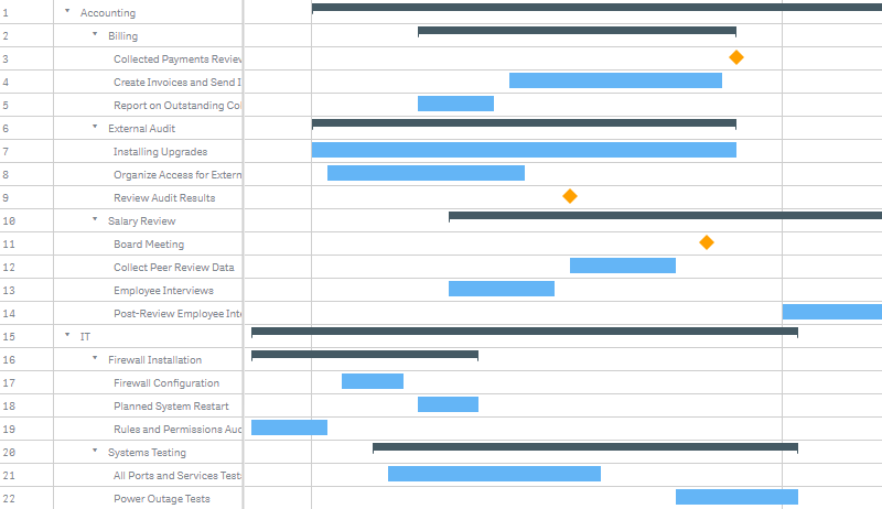
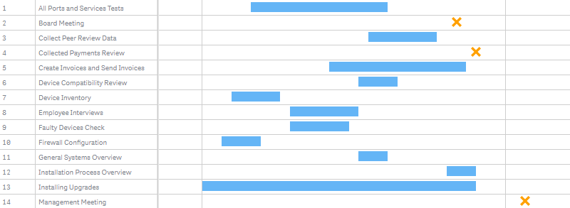
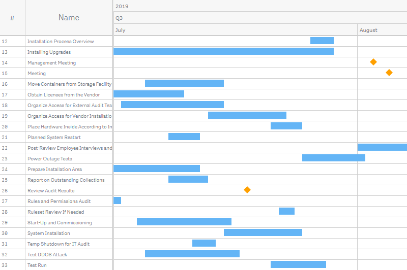
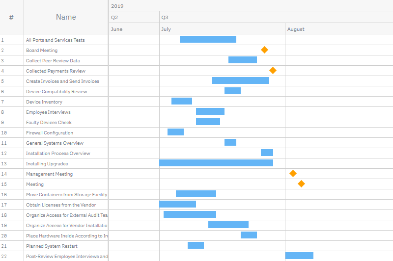
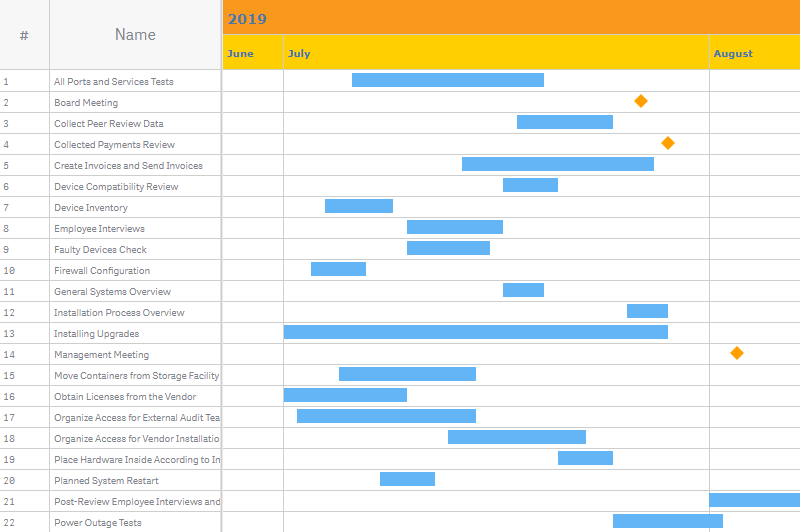
The Project Gantt chart is a tool that schedules projects over periods of time. It is possible to show the actual duration, planned duration, and progress of tasks as well as hierarchical relationships and connections between them.
Read Quick Start and Dimensions and Measures to learn how to add a Project Gantt chart and what dimensions and measures to use.
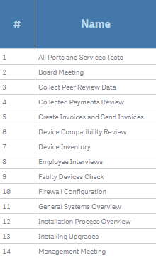
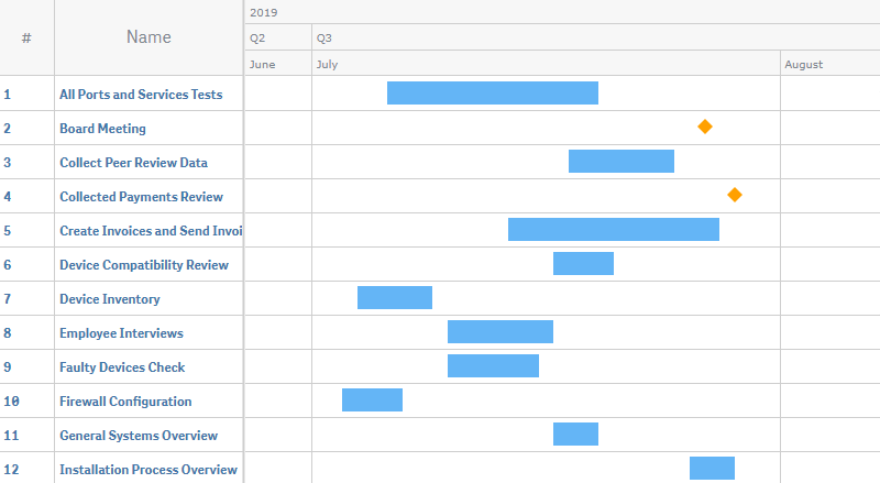
On the left side of the chart, there is a table that displays text information about dimensions and measures. By default, it includes two columns: an index column showing the indexes of rows, and a dimension column showing all dimensions.
On the right, there is the chart area, which displays elements: actual bars, representing actual durations of tasks; baseline bars, representing planned durations; milestones, representing events with zero duration; and others.
The available settings of elements include: colors / color by expression, start and end markers, labels, tooltips, and the special settings of milestones. You can also add reference lines and reference ranges, configure the scale, timeline, and toolbar, set the locale and the starting month of the fiscal year, etc.
Quick Start
This quick tutorial explains how to create a basic Project Gantt chart.
You can also check out a video tutorial: How to Create a Gantt Chart in Qlik Sense.
First of all, add an empty chart to your sheet:
- Go to Custom objects > AnyGantt in the assets panel.
- Drag an empty AnyGantt Project chart to the sheet.
Then add a dimension representing tasks:
- Go to Dimensions in the properties panel.
- Click Add dimension and select a dimension.
Finally, add two measures – the start and end dates:
- Go to Measures in the properties panel.
- Click Add measure and select a measure.
- Click Add measure and select a measure.
- Click the first measure and select Actual start from the Map as drop-down menu.
- Click the second measure and select Actual finish from the Map as drop-down menu.
Please note that you can also create dimensions and measures from fields or add them by clicking on buttons on the empty chart.
Dimensions and Measures
Dimensions
To add a dimension, do the following:
- Go to Dimensions in the properties panel.
- Click Add dimension and select a dimension.
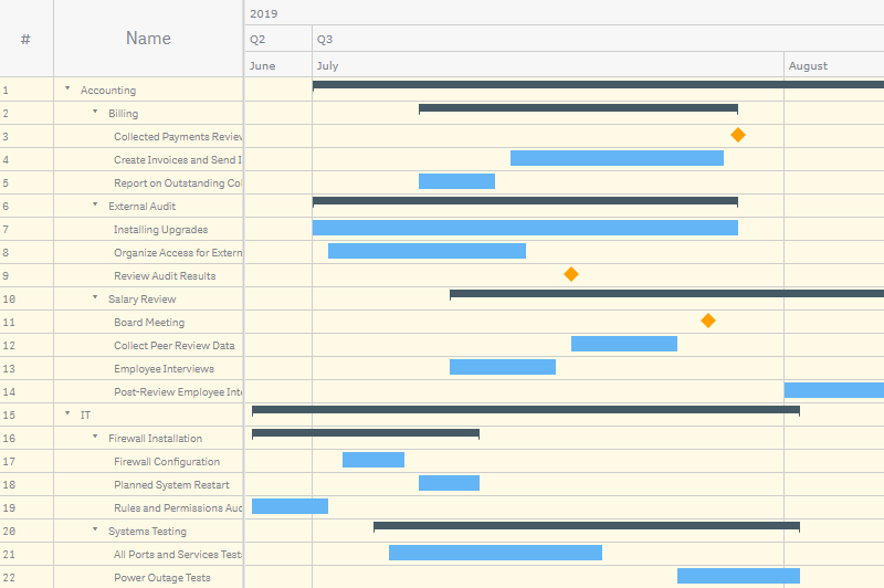
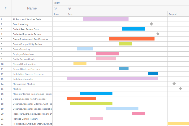
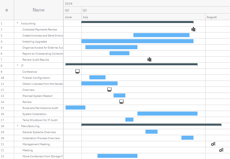
The Project chart requires only one dimension, which represents tasks. However, it is possible to add multiple dimensions. All dimensions are shown in the dimension column.
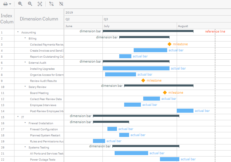
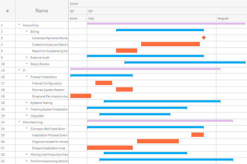
Adding multiple dimensions allows grouping tasks and creating a multilevel hierarchy. In this case, AnyGantt displays dimensions in the dimension column hierarchically, as a tree-like structure. Also, it groups actual bars and other elements under dimension bars.
Please keep in mind that you need to arrange dimensions in the correct order, from higher levels to lower ones: just drag them in the properties panel.
You can customize the text displayed in the dimension column:
- Go to Dimensions in the properties panel.
- Click a dimension.
- Enter a string value or a string expression in the Dimension column text input box.
For example, you can use numeric identifiers of tasks as a dimension and at the same time display task names in the dimension column. To do that, just enter the name of the field containing task names in the Dimension column text input box. AnyGantt works correctly only with unique identifiers, so using this feature may make sense if task names are not unique, but you still want to display them.
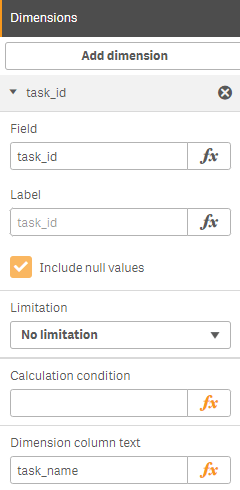
If you need to hide null values, uncheck the Include null values box in the settings of each dimension. However, if you apply this approach to an unbalanced data tree, the nodes with a smaller depth will be hidden.
To hide null values and correctly visualize an unbalanced data tree,
- Go to Add-ons > Data handling in the properties panel.
- Check the Unbalanced tree box.
Measures
To add a measure, do the following:
- Go to Measures in the properties panel.
- Click Add measure and select a measure.
You should map the measures you use: see the Mapping section below to learn more.
It is enough to add just one measure – the start date. However, in this case all tasks are shown as milestones. To create actual bars, you need to add a second measure – the end date. Use more measures to create other elements and display additional information in measure columns.
Mapping
You should map the measures you use to make them work correctly.
For example, to map the actual start and finish dates required by actual bars, do the following:
- Go to Measures in the properties panel.
- Click the first measure and select Actual start from the Map as drop-down menu.
- Click the second measure and select Actual finish from the Map as drop-down menu.
Here is the full list of available mappings and elements they correspond to:
- Actual start – actual bars, milestones
- Actual finish – actual bars
- Baseline start – baseline bars
- Baseline finish – baseline bars
- Actual progress – actual progress
- Baseline progress – baseline progress
- Data field – default mapping
Use Data field (the default mapping) if a measure represents some additional information, and you want to display it only in a measure column.
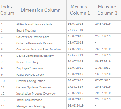
Table
The table on the left of the chart displays text information.
The index column displays the indexes of rows, the dimension column shows dimensions, and measure columns show measures. The header at the top of the table displays the titles of columns.
It is possible to change the titles and other settings of columns and to customize the appearance of the header and cells of the table.
To disable or enable the table,
- Go to Appearance > Table > in the properties panel.
- Switch the Enabled / Disabled slider.
Index Column
AnyGantt automatically creates the index column when you create a chart. It displays the indexes of rows, and its default title is #.
To configure the index column, go to Appearance > Table > Index column in the properties panel and do the following:
- To disable or enable, switch the Enabled / Disabled slider.
- To set the numbering mode, go to Numbering mode and select one of the available options.
- To set a custom title, enter your text in the Label input box.
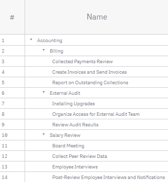
The available numbering modes include: Simple numbering (default), Hierarchical numbering, and Expression. The Expression numbering mode requires entering an expression in the Numbering expression input box.
Simple Numbering

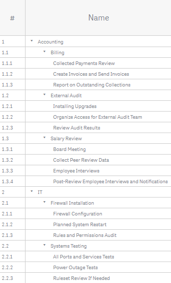
Hierarchical Numbering
Numbering by Expression
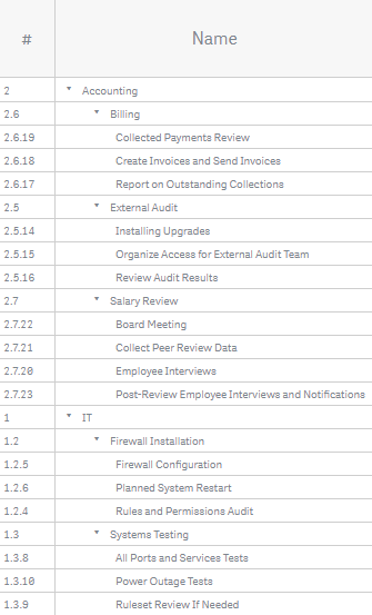
In this sample, the index column hierarchically displays the IDs of elements:
Pick(Dimensionality(), department_id, department_id & '.'
& project_id,department_id & '.' & project_id & '.' & task_id)
Dimension Column
AnyGantt automatically creates the dimension column when you create a chart. It shows all dimensions, and its default title is Name.
If there are two or more dimensions, AnyGantt displays them hierarchically, as a tree-like structure.
To customize the title of the dimension column,
- Go to Appearance > Table > Dimension column in the properties panel.
- Enter your text in the Label input box.
You can also customize the text shown in the dimension column – see the dimensions section to learn more.
Measure Columns
It is possible to add columns displaying measures. By default, their titles are measure expressions.
To create a measure column, do the following:
- Go to Measures in the properties panel.
- Click Add measure and select a measure. (Skip this step if you have already added the measure.)
- In the settings of the measure, check the Show as column box.
Do not forget to map the measure if you want to display it also as an element. If you are going to show the measure only in a column, you can keep the default mapping.
To customize the title of a measure column,
- Go to Measures in the properties panel.
- Click a measure and enter you text in the Label input box.
You can also display custom text in a measure column: add a string value or an arbitrary string expression as a measure and show it in a column. It is possible to use HTML and Unicode symbols.
- Go to Measures in the properties panel.
- Click Add measure and enter a string value or a string expression in the input box.
- Check the Show as column box.
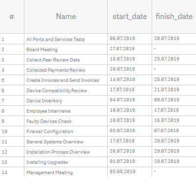
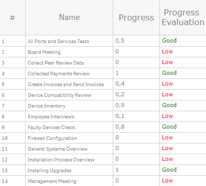
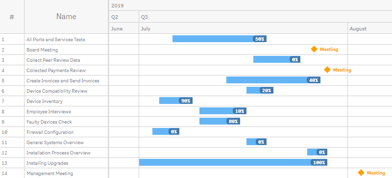
In the example below, the first measure column represents just a data field – the progress of tasks. The second one represents a string expression – it shows different text depending on the progress:
If(progress < 0.5, '<font color="red">Low</font>', '<font color="green">Good</font>')
Header
The header at the top of the table displays the titles of its columns.
The following sections explain how to customize titles:
You can also go to Appearance > Table > Header in the properties panel and configure the background and font of the header:
- To configure the background, switch the Background slider and use the Fill and Opacity options.
- To configure the font, switch the Font slider and use the Style, Color, Size, Family, and Shadow options.
Cells
To configure table cells, go to Appearance > Table > Cells in the properties panel and do the following:
- To configure the fill, select a fill type from the Fill type drop-down menu and use the available options below.
- To configure the font , switch the Font slider and use the Style, Color, Size, Family, and Shadow options.
- To set the height, use the Rows height option.
- To configure the stroke, switch the Rows stroke slider and use the Color, Stroke type, and Thickness options.
Please note that the fill, height, and stroke settings affect both the table and the area where elements are displayed.
Here the height and font of the cells are adjusted:
The table below explains the difference between different fill types and lists the settings available for each of them:
| Fill Type | Description | Settings |
|---|---|---|
| Solid | One color is applied to all rows. | Background > Fill, Opacity |
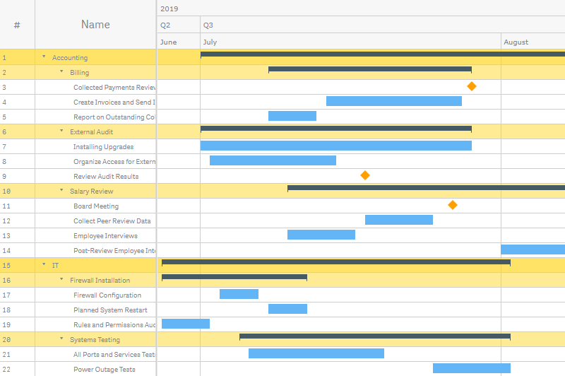
| Hierarchy | One color is applied to the rows displaying hierarchical dimensions. | Background base color > Fill, Opacity |
| Odd/even | Two colors indicate the the odd and even rows. | Background odd row > Fill, Opacity Background even row > Fill, Opacity |
Solid Fill
Hierarchy Fill
Odd/Even Fill
Elements
Elements are the parts of the Project Gantt chart that represent time intervals (corresponding to tasks) as well as information related to them.
Here are the types of elements that are available in AnyGantt Extension for Qlik:
This section explains the difference between the types and how to add them. To learn how to configure elements, read the Settings of Elements section.
Actual Bars
Actual bars show the actual duration of tasks, while baseline bars represent the planned duration.
To add actual bars, you need to add two measures – the start and end dates. Do the following:
- Go to Measures in the properties panel.
- Click Add measure and select a measure.
- Click Add measure and select a measure.
- Click the first measure and select Actual start from the Map as drop-down menu.
- Click the second measure and select Actual finish from the Map as drop-down menu.
Milestones
Milestones are elements representing events with zero duration. They require only one measure – the start date.
To add milestones, just add actual bars. If in your data there are items with only start dates, AnyGantt automatically displays them as milestones.
You can also enable previews of milestones on dimension bars.
Dimension Bars
Dimension bars represent groups of tasks. You can group dimension bars under other dimension bars to create a multilevel hierarchy. In addition, dimension bars can display previews of their child milestones.
To add dimension bars, add extra dimensions to the chart:
- Go to Dimensions in the properties panel.
- Click Add dimension and select a dimension.
Please keep in mind that you need to arrange dimensions in the correct order, from higher levels to lower ones: just drag them in the properties panel.
AnyGantt automatically calculates the duration of each dimension bar from its children. In case you apply aggregation functions to the actual start and actual finish measures, the duration is calculated by these functions.
To disable or enable)dimension bars,
- Go to Appearance > Dimension bars in the properties panel.
- Switch the Enabled / Disabled slider.
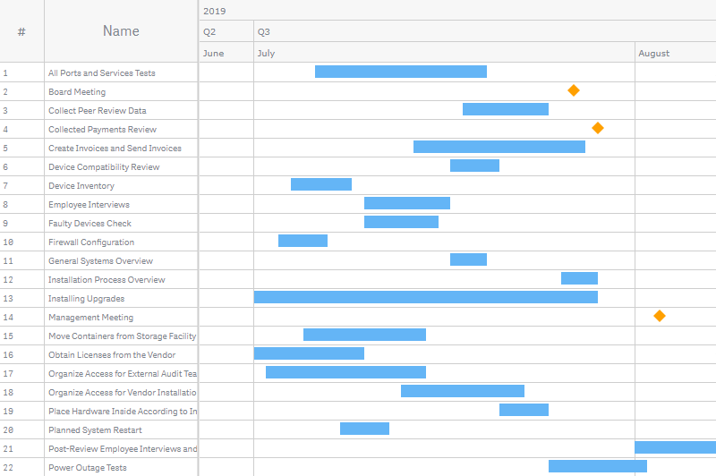
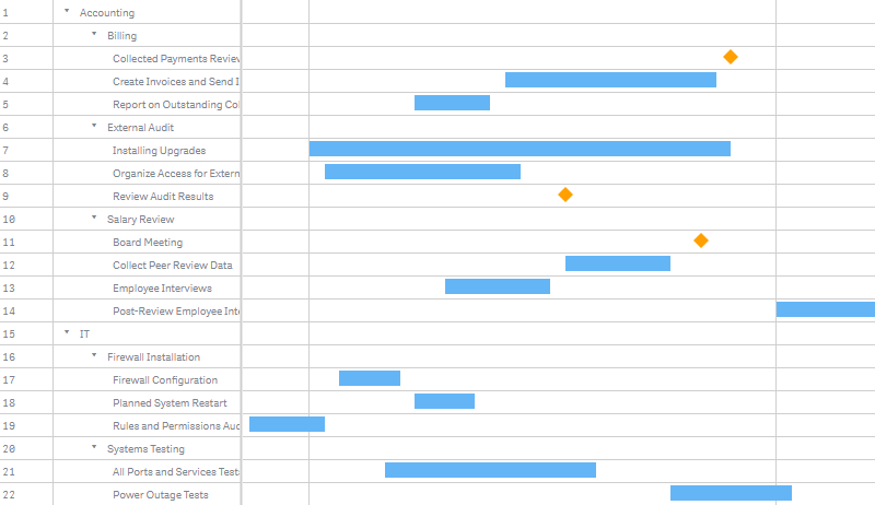
Groups of tasks will be shown only in the table:
Baseline Bars
Baseline bars show the baseline (planned) duration of tasks.
To add baseline bars, you need to add two measures – the baseline start and end dates. Do the following:
- Go to Measures in the properties panel.
- Click Add measure and select a measure.
- Click Add measure and select a measure.
- Click the first measure and select Baseline start from the Map as drop-down menu.
- Click the second measure and select Baseline finish from the Map as drop-down menu.
Actual Progress
You can show the actual progress of tasks. AnyGantt displays it as bars placed over actual bars.
To add the actual progress, do the following:
- Go to Measures in the properties panel.
- Click Add measure and select a measure.
- In the settings of the measure, select Actual progress from the Map as drop-down menu.
If you add dimension bars to your visualization, they will also have progress bars over them.
AnyGantt automatically calculates the progress of each dimension bar from its children. In case you apply an aggregation function to the actual progress measure, the progress is calculated by this function.
To disable or enable progress bars attached to dimension bars,
- Go to Appearance > Dimension bars in the properties panel.
- Switch the Display progress slider.
Baseline Progress
You can show the baseline (planned) progress of tasks. AnyGantt displays it as bars placed over baseline bars.
To add the baseline progress, do the following:
- Go to Measures in the properties panel.
- Click Add measure and select a measure.
- In the settings of the measure, select Baseline progress from the Map as drop-down menu.
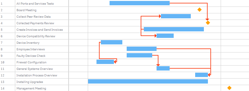
Connectors
Connectors are elements showing the dependencies between tasks.
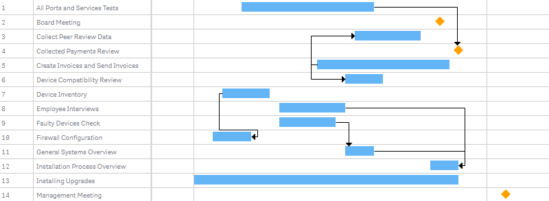
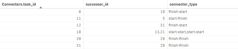
To add connectors, in your data you should specify the identifiers of predecessor and successor tasks and the type of each connector.
In this table, the first column (Connectors.task_id) contains the IDs of predecessor tasks, the second column (successor_id) contains the IDs of successor tasks, and the third one (connector_type) contains the types of connectors:
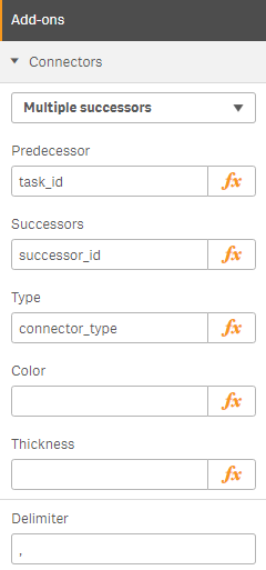
Then you need to do the following:
- Go to Add-ons > Connectors in the properties panel.
- Select Multiple successors or Multiple predecessors from the drop-down menu.
- Specify Predecessor(s).
- Specify Successor(s).
- Specify Type.
- Specify the Delimiter you use with multiple successors or predecessors.
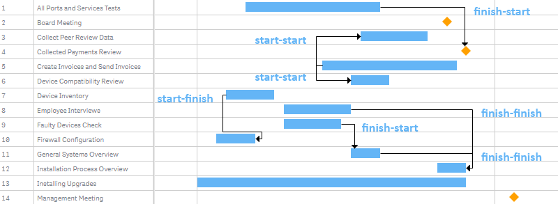
There are four connector types:
| Type | Description |
|---|---|
| start-start | The predecessor must start before the successor can start. |
| start-finish | The predecessor must start before the successor can finish. |
| finish-start | The predecessor must finish before the successor can start. |
| finish-finish | The predecessor must finish before the successor can finish. |
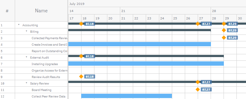
Please note that a task can have several predecessors and successors. Also, a task can be at the same time a successor to one task or tasks and a predecessor to another. All these nuances are illustrated below:
Settings of Elements
Colors
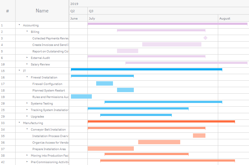
You can color the elements of the chart as you like. Two options are available: default coloring, which is described in this section, and coloring by expression, described in the section below.
To change the default colors and additional settings of the fill and stroke, go to Appearance > Defaults in the properties panel, click an element type you want to adjust, and do the following:
- To configure the fill, select a fill type from the Fill type drop-down menu and use the available options below.
- To configure the stroke, use the Stroke, Stroke type, and Thickness options.
All elements except for dimension bars and connectors support the following fill types and settings:
| Fill Type | Description | Settings |
|---|---|---|
| Solid | One color is applied to all elements. | Color Opacity |
| Palette | Elements are colored by a built-in palette. | Palette selection Reverse colors Opacity |
| Parent-dependent | Elements inherit the colors of their parents: baseline progress bars inherit the colors of baseline bars, and other elements inherit the colors of dimension bars (if there are any). | Opacity |
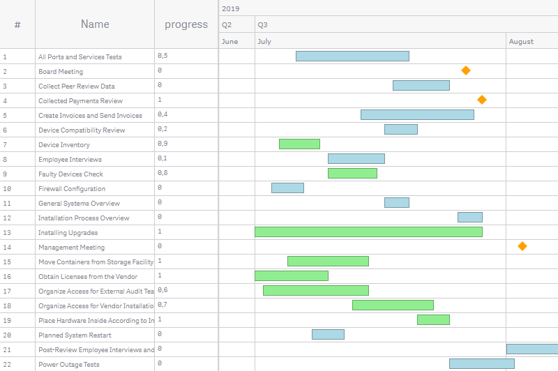
Here the actual bars are colored by a palette, and the fill of the milestones is solid:
For dimension bars, these fill types and settings are available:
| Fill Type | Description | Settings |
|---|---|---|
| Solid | One color is applied to all dimension bars. | Color Opacity |
| Depth level | Dimension bars are colored by a built-in palette according to their place in the hierarchy. | Palette selection Reverse colors Opacity |
| Parent-dependent | At the top level of the hierarchy, dimension bars are colored by a built-in palette. At the lower levels, they inherit the colors of their parents. | Palette selection Opacity |
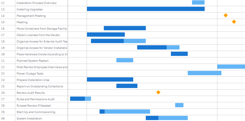
In this screenshot, the dimension bars are colored by depth level. The fill of the actual bars and milestones is parent-dependent: they are colored by the same palette (as the dimension bars) according to their depth level.
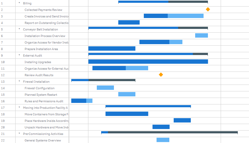
Here the parent-dependent fill is applied to all the elements:
To configure the stroke of connectors,
- Go to Defaults > Connectors in the properties panel.
- Use the Color, Stroke type, and Stroke thickness input boxes.
Color by Expression
You can color the elements of the chart as you like. Two options are available: default coloring, which is described above, and coloring by expression, described in this section.
Coloring by expression sets colors using a user-defined expression. When coloring by expression, you can define both what colors to use and which values to use them with, enabling more control over how colors are used in the visualization. For example, you might highlight values of particular interest, or differentiate between values within different value ranges. Coloring by expression can also be used to color a visualization by values not included within a visualization, such as coloring tasks by the country, importance, or RAG.
To color an element by expression, do the following:
- Go to Add-Ons > Data settings in the properties panel.
- Click Add setting.
- Select an element from the first drop-down menu.
- Select the Color string option from the second drop-down menu.
- Enter an expression in the input box.
To color dimension bars by expression,
- Go to Dimensions in the properties panel.
- Click a dimension.
- Go to Configuration.
- Select the Color string option from the drop-down menu.
- Enter an expression in the input box.
To color connectors by expression,
- Go to Add-ons > Connectors in the properties panel.
- Use the Color and Thickness input boxes.
Examples
Here are a few examples to show what you can do with expressions by color.
Example: Coloring by single measure value
If(progress > 0.5, 'lightgreen', 'lightblue')In this example, there is a condition. If the progress of tasks is > 0.5 (50%), the corresponding actual bars will be colored 'lightgreen', otherwise they will be colored 'lightblue'.
Example: Coloring by multiple measure values
If(Interval(finish_date) - Interval(start_date) > 10, 'lightgreen',
If(Interval(finish_date) - Interval(start_date) > 5, 'lightblue', 'lightgray'))
In this example, there are multiple conditions. If the duration of tasks is > 10 days, the corresponding actual bars will be colored 'lightgreen'. If the duration is 10–5 days, the the corresponding actual bars will be colored 'lightblue'. All other actual bars will be colored 'lightgray'.
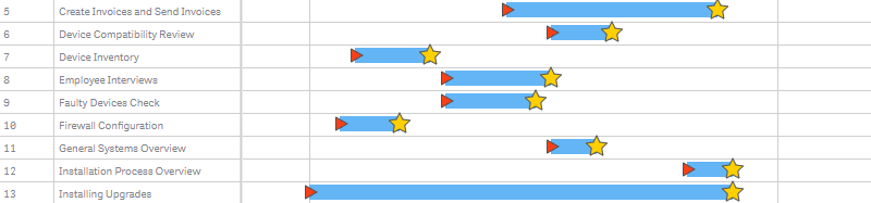
Start and End Markers
You can enable the start and / or end markers of any element (except for connectors and milestones):
- Go to Appearance > Defaults in the properties panel.
- Click an element.
- Go to Start marker or End marker.
- Switch the Disabled / Enabled slider.
To configure them, use the options below:
- To set the type (shape), select one of the built-in types from the Type drop-down menu.
- To configure the fill and stroke, use the Fill, Stroke, and Thickness options.
- To set the size, use the Size option.
Labels
Labels are text objects displaying additional information about elements. Each element type has its own label settings.
By default, there are no labels on the chart. To enable them for an element, just set its label text. AnyGantt will display labels in each row where this element appears.
Please note that it is possible to set the label text either as a string value or as an arbitrary string expression. Using expressions allows you to highlight values of particular interest, display values not included within a visualization or results of calculations, and so on.
To add labels to an element, do the following:
- Go to Add-ons > Label settings in the properties panel.
- Click Add label.
- Select an element from the first drop-down menu.
- Select the Text option from the second drop-down menu.
- Enter a string value or a string expression in the input box.
To configure them, use the options below:
- To set the position, use the Align and Offset options.
- To configure the background, switch the Background slider and use the Fill, Opacity, Corner type, Border type, and Border radius options.
- To configure the font, switch the Font slider and use the Style, Color, Size, Family, and Shadow options.
- To set the character limit, switch the Character limit slider and enter a number in the input box.
To enable and configure the labels of dimension bars (separately for each dimension),
- Go to Dimensions in the properties panel.
- Click a dimension.
- Go to Label.
- Select the Text option from the drop-down menu.
- Enter a string value or a string expression in the input box.
- Use the options below to configure the position, background, font, etc.
Dimension bars can also display previews of milestones and their labels.
In the example below, the labels of actual bars and milestones have different text, background, and font settings. The labels of milestones display the string value 'Meeting', and the labels of actual bars display the following expression:
progress*100 & '%'
Tooltips
Tooltips are text boxes that appear when the user hovers over the rows of the chart. You can set a custom tooltip text for each element type.
Please note that it is possible to set the tooltip text either as a string value or as an arbitrary string expression. Using expressions allows you to highlight values of particular interest, display values not included within a visualization or results of calculations, and so on.
Also, you can use HTML in tooltips.
To disable or enable tooltips, go to Interactivity in the properties panel and switch the Tooltips slider.
To configure tooltips, go to Add-ons > Tooltip settings in the properties panel and do the following:
- To configure the background, switch the Background slider and use the Fill, Opacity, and Border radius options.
- To configure the font, switch the Font slider and use the Style, Color, Size, and Family options.
Here is how the background and font of tooltips may look like after configuration:
To set the tooltip text and character limit of an element, do the following:
- Go to Add-ons > Tooltip settings in the properties panel.
- Click Add tooltip.
- Select an element from the drop-down menu.
- Enter a string value or a string expression in the input box.
- Switch the Character limit slider and enter a number in the input box.
(This option will be available only after setting the text.)
To set the tooltip text and character limit of dimension bars (separately for each dimension),
- Go to Dimensions in the properties panel.
- Click a dimension.
- Enter a string value or a string expression in the Tooltip text input box.
- Switch the Character limit slider and enter a number in the input box.
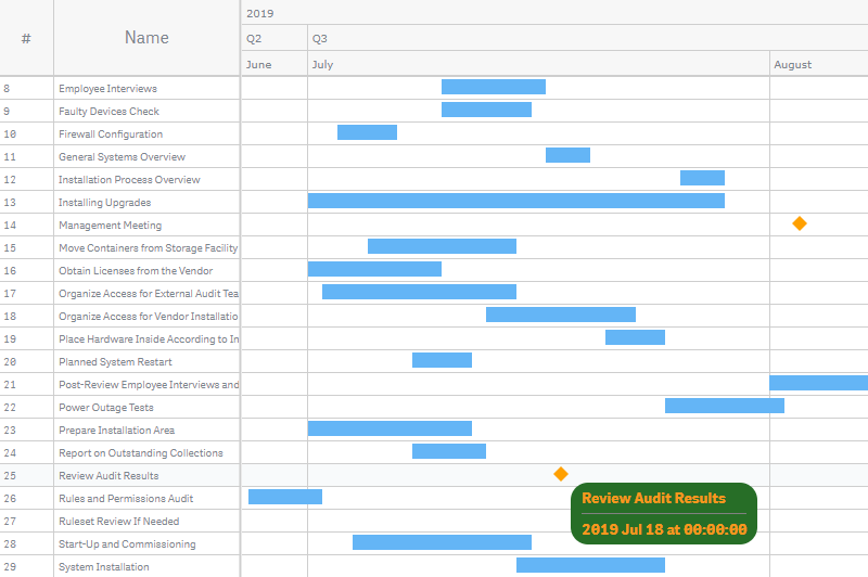
Here is an example of an expression for configuring the tooltip text of actual bars:
'<b>' & task_name & '</b>' &
'<br><i>' & employee_name & '</i>' &

'<br><br>Dates: ' &
Date(start_date, 'MM.DD') & ' – ' & Date(finish_date, 'MM.DD') &
'<br>Baselines: ' &
Date(baseline_start_date, 'MM.DD') & ' – ' & Date(baseline_finish_date, 'MM.DD') &
'<br>Duration: ' & (Interval(finish_date) - Interval(start_date)) & ' days' &
'<br>Progress: ' & progress*100 & '%'
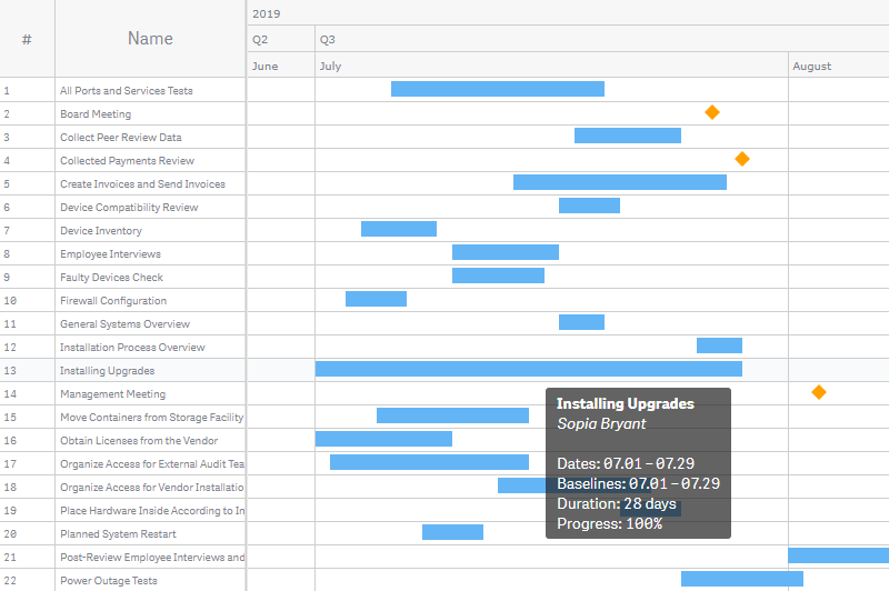
Baseline bars do not have separate tooltips. However, if they are enabled, the tooltips of actual bars and dimension bars display additional information – baseline dates. To adjust this text, you should select the With baseline bars option as the element type.
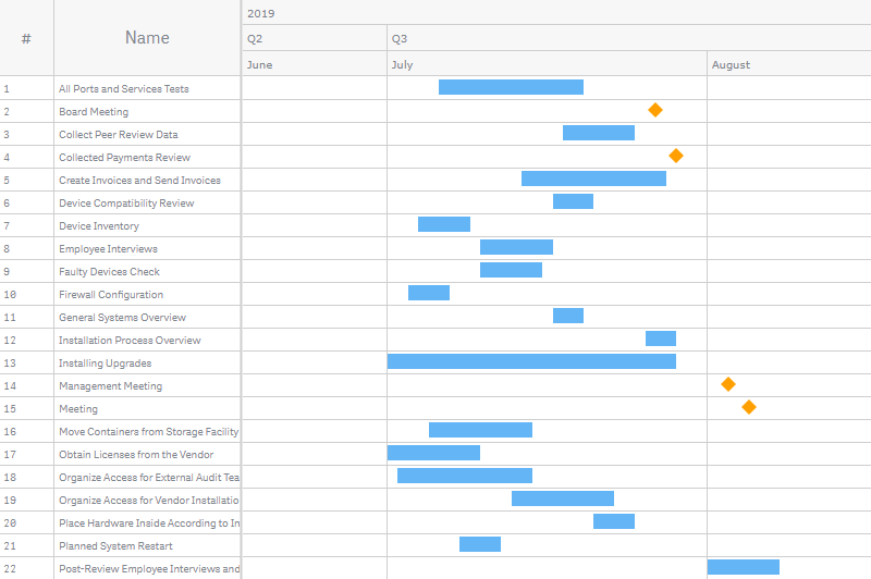
Settings of Milestones
Milestones support the following features: Colors, Color by Expression, Tooltips, Labels. They also support some special settings, described in the subsections below.
Type and Size
In the Appearance > Defaults > Milestones section of the properties panel, you can adjust the type and size (as well as colors) of milestones.
To set the size, use the Size option.
To set the type, use one of the following options:
 |
Click the "icon" pictogram and select a built-in icon (shape) from the drop-down menu. |
 |
Click the "image" pictogram and enter a link to a custom image in the Image URL input box. |
Here is one of the built-in icons:
You can also use a user-defined expression to assign different custom images to different milestones:
- Go to Add-Ons > Data settings in the properties panel.
- Click Add setting.
- Select Milestones from the first drop-down menu.
- Select the Image url option from the second drop-down menu.
- Enter an expression in the input box.
In the example below, milestones belonging to different groups are represented as different images. The following expression is used:
If(department_name = 'IT', 'https://qlik.anychart.com/static/qlik-demo-apps/milestone-icon-it.jpg',
If(department_name = 'Accounting', 'https://qlik.anychart.com/static/qlik-demo-apps/milestone-icon-accounting.jpg',
If(department_name = 'Manufacturing', 'https://qlik.anychart.com/static/qlik-demo-apps/milestone-icon-manufacturing.jpg')))
Previews
You can display the previews of milestones on dimension bars. If milestones have labels, it is possible to display the previews of labels as well.
To display or hide previews, do the following:
- Go to Appearance > Defaults > Dimension bars in the properties panel.
- Switch the Milestones preview slider.
To configure previews,
- To draw previews only on collapsed dimension bars, check the Draw on collapsed only box.
- To manage overlapped labels, uncheck or check the Hide overlapped box.
In this screenshot, the previews of milestones are enabled. As you can see, the dimension bars display them in both the expanded and collapsed states:
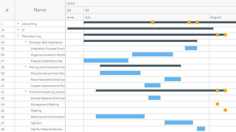
Here the dimension bars display the previews of milestones with their labels:
Other Features
Reference Lines
A reference line is a line intersecting the chart area from a given point on the timeline.
You can add one or several reference lines to a chart to indicate a certain date or dates. The reference line is only drawn if it falls within the current display range.
Please note that it is possible to specify the value defining the position of a reference line either as a date value or as an arbitrary date expression.
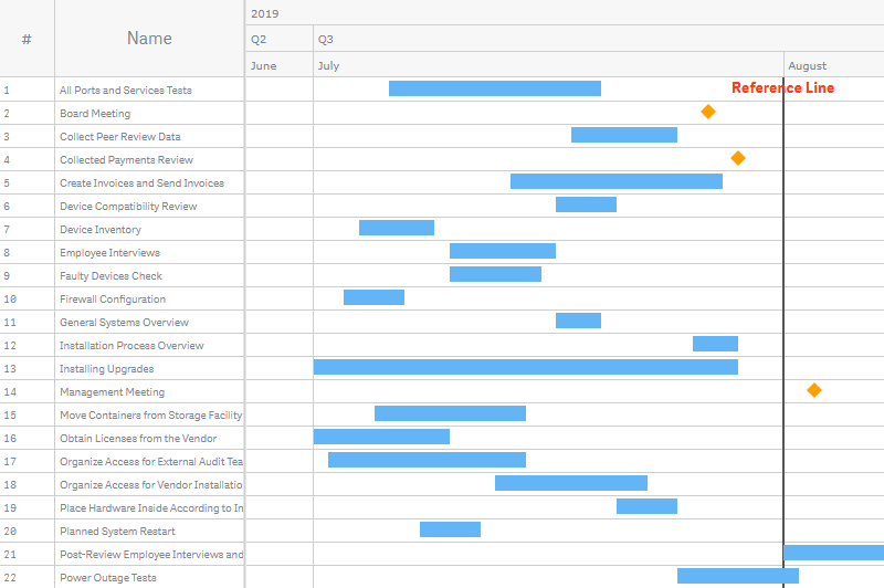
To add a reference line, do the following:
- Go to Add-ons > Reference lines in the properties panel.
- Click Add reference line.
- Enter a date value or a date expression in the Date input box.
Then configure it:
- To add a text label, enter a text string in the Label input box.
- To configure the stroke, use the Stroke, Stroke type, and Thickness options.
- To configure the position of the label, use the Label orientation and Label position options.
- To configure the font, switch the Font slider and use the Style, Color, Size, Family, and Shadow options.
Reference Ranges
A reference range is an area intersecting the chart area from a given range of points on the timeline.
You can add one or several reference ranges to a chart to indicate a certain period or periods of time. The reference range is only drawn if it falls within the current display range.
Please note that it is possible to specify the values defining the position of a reference range either as date values or as arbitrary date expressions.
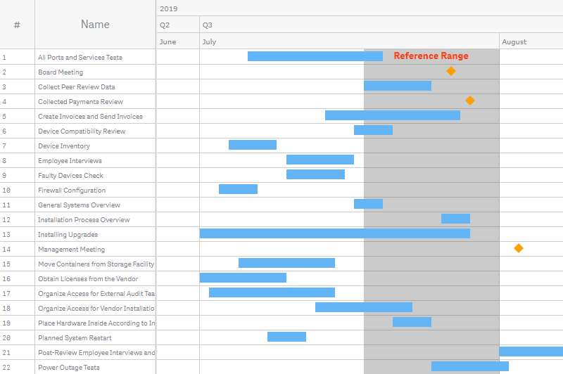
To add a reference range, do the following:
- Go to Add-ons > Reference range in the properties panel.
- Click Add reference range.
- Enter a date value or a date expression in the From input box.
- Enter a date value or a date expression in the To input box.
Then configure it:
- To add a text label, enter a text string in the Label input box.
- To configure the fill, use the Color and Opacity options.
- To configure the position of the label, use the Label orientation and Label position options.
- To configure the font, switch the Font slider and use the Style, Color, Size, Family, and Shadow options.
Scale
AnyGantt Extension operates a scale, which you can configure. It is possible to set the range of dates the chart displays by default as well as the minimum and maximum of the scale.
Please note that you can specify all these dates either as date values or as arbitrary date expressions.
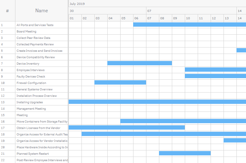
Default Display Range
By default, the chart is zoomed out to the maximum. It can also be zoomed in to a custom range of dates. However, users will be still able to zoom the chart out by using the toolbar (or mouse wheel) – if the minimum and maximum of the scale allow for it.
To set the default display range, do the following:
- Go to Appearance > Scale > Display range in the properties panel.
- Switch Display range from Auto to Custom.
- Enter a date value or a date expression in the From input box.
- Enter a date value or a date expression in the To input box.
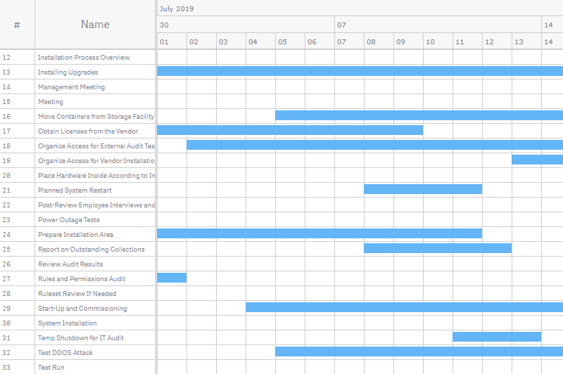
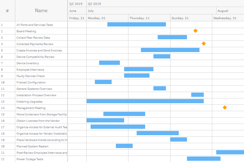
In the following example, the default display range is set to July 1st and 15th, 2019:
-
Date#('07.01.2019', 'MM.DD.YYYY') -
Date#('07.15.2019', 'MM.DD.YYYY')
Here is how the chart with these settings looks like by default:
Minimum and Maximum
When you zoom the chart out to the maximum by using the toolbar (or mouse wheel), you see the range of dates between the minimum and maximum of the scale. By default, AnyGantt adjusts them to display all the elements of the chart.
To set the minimum date of the scale,
- Go to Appearance > Scale > Minimum in the properties panel.
- Switch Minimum from Auto to Custom.
- If necessary, check the Soft box to enable the soft mode.
- Enter a date value or a date expression in the input box.
To set the maximum date of the scale,
- Go to Appearance > Scale > Maximum in the properties panel.
- Switch Maximum from Auto to Custom.
- If necessary, check the Soft box to enable the soft mode.
- Enter a date value or a date expression in the input box.
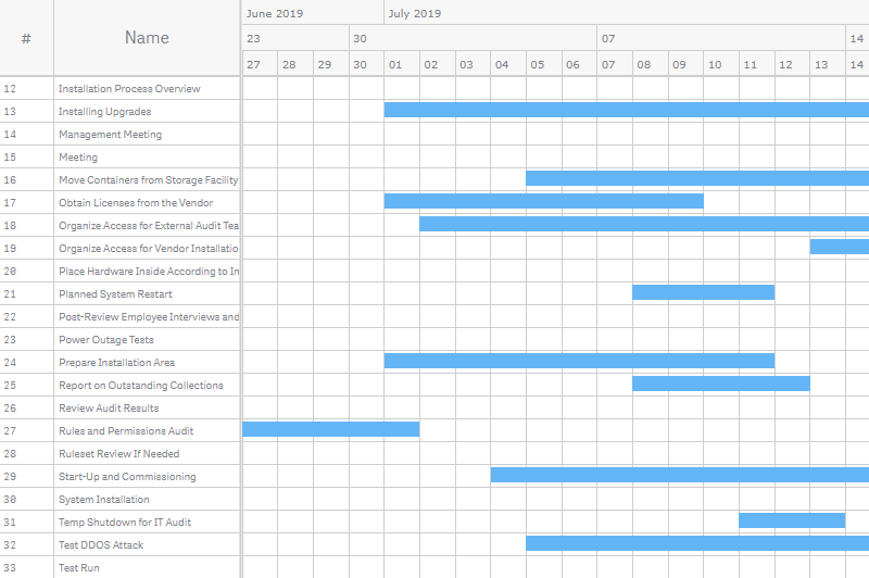
In this example, the minimum is set to 10 days before the earliest actual start date, and the maximum is set to 10 days after the latest actual finish date:
-
Min(start_date) - 10 -
Max(finish_date) + 10
Here is how the chart with this settings looks like when it is zoomed out to the maximum:
Soft Mode
To enable the soft mode, check the Soft box when you set the minimum and maximum of the scale.
The soft mode adjusts the minimum and maximum to the elements of the chart. It matters when there are elements or parts of elements earlier than the minimum or later than the maximum.
For example, if you set the minimum to July 1st, 2019 and enable the soft mode, the chart will still show all the elements and parts of elements that are earlier than this date. Enabling the soft mode for both the minimum and maximum ensures that it is always possible to zoom the chart out (by using the toolbar) to see all elements.
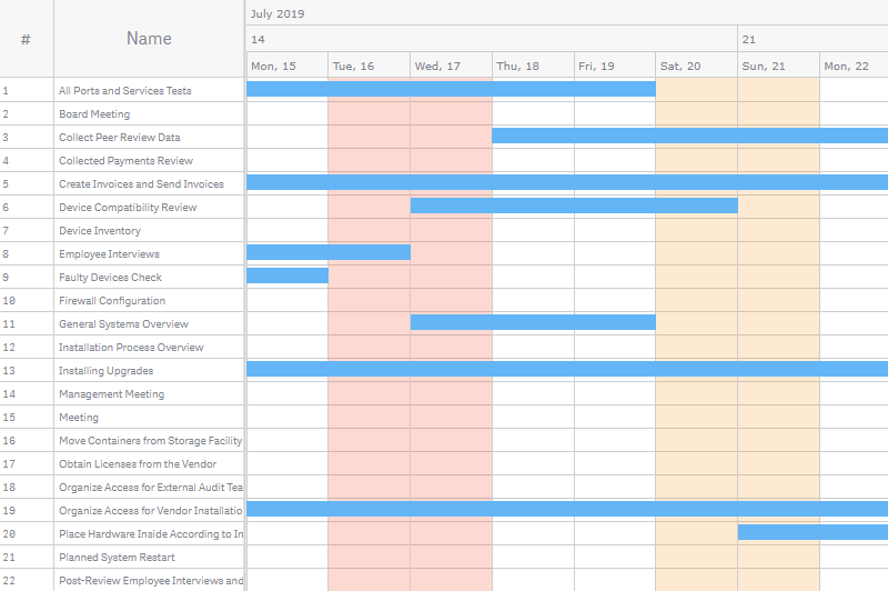
Below there is a Gantt chart with the minimum and maximum of the scale set to July 1st and 15th, 2019:
-
Date#('07.01.2019', 'MM.DD.YYYY') -
Date#('07.15.2019', 'MM.DD.YYYY')
The soft mode is disabled for both the minimum and maximum:
Here is the same chart with the soft mode enabled only for the minimum:
Here the soft mode is enabled only for the maximum:
Gaps
You can add a minimum and a maximum gap – blank spaces to the left and to the right of the space occupied by elements:
- Go to Appearance > Scale > Gaps in the properties panel.
- Switch Gaps from Auto to Custom.
- Select Percents or Pixels from the Unit type drop-down menu.
- Use the Minimum gap and Maximum gap options.
Also, please make sure that the Minimum and Maximum sliders above are switched to Auto: the minimum and maximum settings override the settings of gaps.
Here the minimum gap is set to 20% and the maximum to 50%:
Timeline
A timeline is a set of rows (levels) above the chart area, where dates are displayed.
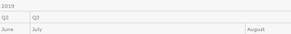
The presentation of dates and intervals in the timeline is affected by the fiscal year settings and the locale.
Timeline Levels
By default, there are three levels in the timeline. Each level displays a certain time unit, depending on the current zoom level and the settings of zoom levels.
To open the settings of a level, do the following:
- Go to Appearance > Timeline in the properties panel.
- Click Top level / Middle level / Bottom level
Then configure it:
- To disable or enable, switch the Enabled slider.
- To set the fill color, use the Fill option.
- To configure the font, switch the Font slider and use the Style, Color, Size, Family, and Shadow options.
Zoom Levels
The chart can be zoomed in and out by using the toolbar (or mouse wheel). At each zoom level, timeline levels display certain time units. To set them,
- Go to Appearance > Timeline in the properties panel.
- Click Zoom levels to open the window with settings.
- Configure zoom levels.
- Click Save and Close.
Here is the window with the default settings of zoom levels:
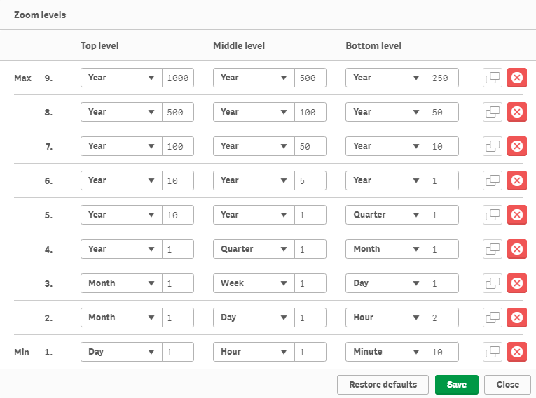
By default, there are 9 zoom levels. The maximum available number of levels is also 9. In the Zoom levels window, you can delete and duplicate levels by clicking on the buttons to the right of them. To restore the default settings, click Restore defaults.
Each zoom level contains the settings of the three timeline levels: Top level, Middle level, and Bottom level. For each timeline level, you can specify a time unit and a number of units.
You should specify the largest time unit for the Top level of the timeline and the smallest unit for the Bottom level. The same logic applies to zoom levels: the first level on the list (marked as Max) is the level displayed when the chart is fully zoomed out, and the timeline displays the largest time units. The last zoom level on the list (Min) is the level displayed when the chart is fully zoomed in, and the timeline displays the smallest time units.
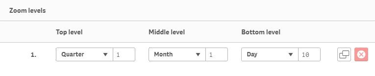
In the example below, there is a chart with only one zoom level:
Fiscal Year
You can set the starting month of the fiscal year. This setting affects only the presentation of dates and intervals in the timeline.
To configure the fiscal year, do the following:
- Go to Appearance > Fiscal year in the properties panel.
- Select This year / Next year from the first drop-down menu.
- Select a month from the second drop-down menu.
Schedule
It is possible to set and highlight the work schedule: holidays, weekends, working and non-working hours.
The highlight of holidays and weekends is visible when the chart is zoomed in to days. The highlight of working hours is visible when it is zoomed to hours. (Use the toolbar or mouse wheel to zoom the chart in and out.)
To configure holidays, go to Appearance > Schedule > Holidays in the properties panel and do the following:
- To set holidays, enter your data in the Holiday dates input box.
- To disable or enable the highlight, switch the Highlight slider.
- To configure the highlight, use the Color and Opacity options.
You can enter holiday dates as a string, separating them by a comma:
'07.16.2019, 07.17.2019'You can also use a data field containing holiday dates. Combine them with the Concat() function:
Concat(holiday_date, ',')To configure weekends, go to Appearance > Schedule > Weekends in the properties panel:
- To set weekend days, click the buttons representing the days of the week.
- To disable or enable the highlight, switch the Highlight slider.
- To configure the highlight, use the Color and Opacity options.
In this screenshot, two different colors highlight the weekend and two holidays:
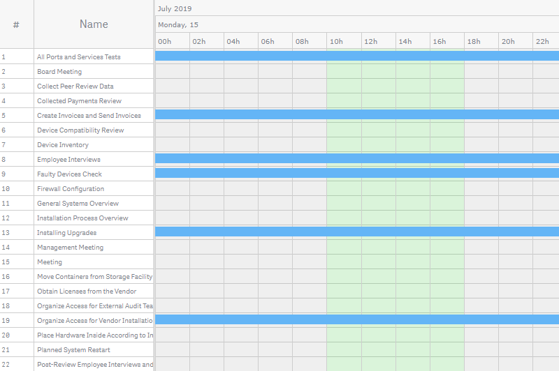
To configure working hours, go to Appearance > Schedule > Working hours in the properties panel:
- To set the start of working hours, select a time from the Start drop-down menu.
- To set the end of working hours, select a time from the End drop-down menu.
- To disable or enable the highlight of working time, switch the Highlight working time slider.
- To disable or enable the highlight of non-working time, switch the Highlight non-working time slider.
- To configure the highlights, use the Color and Opacity options under the sliders.
Here working hours are colored green, and non-working hours are colored gray:
Locale
By default, AnyGantt reads the Qlik locale and applies it to date/time formats used in the timeline and tooltips as well as to the labels of the toolbar. You can select another locale:
- Go to Appearance > Locale in the properties panel.
- Uncheck the Use Qlik locale box.
- Select a locale from the drop-down menu.
AnyGantt supports the following locales:
- Chinese (Peoples Republic of China)
- Chinese (Taiwan)
- Dutch (Netherlands)
- English (United States)
- French (France)
- German (Germany)
- Italian (Italy)
- Japanese (Japan)
- Korean (Korea)
- Polish (Poland)
- Portuguese (Brazil)
- Russian (Russia)
- Spanish (Spain)
- Swedish (Sweden)
- Turkish (Turkey)
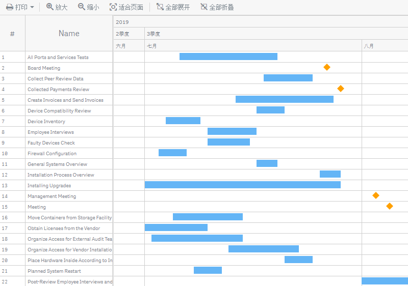
Here is a Gantt chart with the Chinese locale:
Toolbar
Toolbar is a navigation panel above the chart. It allows users to zoom the chart in and out, collapse or expand rows (if there are hierarchical relationships between them), and print the chart.
To configure the toolbar, go to Appearance > Toolbar in the properties panel and do the following:
- To disable or enable, uncheck or check the Enabled box.
- To set the type of buttons, use the Icons (default), Labels, and Both options.
- To select the print formats to be displayed in the Print drop-down menu, go to Print formats and check the corresponding boxes.
- To configure the font, switch the Font slider and use the Style, Color, Size, and Family options.
The font style and family settings affect only button labels (if they are enabled). The font size and color affect both labels and icons as well as the Print menu. Also, the text of labels is affected by the locale.
Here is how the the toolbar with different button types looks like:
| Icons |  |
| Labels |  |
| Both |  |
In this screenshot, both labels and icons are enabled, their font adjusted:
Printing
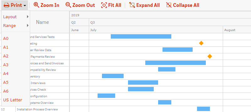
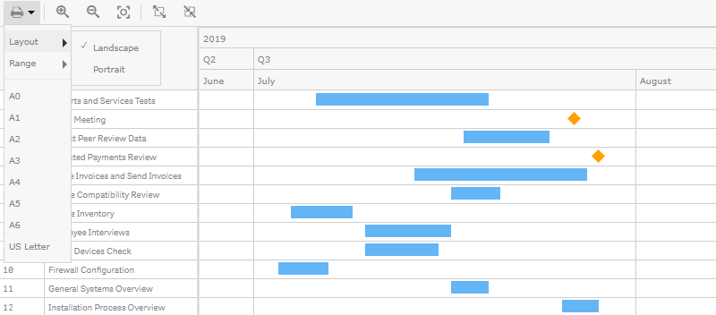
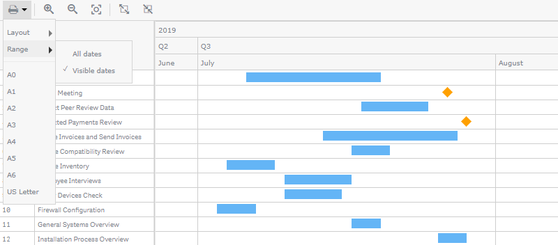
The toolbar at the top of the chart provides the interface for printing.
AnyGantt supports multipage printing and various print formats from A0 to A6. You can also select the landscape or portrait layout and specify the print range (all dates or just the visible dates).
Here is the Print drop-down menu with the available options:
To select the print formats to be displayed in the menu,
- Go to Appearance > Toolbar > Print formats in the properties panel.
- Check the corresponding boxes.
Interactivity
By default, the following interactivity features are available: selection, snapshots, and tooltips. The mouse wheel is used to vertically scroll the chart, but it can be also used to zoom it.
To disable or enable these features, go to Interactivity in the properties panel and switch the following sliders:
- Selection
- Snapshots
- Tooltips
- Zoom with mouse wheel
Expanding / Collapsing
If there are two or more dimensions, AnyGantt organizes the table and elements hierarchically. By default, the chart is drawn with all rows expanded, showing all levels of the hierarchy.
Users can collapse and expand rows with the help of buttons on the table or toolbar.

The chart can be drawn with all rows collapsed, child elements either loaded or not. To handle the state of the chart on load, go to Add-ons > Data handling in the properties panel and do the following:
- To load the whole tree or only the top level, switch the Fully expanded slider.
- To collapse or expand rows by default, switch the Collapse on load slider.
When the Fully expanded option is disabled, only the top-level parent elements are loaded. The toolbar button Expand All expands only previously loaded elements, so in this case it cannot be used to expand the whole tree at once. To load child elements, you have to manually expand their parents by using table buttons.
When the Fully expanded option is enabled, all elements of the tree are loaded. If you enable Collapse on load, the chart is drawn with all child elements collapsed, but they are still loaded. In this case, the toolbar button Expand All expands the whole tree at once.
Calculation Conditions
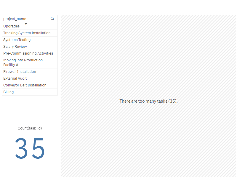
AnyGantt supports calculation conditions: you can set a condition that needs to be fulfilled (true) for the object to be displayed. If the condition is not fulfilled, a custom message is displayed.
A calculation condition is useful when a chart or table is very big and makes the visualization slow to respond. A calculation condition can then help so that for example an object does not show until the user has filtered the data to a more manageable level by applying selections.
To add a condition, do the following:
- Go to Add-ons > Data handling in the properties panel.
- Enter an expression in the Calculation condition input box.
- Enter a string value or a string expression in the Displayed message input box.
For example, the following expression allows showing the chart only when the user selects less than 20 tasks:
If(Count(task_id) < 20, 1, 0) If there are too many tasks, AnyGantt displays this message:
'There are too many tasks (' & Count(task_id) & ').'
Contate nossos representantes de vendas
Nossos Representantes de vendas estão disponíveis para falar com você e resolver quaisquer dúvidas sobre nossos produtos, licenças, compra e tudo mais.- +1 (279) 499-2767 (EUA)
- +44 (800) 0584677 (Europa)
- sales@anychart.com