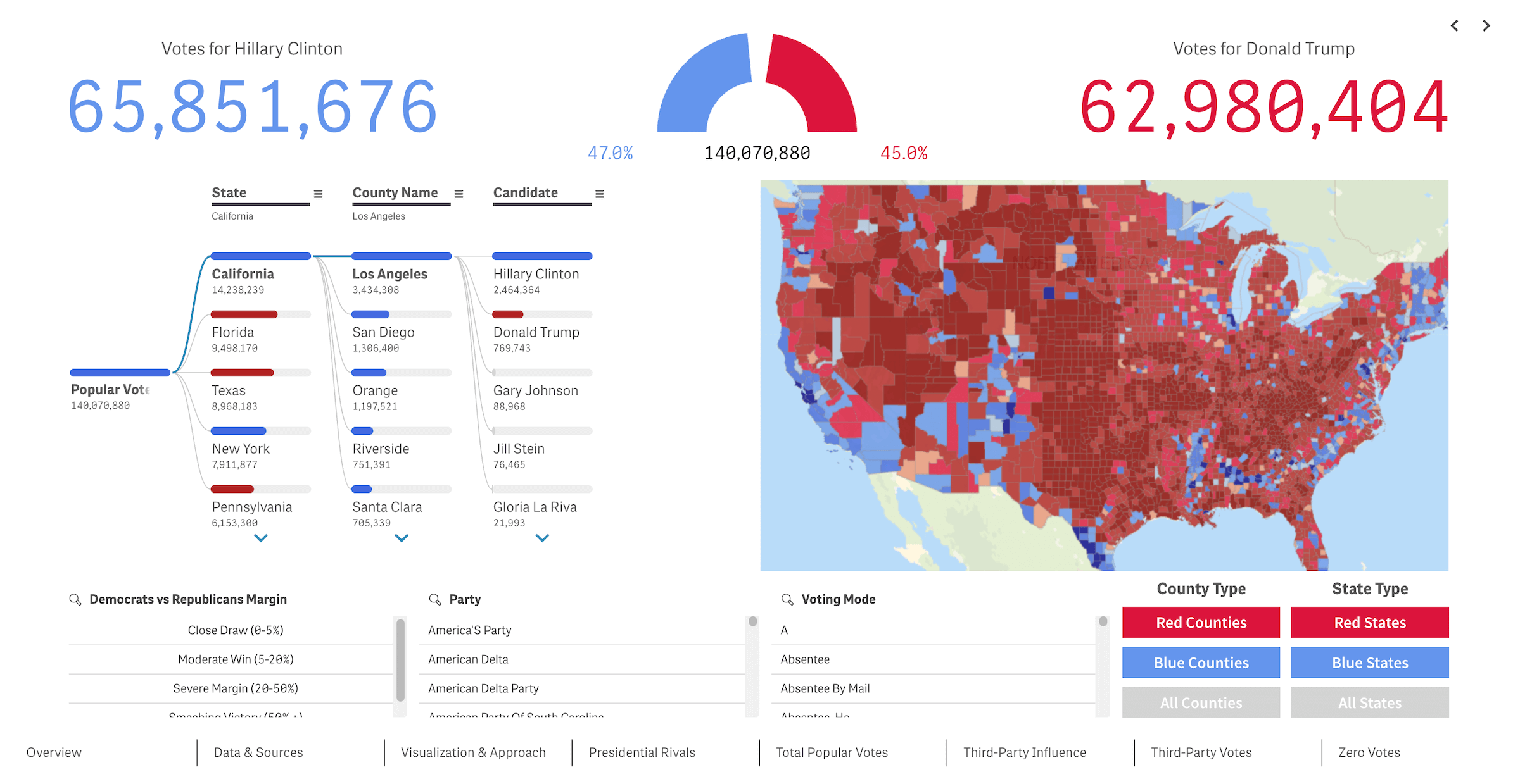
We recently released a new public Qlik Sense application that offers an interactive deep dive into U.S. presidential elections from 2016 through 2024 — our first step toward building the ultimate tool for exploring every presidential election in American history. We’re glad to see it's already been well-received in the Qlik community and attracted significant attention, especially after being featured in the Qlik Gallery.
Built using Qlik’s native visuals and enhanced with our own extensions for Qlik Sense, the app lets you analyze both popular and electoral vote results from multiple angles — with granularity down to the county level. Visualizations include bar charts, circular gauges, decomposition trees, KPI blocks, maps, and treemaps. Together, these help surface voting patterns, examine margins, compare candidates, assess third-party influence, and more — whether nationwide or in specific regions.
Yes, Daenerys Targaryen and Donald Duck even make guest appearances, visible among write-in votes — a fun reminder of how real and detailed the underlying data is. (It’s sourced from Harvard Dataverse and the MIT Election Data and Science Lab.)
We designed this app to be open-ended and adaptable — a foundation we can keep building on with new data and features. That is exactly why we’re now especially looking forward to your feedback.
The current version covers the three most recent presidential elections, but we plan to expand it significantly — adding historical data all the way back to George Washington and introducing more visual analytics tools along the way. If you have any thoughts, ideas, or suggestions, we’d truly love to hear them!
📍 View the U.S. Presidential Elections app in our Demo Apps — explore it live or download the QVF file.
💬 Share your feedback in the Qlik Gallery on Qlik Community — click Like if you enjoyed the app, and leave a comment to let us know what stood out to you or what you’d like to see improved or added. The conversation's already happening there, and we'd love for you to join in!

