
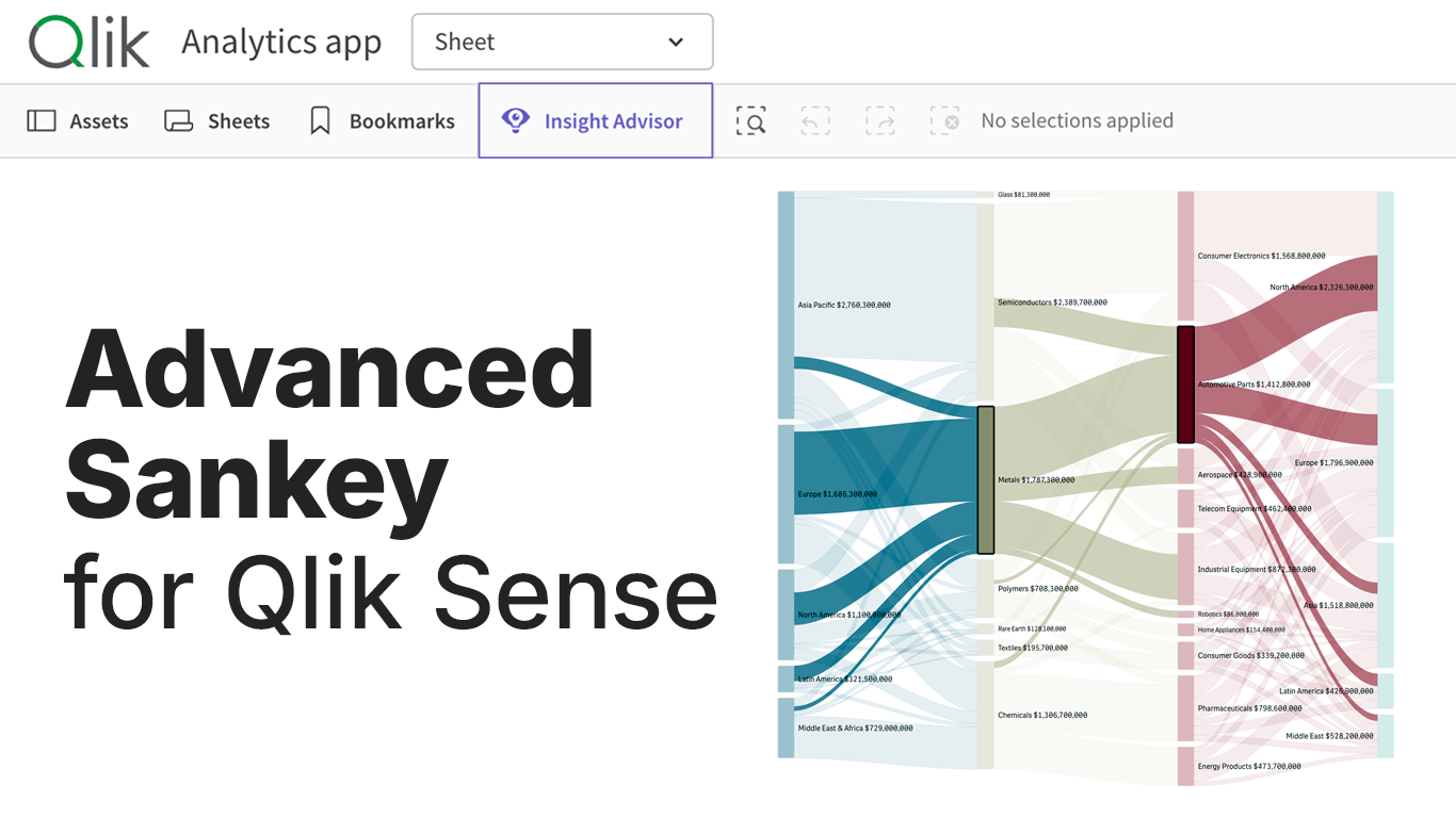
Where does the volume go? It's the question Sankey diagrams answer best, making any flow legible at a glance with proportional-width bands between stages. Qlik has had a native Sankey for years that handles simple flows well, but reality often goes further. Meet our Sankey Chart extension for Qlik Sense, built for the flows that have outgrown it.
Why a New Sankey
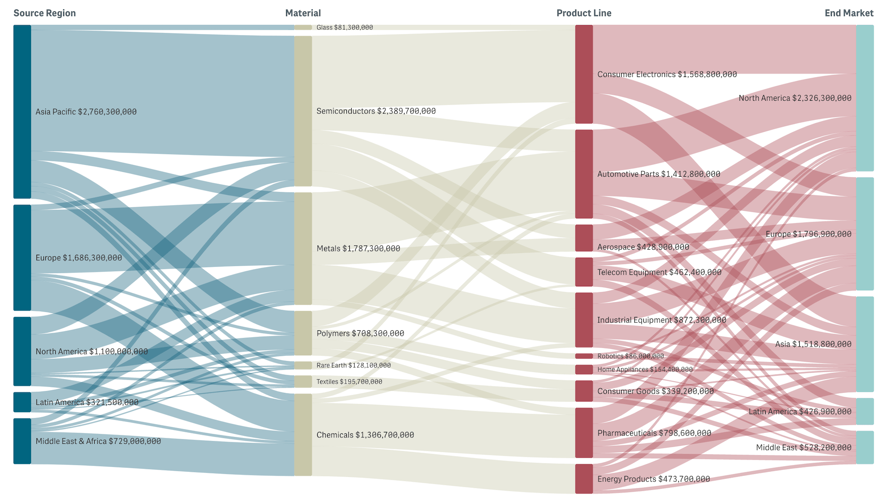
A Sankey diagram visualizes flow as columns of nodes connected by curved bands. Nodes are categories at each stage. Bands carry value, with width scaled to the size of the flow. Read left to right, you see how a starting volume distributes through stages to outcomes.
Qlik's native Sankey is the right call for shorter flow journeys, covering the basics:
- up to five stages
- source-only selection on flow click
- source-or-target link coloring
When those limits start to bite, our Sankey Chart extension takes it further:
- up to ten stages
- full flow-click selection
- richer visual context
Where It Fits
Anywhere a value flows through stages and the question is where the volume goes:
- Budget allocation and cost analysis:
How money flows from business units through departments to expense categories - Supply chain analysis:
Product flow from factories through distribution centers to retail locations - Customer journey mapping:
User paths from acquisition channels through product features to conversion or churn - Energy and resource flows:
Energy conversion from sources through generation stages to end uses - Website traffic analysis:
Visitor paths from landing pages through site sections to exit or conversion - Conversion funnels and marketing attribution:
Multi-step conversion paths or attribution across touchpoints
What Our Sankey Does Well

Up to 10 stages
Our Sankey Chart accepts up to 10 stages (dimensions), giving headroom for the deeper hierarchies and longer journeys that real-world flows often have.
Three to five stages is still the sweet spot for visual readability. The extra capacity is now there whenever your data warrants it.
Full flow-click selection
Click a link and the chart selects both source and target dimension values at once. It acts as a flow-level filter that narrows the entire Qlik model to a specific flow path in a single click.
Node clicks add multi-select within a dimension. A confirm/cancel toolbar handles applying or aborting the selection, and selections survive Qlik repaints.
Rich visual context
Gradient links blend from source node color to target node color, so you see where a flow originates and where it lands. Alternative coloring modes (by source, by target, or single color) cover dashboards that prefer simpler treatment.
Node coloring offers three modes — by dimension level, unique per node, or single color, with full support for master dimension colors.
Level headers above each column label the dimension represented, useful on charts with four or more stages where the meaning of each column might not be obvious from node names alone.
Tooltips break down each flow in detail. Hover a node and see its income, outcome, dropoff, and share of the level total. Hover a link and see source → target, the link's share of total flow, share of the source node's output, and share of the target node's input.
Three sliders fine-tune layout density: node width, node spacing, and link curvature.
Native to Qlik
Our Sankey Chart fits Qlik's standard integration set: master dimension colors, calculation conditions, story snapshots, image and data exports, and locale-aware number formatting.
See the Demo App

We built a free demo app to showcase the new Sankey chart against a global supply chain — flow from source regions through materials and product lines to end markets. Multi-stage enough to stress the chart's interactions, snappy enough to click through without waiting.
Easiest to open in your browser, but the QVF is downloadable if you'd rather load it into your own Qlik environment:
→ Explore the Sankey Chart demo app
Try the flow-level selection in particular: click a link between two stages and watch the entire sheet filter to that path.
Get Started
The Sankey Chart extension is available now:
→ Download the extension — free trial included
Install takes just a few minutes on any Qlik Sense environment:
- On Desktop, drop the extracted folder into your Extensions directory.
- On Enterprise, import the archive through Qlik Management Console.
- On Cloud, upload through the Management Console (with a
qlik.anychart.comentry in your Content Security Policy).
The installation guide in the Sankey Chart documentation walks through each part in detail.
Or if you'd rather see it against your own data with our team first:
→ Book a guided live demo
Share Feedback
Releasing v1.0 is the start, not the goal. We already have a nice roadmap in mind, but the next version that's truly worth shipping is the one shaped by the real apps you're building with Qlik.
If you try our Sankey on your data and something doesn’t work as well as you’d like — a stage layout you wish it had, a coloring mode that's missing, a flow interaction you need — let us know. Your feedback determines what the next version will bring.
The Sankey Chart joins our family of Extensions for Qlik Sense, alongside Spreadsheets, Decomposition Tree, Gantt Chart, Sunburst Chart, Circular Dendrogram, and more. See where it fits in your Qlik dashboards.