

There's a chart we've been wanting to add to the Qlik toolkit for a while. The one that shows you what a hierarchy actually looks like — not packed by value like a treemap, not stacked in rings like a sunburst, but as the parent-child tree it really is. Meet the Circular Dendrogram extension for Qlik Sense.
Why a Radial Tree
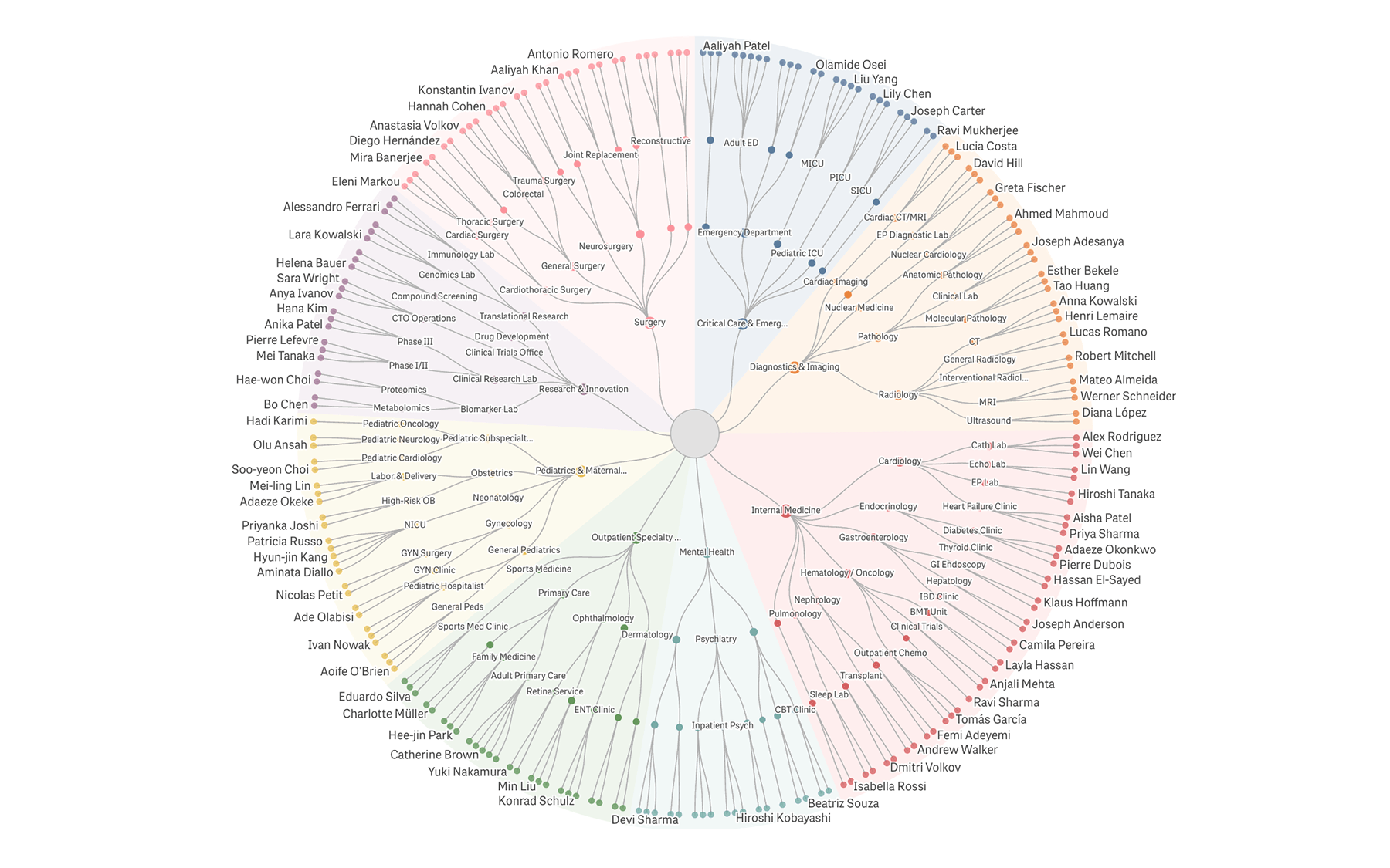
A dendrogram is a node-link tree: every parent-child relationship is drawn as an explicit edge. The radial form fits wide, deep hierarchies onto one screen, with branches fanning out from a single center to leaves on the perimeter.
Each top-level branch gets its own color from a categorical palette, and descendants inherit it, so the eye picks up structure instantly. You read the chart by following lines, not by comparing areas — which makes it the right pick when the question is about shape rather than magnitude.
Qlik Sense's built-in charts cover adjacent cases — the Org Chart for rectangular, top-down hierarchies, the Network Chart for general node-graphs — but neither renders a hierarchy as a radial tree. The Circular Dendrogram is built specifically for that layout.
Where It Fits
Anywhere you have nested categories you want to read as a tree:
- Organizational charts:
Divisions, departments, services, and individual staff in one view - Product or service taxonomies:
Categories down to individual SKUs - Account hierarchies and cost-center breakdowns:
Parent companies down to line items - File systems and folder structures:
Optionally sized by file size or file count - Biological or scientific classification:
Kingdom → phylum → class → order → family → genus
What It Does Well
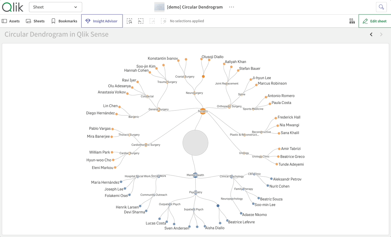
Click to trace a path
Selecting a leaf or inner node brightens its ancestor chain and dims the rest, so you see your pick in the context of the full tree.
Confirm a single-leaf selection and the chart re-renders in chain mode: a clean linear path from root to leaf with every level labeled.
Confirm a multi-leaf selection that shares an upstream ancestor, and the chart shows the shared stem plus a radial fan from the divergence point.
The visualization stays readable as the hypercube narrows. Because this is a Qlik chart, your selection cross-filters every other chart on the sheet.
Handles messy, long-tailed hierarchies
Real data rarely has clean structure.
Top-N grouping collapses small branches into a synthetic Others wedge, recursively at each level or just at the top.
A label density slider keeps perimeter labels from colliding.
Arc extent options render the chart as a full circle (360°), a three-quarter arc (270°), or a semi-circle (180°) for narrow cells.
An optional center node hosts chart-wide totals and doubles as a clear-selection button.
Native to Qlik
Story snapshots, image and data exports, and locale-aware number formatting all work out of the box. Your measure's qNumFormat and the tenant's locale separators are honored everywhere. A measure formatted as $#,##0.00 looks the same in tooltips, perimeter labels, and the center tooltip. No surprises.
See It in Action
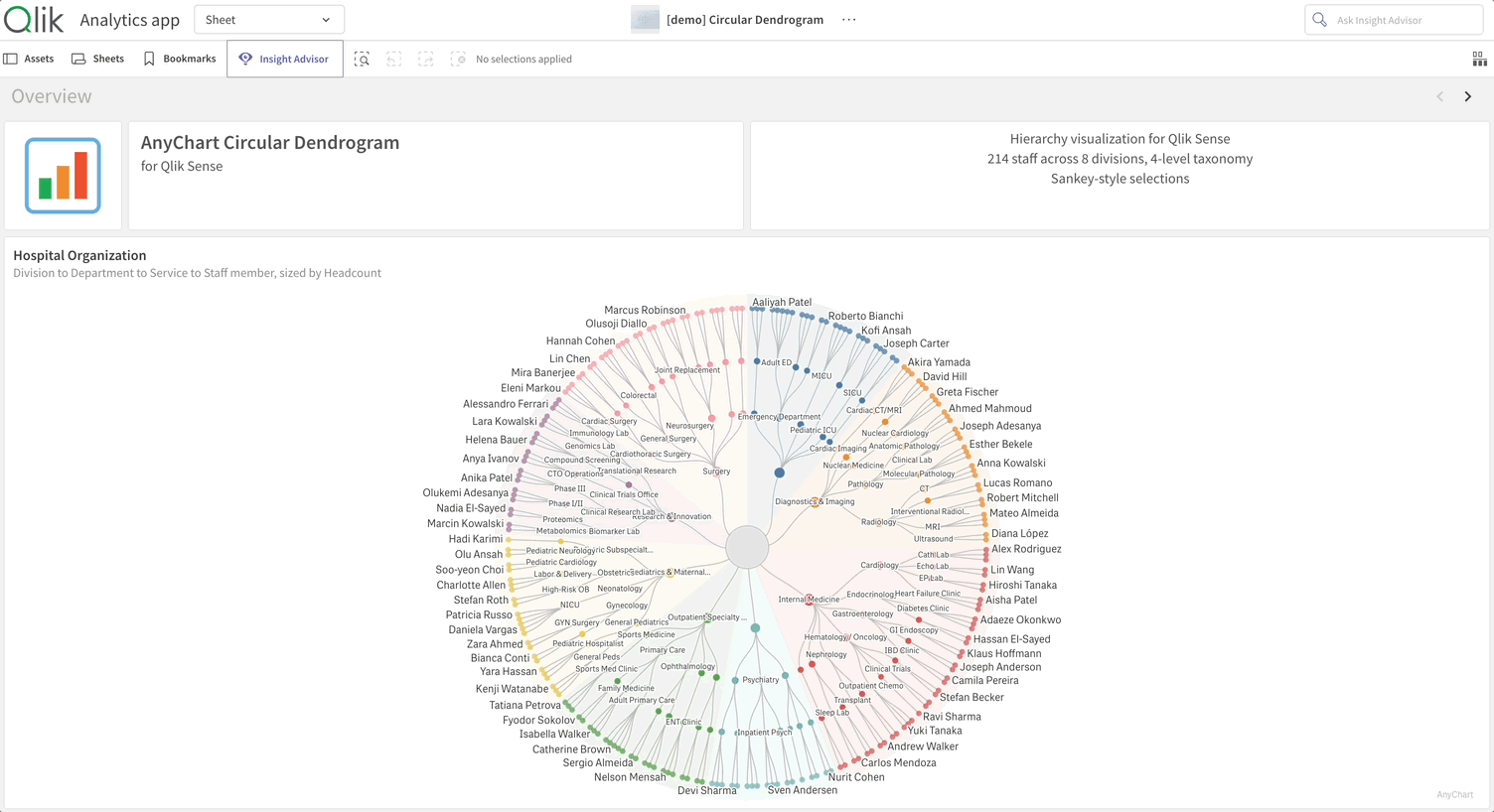
We built a free demo app to showcase the chart against a fictional hospital:
- 8 divisions,
- 42 departments,
- 84 services, and
- 214 staff across clinical and non-clinical roles.
The dataset is hierarchical enough to stress the chart's interactions and small enough to keep the demo snappy.
Open it in your browser (no Qlik login required), or download the QVF file:
Explore the Circular Dendrogram demo app →
Get Started
The Circular Dendrogram extension is available now:
Download the extension — free trial included →
After downloading, it installs quickly on any Qlik Sense environment:
- Qlik Sense Desktop:
Extract the archive intoDocuments\Qlik\Sense\Extensions\ - Qlik Sense Enterprise on Windows:
Import the archive via Qlik Management Console → Extensions - Qlik Cloud (SaaS):
Upload via the Management Console; addqlik.anychart.comto your Content Security Policy
Step-by-step instructions for each environment are in the installation guide, part of the Circular Dendrogram documentation that contains full configuration details.
Want a walkthrough against your own data?
Book a guided live demo with our team →
One Ask
This is v1.0. We have a list of where we'd take it next, but the most useful version of v2.0 is the one that solves the dashboards you're actually building.
If you try the chart on your data and something doesn't quite work — a layout you wish it had, a measure mode that would help, an interaction that feels off — tell us. That's the feedback we build from.
The Circular Dendrogram joins AnyChart's broader family of Extensions for Qlik Sense, alongside Spreadsheets, Decomposition Tree, Gantt Chart, Sunburst Chart, and more. See where it fits in your Qlik dashboards.