
Aplicativos de demonstração para Qlik Sense
Baixe aplicativos de demonstração gratuitos do AnyChart para Qlik Sense e descubra o incrível poder da análise visual avançada usando Qlik Sense com extensões do AnyChart.
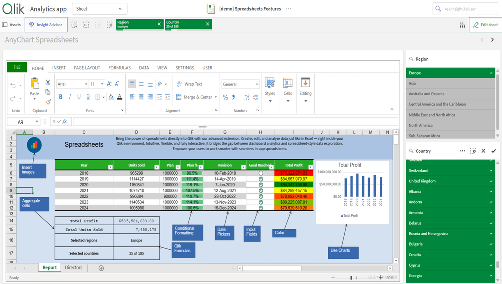
Recursos de planilha semelhantes ao Excel no Qlik Sense
Explore todo o potencial de tabelas e cálculos semelhantes ao Excel com a extensão AnyChart Spreadsheets para Qlik Sense. As planilhas trazem o poder familiar do Excel diretamente para o Qlik Sense. Este aplicativo de demonstração mostra os amplos recursos da extensão AnyChart Spreadsheets — desde tabelas editáveis e fórmulas avançadas até formatação, validação, tabelas dinâmicas e criação de gráficos — tudo dentro do ambiente nativo do Qlik.

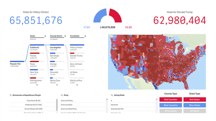
Eleições presidenciais dos EUA
Obtenha uma compreensão profunda da dinâmica das eleições presidenciais dos EUA. Analise os resultados por meio de visualizações interativas, incluindo mapas, árvores de decomposição com divisões de IA, indicadores circulares e muito mais. Aprofunde-se nos dados de votos populares e eleitorais em nível nacional, estadual e municipal. Explore o impacto dos estados-pêndulo, a influência de terceiros partidos e até mesmo candidaturas fictícias — de Daenerys Targaryen a Pato Donald. Descubra tendências, margens e padrões que moldaram a escolha da América — com planos de expandir a análise até George Washington.

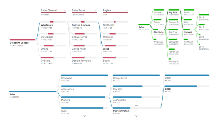
Árvore de Decomposição — agora com divisões de IA!
Descubra a Árvore de Decomposição no Qlik Sense!
Este gráfico visualiza dados de forma eficiente em várias dimensões, permitindo uma desagregação e análise detalhada em qualquer ordem para revelar o que compõe um valor. Explore os Divisores de IA, que fornecem insights automatizados sobre causas raiz, além de outros recursos importantes da nossa intuitiva Extensão de Árvore de Decomposição para Qlik Sense — veja várias medidas, coloração condicional, análise percentual, paginação e muito mais demonstrado em ação.

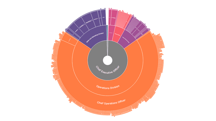
Estrutura da Empresa
Experimente como é fácil explorar toda a hierarquia organizacional da sua empresa com um poderoso gráfico sunburst. Este aplicativo de demonstração do Qlik Sense apresenta um que revela a estrutura de uma empresa fictícia, incluindo mais de 800 subdivisões em 12 níveis. Navegue e analise a estrutura organizacional com facilidade e aprofunde-se para explorar níveis específicos de divisão e obter uma compreensão mais detalhada da hierarquia.

Painel de Saúde
Desbloqueie insights transformadores na área da saúde usando o Qlik Sense com as extensões da AnyChart: Árvore de Decomposição, Gráfico de Gantt, Gráfico Combinado, Gráfico Sunburst e Gráfico de Linha do Tempo. Aprofunde-se em métricas como admissões, número de pacientes e custos de tratamento. Realize análises de causa raiz ou explorações ad hoc com facilidade. Mantenha uma visibilidade clara e acionável das linhas do tempo médico-paciente e acompanhe a jornada de cada paciente com precisão esclarecedora.
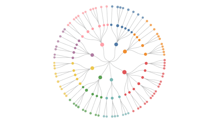
Circular Dendrogram Features
Circular dendrograms reveal the shape of any hierarchy through a radial tree of explicit parent-child edges, making large org charts and category trees readable at a glance. Explore all major features of our intuitive Circular Dendrogram Extension for Qlik Sense while looking at a hospital organization with 8 divisions, 42 departments, 84 services, and 214 staff members across clinical and non-clinical roles. See click selections, label formats, coloring, grouping options, tooltips, and much more demonstrated in action.
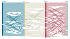
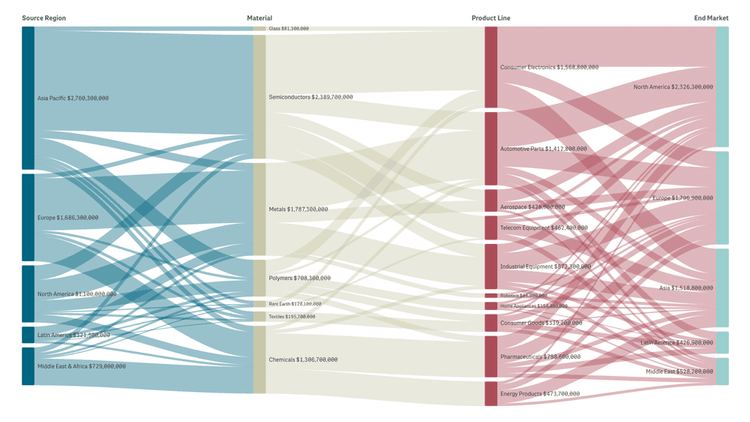
Sankey Chart Features
Sankey diagrams visualize how value flows across multi-stage processes with curved links whose widths represent the amount transferred — great for budget breakdowns, energy and material flows, customer journeys, and conversion funnels. Explore all major features of our intuitive Sankey Chart Extension for Qlik Sense as you trace a global supply chain from source region through material and product line to end market. See multiple dimensions, interactive selections, node and link coloring, flexible labels, layout controls, and much more demonstrated in action.
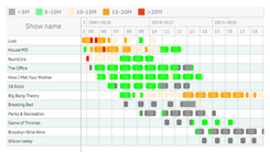
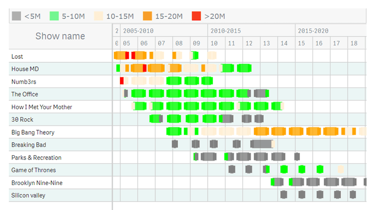
Programas de TV (Gráfico de Gantt de Recursos com Múltiplos Marcos)
Analise a popularidade de vários programas de TV por temporada e episódio — com nossos gráficos de Gantt de Recursos para Qlik Sense e o recurso de múltiplos marcos em uma única linha em ação. Compare a audiência episódio por episódio e identifique os mais e menos assistidos. Examine os primeiros e últimos episódios. Obtenha uma visão geral de todas as temporadas com barras codificadas por cores com base no número de visualizações.

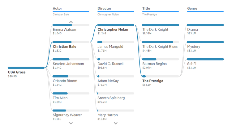
Filmes Top 1000 do IMDb
Mergulhe nos 1000 melhores filmes de todos os tempos segundo o IMDb, a base de dados online que afirma ser a fonte mais popular do mundo para conteúdo cinematográfico. Identifique os principais atores e descubra rapidamente quais diretores, gêneros, anos e filmes individuais mais contribuíram para o seu sucesso. Altere essas dimensões como quiser para explorar os diretores, anos, filmes ou gêneros em destaque, de forma inovadora, com árvores de decomposição no Qlik Sense.
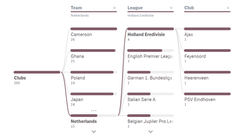

Equipes da Copa do Mundo FIFA Catar 2022
Investigue como as seleções nacionais de futebol dos 32 países participantes da Copa do Mundo da FIFA de 2022 no Catar são compostas por jogadores de várias ligas e clubes, usando notáveis visualizações em Árvore de Decomposição no Qlik Sense. (Re)organize a ordem das dimensões representadas conforme desejar para desagregar os totais. Analise também gols e jogos pela seleção (caps) de forma semelhante, usando árvores de decomposição intuitivas.

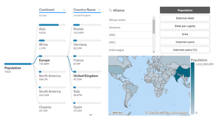
Insights Globais por País
Explore países, alianças e continentes com nossa poderosa Árvore de Decomposição no Qlik Sense, que representa dados de forma brilhante em várias dimensões e possibilita análises ad hoc com facilidade. Veja estatísticas de cada país: população, área, dívida, uso da internet e muito mais. Use a interface intuitiva para navegar sem esforço por continente ou aliança (APEC, OTAN etc.). Descubra todo o potencial da Árvore de Decomposição para transformar dados complexos em ações práticas!

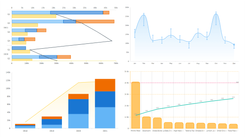
Demonstração Complexa do AnyChart
Eleito o melhor em análise e visualização de dados em 2023, o AnyChart oferece um conjunto de extensões inovadoras para o Qlik Sense. Descubra o poder das principais em uma rápida demonstração e veja como elas podem ajudar você a levar sua análise visual no Qlik a um novo nível: Árvore de Decomposição, Gráfico de Gantt, Gráfico Combinado, Medidor Circular, Gráfico Alvo, Gráfico Sunburst, Gráfico de Linha do Tempo e Gráfico de Cascata & Gráfico de Cascata Avançado.
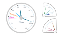
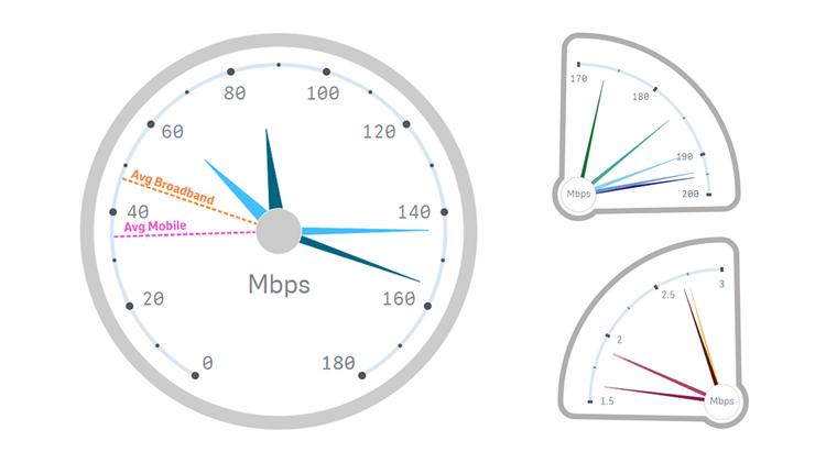
Velocidade da Internet no Mundo
Analise as velocidades de internet ao redor do mundo usando dados da Ookla, visualizados em medidores circulares impressionantes criados com nossa intuitiva extensão para Qlik Sense. Comece com uma visão geral rápida das velocidades médias de conexão de banda larga fixa e móvel (celular) em todos os países. Em seguida, descubra as velocidades de internet mais rápidas e mais lentas por tipo de rede, em cada continente e globalmente. Por fim, compare as velocidades de internet de quaisquer dois países ou continentes.
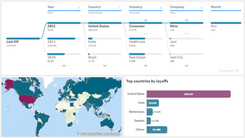
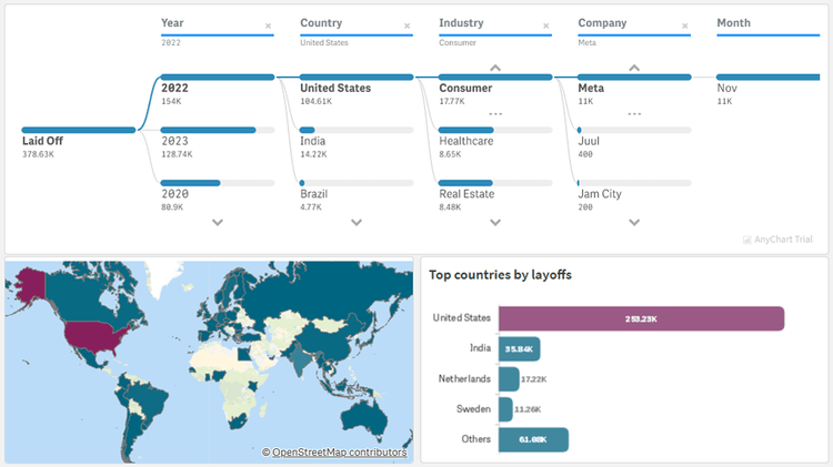
Demissões no Setor de Tecnologia
Explore as demissões no setor de tecnologia em todo o mundo desde a pandemia de COVID-19 com dados do Layoffs.fyi. Usando as visualizações de Árvore de Decomposição e Gráfico Combinado neste app do Qlik Sense, identifique quais países, setores e empresas tiveram mais cortes e quando ocorreram. Compare o número de demissões com os valores captados e obtenha outros insights sobre as estatísticas de demissões em tecnologia nos últimos anos.
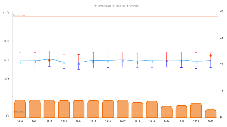
Clima nos EUA
Examine dados climáticos dos Estados Unidos entre 2010 e 2023 sob várias perspectivas. Acompanhe as temperaturas do ar e avalie o nível de conforto do clima. Aprofunde-se em precipitação, vento, umidade, pressão, índice UV e cobertura de nuvens, compare tendências ano a ano e descubra mais com múltiplos gráficos combinados flexíveis, impulsionados por nossa extensão dedicada para o Qlik Sense.
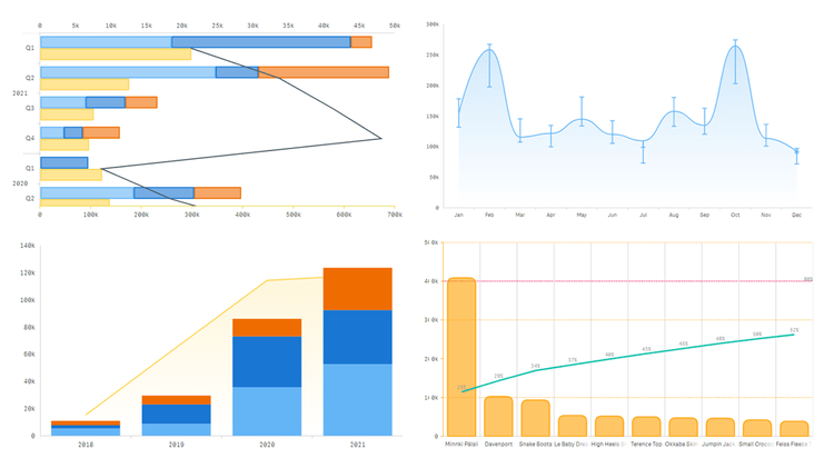
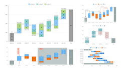
Recursos Avançados do Gráfico Combinado
Conheça a técnica de gráficos combinados incrivelmente flexível no Qlik Sense, projetada para ajudar você a obter ainda mais e melhores insights de seus dados com a mesma facilidade que já espera do Qlik! Explore todos os principais recursos da nossa intuitiva Extensão de Gráfico Combinado para Qlik Sense navegando entre os múltiplos tipos de gráficos disponíveis e suas combinações. Veja eixos aninhados, barras de erro, empilhamento, configurações visuais avançadas e muito mais demonstrado em ação.
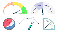
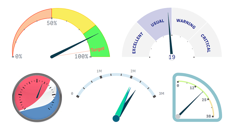
Recursos Personalizados do Medidor Circular
Vá muito além dos recursos nativos do Qlik para visualização de KPIs com o medidor circular avançado e autêntico, capaz de representar mais do que um único valor de medida e fornecer mais contexto! Explore todos os principais recursos da nossa intuitiva Extensão de Medidor Circular para Qlik Sense enquanto confere diversos medidores personalizados, perfeitamente adequados para diferentes casos de uso. Veja múltiplas opções de ponteiros, formas, ângulos, tamanhos e muito mais demonstrado em ação.
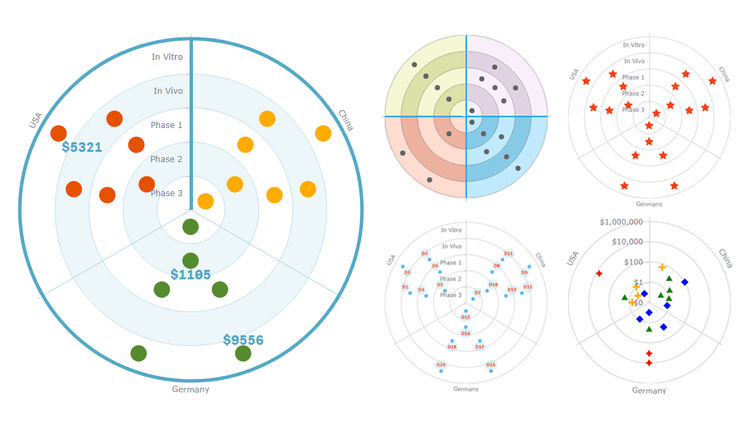
Recursos do Gráfico Alvo
Os gráficos Alvo são amplamente usados para visualizar pipelines de produtos de forma clara e concisa. Explore todos os principais recursos da nossa intuitiva Extensão de Gráfico Alvo para Qlik Sense enquanto observa um pipeline fictício de medicamentos que representa graficamente como os ensaios clínicos avançam pelas fases. Veja eixos e grades flexíveis, rótulos e marcadores personalizáveis, coloração condicional, tooltips em HTML e muito mais demonstrado em ação.
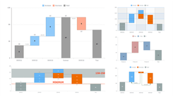
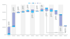
Recursos do Gráfico de Cascata Empilhado
Descubra a opção de gráfico de cascata empilhado no Qlik Sense e analise o efeito cumulativo de valores adicionados e subtraídos tanto por categoria quanto por subcategoria. Ao observar uma visualização fictícia de métricas de produtos, explore todos os principais recursos da nossa intuitiva Extensão de Gráfico de Cascata Avançado para Qlik Sense. Veja sub-barras empilhadas dentro das barras principais, diferentes modos de dados, rótulos personalizáveis e muito mais demonstrado em ação.

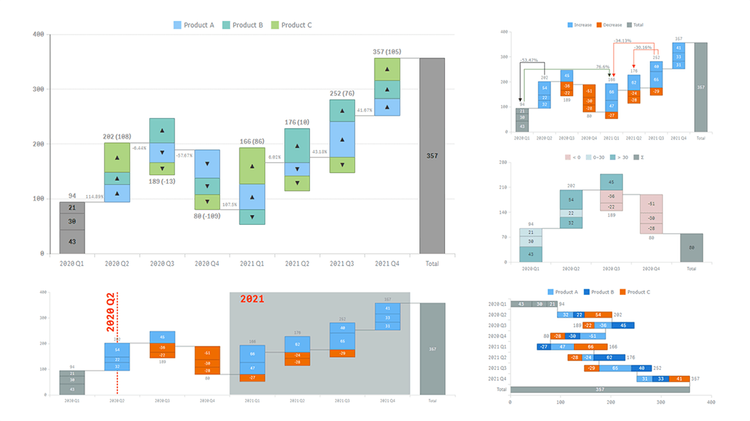
Recursos do Gráfico de Cascata
Os gráficos de cascata revelam o efeito cumulativo de valores adicionados e subtraídos de forma sequencial. Ao observar uma visualização fictícia de métricas de produtos, explore todos os principais recursos da nossa intuitiva Extensão de Gráfico de Cascata Clássico para Qlik Sense, que oferece uma gama mais ampla de opções do que a solução padrão do Qlik. Veja diferentes modos de dados, subcategorias empilhadas, coloração personalizável, eixos flexíveis e muito mais demonstrado em ação.
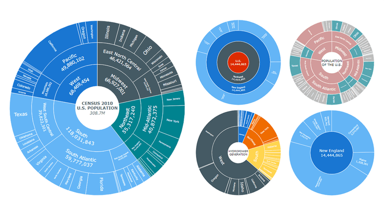
Recursos do Gráfico Sunburst
Os gráficos Sunburst são projetados para representar dados hierárquicos por meio de um conjunto de anéis concêntricos segmentados. Ao observar uma visualização de dados reais da população dos EUA do Censo de 2010, explore todos os principais recursos da nossa intuitiva Extensão de Gráfico Sunburst para Qlik Sense. Veja rótulos flexíveis, cores personalizadas, drilldown, conteúdo central, tooltips em HTML, múltiplas formas de exibir a hierarquia e as medidas, e muito mais demonstrado em ação.

Recursos do Gráfico de Linha do Tempo
Os gráficos de Linha do Tempo garantem uma visão clara de uma série de eventos em ordem cronológica. Explore todos os principais recursos da nossa intuitiva Extensão de Gráfico de Linha do Tempo para Qlik Sense enquanto observa uma visualização fictícia do processo de desenvolvimento de medicamentos. Veja múltiplas opções para personalizar intervalos e momentos, definir marcadores e rótulos, configurar eixos, navegação, tooltips e muito mais demonstrado em ação.
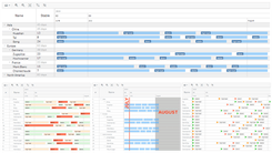
Recursos do Gráfico de Gantt de Recursos
Os gráficos de Gantt de Recursos permitem gerenciar a alocação de recursos de forma eficiente e eficaz. Explore todos os principais recursos da nossa intuitiva Extensão de Gráfico de Gantt de Recursos para Qlik Sense enquanto observa esta visualização de dados fictícios de uso de recursos. Veja diferentes estruturas de dados, tabelas e cronogramas flexíveis, marcos personalizáveis, rótulos, marcadores, coloração, configurações de ano fiscal e muito mais demonstrado em ação.

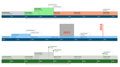
Recursos do Gráfico de Gantt de Projetos
Os gráficos de Gantt são uma ferramenta essencial de gestão de projetos, ideais para mostrar o cronograma de um projeto. Explore todos os principais recursos da nossa intuitiva Extensão de Gráfico de Gantt de Projetos para Qlik Sense enquanto observa esta visualização de dados fictícios de projetos. Veja diferentes estruturas de dados, tabelas e cronogramas personalizáveis, marcos flexíveis, conectores de dependência, configurações de ano fiscal, padrões de coloração e muito mais demonstrado em ação.

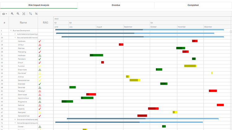
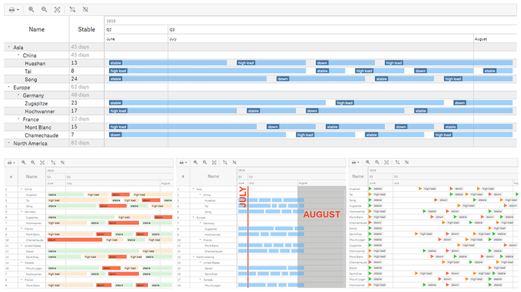
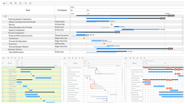
Visão Geral da Organização
Confira uma forma brilhante de consolidar a gestão de projetos e a tomada de decisões na sua empresa ou organização usando gráficos de Gantt no Qlik Sense. Imagine ter dezenas de colaboradores em vários departamentos — e milhares de tarefas em diversos projetos. Agora, aproveite uma visão abrangente de todo o trabalho de uma só vez! Com máxima eficácia e eficiência, realize o planejamento e o agendamento de projetos e mantenha todos os processos no rumo certo.
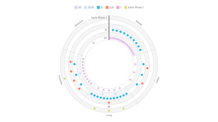
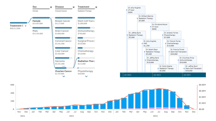
Ensaios Clínicos Ativos (RPCI)
Obtenha uma visão clara dos estudos clínicos ativos conduzidos no Roswell Park Cancer Institute e de como eles progridem. Para cada um dos cinco tipos de câncer mais comuns por local anatômico primário, saiba quais ensaios estão em andamento e entenda intuitivamente quais estão mais próximos da conclusão. Explore por tipo de câncer, fase atual, protocolo, investigador principal ou ano de início.
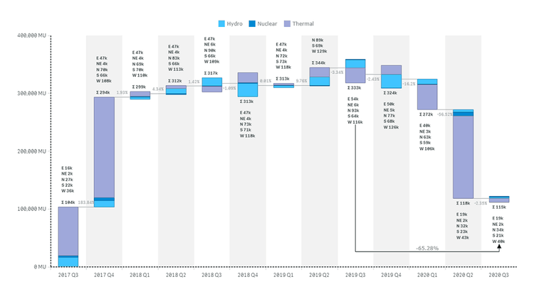
Geração de Energia na Índia (CEA)
Executa uma análise visual rápida da geração de energia a partir de fontes térmicas, nucleares e hídricas na Índia nos últimos anos — com base em dados fornecidos pela Autoridade Central de Eletricidade (CEA) através do National Power Portal. Acompanha as variações trimestrais no volume de eletricidade produzida, no geral ou por tipo. Localiza os aumentos e as reduções que têm maior impacto a nível nacional e em cada região.

Produção de Mel nos EUA (NASS)
Obtenha uma visão aprofundada do volume e do valor da produção de mel nos Estados Unidos da América, conforme reportado oficialmente pelo National Agricultural Statistics Service (NASS) do USDA. Saiba quais estados mais produzem mel. Identifique de imediato e analise os aumentos e as quedas nas suas contribuições de ano para ano. Foque em determinados estados ou períodos com um clique, utilizando os filtros apropriados.

Demografia dos EUA (Censo 2010)
Obtenha uma visão panorâmica das tendências populacionais dos EUA reveladas pelas principais estatísticas demográficas do Censo de 2010 — por estados, divisões e regiões. Compare os territórios pelo tamanho da população e identifique onde o crescimento é mais lento do que a média nacional ou até mesmo em declínio. Aprofunde-se em diferentes níveis. Passe o cursor para verificar os números exatos juntamente com as taxas de natalidade, mortalidade e crescimento natural.

Licenças de Instalações de Alimentação Móvel (São Francisco Public Works)
Percorra as licenças de instalações de alimentação móvel em São Francisco numa visualização intuitiva dos dados oficiais fornecidos pelo departamento de Obras Públicas da cidade. Para cada fornecedor e local, veja rapidamente o status atual da licença (aprovada, expirada, inativa, emitida, solicitada ou suspensa), bem como as datas em que a solicitação foi recebida e aprovada, e quando a licença está prevista para expirar.
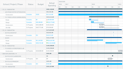
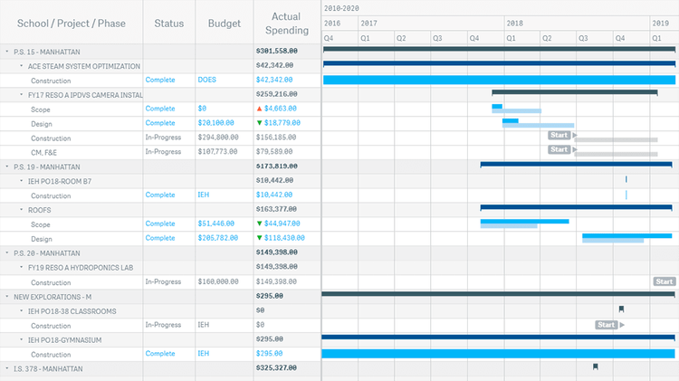
Projetos de Instalações Escolares (NYCSCA)
Investigue a linha do tempo de todos os projetos de desenvolvimento de instalações escolares geridos pela NYC School Construction Authority, atualmente em andamento ou concluídos nas duas últimas décadas, com uma visão transparente de ponta a ponta. Inspecione o desempenho do orçamento em cada fase e identifique de imediato excessos de custo e economias. Compare as projeções de cronograma original com os prazos reais para detectar rapidamente falhas e atrasos.
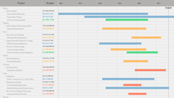
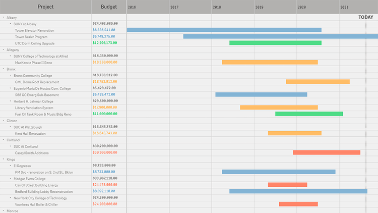
Projetos de Construção Ativos (DASNY)
Explore todos os projetos ativos de construção, renovação e reparo de dormitórios no Estado de Nova York onde a DASNY exerce algum nível de supervisão — por condado, instituição, projeto, arquiteto, ano de início ou ano de conclusão. Veja de relance quão perto da conclusão cada obra está. Altere a ordenação por orçamento para identificar rapidamente os projetos mais caros e descobrir sua localização, gestor etc.