
Sankey Chart Features
Sankey diagrams visualize flows & quantities between nodes. Explore all major features of our Sankey Chart Extension for Qlik Sense in this Qlik demo app.
Sankey Chart Features


このアプリについて
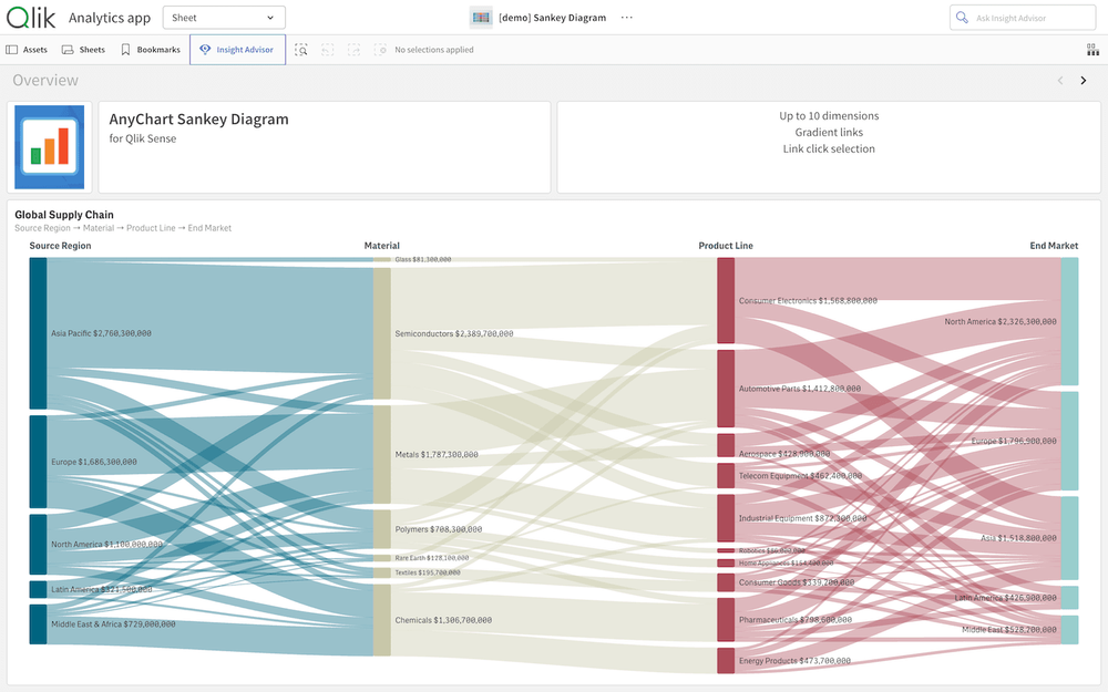
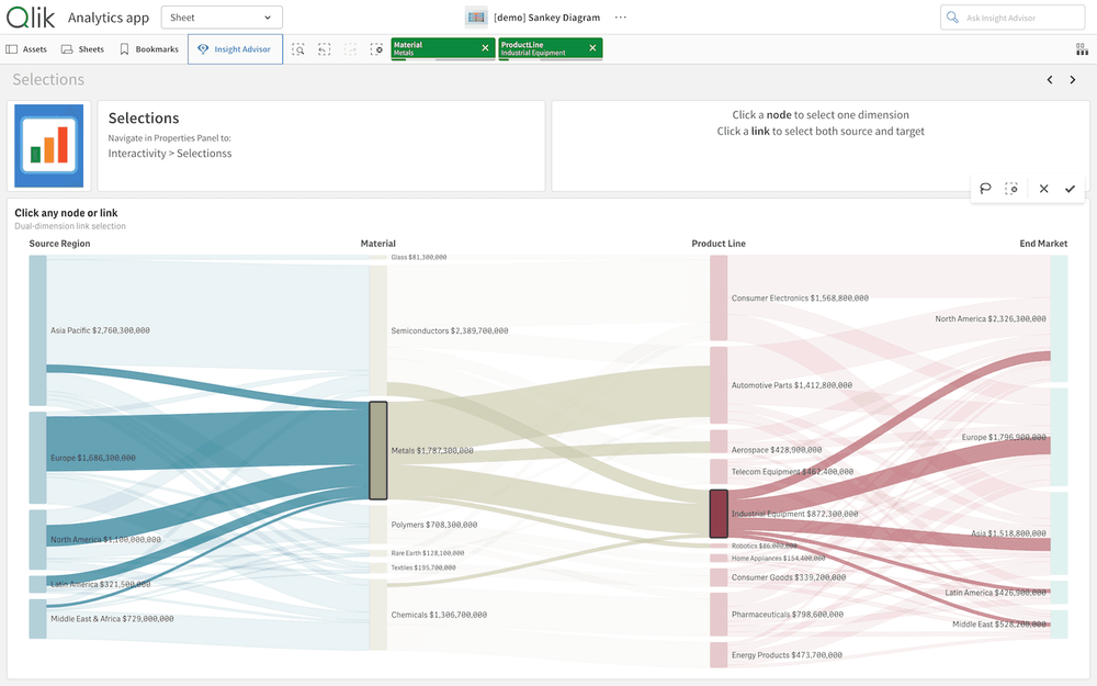
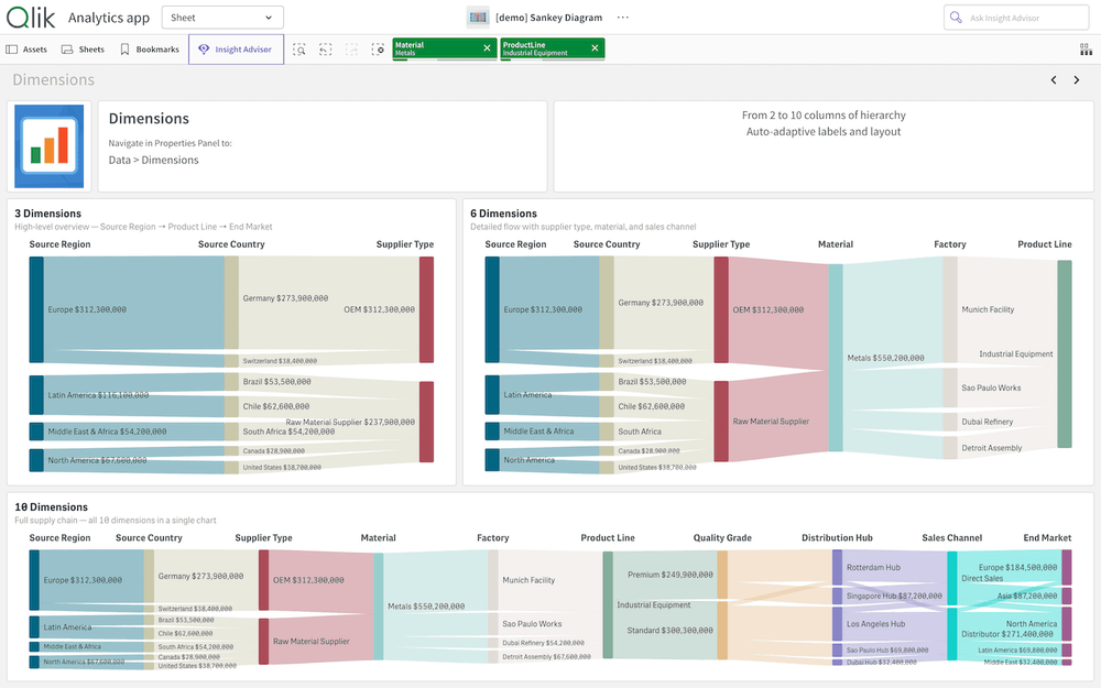
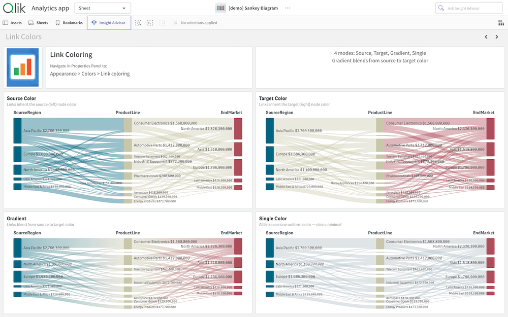
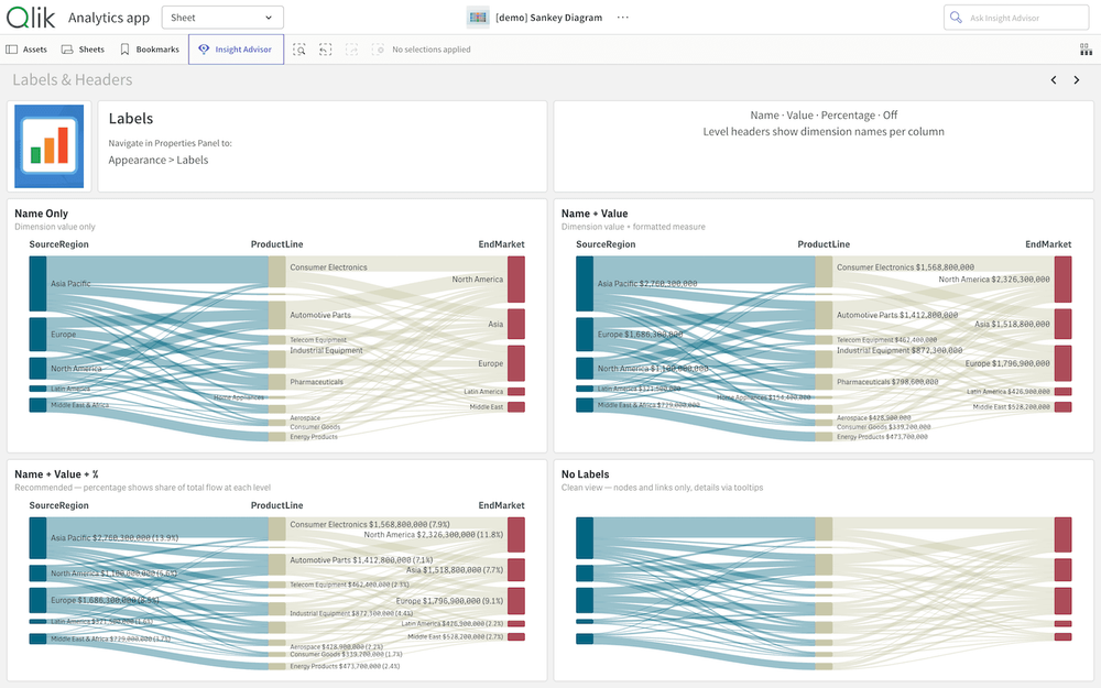
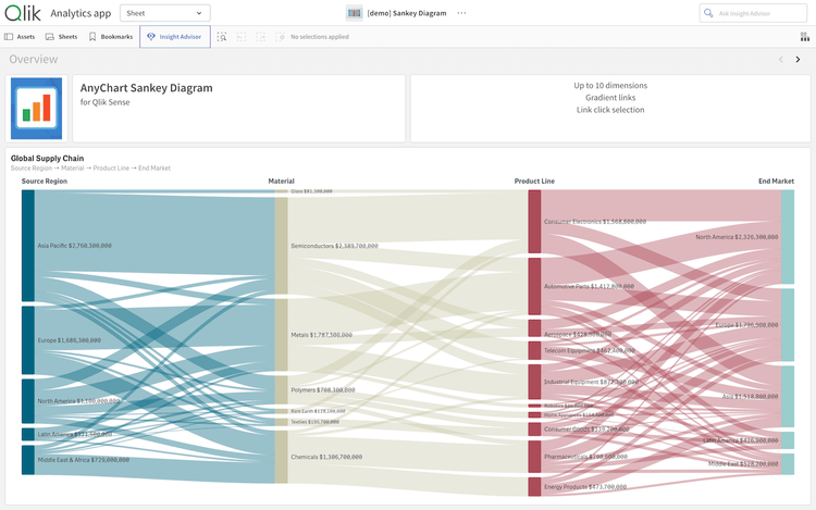
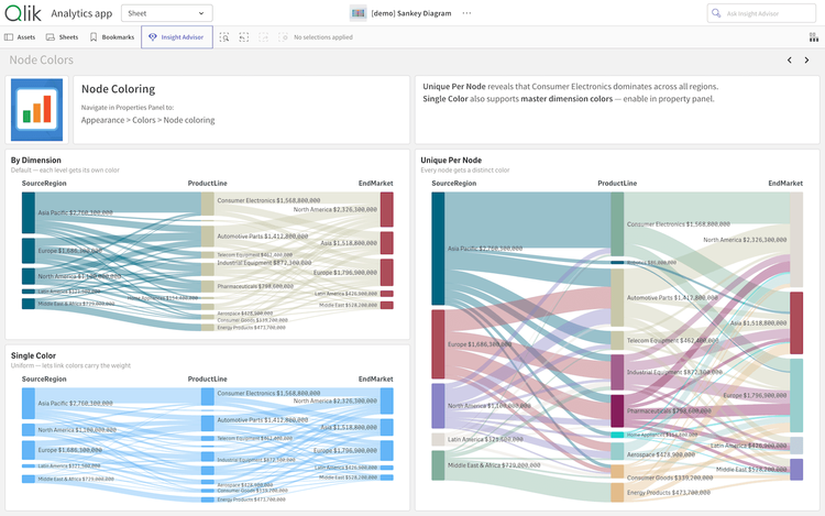
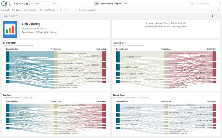
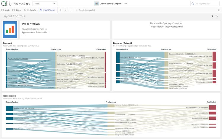
Sankey diagrams visualize how value flows across multi-stage processes with curved links whose widths represent the amount transferred — great for budget breakdowns, energy and material flows, customer journeys, and conversion funnels. Explore all major features of our intuitive Sankey Chart Extension for Qlik Sense as you trace a global supply chain from source region through material and product line to end market. See multiple dimensions, interactive selections, node and link coloring, flexible labels, layout controls, and much more demonstrated in action.
This application features a Sankey Chart built with the Sankey Chart extension for Qlik Sense. The dataset is fictional.