
Circular Dendrogram Extension for Qlik
Downloading and Installing
Qlik Sense Desktop
To install the Circular Dendrogram Extension in Qlik Sense Desktop, do the following:
- Download Circular Dendrogram Extension for Qlik Sense.
- Extract the archive.
-
Open a Windows Explorer window and navigate to the Qlik Sense Extensions directory:
..\Users\<UserName>\Documents\Qlik\Sense\Extensions. - Copy the anychart-4x-circular-dendrogram folder to the Extensions directory.
- Relaunch Qlik Sense Desktop.
Qlik Sense Server
To install the Circular Dendrogram Extension on a Qlik Sense server, do the following:
- Download Circular Dendrogram Extension for Qlik Sense.
- Open Qlik Management Console (QMC): https://<QPS server name>/qmc
- Select Extensions on the QMC start page or from the Start drop-down menu.
- Click Import in the action bar.
- In the dialog, select the downloaded archive. Leave the password area blank.
- Click Open in the file explorer window.
- Click Import.
Qlik Sense Cloud
To install the Circular Dendrogram Extension in Qlik Sense Cloud, do the following:
- Download Circular Dendrogram Extension for Qlik Sense Cloud.
- Extract the archive.
-
Access the Management Console:
- add /console to your tenant address: https://<your tenant address>/console
- or use the navigation link Administration under the user profile in the hub
- Go to the Extensions page and click Add.
- In the dialog, select the archive with the extension – for example, anychart-4x-circular-dendrogram.zip.
- Click Add.
- Repeat the steps above to add other extensions.
- In the Management Console, go to the Content Security Policy section and click Add.
- In the dialog, give the Content Security Policy a name – for example, AnyChart.
- Type the address of the origin server: qlik.anychart.com
-
Select the following directives:
- connect-src
- font-src
- img-src
- script-src
- style-src
- Click Add.
Overview
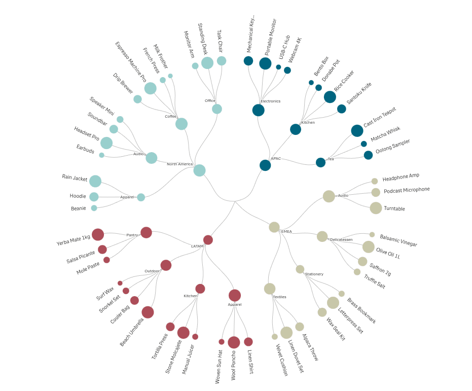
The Circular Dendrogram visualizes a hierarchy as a radial tree: a single root at the center, branches fanning outward, leaves on the perimeter. Every parent-child relationship is drawn as a line, node sizes carry the measure, and each top-level branch is color-coded. Use it when the structure of the data matters as much as the values: organizations, product taxonomies, cost breakdowns, geographic nestings.
Quick start
1. Drag the Circular Dendrogram onto a sheet.
2. Add two or more dimensions, outermost level first (e.g. Region, Category, Product), and exactly one measure.
3. The chart renders with Radial labels, theme branch colors, and sibling-based node sizing. Adjust under Appearance: chart shape and fill (Layout), node sizing (Node size), label layout and density (Outer labels).
4. Click any node or label to select; confirm in the toolbar.
Data
- Dimensions: 2 to 10. Each dimension is one level of the hierarchy, outermost first (e.g. Region → Category → Product).
- Measure: exactly 1. Drives node sizing, label values, shares, and tooltips. Without meaningful measure values, nodes size by leaf count.
Sorting
Native Qlik sorting per dimension. Sort order determines the angular order of branches and leaves.
Layout
| Control | Type | Values / range | Default |
|---|---|---|---|
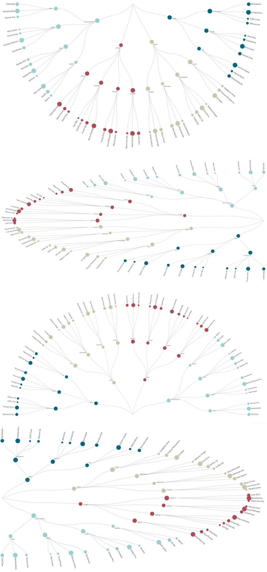
| Chart shape | dropdown | Full circle (360°) / Half circle (180°) | Full circle |
| Rotation | slider | 0–359° | 0° |
| Position | dropdown | Top / Right / Bottom / Left | Top |
| Fit to space | dropdown | Keep circular / Stretch to fill | Keep circular |
- Chart shape — draws the chart as a full circle or a half circle.
- Rotation — turns the whole chart around its center. Shown for the full circle only.
- Position — which half of the tile the half circle fills; the flat side anchors to the opposite wall. Shown for the half circle only.
- Fit to space — Stretch to fill uses the whole tile; the chart may become oval. Keep circular bounds the chart by the tile's shorter side.
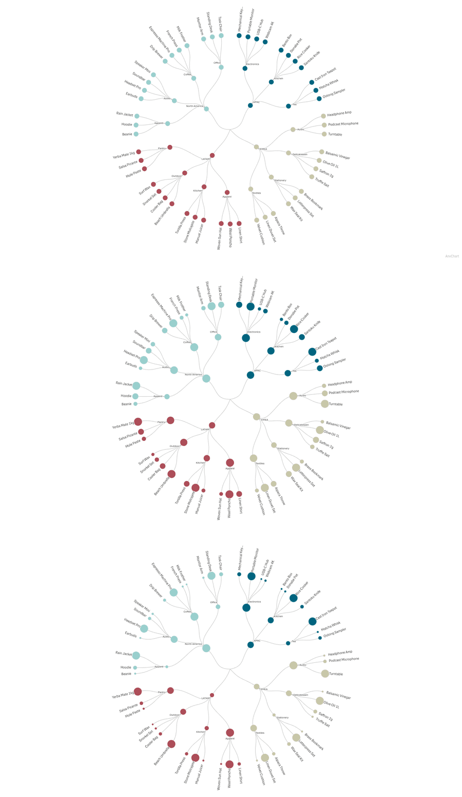
Node size
| Control | Type | Values / range | Default |
|---|---|---|---|
| Min node size | slider | 1–20 px (step 0.5) | 2.5 px |
| Max node size | slider | 4–40 px (step 1) | 12 px |
| Size contrast | slider | 0–2 (step 0.1) | 0.5 |
| Compare nodes to | dropdown | Siblings / Same level | Siblings |
| Cap node size to parent | switch | On / Off | Off |
- Min / Max node size — the radius range in pixels. The sliders keep each other consistent: moving one past the other drags it along. Contradictory values in saved charts are normalized on load.
- Size contrast — how strongly value differences translate into size differences. 0 renders all nodes equal (uniform); 2 is maximum spread.
- Compare nodes to — the population a node's value ranks against. Siblings: against the other children of its parent — the leader of every group renders at Max. Same level: against all nodes at the same depth.
- Cap node size to parent — prevents any node from appearing larger than the node it branches from; the cap cascades down the hierarchy.
Notes: with Siblings, an only child always renders at Max, and a node may appear larger than its parent (it leads its own group). The root's circle is controlled separately (Center section), not by these sliders.
Colors
| Control | Type | Values / range | Default |
|---|---|---|---|
| Color by | dropdown | By branch / Single color / By expression | By branch |
| Color expression | Fx string | color code per value | — |
| Use library colors | dropdown | Custom color / Measure / Dimension | Custom color |
| Node color | color picker | — | #4e79a7 |
| Line color | color picker | — | #bdbdbd |
| Line thickness | slider | 0.5–4 px (step 0.5) | 1 px |
| Line opacity | slider | 0.1–1 (step 0.1) | 1 |
| Branch backgrounds | switch | On / Off | Off |
| Extend behind labels | switch | On / Off | Off |
- Color by — By branch: each top-level branch gets a color from the active Qlik theme's palette. Single color: the whole chart uses one color, chosen with Use library colors below. By expression: node colors come from your expression (e.g. if(sum(Sales) > 1000, '#c84a3b', '#5b9e62')), applied per dimension value, inner nodes included.
- Color expression — shown in expression mode. Must return a color code such as #4e79a7.
- Use library colors — shown in single-color mode; picks where the one chart color comes from. Custom color: the Node color picker below. Measure: the color assigned to the master measure in your library. Dimension: the color assigned to the master dimension. When a master item carries no color (or the field isn't a master item), it falls back to the Node color picker.
- Node color / Line color — shown in single-color mode; the Node color picker is hidden when Use library colors is set to Measure or Dimension.
- Line thickness / opacity — styling of the connecting lines, all modes.
- Branch backgrounds — a tinted background wedge behind each branch, color-matched to the branch.
- Extend behind labels — stretches each background to also cover the outer label band; shown when backgrounds are on. The band stays inside the tile.
Outer labels
| Control | Type | Values / range | Default |
|---|---|---|---|
| Show outer labels | switch | On / Off | On |
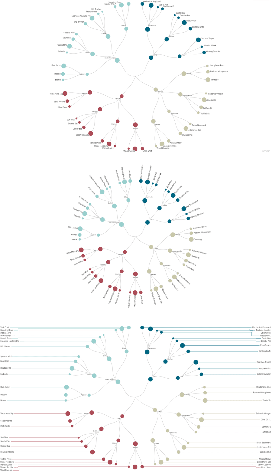
| Label layout | dropdown | Horizontal / Radial / Outside with lines | Radial (new charts) |
| Label density | slider | 0–100% (step 5) | 50% |
| Show full labels | switch | On / Off | Off |
| Font size | slider | 5–32 px | 10 px |
| Distance from chart | slider | 0–32 px | 6 px |
| Label content | dropdown | Dimension / Dimension and value / Dimension and share / Value | Dimension |
| Text color | dropdown | Custom color / Match node color / By expression | Custom color |
| Custom color | color picker | — | #333333 |
| Color expression | Fx string | color code per label | — |
| Connector color | dropdown | Match node color / Custom color | Match node color |
| Custom connector color | color picker | — | — |
- Show outer labels — labels for the outermost level. Switching off hides all controls below.
- Label layout — Horizontal: upright text at the rim. Radial: text rotated to its spoke angle. Outside with lines: labels placed beyond the chart, joined by non-crossing connector lines; when space is tight, labels are granted by value with every branch's biggest item guaranteed.
- Label density — how many labels appear; applies in every layout.
- Show full labels — disables truncation; long text may extend into the chart.
- Distance from chart — label offset from the rim. Not used in the Outside layout.
- Label content — what each label shows. With Dimension and value, the value survives truncation; only the name is shortened.
- Text color / Connector color — see Colors section semantics; connectors exist in the Outside layout only.
Inner labels
| Control | Type | Values / range | Default |
|---|---|---|---|
| Show inner labels | switch | On / Off | On |
| Font size | slider | 5–32 px | 8 px |
| Distance from node | slider | 0–32 px | 6 px |
| Label density | slider | 0–100% (step 5) | 50% |
| Show full labels | switch | On / Off | Off |
| Label content | dropdown | (as outer) | Dimension |
| Text color | dropdown | (as outer) | Custom color |
- Show inner labels — labels at the branching points inside the chart. Switching off hides the controls below.
- Distance from node — 0 places the label on the node; 1+ uses collision-aware placement beside it with the given gap.
- Label density — how many interior labels appear; lower hides some to keep the chart tidy.
- Show full labels — disables truncation on inner labels; long text may reach into the chart.
- Content and color controls mirror the outer family but are independent.
Center
| Control | Type | Values / range | Default |
|---|---|---|---|
| Center circle | switch | On / Off | Off |
| Center circle size | slider | 8–120 px | 32 px |
| Center circle color | color picker | — | #e8e8e8 |
| Center label | switch | On / Off | Off |
| Center label text | Fx string | text or expression | — |
| Center label font size | slider | 9–36 px | 14 px |
| Center label color | color picker | — | #333333 |
| Background image | switch + Image URL + size/opacity | URL; 5–100%; 0–1 | Off; 50%; 0.15 |
| Center image | switch + Image URL | URL | Off |
- Center circle — a filled hub at the middle; the first ring starts outside it.
- Center label — your own text (or expression result) in the middle; independent of the circle.
- Background image — a faint image behind the whole chart. Available when the center circle is off.
- Center image — an image clipped inside the center circle. Available when the center circle is on.
- The two image options are mutually exclusive by design, switched by the Center circle toggle. The image value is a URL.
Grouping
| Control | Type | Values / range | Default |
|---|---|---|---|
| Group small branches | switch | On / Off | Off |
| Number to keep | integer | 1–50 | 6 |
| Grouping scope | dropdown | Last dimension only / All dimensions | Last dimension only |
- Group small branches — combines the smallest items into one "Others" node to reduce clutter.
- Number to keep — how many of the largest items stay separate; the rest go into "Others".
- Grouping scope — Last dimension only thins just the innermost ring; All dimensions groups at every level of the hierarchy.
Interactivity
| Control | Type | Default |
|---|---|---|
| Tooltip | switch | On |
| Selection on click | switch | On |
- Tooltip — details popup on hover, for nodes, outer labels, and inner labels.
- Selection on click — clicking a node, outer label, or inner label starts a Qlik selection on its dimension value. The clicked path highlights in the theme's selection color (connector lines included); same-value matches elsewhere render dashed; everything unrelated dims. Clicks are non-destructive and confirmed via the standard toolbar.
Add-ons
Native Qlik data handling (calculation condition).
Snapshots and Export
The Circular Dendrogram supports Qlik's standard snapshot and data-export pipelines.
- Snapshot capture – right-click the chart and choose Take snapshot. The snapshot saves the chart's current settings, layout, and selection state so it can be replayed later. License status is captured into the snapshot so a future licence change does not affect a previously captured snapshot.
- Story replay – drag a captured snapshot onto a Story slide. The chart re-renders from the snapshot data.
- Export data – right-click the chart and choose Export > Data. CSV and Excel formats are supported.
- Print – the chart inherits Qlik's standard print pipeline (File > Print or Print to PDF).
Add-ons
The standard Qlik Add-ons accordion contains:
- Calculation condition – a Qlik expression that gates whether the chart computes and renders. When the expression evaluates false, the chart shows the Calculation condition error message instead of computing the hypercube. Useful for gating heavy charts on selection cardinality — for example, Count(distinct StaffID) > 10.
- Calculation condition error message – the copy shown when the condition is false.
- Include zero values – when off, rows whose measure resolves to zero are excluded from the chart.
About
The About section shows the extension display name, the version number, the build date, license status, AnyChart branding, and a link to this documentation page.
Troubleshooting
| Symptom | Resolution |
|---|---|
| Chart is blank or shows “Add at least 2 dimensions to render a dendrogram.” | Add at least two dimensions in the data picker. The Circular Dendrogram requires a hierarchy of at least two levels. |
| Chart shows “No data to display.” | The dimensions or measure are empty under the current selection. Check filters or remove the calculation condition. |
| Perimeter labels overlap. | Lower the Label density slider toward 0 for stricter pruning, or reduce the leaf font size in Size (px). |
| Many labels are missing. | Raise the Label density slider toward 100, or enlarge the chart cell so more labels fit. |
| Branches stack on top of each other near the center. | The hierarchy may have a single-leaf chain near the root. Increase the center circle radius or disable the center circle to push the inner-hub layer outward. |
| Center tooltip does not appear. | The center tooltip requires the Center circle switch to be on (Properties Properties > Presentationgt; Center). |
| Chart shows the trial overlay even though the license is valid. | Reload the app (Ctrl+F5). If the issue persists, check the license status in the About section. |