

🎯 Bam! Meet Bullseye charts in Qlik Sense! Qlik counted on us to provide its customers with "additional choices for building even more compelling visualizations." And we could not stop innovating, so Bullseye has become the 42nd chart type in AnyChart's extensions for Qlik Sense — enjoy and hit the bull's-eye in data-driven decision making!
Also, we have added new awesome features to our Gantt charts in Qlik Sense to help expedite actionable insights into your project data. Learn more about the highlights of the March release of the AnyChart and AnyGantt extensions in a quick overview below, and download the latest version!
Bullseye Chart
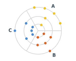
So, the centerpiece of the new release is the stunning Bullseye chart for Qlik. In this type of visualization, data points are displayed as markers distributed across several concentric rings that can represent numerical value ranges (e.g. desired, expected, etc.) or ordinal categories.
Bullseye charts are widely used for data analysis in the healthcare and pharmaceutical industries, for example to visualize drug development pipelines, as well as in many other cases when stages (or phases) require a clear demonstration and range tracking across multiple parameters is needed.
AnyChart's Bullseye chart for Qlik Sense features flexible axes and grids, adjustable markers, fully customizable colors and labels, legend, HTML tooltips, and much more.
Learn how to get started with a Bullseye chart in Qlik Sense, in the documentation.
Gantt Chart Legend
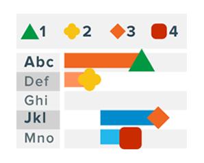
Striving to make creating Gantt charts in Qlik ever more intuitive, this time we have introduced two great options in our AnyGantt project management bundle.
First, we've added the Gantt chart legend functionality! Feel free to turn it on and add any number of colored markers. The legend will explain all the coding at a glance, making your Gantt chart much easier to read and analyze.
Total Row in Table Grid
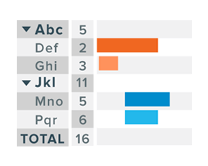
Second, now you can enable the display of totals in a really straightforward way. Just turn on a dedicated total row in the Gantt chart table grid and you'll have the sum of values across each column at hand!
For the most efficient and effective representation, you're welcome to tweak the format of the total row labels the way you want.
Download New Version
Download the updated extensions for Qlik Sense and enjoy the new chart type — Bullseye chart — along with Gantt chart improvements!
You can also schedule a call with us and we will gladly conduct a guided demonstration and answer all your questions.
Next on Our Plan
New features are already on the way! Within the next couple of months, for example, we plan to roll out a number of improvements for the Waterfall chart: axis settings, vertical layout, cross-category connectors, union tooltip for subcategories stacks, split total display, and outside labels placement.
More updates for Gantt and other charts in our Qlik Sense extensions are also coming up.
Please let us know if you have any questions or ideas on what we should add or improve next. We are working to help you explore data in the most intuitive way so you can make the right decisions faster, and your feedback is the greatest determinant of our roadmap.
ICYMI, we partnered with Qlik and launched three intuitive extensions for data analytics and business intelligence experts using Qlik Sense. Go ahead and try them for free and schedule an online meeting with us for a personalized demo.