AnyChart Extension for Qlik: Bullseye Chart
Basics
Downloading and Installing
Qlik Sense Desktop
To install AnyChart Bullseye Extension in Qlik Sense Desktop, do the following:
- Download AnyChart Bullseye Extension for Qlik Sense.
- Extract the archive.
- Open a Windows Explorer window and navigate to the Qlik Sense Extensions directory:
..\Users\<UserName>\Documents\Qlik\Sense\Extensions. - Copy the anychart-4x-bullseye folder to the Extensions directory.
- Relaunch Qlik Sense Desktop.
Qlik Sense Server
To install AnyChart Bullseye Extension on a Qlik Sense server,
- Download AnyChart Bullseye Extension for Qlik Sense.
- Open Qlik Management Console (QMC): https://<QPS server name>/qmc
- Select Extensions on the QMC start page or from the Start drop-down menu.
- Click Import in the action bar.
- In the dialog, select the downloaded archive. Leave the password area blank.
- Click Open in the file explorer window.
- Click Import.
Qlik Sense Cloud
To install AnyChart Bullseye Extension in Qlik Sense Cloud, do the following:
- Download AnyChart Bullseye Extension for Qlik Sense Cloud.
- Access the Management Console:
- add /console to your tenant address: https://<your tenant address>/console
- or use the navigation link Administration under the user profile in the hub
- Go to the Extensions page and click Add.
- In the dialog, select the downloaded archive.
- Click Add.
- In the Management Console, go to the Content Security Policy section and click Add.
- In the dialog, give the Content Security Policy a name – for example, AnyChart.
- Type the address of the origin server: qlik.anychart.com
- Select the following directives:
- connect-src
- font-src
- img-src
- script-src
- style-src
- Click Add.
Overview
The Bullseye chart is a tool that displays data points as markers spread across a set of concentric rings, which represent either ordinal categories or ranges of numerical values.
You can configure the appearance of the chart: set the colors, adjust the markers, legend, axes, and grids, set the start angle and inner radius, enable and configure the labels, and set the text of the tooltips.
Also, the following options are available: interactivity and calculation conditions.
Quick Start
This quick tutorial explains how to create a basic Bullseye chart.
First of all, add an empty chart to your sheet:
- Go to Custom objects > AnyChart in the assets panel.
- Drag an empty AnyChart Bullseye chart to the sheet.
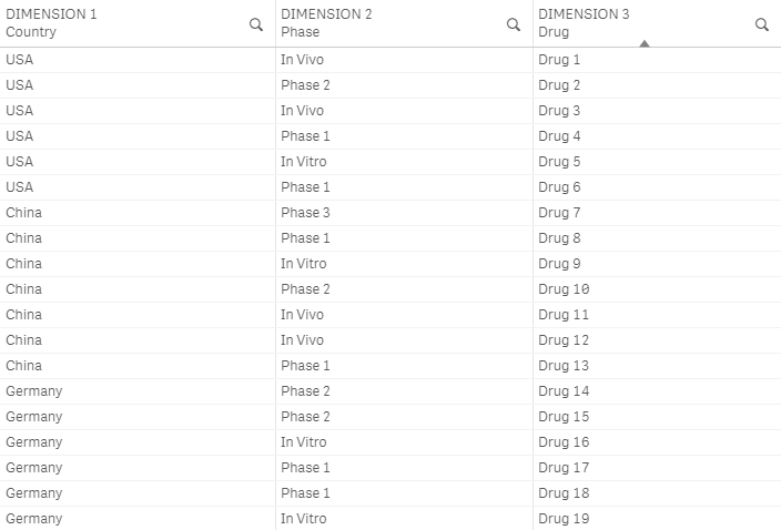
Then add three dimensions, the first one representing nominal categories (the groups of data points), the second one ordinal categories (the names of rings), and the third one the IDs of points:
- Go to Dimensions in the properties panel.
- Click Add dimension and select a dimension.
- Click Add dimension and select a dimension.
- Click Add dimension and select a dimension.
Alternatively, it is possible add two dimensions and one measure if the structure of your data requires that.
Please note that you can also create dimensions and measures from fields or add them by clicking on buttons on the empty chart.
Dimensions and Measures
Dimensions
To add a dimension, do the following:
- Go to Dimensions in the properties panel.
- Click Add dimension and select a dimension.
Depending on the data structure, you can add two or three dimensions.
Measures
To add a measure, do the following:
- Go to Measures in the properties panel.
- Click Add measure and select a measure.
Depending on the data structure, you can add one measure or create a chart without measures.
Data Structures
The Bullseye chart supports two different ways of setting data (data structures). You should select the one that best suits your data.
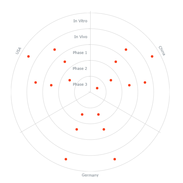
3 Dimensions
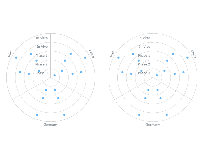
If you want the Y-axis to display ordinal categories (the names of rings), add three dimensions:
- The first dimension (Categories) represents the names of nominal categories, which are shown on the X-axis.
- The second dimension (Rings) represents the names of rings, which are shown on the Y-axis.
- The third dimension (ID) represents the IDs of data points.
Please keep in mind that the order of categories on the Y-axis is defined by the sorting settings of the second dimension.

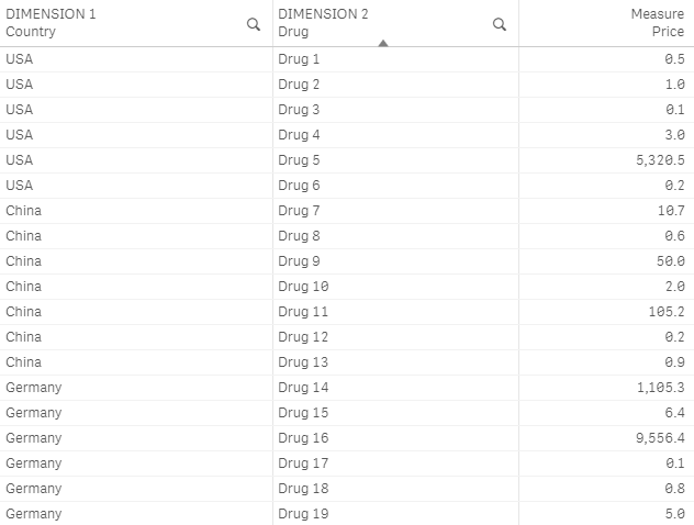
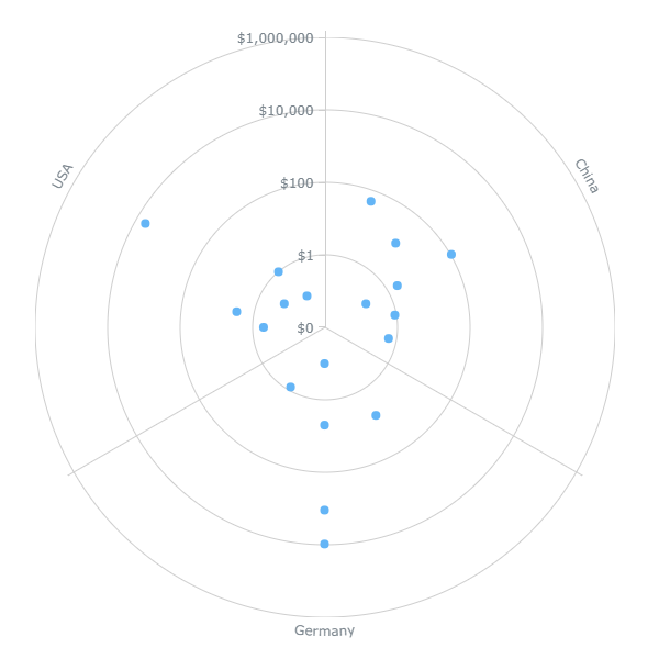
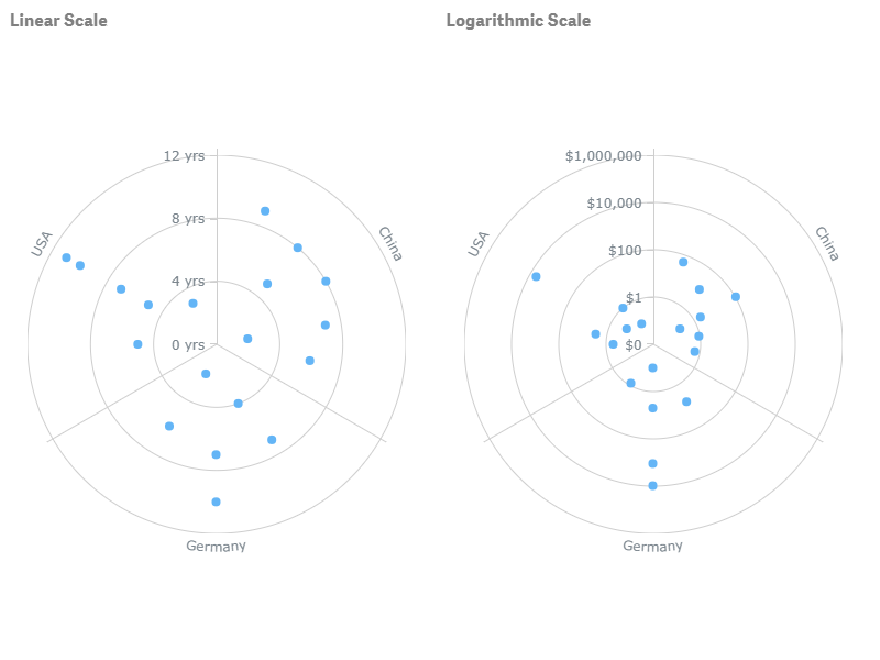
2 Dimensions + 1 Measure
If you want the Y-axis to display numerical values, add two dimensions and one measure:
- The first dimension (Categories) represents the names of nominal categories, which are shown on the X-axis.
- The second dimension (ID) represents the IDs of data points.
- The measure (Rings) represents numerical values, which are shown on the Y-axis.
Please note that when the Y-axis displays numerical values, it is possible to set the scale type (linear or logarithmic).
Appearance
Colors
AnyChart Bullseye supports different ways of coloring the markers of the chart.
One of the color modes (By dimension) affects the legend as well. Also, depending on the mode, the legend is either available or not.
To select a color mode,
- Go to Appearance > Colors and legend in the properties panel.
- Switch the Colors slider.
- Select a color mode from the drop-down menu.
The following table explains the difference between different modes and lists the settings available for each of them:
| Color Mode | Description | Settings |
|---|---|---|
| Single color |
|
Color Opacity |
| By dimension |
|
Select dimension Palette selection Reverse colors Opacity |
| By expression |
|
Expression |
Single Color
You can set one color, which is applied to all markers:
- Go to Appearance > Colors and legend in the properties panel.
- Switch the Colors slider.
- Select Single color from the drop-down menu.
- Use the Color and Opacity options.
In this mode, the legend is not available.
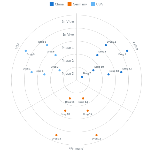
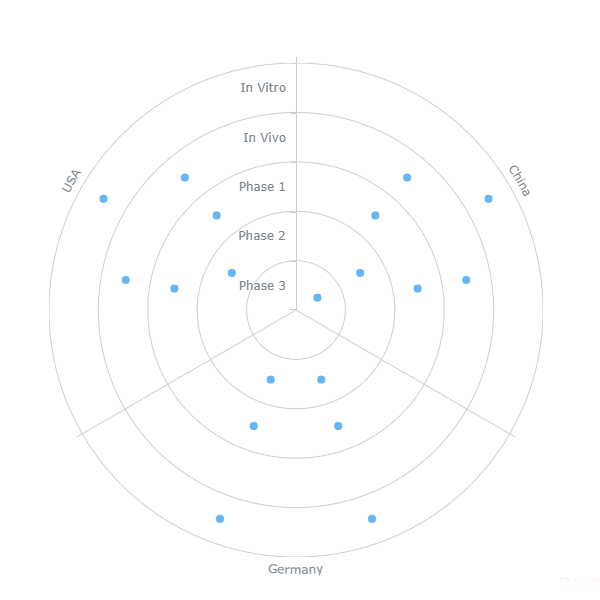
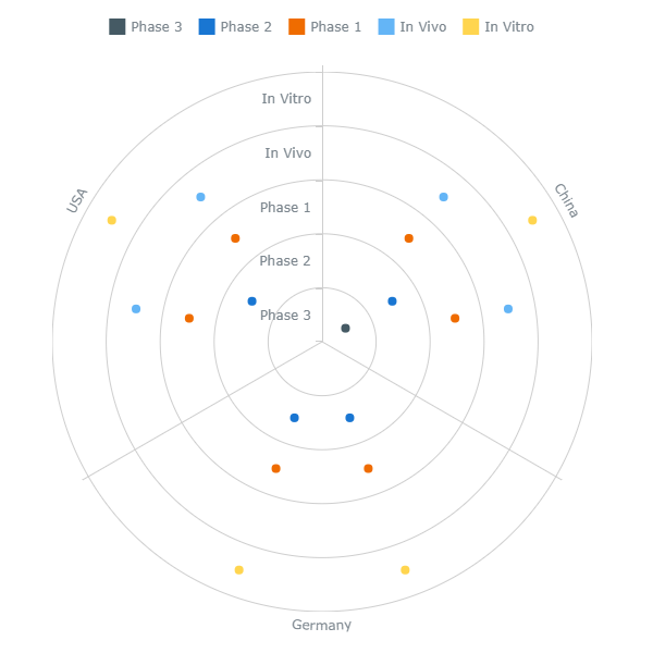
Color by Dimension
You can use the built-in palettes to color markers by any dimension (depending on the data structure, there are two or three dimensions):
- Go to Appearance > Colors and legend in the properties panel.
- Switch the Colors slider.
- Select By dimension from the drop-down menu.
- Select a dimension from the Select dimension drop-down menu.
- Select a palette and use the Reverse colors and Opacity options.
The legend is automatically generated and colored. However, you can always disable or customize it if needed.
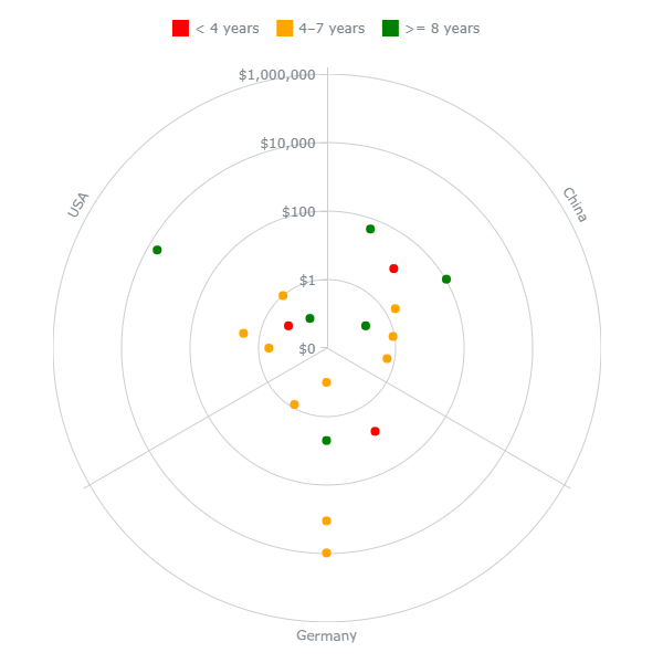
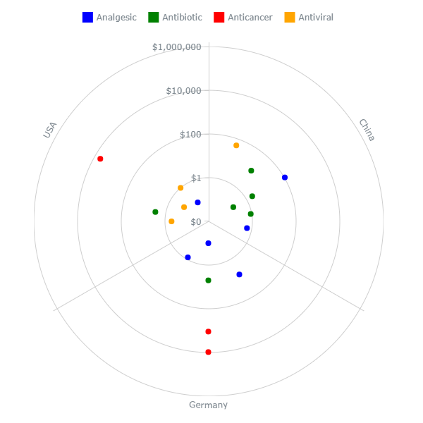
In this screenshot, the markers and legend are colored by the first dimension:
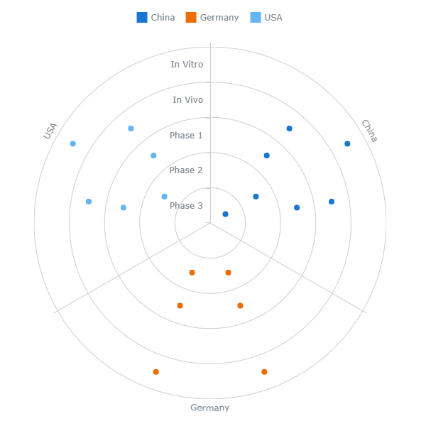
Here the markers and legend are colored by the second dimension:
Color by Expression
If the data structure of the chart includes a measure, you can color its markers by expression:
- Go to Appearance > Colors and legend in the properties panel.
- Switch the Colors slider.
- Select By expression from the drop-down menu.
- Enter an expression in the Expression input box.
In addition, the shape of markers can also be set conditionally. The legend is available, but you have to manually add and color every item.
Coloring by expression sets colors using a user-defined expression. When coloring by expression, you can define both what colors to use and which values to use them with, enabling more control over how colors are used in the visualization. For example, you might highlight values of particular interest, or differentiate between values within different value ranges. Coloring by expression can also be used to color a visualization by values not included within a visualization, such as coloring markers by alternative measures or dimensions.
Examples
Here are a few examples to show what you can do with expressions by color. Please note that expressions do not affect the legend, so in these examples it is configured manually.
Example: Coloring by Measure
If(Price < 1, 'green',
If(Price < 100, 'gold',
If(Price < 1000, 'orange',
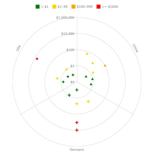
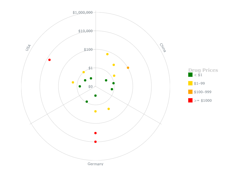
If(Price >= 1000, 'red'))))In this example, 4 colors indicate 4 ranges of the measure shown on the Y-axis (price).

Example: Coloring by alternative measure
If(EstimatedCompletionTime < 4, 'red',
If(EstimatedCompletionTime < 8, 'orange',
If(EstimatedCompletionTime >= 8, 'green')))
In this example, 3 colors indicate 3 ranges of the estimated completion time. The Y-axis, however, displays another measure – the price.
Example: Coloring by alternative dimension
If(Type = 'Antibiotic', 'green',
If(Type = 'Antiviral', 'orange',
If(Type = 'Analgesic', 'blue',
If(Type = 'Anticancer', 'red'))))
In this example, 4 colors distinguish markers belonging to 4 different groups (drug types). The X-axis displays other groups (countries).
Markers
Type and Size
To configure markers, go to Appearance > Colors and legend in the properties panel, switch the Colors slider, and do the following:
- To set the size, use the Size option.
- To set the type, switch the Marker shape slider and select a built-in icon (shape) from the drop-down menu below.
- To set markers as a custom image, enter a link to the image in the Image URL input box.
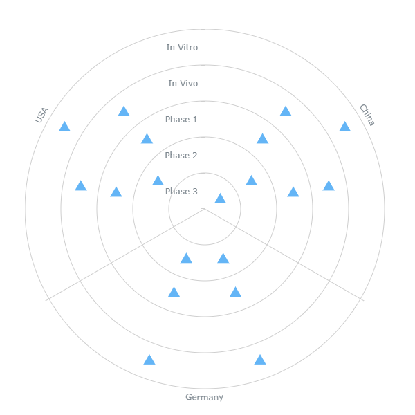
Here is one of the built-in icons:
Type by Expression
You can add a user-defined expression assigning different built-in icons to different markers. This option is available when markers are colored by expression. To use it,
- Go to Appearance > Colors and legend in the properties panel.
- Switch the Marker shape slider.
- Enter an expression in the Marker shape expression input box.
In the expression, you should refer to the icons by their names:
|
|
||
|
|
||
|
|
||
|
|
||
|
|
||
|
|
||
|
|
||
|
|
||
|
|
||
|
|
||
|
|
In the example below, the colors and shapes represent different ranges of the measure shown on the Y-axis (price). The following expression is used to set the shapes:
If(Price < 1, 'triangle-up',
If(Price < 100, 'diamond',
If(Price < 1000, 'cross',
If(Price >= 1000, 'star4'))))
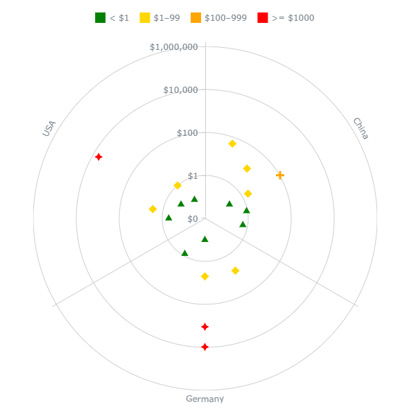
The expression that defines shapes does not need to be similar to the expression that defines colors. For example, here the colors represent the measure shown on the Y-axis (price), but the shapes represent the dimension shown on the X-axis (country):
If(Country = 'China', 'triangle-up',
If(Country = 'Germany', 'cross',
If(Country = 'USA', 'star4')))
Legend
When the chart is colored by dimension, the legend is automatically generated and colored. However, you can disable or customize it.
When the chart is colored by expression, the legend is available, but you have to manually add and color every item.
To configure the legend, go to Appearance > Colors and legend in the properties panel and do the following:
- To enable or disable, switch the Legend slider.
- To set the position, select Top, Right, Bottom, or Left from the Position drop-down-menu.
- To set the alignment, select one of the available options from the the Alignment drop-down menu.
- To set the title, go to Title and enter your text in the Title input box.
- To configure the title font, use the Style, Color, Size, Family, and Shadow options.
To add a new legend item,
- Go to Items and switch the Items slider (if present).
- Click Add legend item.
- Enter the name of the item in the Label input box.
- To set the color, use the Color option.
Custom items replace the automatically generated ones.
In this screenshot, the chart is colored by the second dimension, and the auto-generated legend is shown, its position and title customized:
Here the chart is colored by expression, and the legend displays custom items, its position and title customized:
Axes
X-Axis
The X-axis displays the names of nominal categories (the first dimension in any data structure).
To configure the X-axis, go to Appearance > X-axis in the properties panel and do the following:
- To disable or enable the labels, switch the Labels slider.
- To configure the stroke, go to Line and use the Line, Color, and Style options.
- To configure the X-grid, switch the Grid slider and use the options below.
Y-Axis
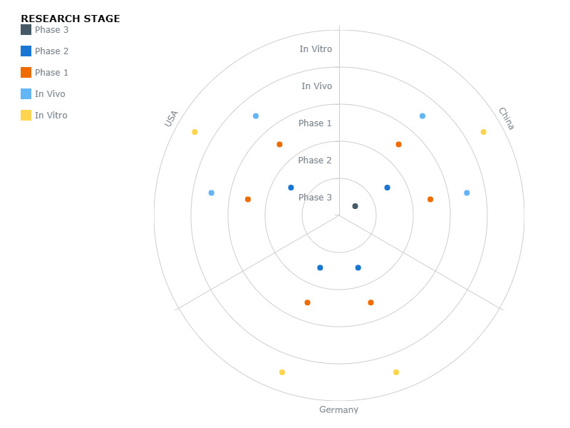
Depending on the data structure, the Y-axis displays either ordinal categories (the names of rings) or numerical values (corresponding to the measure).
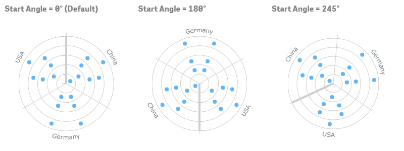
The position of the Y-axis is affected by the start angle of the chart.
To configure the Y-axis, go to Appearance > X-axis in the properties panel and do the following:
- To disable or enable the labels, switch the Labels slider.
- To configure the stroke, go to Line and use the Line, Color, and Style options.
- To configure the Y-grid, switch the Grid slider and use the options below.
Also, to set type of the Y-scale,
- Go to Scale type.
- Select Linear or Logarithmic from the drop-down menu.
Please keep in mind that this option is available only when the Y-axis displays numerical values. You might need to use the Logarithmic scale type if the range of the values is very wide.
Grids
The Bullseye chart has two grids:
- The X-grid intersects the X-axis and divides the chart into sectors.
- The Y-grid intersects the Y-axis and divides the chart into rings.
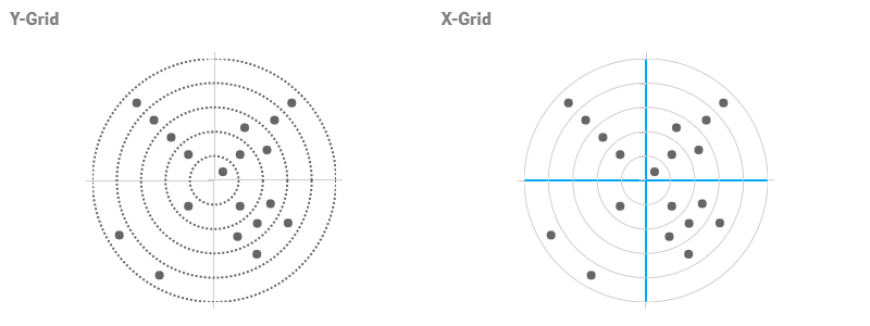
To configure a grid, go to Appearance > X-axis or Y-axis in the properties panel, switch the Grid slider, and do the following:
- To configure the stroke, go to Line and use the Line, Color, and Style options.
- To configure the fill, go down, select a fill type from the drop-down menu, and use the available options below.
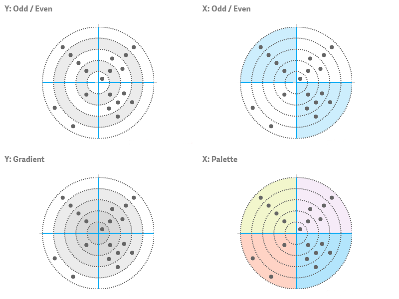
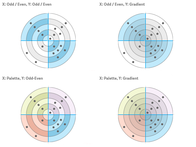
The X- and Y-grids support different fill schemes and settings:
| Grid | Fill Type | Description | Settings |
|---|---|---|---|
| X, Y | None | No colors are applied to the grid. | N/A |
| X, Y | Solid | One color is applied to the whole grid. | Color Opacity |
| X, Y | Odd / Even | Two colors indicate the odd and even rings. | Odd color, Opacity Even color, Opacity |
| X | Palette | Sectors are colored by a built-in palette. | Palette selection Reverse colors Opacity |
| Y | Gradient | Rings are colored by a two-color stepped gradient. | Inner color Outer color Opacity |
It is possible to combine fill types by applying different schemes to different grids. The screenshots below show most of the fills and their combinations:
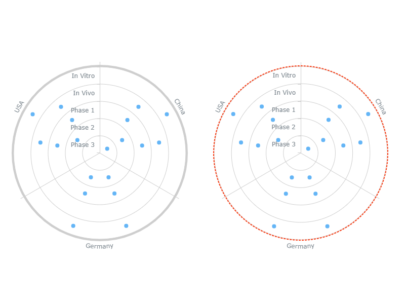
Start Angle
You can adjust the start angle of the chart, which affects orientation of the chart and the position of the Y-axis:
- Go to Appearance > Presentation in the properties panel.
- Use the Start angle option.
By default, the start angle is 0°.
Inner Radius
You can adjust the inner radius of the chart to set the size of the open space in the center:
- Go to Appearance > Presentation in the properties panel.
- Use the Inner radius option.
By default, the inner radius is 0%: the center is occupied by the inner ring, and no extra space is left.

Labels
Labels are text objects that are linked to markers and display additional information about the data points they represent.
By default, there are no labels on the chart, but you can enable and configure them. Go Appearance > Labels in the properties panel and do the following:
- To enable or disable, switch the Labels slider.
- To set the text, switch the Text slider and enter a string value or a string expression in the input box.
- To configure the background, switch the Background slider and use the Fill, Opacity, Corner type, Border type, and Border radius options.
- To configure the font, switch the Font slider and use the Style, Color, Size, Family, and Shadow options.
- To set the character limit, switch the Character limit slider and enter a number in the input box.
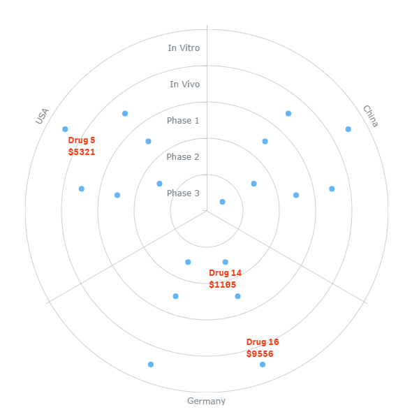
In the example below, the labels display the following expression:
If(Price >= 1000, Drug & Chr(10) & '$' & Round(Price), ' ')
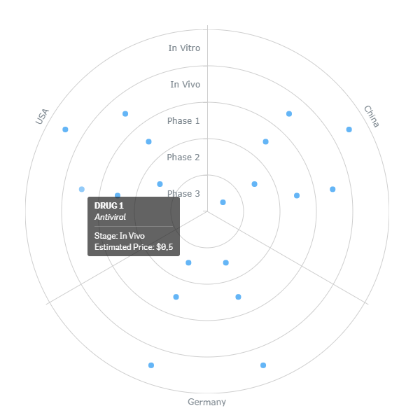
Tooltips
Tooltips are text boxes that appear when the user hovers over markers. You can set a custom tooltip text.
Please note that it is possible to set the tooltip text either as a string value or as an arbitrary string expression. Using expressions allows you to highlight values of particular interest, display values not included within a visualization or results of calculations, and so on.
Also, you can use HTML in tooltips.
To disable or enable tooltips, go to Interactivity in the properties panel and switch the Tooltips slider.
To configure the tooltip text,
- Go to Appearance > Tooltips in the properties panel.
- Switch the Tooltip text slider.
- Enter a string value or a string expression in the input box.
Here is an example of an expression for configuring the tooltip text:
'<b>' & Upper(Drug) & '</b>'&
'<br><i>' & Type & '</i>' &
'<hr>Stage: ' & Phase &
'<br>Estimated Price: $' & Price
Other Features
Interactivity
By default, the following interactivity features are available: selection, snapshots, and tooltips. To disable or enable them, go to Interactivity in the properties panel and switch the following sliders:
- Selection
- Snapshots
- Tooltips
Calculation Conditions
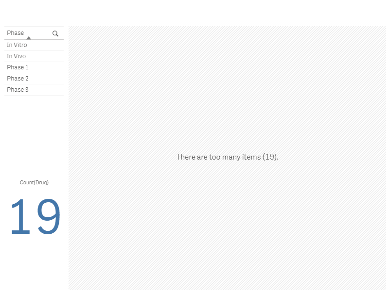
AnyChart supports calculation conditions: you can set a condition that needs to be fulfilled (true) for the object to be displayed. If the condition is not fulfilled, a custom message is displayed.
A calculation condition is useful when a chart or table is very big and makes the visualization slow to respond. A calculation condition can then help so that for example an object does not show until the user has filtered the data to a more manageable level by applying selections.
To add a condition, do the following:
- Go to Add-ons > Data handling in the properties panel.
- Enter an expression in the Calculation condition input box.
- Enter a string value or a string expression in the Displayed message input box.
For example, the following expression allows showing the chart only when the user selects less than 10 data items:
If(Count(Drug) < 10, 1, 0) If there are too many items, AnyChart displays this message:
'There are too many items (' & Count(Drug) & ').'
Contate nossos representantes de vendas
Nossos Representantes de vendas estão disponíveis para falar com você e resolver quaisquer dúvidas sobre nossos produtos, licenças, compra e tudo mais.- +1 (888) 845-1211 (EUA)
- +44 20 7193 9444 (Europa)