AnyChart Extension for Qlik: Waterfall Advanced Chart
Basics
Chart Types
There are two AnyChart Waterfall extensions for Qlik:
- Waterfall Classic Chart – a waterfall chart optionally supporting stacked sub-bars. In general, it is similar to the default Qlik Sense Waterfall chart.
- Waterfall Advanced Chart – a waterfall chart always displaying stacked sub-bars.
The choice between these two types depends on the structure of your data and what you are going to show on the chart.
This section explains how to create and configure Waterfall Advanced charts.
Downloading and Installing
Qlik Sense Desktop
To install AnyChart Waterfall Advanced Extension in Qlik Sense Desktop, do the following:
- Download AnyChart Waterfall Advanced Extension for Qlik Sense.
- Extract the archive.
- Open a Windows Explorer window and navigate to the Qlik Sense Extensions directory:
..\Users\<UserName>\Documents\Qlik\Sense\Extensions. - Copy the anychart-4x-waterfall-advanced folder to the Extensions directory.
- Relaunch Qlik Sense Desktop.
Qlik Sense Server
To install AnyChart Waterfall Advanced Extension on a Qlik Sense server,
- Download AnyChart Waterfall Advanced Extension for Qlik Sense.
- Open Qlik Management Console (QMC): https://<QPS server name>/qmc
- Select Extensions on the QMC start page or from the Start drop-down menu.
- Click Import in the action bar.
- In the dialog, select the downloaded archive. Leave the password area blank.
- Click Open in the file explorer window.
- Click Import.
Qlik Sense Cloud
To install AnyChart Waterfall Advanced Extension in Qlik Sense Cloud, do the following:
- Download AnyChart Waterfall Advanced Extension for Qlik Sense Cloud.
- Access the Management Console:
- add /console to your tenant address: https://<your tenant address>/console
- or use the navigation link Administration under the user profile in the hub
- Go to the Extensions page and click Add.
- In the dialog, select the downloaded archive.
- Click Add.
- In the Management Console, go to the Content Security Policy section and click Add.
- In the dialog, give the Content Security Policy a name – for example, AnyChart.
- Type the address of the origin server: qlik.anychart.com
- Select the following directives:
- connect-src
- font-src
- img-src
- script-src
- style-src
- Click Add.
Overview
The Waterfall Advanced chart shows how an initial value is affected by a series of intermediate positive or negative values.
This chart type always displays subcategories, visualized as sub-bars stacked within main bars.
You can configure the appearance of the chart: set the colors, adjust the legend, total bars, connectors, axes, and grids, set the layout, and configure the labels, stack labels, and tooltips.
Also, the following options are available: subtotal bars, split total, arrows, reference lines, reference ranges, interactivity, and calculation conditions.
Quick Start
This quick tutorial explains how to create a basic Waterfall Advanced chart.
First of all, add an empty chart to your sheet:
- Go to Custom objects > AnyChart in the assets panel.
- Drag an empty AnyChart Waterfall Advanced chart to the sheet.
Then add two dimensions, the first one representing categories, and the second one subcategories:
- Go to Data > Dimensions in the properties panel.
- Click Add and select a dimension.
- Click Add and select a dimension.
Finally, add a measure representing numerical values:
- Go to Data > Measures in the properties panel.
- Click Add and select a measure.
Alternatively, it is possible add one dimension and multiple measures if the structure of your data requires that.
Please note that you can also create dimensions and measures from fields or add them by clicking on buttons on the empty chart.
Dimensions and Measures
Dimensions
Unlike the default Qlik Sense Waterfall chart, AnyChart Waterfall Advanced requires adding at least one dimension. Do the following:
- Go to Data > Dimensions in the properties panel.
- Click Add and select a dimension.
You can add one or two dimensions, depending on the structure of your data.
Measures
To add a measure, do the following:
- Go to Data > Measures in the properties panel.
- Click Add and select a measure.
You can add one or multiple measures, depending on the structure of your data. Also, you can select the absolute or difference mode of interpreting measure values.
If there are multiple measures, their names are shown in the legend and tooltips. To customize them,
- Go to Data > Measures in the properties panel.
- Click a measure.
- Enter a string value or a string expression in the Label input box.
Data Structures
The Waterfall Advanced chart supports different ways of setting data. You should select the one that best suits the structure of your data.
Please note that Waterfall Advanced always displays sub-bars (representing subcategories) stacked within main bars.
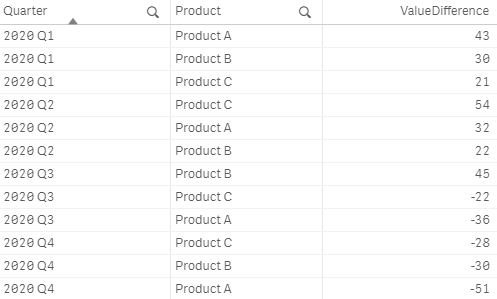
2 Dimensions + 1 Measure
You can add two dimensions and one measure:
- The values of the first dimension represent the names of categories, which are shown on the X-axis.
- The values of the second dimension represent the names of subcategories, which are shown in the legend.
- The values of the measure represent the numerical values of subcategories.

1 Dimensions + N Measures
You can add one dimension and multiple (two or more) measures:
- The values of the dimension represent the names of categories, which are shown on the X-axis.
- The names of measures represent the names of subcategories, which are shown in the legend.
- The values of the measure represent the numerical values of subcategories.
Data Modes
The Waterfall Advanced chart supports two modes of interpreting measure values: Absolute and Difference.
To select a data mode,
- Go to Appearance > Presentation in the properties panel.
- Select Absolute or Difference from the Data Mode drop-down menu.
The correct choice of the mode depends on the data:
| Data Mode | Description | Usage |
|---|---|---|
| Difference | Each measure value is interpreted as the difference between the current sub-bar and the previous one. (This is also the way how measures are interpreted by the default Qlik Sense Waterfall chart.) |
This mode should be used if the measure or measures contain difference values. |
| Absolute | Each measure value is interpreted as the absolute value of a sub-bar. | This mode should be used if the measure or measures contain absolute values. |
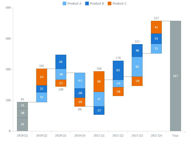
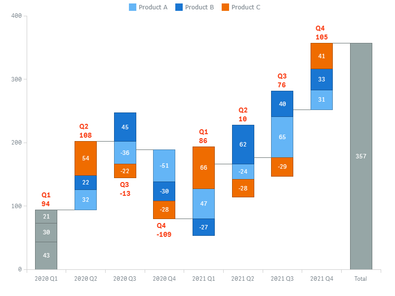
By default, Waterfall Advanced displays both difference and absolute values:
- The labels of sub-bars display difference values.
- The stack labels on the top of bars display the sums of absolute values (subtotals).
- Tooltips dispaly both absolute values and difference values (in brackets).
Depending on the mode, one set of values is taken directly from the measure, and the other is calculated automatically.
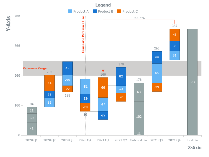
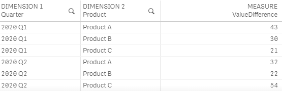
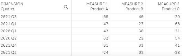
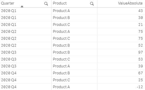
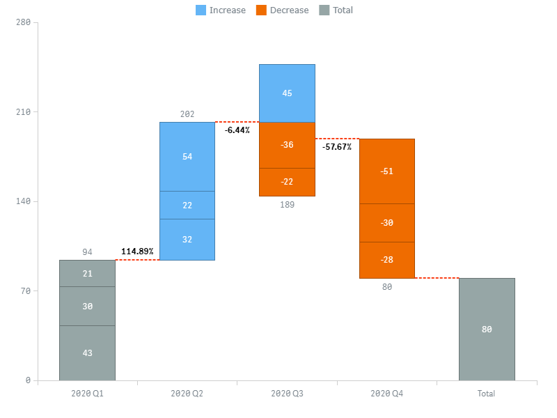
For example, take a look at this chart:
Such chart can be created by enabling the Difference mode and using the following data:
Alternatively, the same result can be achieved by enabling the Absolute mode and using this data:
Appearance
Colors
AnyChart Waterfall Advanced supports different ways of coloring the sub-bars, total bars, and subtotal bars of the chart. Some of the available color modes also affect the legend.
To select a color mode,
- Go to Appearance > Colors and Legend in the properties panel.
- Select a color mode from the Color by drop-down menu and use the available options below.
The table below explains the difference between different color modes and lists the settings available for each of them:
| Color Mode | Description | Settings |
|---|---|---|
| Subcategory |
|
Palette selection Reverse colors "Total" color Color totals as subcategories |
| Increase / Decrease / Total |
|
"Increase" color "Decrease" color "Total" color |
| Expression |
|
Expression "Total" color |
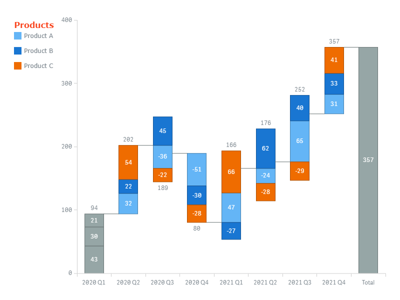
Subcategory
You can use the built-in palettes to color sub-bars by subcategory. A separate user-defined color is applied to total and subtotal bars (alternatively, you can color them by subcategory).
- Go to Appearance > Colors and Legend in the properties panel.
- Select Subcategory from the Color by drop-down menu.
- Select a palette and use the Reverse colors, "Total" color, and Color totals as subcategories options.
In this mode, the legend is colored automatically.

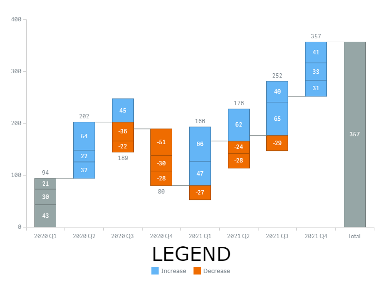
Increase / Decrease / Total
You can set three colors to indicate increasing, decreasing, and total (as well as subtotal) bars.
- Go to Appearance > Colors and Legend in the properties panel.
- Select Increase / Decrease / Total from the Color by drop-down menu.
- Use the "Increase" color, "Decrease" color, and "Total" color options.
The legend is colored automatically.
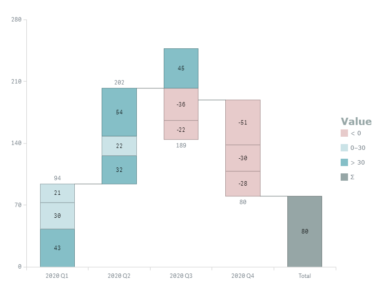
Color by Expression
You can set a custom expression to color sub-bars. A separate user-defined color is applied to total and subtotal bars.
- Go to Appearance > Colors and Legend in the properties panel.
- Select Expression from the Color by drop-down menu.
- Enter an expression in the input box and use the "Total" color option.
The items of the legend have to be added and colored manually.
Coloring by expression sets colors using a user-defined expression. When coloring by expression, you can define both what colors to use and which values to use them with, enabling more control over how colors are used in the visualization. For example, you might highlight values of particular interest, or differentiate between values within different value ranges. Coloring by expression can also be used to color a visualization by values not included within a visualization.
Examples
Here are a few examples to show what you can do with expressions by color. Please note that expressions do not affect the legend, so in these examples it is configured manually.
Example: Coloring by Category
Pick(Match(Quarter,  '2020 Q1', '2020 Q2', '2020 Q3', '2020 Q4'),
'#d29b9b', '#85bfc7', '#85a6c7', '#9b9bd2')
In this example, 4 colors indicate 4 categories (quarters).
Example: Coloring by Measure
If(Sum(ValueDifference) < 0, '#e7cbcb',
If(Sum(ValueDifference) <= 30, '#cbe3e7',
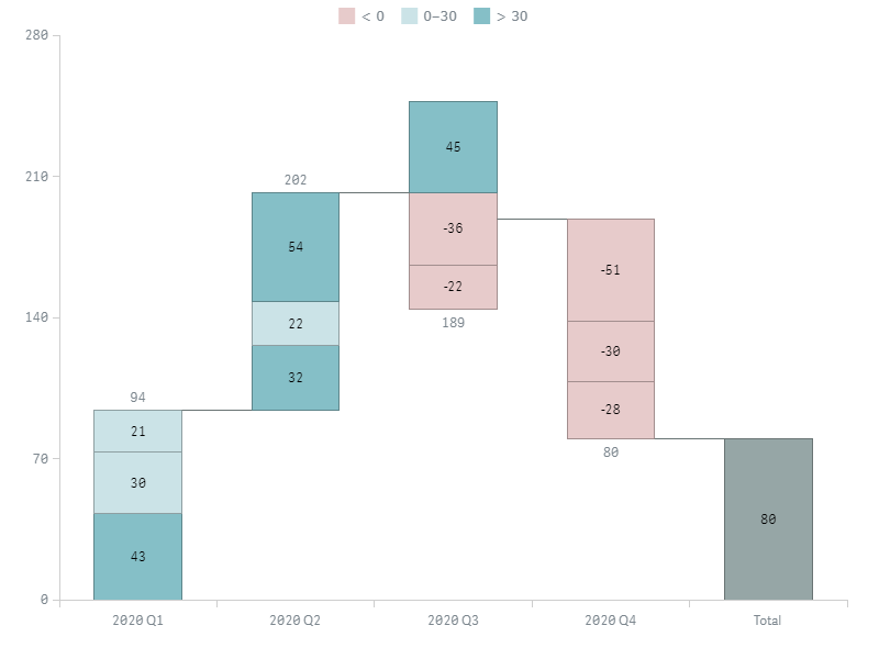
If(Sum(ValueDifference) > 30, '#85bfc7')))Here 3 colors indicate 3 value ranges.
Legend
When the chart is colored by subcategory or Increase / Decrease / Total, its colors are automatically applied to the legend.
When the chart is colored by expression, you have to manually add and color every item.
To configure the legend, go to Appearance > Colors and legend in the properties panel and do the following:
- To enable or disable, switch the Legend slider.
- To set the position, select Top, Right, Bottom, or Left from the Position drop-down-menu.
- To set the alignment, select one of the available options from the the Alignment drop-down menu.
- To set the title, go to Title and enter your text the Title input box.
- To configure the title font, use the Style, Color, Size, Family, and Shadow options.
To customize the Total item or add a new item, go to Items, switch the Items slider, and do the following:
- To enable or disable the Total item, check or uncheck the Show total in legend box.
- To set the name of the Total item, enter your text in the Total label input box.
- To add a custom item, click Add legend item.
- To set the name of the new item, enter your text in the Label input box.
- To set the color of the new item, use the Color option.
Custom items replace the automatically generated ones.
If the chart is colored by Increase / Decrease / Total, you can customize the names of all the default items. Go to Items, do NOT switch the Items slider, and do the following:
- To set the name of the Total item, enter your text in the Total label input box.
- To set the name of the Increase item, enter your text in the Increase label input box.
- To set the name of the Decrease item, enter your text in the Decrease label input box.
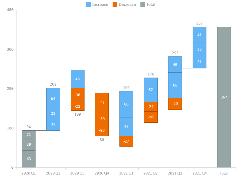
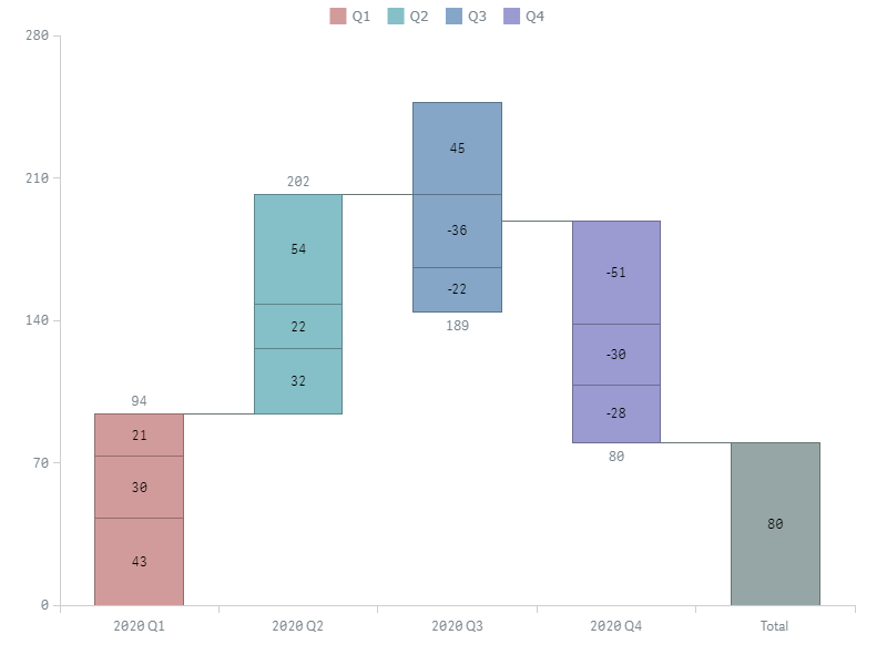
In this screenshot, the chart is colored by subcategories, the auto-generated legend is shown, its position and title customized:
Here the chart is colored by Increase / Decrease / Total, the auto-generated legend is shown, its position and title customized:
Here the chart is colored by expression, and the legend displays custom items. The name of the Total item, position, and title are customized.
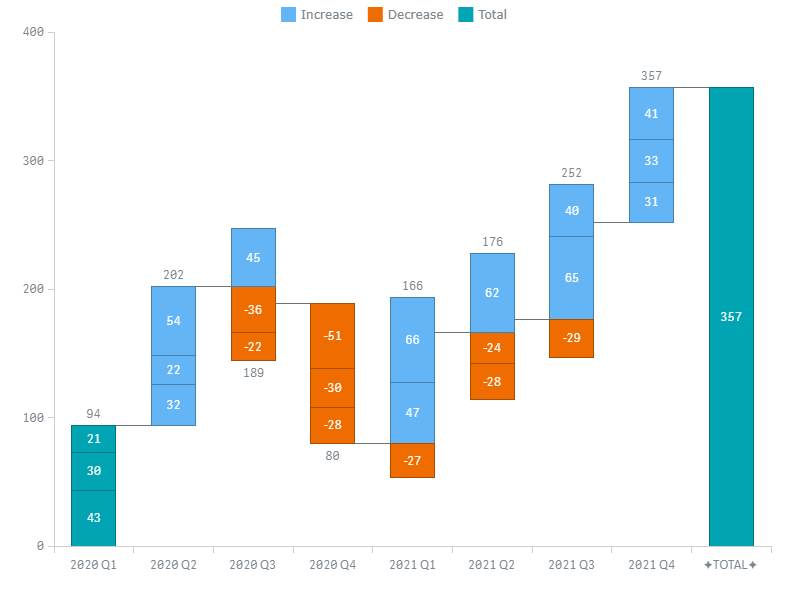
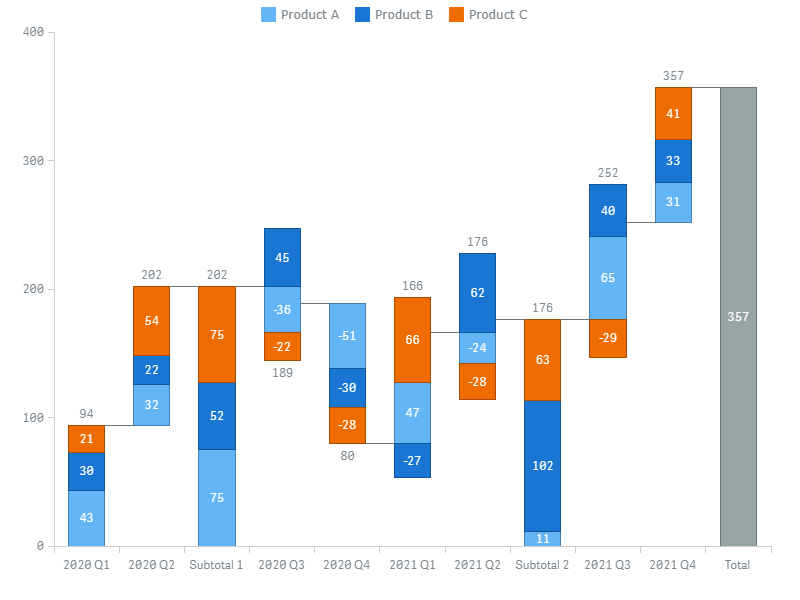
Total Bars
You can show a total bar after the last bar of the chart and color the first bar as total. In addition, it is possible to show a split total, stacked total, and add multiple subtotal bars after any bars.
Go to Appearance > Presentation > Total in the properties panel and do the following:
- To enable the starting total, uncheck the Color first item as change box.
- To enable the ending total, check the Show cumulative total box.
- To set the label of the ending total (shown on the X-axis), enter your text in the Label input box.
You can display total bars at the beginning of the X-axis:
- Go to Appearance > Presentation > Total in the properties panel.
- Select Start from the Position dropdown menu.
You can also set the color of total bars:
- Go to Appearance > Colors and Legend in the properties panel.
- Use the "Total" color option.
In this screenshot, the starting and ending total bars are enabled, a custom total color is used, and the label of the ending total is customized:
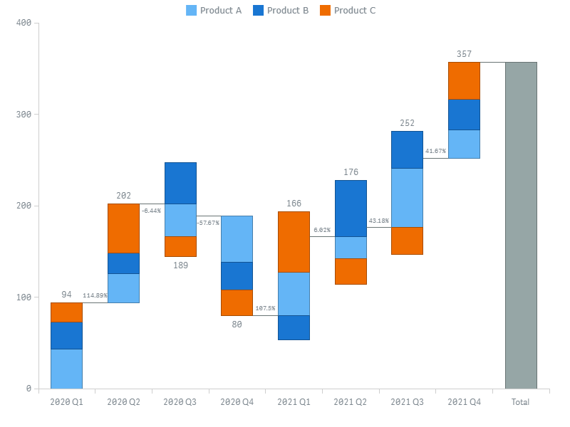
Connectors
A connector is a line connecting two bars of a chart that are next to each other. The labels of connectors display the difference between each pair of bars as a percentage.
To configure connectors, go to Appearance > Presentation > Connectors in the properties panel and do the following:
- To disable or enable labels, switch the Labels slider.
- To configure labels, use the Style, Color, Size, Family, and Shadow options.
- To configure the stroke, switch the Stroke settings slider and use the Color, Style, and Thickness options.
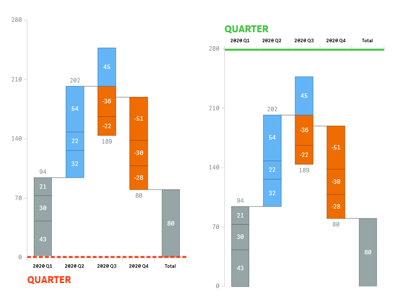
Axes
X-Axis
The X-axis displays the names of categories as well as the labels of total and subtotal bars.
To configure the X-axis, go to Appearance > X-axis in the properties panel and do the following:
- To disable or enable, switch the Axis slider.
- To configure the stroke, use the Color, Style, and Thickness options.
- To set the position, use the Position option.
- To configure the labels, switch the Labels and Font sliders and use the options below.
- To configure the title, switch the Title slider and use the Text, Font, and Align options.
- To configure the X-grid, switch the Grid slider and use the options below.
The orientation of the X-axis (horizontal or vertical) is affected by the layout of the chart.
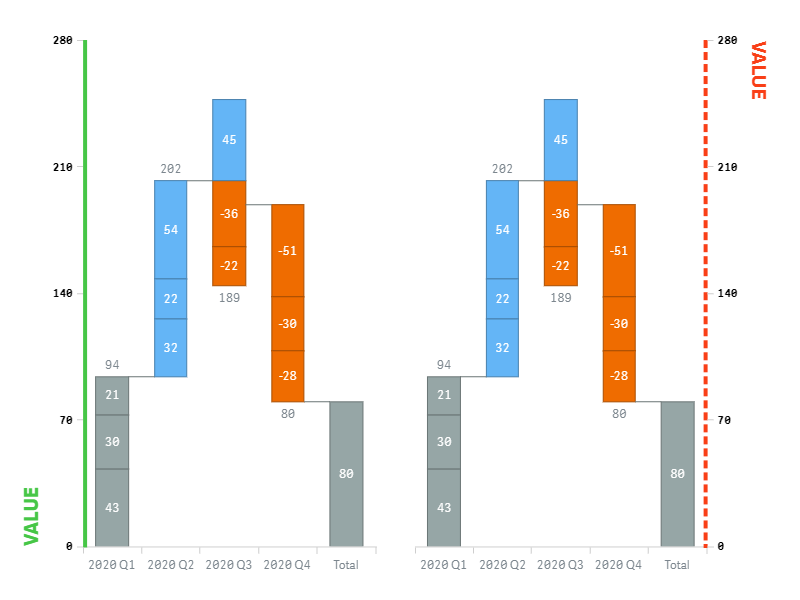
Y-Axis
The Y-axis displays numerical values, which correspond to the measure or measures, depending on the data structure.
To configure the Y-axis, go to Appearance > Y-axis in the properties panel and do the following:
- To disable or enable, switch the Axis slider.
- To configure the stroke, use the Color, Style, and Thickness options.
- To set the position, use the Position option.
- To configure the labels, switch the Labels and Font sliders and use the options below.
- To configure the title, switch the Title slider and use the Text, Font, and Align options.
- To configure the Y-grid, switch the Grid slider and use the options below.
The orientation of the Y-axis (vertical or horizontal) is affected by the layout of the chart.
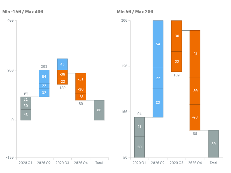
Also, to set the range of the Y-scale:
- Switch the Range slider.
- Select Min, Max, or Min/Max from the drop-down menu.
- Enter the value(s) or expression(s) in the input box(es) below.
By default, the Y-scale is adjusted to display all the bars of the chart. Depending on the value(s) your specify as the minimum and / or maximum, either the bars are cropped, or extra space is displayed below or above them:
Grids
The Waterfall Advanced chart has two grids:
- The X-grid intersects the X-axis and divides the chart into vertical bands.
- The Y-grid intersects the Y-axis and divides the chart into horizontal bands.
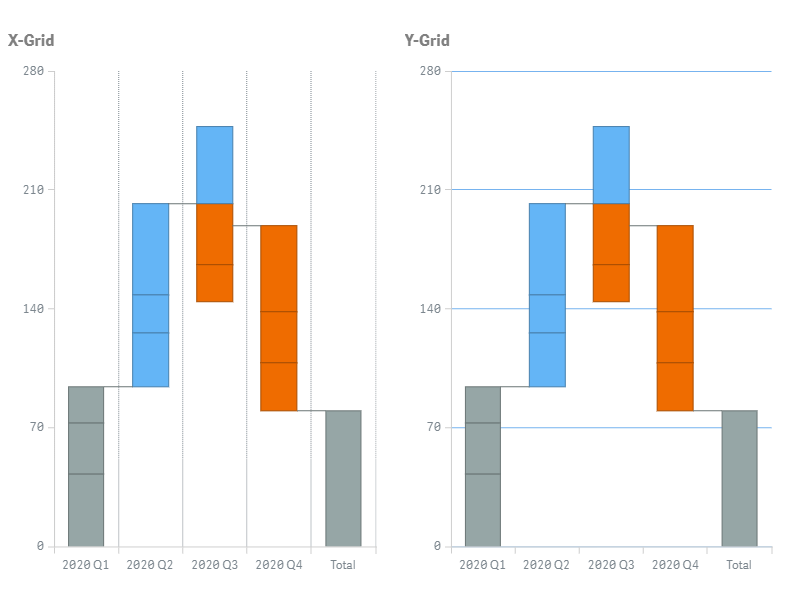
To configure a grid, go to Appearance > X-axis or Y-axis in the properties panel, switch the Grid slider, and do the following:
- To configure the stroke, use Color, Style, and Thickness options.
- To configure the fill, select a fill type from the Fill type drop-down menu and use the available options below
The X- and Y-grids support the following fill schemes and settings:
| Fill Type | Description | Settings |
|---|---|---|
| None | No colors are applied to the grid. | N/A |
| Solid | One color is applied to the whole grid. | Color Opacity |
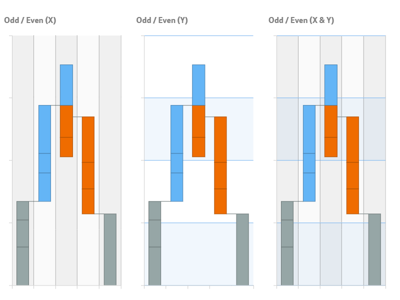
| Odd / Even | Two colors indicate the odd and even bands. | Odd color, Opacity Even color, Opacity |
Please note that is possible to combine fills by enabling them for both grids at once.
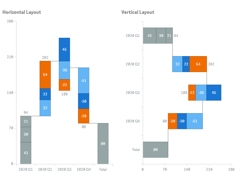
Layout
By default, the chart is oriented horizontally: the X-axis is horizontal, and the Y-axis is vertical.
When the vertical layout is enabled, the X-axis is vertical, and the Y-axis is horizontal:
To set the layout,
- Go to Appearance > Presentation > Layout in the properties panel.
- Select Horizontal or Vertical.
Labels
Labels are text objects displaying the information about the sub-bars of the chart.
To configure labels, go to Appearance > Labels in the properties panel and do the following:
- To enable or disable, switch the Labels slider.
- To set the text, switch the Text slider and enter a string value or a string expression in the input box.
- To configure the font, use the Style, Color, Size, Family, and Shadow options.
- To enable or disable outer labels, check or uncheck the Allow outside box.
- To set the threshold, enter a numerical value or an expression in the Threshold modulus input box.
Labels representing values less than the threshold (in modulus) are hidden.
By default, the label of each sub-bar shows its difference value.
In the example below, the font of the labels is adjusted. They display the short names of subcategories:
Right(Product, 1)

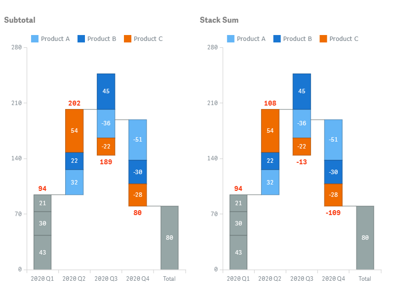
Stack Labels
Stack labels are text objects displaying the information about the bars of the chart.
To configure stack labels, go to Appearance > Stack labels in the properties panel:
- To disable or enable, switch the Stack labels slider.
- To set the text, select an option from the Text drop-down menu.
- To configure the font, use the Style, Color, Size, Family, and Shadow options.
In the Text menu, three options are available. They define the text shown by stack labels:
- Subtotal (default) – sums of absolute values corresponding to sub-bars.
- Stack sum – sums of difference values corresponding to sub-bars.
- Custom – a string value or a string expression you enter in the input box.
In the example below, stack labels display a custom text – the short names of quarters and the sums of difference values:
Right(Quarter, 2) & Chr(10) & Sum(ValueDifference)
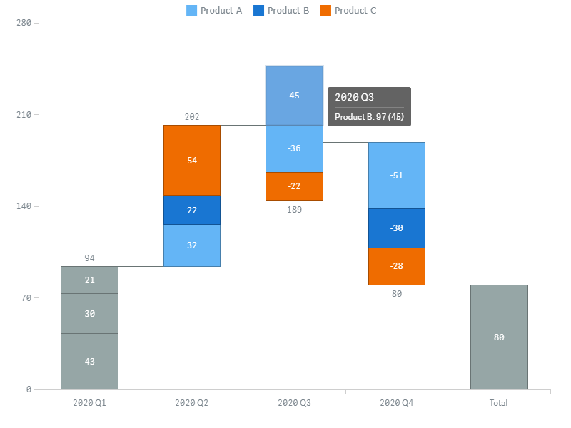
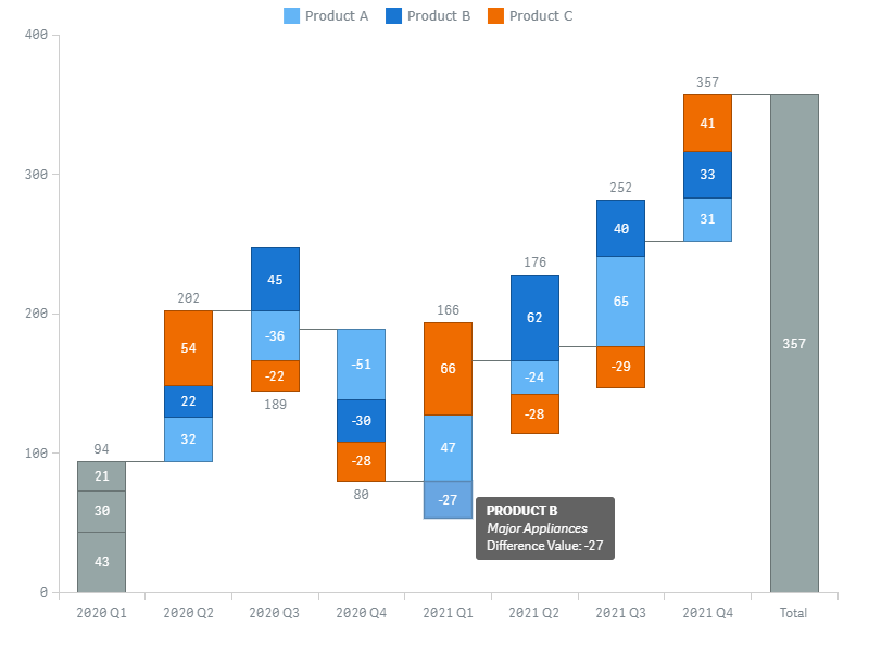
Tooltips
Tooltips are text boxes that appear when the user hovers over the sub-bars of the chart. Each tooltip displays additional information about the current sub-bar.
You can as well enable group tooltips, which are shown when the user hovers over the bars. Each group tooltip displays the information about all the sub-bars of the current bar.
Please note that it is possible set the text of tooltips and group tooltips either as a string value or as an arbitrary string expression. Using expressions allows you to highlight values of particular interest, display values not included within a visualization or results of calculations, and so on.
Also, you can use HTML in tooltips.
To disable or enable tooltips, go to Interactivity in the properties panel and switch the Tooltips slider.
To configure tooltips, go to Appearance > Tooltip in the properties panel and do the following:
- To set the text, switch the Tooltip text slider and enter a string value or a string expression in the input box.
- To enable or disable group tooltips, check or uncheck the Group tooltips box.
Here is an example of an expression for configuring the tooltip text:
'<b>' & Upper(Product) & '</b>' &
'<br><i>' & Capitalize(Type) & '</i>' &
'<br>Difference Value: ' & ValueDifference
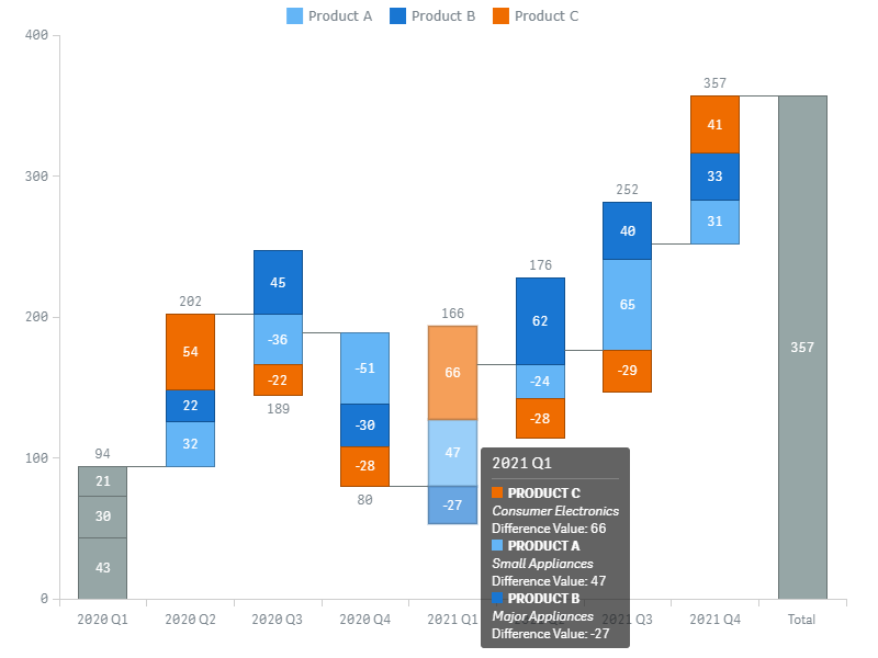
In this screenshot, the same text is displayed by a group tooltip:
Other Features
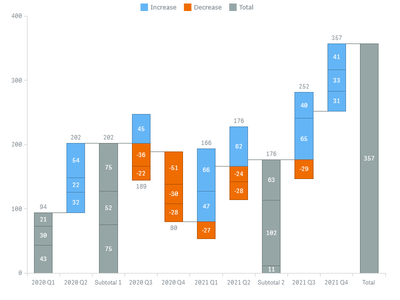
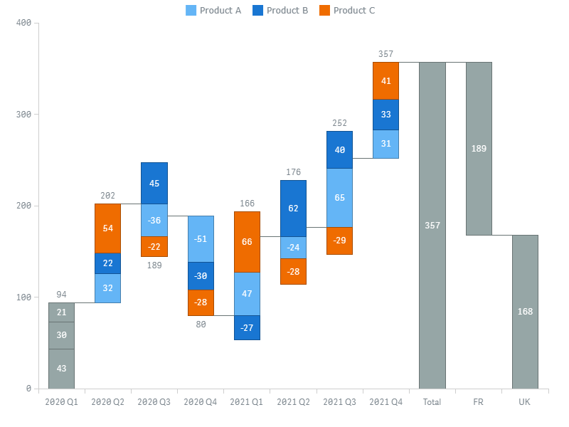
Subtotal Bars
You can show multiple subtotal bars anywhere on the chart.
To add a subtotal bar after any bar, do the following:
- Go to Add-ons > Subtotals in the properties panel.
- Click Add subtotal.
- Enter a value or an expression in the Dimension value input box.
- Enter your text or an expression in the Label input box to set the label (shown on the X-axis).
In the Dimension value input box, you can specify a value of the first or the only dimension (depending on the data structure), which represents one of the category names shown on the X-axis. The subtotal bar is added after the bar corresponding to the specified value, or at the end of the chart if no value is entered.
You can also set the color of subtotal bars:
- Go to Appearance > Colors and Legend in the properties panel.
- Use the "Total" color option or Color totals as subcategories (if available).
The Color totals as subcategories option is available only if the chart is colored by subcategory. This color scheme is also applied to the starting total, overriding the Color first item as change option.
In this screenshot, there are two subtotal bars, added after the following dimension values:
- 2020 Q2
- 2021 Q2
The Color totals as subcategories option is available only if the chart is colored by subcategory:
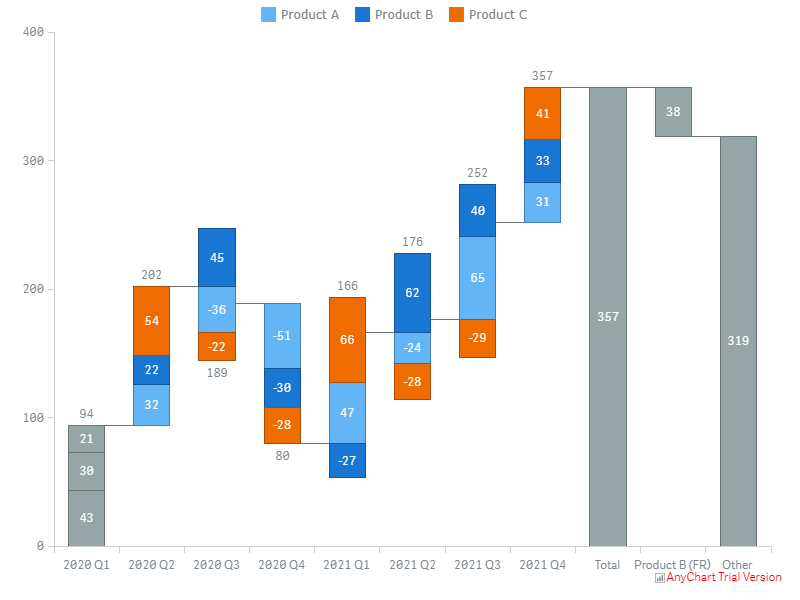
Split Total
You can split the total bar into multiple bars (splits) shown right after it. Splits represent user-defined values or expressions.
To add a split, go to Add-ons > Split total in the properties panel and do the following:
- Click Add value.
- Enter your text or an expression in the Label input box to set the label (shown on the X-axis).
- Enter a numerical value or an expression in the Value input box.
The sum of the values you specify should be equal to or less than the total. If it is less than the total, the 'Other' category is created automatically.
Here is a chart with the split total enabled:
Here the automatically created 'Other' category is shown:
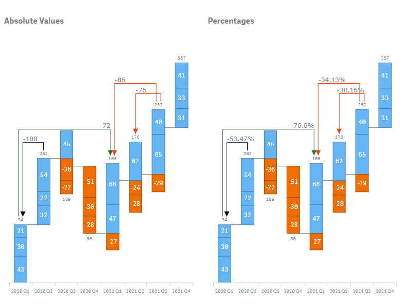
Arrows
You can add and customize multiple arrow-shaped connectors (arrows). They connect pairs of any bars and show the difference between them: either as an absolute value or as a percentage.
To add an arrow,
- Go to Add-ons > Arrows in the properties panel.
- Click Add arrow.
- Enter a value or an expression in the From input box.
- Enter a value or an expression in the To input box.
In the From and To input box, you need to specify values of the first or the only dimension (depending on the data structure), which represent category names shown on the X-axis.
To configure an arrow, go to Add-ons > Arrows and do the following:
- To set the color, use the Color option:
- To display the difference as absolute values or percentages, uncheck or check the Show percents box.
- To set the alignment of labels, use the Align option.
Reference Lines
There are two types of reference lines:
- A reference line is a horizontal line intersecting the Y-axis in a given point. It indicates numerical values.
- A dimension reference line is a vertical line intersecting the X-axis in a given point. It indicates category names, represented by the values of the first or the only dimension (depending on the data structure).
You can add one or several reference lines and dimension reference lines. Lines of both types are only drawn if their values fall within the displayed range of values.
Please note that it is possible to specify the value defining the position of a line either as an exact value or as an arbitrary expression.
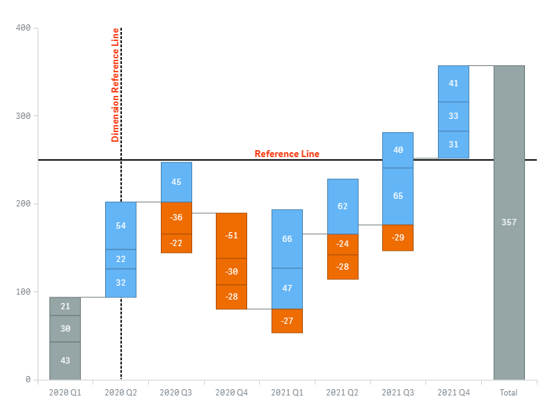
To add a reference line, do the following:
- Go to Add-ons > Reference lines in the properties panel.
- Click Add reference line.
- Enter a value or an expression in the Reference line expression input box.
To add a dimension reference line,
- Go to Add-ons > Dimension reference lines in the properties panel.
- Click Add reference line.
- Enter a value or an expression in the Dimension value input box.
To configure a line, go to Add-ons > Reference lines or Dimension reference lines and do the following:
- To add a text label, enter a text string in the Label input box.
- To configure the stroke, use the Stroke, Stroke type, and Thickness options.
- To configure the position of the label, use the Label orientation and Label position options.
- To configure the font, switch the Font slider and use the Style, Color, Size, Family, and Shadow options.
Reference Ranges
There are two types of reference ranges:
- A reference range is a horizontal area intersecting the Y-axis in a given range of points. It indicates a range of numerical values.
- A dimension reference range is a vertical range intersecting the X-axis in a given range of point. It indicates a range of category names, represented by the values of the first or the only dimension (depending on the data structure).
You can add one or several reference ranges and dimension reference ranges. Ranges of both types are only drawn if their values fall within the displayed range of values.
Please note that it is possible to specify the values defining the position of a range either as exact values or as arbitrary expressions.
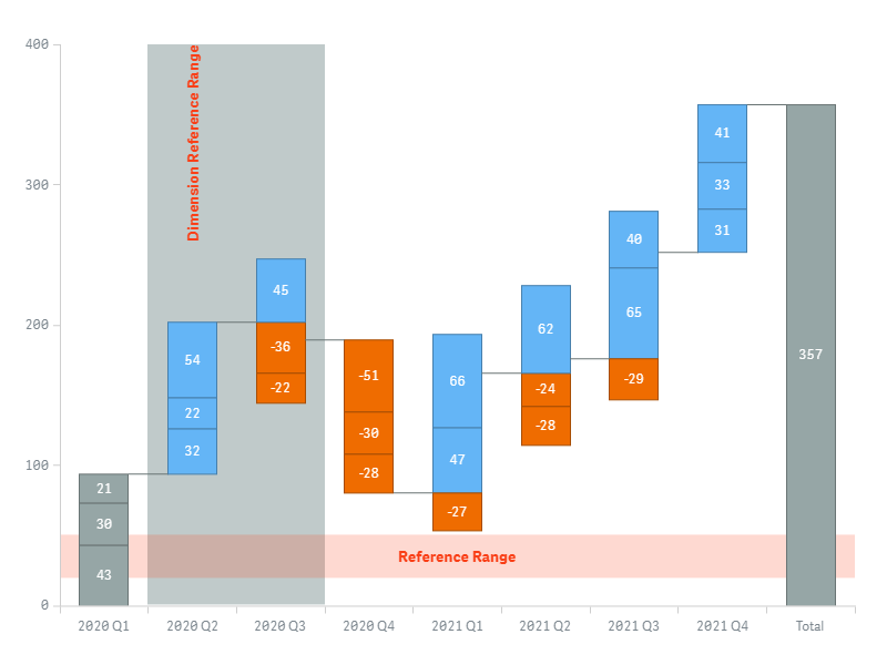
To add a reference range, do the following:
- Go to Add-ons > Reference ranges in the properties panel.
- Click Add reference range.
- Enter a value or an expression in the From input box.
- Enter a value or an expression in the To input box.
To add a dimension reference range,
- Go to Add-ons > Dimension reference ranges in the properties panel.
- Click Add reference range.
- Enter a value or an expression in the From input box.
- Enter a value or an expression in the To input box.
To configure a range, go to Add-ons > Reference ranges or Dimension reference ranges and do the following:
- To add a text label, enter a text string in the Label input box.
- To configure the fill, use the Color and Opacity options.
- To configure the position of the label, use the Label orientation and Label position options.
- To configure the font, switch the Font slider and use the Style, Color, Size, Family, and Shadow options.
Interactivity
By default, the following interactivity features are available: selection, snapshots, and tooltips. To disable or enable them, go to Interactivity in the properties panel and switch the following sliders:
- Selection
- Snapshots
- Tooltips
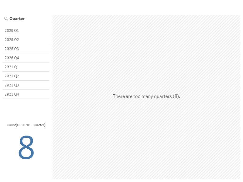
Calculation Conditions
AnyChart supports calculation conditions: you can set a condition that needs to be fulfilled (true) for the object to be displayed. If the condition is not fulfilled, a custom message is displayed.
A calculation condition is useful when a chart or table is very big and makes the visualization slow to respond. A calculation condition can then help so that for example an object does not show until the user has filtered the data to a more manageable level by applying selections.
To add a condition, do the following:
- Go to Add-ons > Data handling in the properties panel.
- Enter an expression in the Calculation condition input box.
- Enter a string value or a string expression in the Displayed message input box.
For example, the following expression allows showing the chart only when the user selects less than 5 quarters:
If(Count(DISTINCT Quarter) < 5, 1, 0) If there are too many quarters, AnyChart displays this message:
'There are too many quarters (' & Count(DISTINCT Quarter) & ').'