

About the app:
Grab a clear picture of the active clinical research studies conducted at Roswell Park Cancer Institute and how they progress. For each of the five most common types of cancer by primary anatomic site of origin, learn what trials are ongoing and intuitively understand which ones are closer to completion than others. Explore by cancer type, current phase, protocol, principal investigator, or start year.
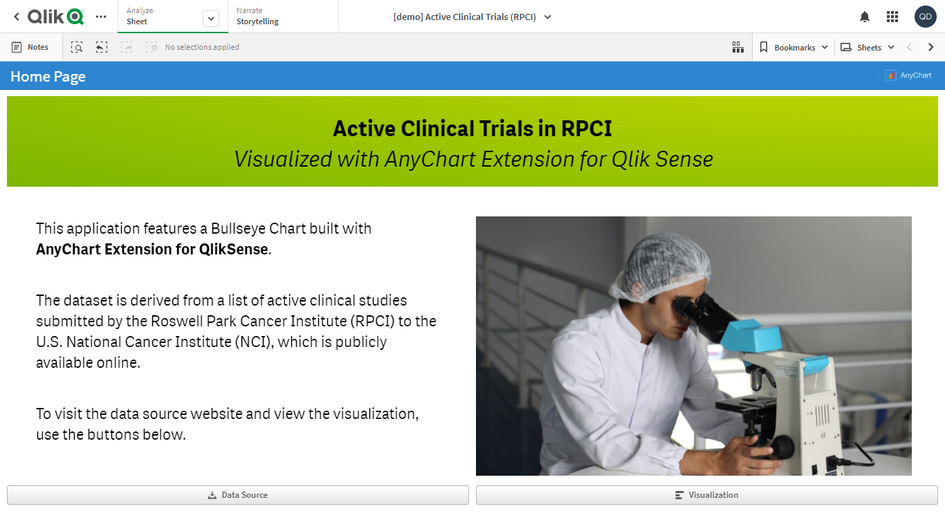
This application features a Bullseye Chart built using the AnyChart extension for Qlik Sense. The dataset is derived from a list of active clinical studies submitted by the Roswell Park Cancer Institute (RPCI) to the U.S. National Cancer Institute (NCI), which is publicly available online.
Bullseye Chart:
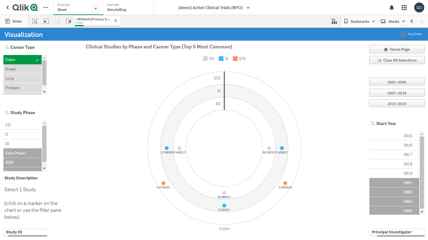
- The chart shows which clinical trials are the closest to completion. Dots are studies. Rings are phases. 5 sectors are 5 types of cancer.
- Data structure: 3 dimensions.
- The chart is colored by the second dimension — Phase.
- The text labels can only be seen when fewer than 15 dots are displayed.
- The text of the tooltips is custom, displaying the following additional information: start year and the principal investigator (research group leader). The names of the phases are shaded using the same colors as the corresponding dots and legend items.
- The Y-grid is colored according to the odd/even scheme, which means the odd rings are filled with one color and the even rings are filled with a different one.
Additionally:
- Filtering by all dimensions: Cancer Type, Study Phase, Study ID.
- Filtering by several additional fields: Start Year and Principal Investigator.
- Custom buttons for filtering by several-year periods.
- When one study is selected, its description is displayed.